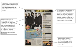
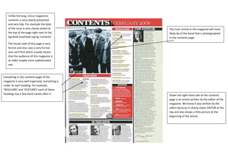
It also uses the word ‘kerrang!’ in the
  title of ‘KERRANG! CONTENTS’ is used
  in exactly the same format as the
  front page, this helps to keep the
  pattern of the magazine all the way
  through                                   The fonts for each of the headings are all
                                            the same. It uses a sans Serif font to
                                            connote informality. The yellow on black
                                            headings also give a sense of structure
                                            because it makes the headings bold to
                                            make them stand out. The house style of
                                            the contents page uses similar ‘square’
The main image used on the
                                            shapes throughout the contents page
contents page is a picture of
‘YOUMEATSIX’ who are the main
article of the magazine. This helps to
draw the reader in and tells them
exactly what to expect throughout
the magazine. It also uses an advert
of ‘YOUMEATSIX’ T-shirts as
promotion for the artists that are
going to be on the main article of
the magazine.


                                              Subscription of the magazine is
                                              advertised in the terminal optical
                                              area of the contents page, used to
                                              try and make sure that you buy the
                                              magazine again.
2 speech “splats” of blood used to ask an informal
                                                  question to the readers of the magazine, and then an
                                                  answer is given to the question by two famous artists at
                                                  the bottom of the splat


                                                                                                                            The masthead for the main article is
                                                                                                                            put in the middle of the page instead
                                                                                                                            of at the top of the page. Also this
Once again the format for Kerrangs double page                                                                              masthead is in a big bold red font to
spread is very informal and ‘messy’. Also                                                                                   make sure it stands out, they could
because the band that is being written about                                                                                have also used the colour red
here is very well known the Kerrang writers can
                                                                                                                            because it connotes blood which is
afford to cover the masthead with the top of a
guitar and get away with it.                                                                                                in the name “Bloodstock”.


                    Lots of small photos used
                    to show different
                    attributes of the band.                                                              Website used to promote the artists that are being
                                                                                                         written about in the article above going across the
                                                                                                         bottom of one page, then on the other page using
                                                                                                         the same banner a description of what is on the
                                                                                                         website.
The Masthead also uses some colloquial language because
                                         it uses Florence and the machines song ‘You’ve got the
                                         love’ and instead put USA got the love. The article will
                                         most likely be about how the USA have started to love the
                                         artist

The Main article in the double page
spread is most clearly about
Florence and the machine because it
uses a very large image in the back
ground which takes up the
background of the whole page, but
the actual image itself is only on the
left side of the page.


                                         Unlike Kerrang again. Uncut doesn’t use lots of small
                                         photos it only uses one big one, and also the text is very
                                         formal and tidy. Put to the bottom right hand corner of
                                         the two pages underneath the article. Also this double
                                         page spread doesn’t use promotions or an advertisement
                                         it only has the one article and that’s it.
Unlike Kerrang, Uncut magazines
   contents is very clearly presented
   and very tidy. For example the date
   of the issue is very clearly stated at        The main article in the magazine will most
   the top of the page right next to the         likely be of the band that is photographed
   big bold masthead saying ‘contents’           in the contents page.

   The house style of this page is very
   formal and also uses a very formal
   sans serif font which usually means
   that the audience of this magazine is
   an older maybe more sophisticated
   one


Everything in the contents page of the
magazine is very well organised, everything is
under its own heading. For example,
‘REGULARS’ and ‘FEATURES’ each of these
headings has a few band names after it.          Down the right hand side of the contents
                                                 page is an article written by the editor of the
                                                 magazine. We know it was written by the
                                                 editor because it clearly states EDITOR at the
                                                 top and also shows a little picture at the
                                                 beginning of the article.

Contents page and double page spread analysis

  • 1.
    It also usesthe word ‘kerrang!’ in the title of ‘KERRANG! CONTENTS’ is used in exactly the same format as the front page, this helps to keep the pattern of the magazine all the way through The fonts for each of the headings are all the same. It uses a sans Serif font to connote informality. The yellow on black headings also give a sense of structure because it makes the headings bold to make them stand out. The house style of the contents page uses similar ‘square’ The main image used on the shapes throughout the contents page contents page is a picture of ‘YOUMEATSIX’ who are the main article of the magazine. This helps to draw the reader in and tells them exactly what to expect throughout the magazine. It also uses an advert of ‘YOUMEATSIX’ T-shirts as promotion for the artists that are going to be on the main article of the magazine. Subscription of the magazine is advertised in the terminal optical area of the contents page, used to try and make sure that you buy the magazine again.
  • 2.
    2 speech “splats”of blood used to ask an informal question to the readers of the magazine, and then an answer is given to the question by two famous artists at the bottom of the splat The masthead for the main article is put in the middle of the page instead of at the top of the page. Also this Once again the format for Kerrangs double page masthead is in a big bold red font to spread is very informal and ‘messy’. Also make sure it stands out, they could because the band that is being written about have also used the colour red here is very well known the Kerrang writers can because it connotes blood which is afford to cover the masthead with the top of a guitar and get away with it. in the name “Bloodstock”. Lots of small photos used to show different attributes of the band. Website used to promote the artists that are being written about in the article above going across the bottom of one page, then on the other page using the same banner a description of what is on the website.
  • 3.
    The Masthead alsouses some colloquial language because it uses Florence and the machines song ‘You’ve got the love’ and instead put USA got the love. The article will most likely be about how the USA have started to love the artist The Main article in the double page spread is most clearly about Florence and the machine because it uses a very large image in the back ground which takes up the background of the whole page, but the actual image itself is only on the left side of the page. Unlike Kerrang again. Uncut doesn’t use lots of small photos it only uses one big one, and also the text is very formal and tidy. Put to the bottom right hand corner of the two pages underneath the article. Also this double page spread doesn’t use promotions or an advertisement it only has the one article and that’s it.
  • 4.
    Unlike Kerrang, Uncutmagazines contents is very clearly presented and very tidy. For example the date of the issue is very clearly stated at The main article in the magazine will most the top of the page right next to the likely be of the band that is photographed big bold masthead saying ‘contents’ in the contents page. The house style of this page is very formal and also uses a very formal sans serif font which usually means that the audience of this magazine is an older maybe more sophisticated one Everything in the contents page of the magazine is very well organised, everything is under its own heading. For example, ‘REGULARS’ and ‘FEATURES’ each of these headings has a few band names after it. Down the right hand side of the contents page is an article written by the editor of the magazine. We know it was written by the editor because it clearly states EDITOR at the top and also shows a little picture at the beginning of the article.