Download to read offline


![How did my poster meet the
romantic-comedy genre?
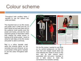
The title’s font is [insert font here],
which is a plain and clear font The main title is a mixture of
which is easy to see and read. I both standard text, and bold
decided to use this font, as I text, to highlight who the films
previously mentioned the text main protagonist is. BOBBY
comes out clear to read, which is in bold, which gives away
links to the plot of our film which is to the audience who the main
clear and easy to follow which is character is. I decided to do
why I decided to use this font. this because, I wanted to let
The clothing of both characters, also the audience know who the
conforms to the conventions of a main character was, but at
typical rom-com film. The male is the same time not give too
wearing a suit, which is typical much away as there are two
within rom-com films such as characters on the poster,
‘Friends With Benefits’, where the which creates an enigma to
male lead on the poster is wearing a the audience as they are left
suit. The females clothing also wondering who the female is
connotes to the audience that my and why has she been
film is a rom-com as the female placed on the poster. It
leads within many rom-com creates questions such as,
films, are presented as attractive what role does she play in
and sexy, and wear clothing to theI film?
also put the BBFC
connote this, which is why we certification onto the poster
decided to put Simren in a bright as this is a convention of
red dress to conform to the typical film posters.
convention of a romantic comedy](https://image.slidesharecdn.com/evaluationquestion2sharnamandil-121029195939-phpapp01/85/Evaluation-Question-2-Sharna-Mandil-5-320.jpg)
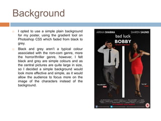
![Font choices for my poster
The other font I used within my poster
was called [insert font here]. I decided to
use this font as it is to the point, clear and
easy to read, which is like the plot of this
film, as it is easy to follow and
understand. The font is also BOLD in
some areas of the poster, this was to
signify to the audience who the main
characters were and also to highlight the
key information on the poster, such as the
release date, main protagonist, and also
the tag line.
For my credits on my film poster I
decided to use the font called,
‘Universal Accreditation’ as this
is a convention of any film poster](https://image.slidesharecdn.com/evaluationquestion2sharnamandil-121029195939-phpapp01/85/Evaluation-Question-2-Sharna-Mandil-6-320.jpg)
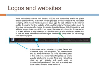
![Font choices for my review
I used a font which was clean and simple, so
that it was easy for the audience to read. The
font was also similar to what we used in our
credits.
I decided to opt for a font similar to what I
used in my film poster ([insert font here]),
as the font on my film poster was clear
and simple. I decided to use the font
([insert font here]), as I believed it would
be effective to use on my film review. I
stuck to a white colour to add to
continuity.](https://image.slidesharecdn.com/evaluationquestion2sharnamandil-121029195939-phpapp01/85/Evaluation-Question-2-Sharna-Mandil-7-320.jpg)


The combination of the film, film review, and film poster was effective in promoting the romantic comedy film. The film poster visually represented the romantic comedy genre through the characters' poses and inclusion of the color red. Both the film review and poster used consistent fonts that were clear and easy to read. The film review additionally included an image of both main characters that provided context about their relationship without revealing too much of the plot. Overall, the ancillary texts enhanced the film by creatively engaging the target audience.


