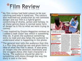
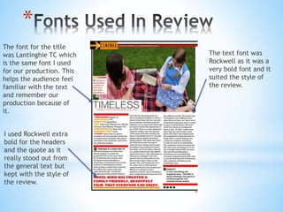
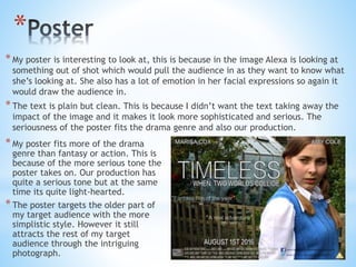
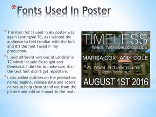
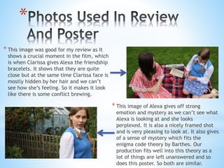
The document discusses the effectiveness of ancillary tasks created to promote a short film. These included a film poster and film review created in Photoshop. The review used bold colors and fonts to stand out while matching the film's genres of drama, action, and fantasy. The poster features the main character with an intriguing expression to draw in viewers. Both ancillary tasks stuck to genre conventions and used familiar fonts and imagery to effectively promote the film and catch audience attention.
Model Attribute Check Company Auto PropertyCeline George
In Odoo, the multi-company feature allows you to manage multiple companies within a single Odoo database instance. Each company can have its own configurations while still sharing common resources such as products, customers, and suppliers.
How to Split Bills in the Odoo 17 POS ModuleCeline George
Bills have a main role in point of sale procedure. It will help to track sales, handling payments and giving receipts to customers. Bill splitting also has an important role in POS. For example, If some friends come together for dinner and if they want to divide the bill then it is possible by POS bill splitting. This slide will show how to split bills in odoo 17 POS.
The French Revolution, which began in 1789, was a period of radical social and political upheaval in France. It marked the decline of absolute monarchies, the rise of secular and democratic republics, and the eventual rise of Napoleon Bonaparte. This revolutionary period is crucial in understanding the transition from feudalism to modernity in Europe.
For more information, visit-www.vavaclasses.com
This is a presentation by Dada Robert in a Your Skill Boost masterclass organised by the Excellence Foundation for South Sudan (EFSS) on Saturday, the 25th and Sunday, the 26th of May 2024.
He discussed the concept of quality improvement, emphasizing its applicability to various aspects of life, including personal, project, and program improvements. He defined quality as doing the right thing at the right time in the right way to achieve the best possible results and discussed the concept of the "gap" between what we know and what we do, and how this gap represents the areas we need to improve. He explained the scientific approach to quality improvement, which involves systematic performance analysis, testing and learning, and implementing change ideas. He also highlighted the importance of client focus and a team approach to quality improvement.
Read| The latest issue of The Challenger is here! We are thrilled to announce that our school paper has qualified for the NATIONAL SCHOOLS PRESS CONFERENCE (NSPC) 2024. Thank you for your unwavering support and trust. Dive into the stories that made us stand out!
Unit 8 - Information and Communication Technology (Paper I).pdfThiyagu K
This slides describes the basic concepts of ICT, basics of Email, Emerging Technology and Digital Initiatives in Education. This presentations aligns with the UGC Paper I syllabus.
Instructions for Submissions thorugh G- Classroom.pptxJheel Barad
This presentation provides a briefing on how to upload submissions and documents in Google Classroom. It was prepared as part of an orientation for new Sainik School in-service teacher trainees. As a training officer, my goal is to ensure that you are comfortable and proficient with this essential tool for managing assignments and fostering student engagement.
1. HOW EFFECTIVE IS THE COMBINATION OF YOUR
MAIN PRODUCT AND ANCILLARY TASKS?
*
2. *The assignment brief was to create a five minute short film
*We also had to create a film poster and film review, after we
finished the production.
*The purpose of the ancillary tasks was to promote our film in
a visual and written way.
*Both of my ancillary tasks were targeted to our films target
audience and was made to be attractive to them.
*I created the poster and review in a software called
Photoshop and used high quality photos that I had taken
separately from our production.
*
3. *
*My film review had bold colours to be eye
catching and help it stand out. The colours
also matched our production as red connotes
danger and our film is a hybrid genre
constricting of drama, action and fantasy. In
all these genres there is normal some form
of danger so it fits to what we were trying to
convey.
*I was inspired by Empire Magazine reviews so
I added a look closer box which is something
they do. It gives the audience something
extra to read and also helps the audience to
understand what is happening in the photo.
*The general text tells the audience that this
is a film they should go see and gives them a
idea of what the film is about. It also gives
an insight into the directors intentions and
the struggles Alexa (the main character) is
facing. The audience should be able to
sympathise with Alexa through the way the
story is told in the text.
4. *
The text font was
Rockwell as it was a
very bold font and it
suited the style of
the review.
I used Rockwell extra
bold for the headers
and the quote as it
really stood out from
the general text but
kept with the style of
the review.
The font for the title
was Lantinghie TC which
is the same font I used
for our production. This
helps the audience feel
familiar with the text
and remember our
production because of
it.
5. *
*My poster is interesting to look at, this is because in the image Alexa is looking at
something out of shot which would pull the audience in as they want to know what
she’s looking at. She also has a lot of emotion in her facial expressions so again it
would draw the audience in.
*The text is plain but clean. This is because I didn’t want the text taking away the
impact of the image and it makes it look more sophisticated and serious. The
seriousness of the poster fits the drama genre and also our production.
*My poster fits more of the drama
genre than fantasy or action. This is
because of the more serious tone the
poster takes on. Our production has
quite a serious tone but at the same
time its quite light-hearted.
*The poster targets the older part of
my target audience with the more
simplistic style. However it still
attracts the rest of my target
audience through the intriguing
photograph.
6. *
*The main font I used in my poster was
again Lantinghie TC, as I wanted the
audience to feel familiar with the font
and it’s the font I used in my
production.
*I used different versions of Lantinghie
TC which include Extralight and
Demibold. I did this to make sure that
the text font didn’t get repetitive.
*I also added outlines on the production
name, tagline, release date and actors
names to help them stand out from the
picture and add an impact to the text.
7. *
* This image was good for my review as It
shows a crucial moment in the film, which
is when Clarissa gives Alexa the friendship
bracelets. It shows that they are quite
close but at the same time Clarissa face is
mostly hidden by her hair and we can’t
see how she’s feeling. So it makes it look
like there is some conflict brewing.
* This image of Alexa gives off strong
emotion and mystery as we can’t see what
Alexa is looking at and she looks
perplexed. It is also a nicely framed shot
and is very pleasing to look at. It also gives
of a sense of mystery which fits the
enigma code theory by Barthes. Our
production fits well into this theory as a
lot of things are left unanswered and so
does this poster. So both are similar.
8. *
*Both of my ancillary task were very effective at
attracting the audience and are both very eye catching.
*My production and ancillary tasks work well together as
I stuck to the typical codes and conventions of the
genres that my film is: drama, action and fantasy.
*Through simplistic styles I was able to grab the
audiences attention with the use of bold text and
interesting images.
*I think both the ancillary tasks were effective in
promoting my production piece and catching the
audiences attention with interesting information about
the film and good reviews.