SlideShare a Scribd company logo
How effective is the combination of
 your main product and ancillary
               task?
      By Kellly Shanahan and Laura
                Mandeville
The key importance in our project was
producing an effective horror film trailer,
however we along with this we had to produce
an accompanying film poster and magazine
front cover. Since creating a horror film poster
and magazine front cover are just as
significant, as they are just another way of
persuading the audience into going to watch
the film.
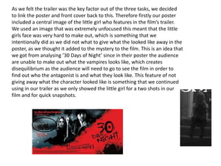
As we felt the trailer was the key factor out of the three tasks, we decided
to link the poster and front cover back to this. Therefore firstly our poster
included a central image of the little girl who features in the film’s trailer.
We used an image that was extremely unfocused this meant that the little
girls face was very hard to make out, which is something that we
intentionally did as we did not what to give what the looked like away in the
poster, as we thought it added to the mystery to the film. This is an idea that
we got from analysing ’30 Days of Night’ since in their poster the audience
are unable to make out what the vampires looks like, which creates
disequilibrium as the audience will need to go to see the film in order to
find out who the antagonist is and what they look like. This feature of not
giving away what the character looked like is something that we continued
using in our trailer as we only showed the little girl for a two shots in our
film and for quick snapshots.
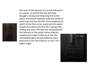
We came to the decision to use the little girl in
our poster, as we felt that she definitely
brought a creepy and disturbing feel to the
poster and would hopefully make the audience
want to go and see the film. Since people go to
watch horror films to be scared and this poster
should show them that this film is going to be
chilling and scary. The way that we positioned
the little girl on the poster means that the
audience are made to look up at her, this
immediately gives the girl authority and a
dominance over the audience as she is at a
higher angle.
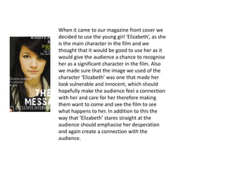
When it came to our magazine front cover we
decided to use the young girl ‘Elizabeth’, as she
is the main character in the film and we
thought that it would be good to use her as it
would give the audience a chance to recognise
her as a significant character in the film. Also
we made sure that the image we used of the
character ‘Elizabeth’ was one that made her
look vulnerable and innocent, which should
hopefully make the audience feel a connection
with her and care for her therefore making
them want to come and see the film to see
what happens to her. In addition to this the
way that ‘Elizabeth’ stares straight at the
audience should emphasise her desperation
and again create a connection with the
audience.
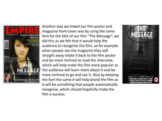
Another way we linked our film poster and
magazine front cover was by using the same
font for the title of our film “The Message”, we
did this as we felt that it would help the
audience to recognise the film, so for example
when people see the magazine they will
straight away relate it back to the film poster
and be more inclined to read the interview,
which will help make the film more popular as
the audience will learn more about it and be
more inclined to go and see it. Also by keeping
the font the same it will help brand the film as
it will be something that people automatically
recognise, which should hopefully make the
film a success.
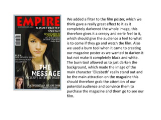
We added a filter to the film poster, which we
think gave a really great effect to it as it
completely darkened the whole image, this
therefore gives it a creepy and eerie feel to it,
which should give the audience a feel to what
is to come if they go and watch the film. Also
we used a burn tool when it came to creating
our magazine poster as we wanted to darken it
but not make it completely black and white.
The burn tool allowed us to just darken the
background, which made the image of the
main character ‘Elizabeth’ really stand out and
be the main attraction on the magazine this
should therefore grab the attention of our
potential audience and convince them to
purchase the magazine and them go to see our
film.
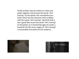
Finally another way we linked our trailer and
poster together was by have the words “He’s
Coming” on the poster, this correlated to our
trailer which has the character finds scribbles
with the words “He’s Coming”. We think that it
was a good idea to put the words “He’s Coming”
on the poster as it should help again to create a
brand for the film and a slogan of “He’s Coming”
is memorable and catchy for the audience.

More Related Content

What's hot

Movie poster research
Movie poster researchMovie poster research
Movie poster research
Cesscablog
 
Editing my magazine front cover
Editing my magazine front coverEditing my magazine front cover
Editing my magazine front cover
gabrielledavies15
 
Evaluation
EvaluationEvaluation
Evaluation
nieevequinn
 
Critical Evaluation Question 2
Critical Evaluation Question 2Critical Evaluation Question 2
Critical Evaluation Question 2
L0ui5P1P
 
Question 2 evaluation
Question 2 evaluationQuestion 2 evaluation
Question 2 evaluation
08jessbrow
 
Evaluation Question 2
Evaluation Question 2Evaluation Question 2
Evaluation Question 2Melisahasan
 
Question 1 poster
Question 1 posterQuestion 1 poster
Question 1 poster410442
 
Poster research
Poster researchPoster research
Poster researchbeccacobb
 
In what ways does your product use
In what ways does your product useIn what ways does your product use
In what ways does your product useA2MediaStudies
 

What's hot (17)

Movie poster research
Movie poster researchMovie poster research
Movie poster research
 
Editing my magazine front cover
Editing my magazine front coverEditing my magazine front cover
Editing my magazine front cover
 
Evaluation question 3
Evaluation question 3Evaluation question 3
Evaluation question 3
 
Evaluation
EvaluationEvaluation
Evaluation
 
Editing the film poster
Editing the film posterEditing the film poster
Editing the film poster
 
First question
First questionFirst question
First question
 
Presentation2
Presentation2Presentation2
Presentation2
 
Critical Evaluation Question 2
Critical Evaluation Question 2Critical Evaluation Question 2
Critical Evaluation Question 2
 
Question 2 evaluation
Question 2 evaluationQuestion 2 evaluation
Question 2 evaluation
 
Evaluation Question 2
Evaluation Question 2Evaluation Question 2
Evaluation Question 2
 
Evaluation question 2
Evaluation question 2Evaluation question 2
Evaluation question 2
 
Question 1 poster
Question 1 posterQuestion 1 poster
Question 1 poster
 
Poster research
Poster researchPoster research
Poster research
 
In what ways does your product use
In what ways does your product useIn what ways does your product use
In what ways does your product use
 
Question 2
Question 2Question 2
Question 2
 
Question 2
Question 2 Question 2
Question 2
 
Question 2
Question 2Question 2
Question 2
 

Viewers also liked

Session28 Lisa Ström
Session28 Lisa StrömSession28 Lisa Ström
Session28 Lisa StrömLisaStrom
 
Centre, konceptpresentation
Centre,   konceptpresentationCentre,   konceptpresentation
Centre, konceptpresentation
Harald Börje
 
Procesų skaitmenizavimo iššūkiai
Procesų skaitmenizavimo iššūkiaiProcesų skaitmenizavimo iššūkiai
Procesų skaitmenizavimo iššūkiaiEdmundas Vasonskis
 
Verslui nereikia IT sistemų @ Verslo Procesų Valdymo Praktika 2014 by Edmunda...
Verslui nereikia IT sistemų @ Verslo Procesų Valdymo Praktika 2014 by Edmunda...Verslui nereikia IT sistemų @ Verslo Procesų Valdymo Praktika 2014 by Edmunda...
Verslui nereikia IT sistemų @ Verslo Procesų Valdymo Praktika 2014 by Edmunda...
Edmundas Vasonskis
 

Viewers also liked (6)

Evaluation questions
Evaluation questionsEvaluation questions
Evaluation questions
 
Session28 Lisa Ström
Session28 Lisa StrömSession28 Lisa Ström
Session28 Lisa Ström
 
Evaluation question 1
Evaluation question 1Evaluation question 1
Evaluation question 1
 
Centre, konceptpresentation
Centre,   konceptpresentationCentre,   konceptpresentation
Centre, konceptpresentation
 
Procesų skaitmenizavimo iššūkiai
Procesų skaitmenizavimo iššūkiaiProcesų skaitmenizavimo iššūkiai
Procesų skaitmenizavimo iššūkiai
 
Verslui nereikia IT sistemų @ Verslo Procesų Valdymo Praktika 2014 by Edmunda...
Verslui nereikia IT sistemų @ Verslo Procesų Valdymo Praktika 2014 by Edmunda...Verslui nereikia IT sistemų @ Verslo Procesų Valdymo Praktika 2014 by Edmunda...
Verslui nereikia IT sistemų @ Verslo Procesų Valdymo Praktika 2014 by Edmunda...
 

Similar to Evaluation question 2

Focus Group Analysis
Focus Group AnalysisFocus Group Analysis
Focus Group Analysis
kirstyharragan2
 
Evaluation 5
Evaluation 5 Evaluation 5
Evaluation 5
Daisie Mae
 
Evaluation question 2 (2)
Evaluation question 2 (2)Evaluation question 2 (2)
Evaluation question 2 (2)
AliceMee
 
Question 1 evaluation ava pp
Question 1 evaluation ava ppQuestion 1 evaluation ava pp
Question 1 evaluation ava pp
imunoztorre
 
Critical evaluation q2ppt
Critical evaluation q2pptCritical evaluation q2ppt
Critical evaluation q2pptJessica Venson
 
Question 2
Question 2Question 2
Question 2
NatalieKidd04
 
A2 MEDIA EVALUATION
A2 MEDIA EVALUATIONA2 MEDIA EVALUATION
A2 MEDIA EVALUATION
Caitlin_C
 

Similar to Evaluation question 2 (20)

Focus Group Analysis
Focus Group AnalysisFocus Group Analysis
Focus Group Analysis
 
Evaluation 5
Evaluation 5 Evaluation 5
Evaluation 5
 
Evaluation question 2 (2)
Evaluation question 2 (2)Evaluation question 2 (2)
Evaluation question 2 (2)
 
Question 1 evaluation ava pp
Question 1 evaluation ava ppQuestion 1 evaluation ava pp
Question 1 evaluation ava pp
 
Critical evaluation q2ppt
Critical evaluation q2pptCritical evaluation q2ppt
Critical evaluation q2ppt
 
Question 2
Question 2Question 2
Question 2
 
A2 media evaluation
A2 media evaluationA2 media evaluation
A2 media evaluation
 
A2 media evaluation
A2 media evaluationA2 media evaluation
A2 media evaluation
 
A2 media evaluation
A2 media evaluationA2 media evaluation
A2 media evaluation
 
A2 MEDIA EVALUATION
A2 MEDIA EVALUATIONA2 MEDIA EVALUATION
A2 MEDIA EVALUATION
 
Evaluation
EvaluationEvaluation
Evaluation
 
Evaluation
EvaluationEvaluation
Evaluation
 
Evaluation
EvaluationEvaluation
Evaluation
 
Evaluation
EvaluationEvaluation
Evaluation
 
Evaluation
EvaluationEvaluation
Evaluation
 
Evaluation
EvaluationEvaluation
Evaluation
 
Evaluation
EvaluationEvaluation
Evaluation
 
Evaluation
EvaluationEvaluation
Evaluation
 
Evaluation
EvaluationEvaluation
Evaluation
 
A2 media evaluation
A2 media evaluationA2 media evaluation
A2 media evaluation
 

Evaluation question 2

  • 1. How effective is the combination of your main product and ancillary task? By Kellly Shanahan and Laura Mandeville
  • 2. The key importance in our project was producing an effective horror film trailer, however we along with this we had to produce an accompanying film poster and magazine front cover. Since creating a horror film poster and magazine front cover are just as significant, as they are just another way of persuading the audience into going to watch the film.
  • 3. As we felt the trailer was the key factor out of the three tasks, we decided to link the poster and front cover back to this. Therefore firstly our poster included a central image of the little girl who features in the film’s trailer. We used an image that was extremely unfocused this meant that the little girls face was very hard to make out, which is something that we intentionally did as we did not what to give what the looked like away in the poster, as we thought it added to the mystery to the film. This is an idea that we got from analysing ’30 Days of Night’ since in their poster the audience are unable to make out what the vampires looks like, which creates disequilibrium as the audience will need to go to see the film in order to find out who the antagonist is and what they look like. This feature of not giving away what the character looked like is something that we continued using in our trailer as we only showed the little girl for a two shots in our film and for quick snapshots.
  • 4. We came to the decision to use the little girl in our poster, as we felt that she definitely brought a creepy and disturbing feel to the poster and would hopefully make the audience want to go and see the film. Since people go to watch horror films to be scared and this poster should show them that this film is going to be chilling and scary. The way that we positioned the little girl on the poster means that the audience are made to look up at her, this immediately gives the girl authority and a dominance over the audience as she is at a higher angle.
  • 5. When it came to our magazine front cover we decided to use the young girl ‘Elizabeth’, as she is the main character in the film and we thought that it would be good to use her as it would give the audience a chance to recognise her as a significant character in the film. Also we made sure that the image we used of the character ‘Elizabeth’ was one that made her look vulnerable and innocent, which should hopefully make the audience feel a connection with her and care for her therefore making them want to come and see the film to see what happens to her. In addition to this the way that ‘Elizabeth’ stares straight at the audience should emphasise her desperation and again create a connection with the audience.
  • 6. Another way we linked our film poster and magazine front cover was by using the same font for the title of our film “The Message”, we did this as we felt that it would help the audience to recognise the film, so for example when people see the magazine they will straight away relate it back to the film poster and be more inclined to read the interview, which will help make the film more popular as the audience will learn more about it and be more inclined to go and see it. Also by keeping the font the same it will help brand the film as it will be something that people automatically recognise, which should hopefully make the film a success.
  • 7. We added a filter to the film poster, which we think gave a really great effect to it as it completely darkened the whole image, this therefore gives it a creepy and eerie feel to it, which should give the audience a feel to what is to come if they go and watch the film. Also we used a burn tool when it came to creating our magazine poster as we wanted to darken it but not make it completely black and white. The burn tool allowed us to just darken the background, which made the image of the main character ‘Elizabeth’ really stand out and be the main attraction on the magazine this should therefore grab the attention of our potential audience and convince them to purchase the magazine and them go to see our film.
  • 8. Finally another way we linked our trailer and poster together was by have the words “He’s Coming” on the poster, this correlated to our trailer which has the character finds scribbles with the words “He’s Coming”. We think that it was a good idea to put the words “He’s Coming” on the poster as it should help again to create a brand for the film and a slogan of “He’s Coming” is memorable and catchy for the audience.