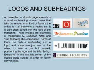
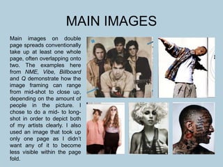
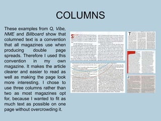
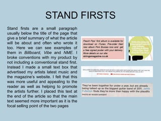
This document discusses conventions used in magazine double page spreads and how the author of this document followed or challenged conventions in their own magazine spread. It provides examples of conventions like using logos and subheadings, large main images, drop caps, pull quotes, titles, page numbers, columned text, and stand firsts from magazines like Q, Billboard, NME, and Vibe. It then explains how the author chose to follow conventions like columned text but challenge others like not using stand firsts in their own magazine spread design.