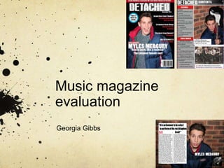
Music magazine
evaluation
Georgia Gibbs
1) In what ways does your media product use, develop or challenge the
forms & conventions of real media products?
In order to complete my media product I had to do some format research into the conventions
of a music magazine, during this research I developed ideas of what I wanted my end product
the look like, following this I believe I have fulfilled the ideas I had and included many typical
features. For example, my media product uses the conventions of real media products as it has
the masthead, which is typically central and at the top of the page above the models head.
Although a number of magazine’s choose to have the masthead sitting behind the model my
genre of rock ‘n’ roll magazines often had a more aggressive masthead in order for it to be
related to the genre, this is shown with my research with a ‘KERRANG’ magazine. Due to my
research I decided to use a white mast head to contrast the darker colours surrounding it and it
also becomes obvious to the buyer that the magazine is rock n roll just from the colour, font and
positioning.
Also, I have only used one image on my front cover, immediately drawn attention to the fact this
is the main image and main cover story, and as from my research this is apparent in all genres
of music magazines and I therefore was going to follow this convention due to it being effective
However it does challenge some conventions as the model in my main image is looking away
from the reader which is making his gaze indirect, although I feel this is effective as the image
looks natural. The main image makes the front cover appealing to both females and males as it
is a male artist who both genders may like, I used a natural medium shot as it shows off his
facial expressions as well as his body language. As well as the image, the main cover line is
related to this image luring the audience into buying the product and this means that the story
needed to be appealing and ‘party like a rock star’ is not specific to a gender or age however it
would target 15 year olds and above. I went against typical magazine conventions however as I
did not add another image, I done this as I felt with an added thumbnail the front cover did not
look professional as it made the front cover look extremely busy. My research allowed me to
see that the majority of rock magazines did not have an added image on the front cover but
other genres such as pop have up to 4 added images. This meant that the main image and
main story were the main bait to the audience which is what I wanted to achieve.
I have also used a number of cover lines, along with the selling features of the price, barcode
and email address being used which have followed the forms and conventions as these would
After my research into rock music magazines, I decided to closely follow all the
forms and conventions as going away from the typical rock n roll content layout
would make the magazine seem amateur as well as not reflecting the genre
the best it could. I used the same masthead as on the front cover I done this
as a reminder of the branding, as well as this I used a clear layout similar to
“KERRANG” which is a rock n roll magazine so I knew this would be a good
place to research. I have followed a simple colour scheme, red, grey, black and
white, these colours all bounce off of each other and can be associated with
the genre of Rock therefore I think the colour choice is reasonable and not to
abrupt and also follows a running scheme from the front cover and double
page spread. Furthermore, I have separated the page up into simple headings
such as ‘features’ and ‘every month’ this makes the magazine feel familiar and
easier to follow for the reader. In a number of contents pages that I researched
including Kerrang and Top of the pops, all have added images to the contents
page to make it more fun and give the reader a larger sense of what to expect,
I have followed this convention by adding an image of the well known rock
group ‘Arctic Monkeys’ as this reflects that the genre is rock and also attracts a
wider audience of male and female.
Similarly to the contents page I have followed a colour scheme of
red, black, white and grey for the double page spread. However this
needed more research into finding the typical conventions. I found
that all magazines are different and do not all follow the same
scheme. Due to this I decide to use a few ideas from my research.
The majority of double page spreads have a quote from the text
repeated on the outside and I have also done this as I feel this is a
good bait in order to hook the reader in as it gives them a taste of
what to expect from the article. Furthermore, I used the idea of
having one main image dominating both pages with a direct gaze
and also another thumbnail image to backup the article and adding a
sense of fun for the reader as there is more to look at.
2)How does your media product represent particular social
groups?
My media product represents social groups as it appeals to the target audience of a young to older generation, probably
aged 15 and above. These people are all people who are interested in and enjoy reading about the rock genre. The
masthead is very ‘rock’ like as it is dark and looks like it is being screamed, this links in with the main image as the
model could be seen as screaming. The cover lines reflect and attract the target audience this is mostly as they are
directly talking about rock and iconic rock bands and are the main selling point. Also, the use of the iconic band ‘Arctic
monkeys’ being used on my contents page means that all types of social groups are presented as they appeal to all
ages and genders. However the fashion of the model appeals to a younger age group it can also be seen as current and
understandable to older ages, but his hairstyle is ‘old school’ which is current but was also around 30 years ago when a
lot of older rock fans were teenagers and this can present the older social groups.
3) What kind of media institution might you distribute your media product and
why?
A media institution is a company that owns a group of mass media such as publishing ands the TV and is responsible for
production and marketing of media texts such as magazines. Examples of media institutions include:
IPC MEDIA: known for distributing NME magazine and guitar and bass magazine.
BAUER GROUP: Known for Q, MOJO and KERRANG
Emap: second largest in UK
FUTURE PLC: Classic Rock, guitarist magazine, computer music, SFX, Rhythm, Future music and music radar.
After my research I have come to the conclusion that the distributor I would like to use would be Future
Publishing Ltd. This is because my choice of magazine is rock and this distributor is prominent in the
publishing and distributing of magazines including rock. Future is a well known media company which
focus on selling a number of magazines here are some: ‘Official Xbox Magazine Rhythm SFX T3 Total
Film Total Guitar Triathlon Plus Windows: The Official Magazine Your Family Tree’ this was taken from
Wikipedia. This means my magazine would fit in with the institution, as the company publishes a
number of rock magazines already, this also means they will know how to distribute and sell the
magazine well. This consists with the likes of metal hammer and total guitar, due to the company being
well known my magazine will immediately be put in good hands and will have a high chance of large
selling rates, they also use convergence such as TV and radio, which means my magazine may be
promoted further than I expect. My magazine would be complimentary to future, due to them not
currently selling a rock-based magazine weekly, this means it will add to their portfolio as well as help
my product in promotion. It also means that Future will be able to compete with their competition such
as Bauer who produce Kerrang! weekly, which is a top selling rock magazine. I also feel like my
magazine will do better with Future than the likes of IPC or Bauer as these companies already have
iconic rock magazines which means there is more likely to be a place for my magazine at Future.
4) In the process of constructing this product, what have you learnt about
the technologies employed?
In the process of making my final product I had to use programs such as InDesign,
Photoshop and in design which I have never used before, so this made the process of
making my media product a challenge.
I was introduced to the idea of ‘blogger’ as this is what I need to use in order to present
my work and research, however I had no clue how to use it as I have never created a
blog. This mean I had to find out how to successfully upload images, questionnaires and
the final products onto my blog. I also needed to learn how to present and arrange the
blog so it was presentable which proved to be a struggle however with practices I have
learnt how to effectively ‘blog’ in a manor that is presentable and attractive. I came across
some problems such as in order to upload something it needs to be in the form of an
image, link or text, this proved difficult on occasion but was easily resolved by changing
the format.
After I had taken my photos I needed to learn how to use Photoshop as this was a software in
question that again I have never used and I found very difficult to use, and there was no way around
it as I needed to adjust and edit my images in order for them to look effective. This meant I needed
to ‘play’ around with the programmes and watch several tutorials in order to start properly with my
piece. With this I learnt how to use the magic wand tool, which helped me to create the background
colour of my masthead as I needed to carefully select around the edges to ensure that the font was
not disturbed. I learnt how to crop my images and manipulate them to get rid of any unwanted
marks, blemishes and spots. I also had to use different layers in order to add to the contents page
as I used a number of boxes, shapes and colours, so this was important before taking it onto
InDesign to make my final product.
Again with InDesign I did not have any current knowledge of how to operate the software and due to
this I needed to again watch tutorials and practice with the software. With this in mind I worked out
how to successfully make my final pieces.
5)Who is the audience for your media product? (the target market)?
The target audience for my media product is both genders of ‘rock’ genre lovers, this could be either male or female
and therefore my magazine targets both genders. The magazine is directed at people who listen, read, and love rock
‘n’ Roll. The general age that the magazine appeals to is 15+ as any age below this would not be attracted to this
magazine due to the nature of the music. I have targeted this audience as it is a wide range of people and I believe
that many people who enjoy rock would purchase this magazine as it shows up to date information about the genre
and possibly their favourite bands.
6)How did you attract/address your audience?
I addressed my audience in a number of ways, one being the use of a simple colour scheme, which
is black, white and red. I decided to use these colours as they are automatically associated with rock
due to the darkness of the genre. It also looks appropriate as the colours coordinate with the model’s
clothing and this makes the colours easy on the eye and not to bold or in the readers face, this
attracts them to read the article as the flow feels better with a suited colour scheme.
Secondly, I have also used direct but simple language with the cover lines, this is to keep them
snappy, One of the cover lines says- ‘rock king or queen? You decide’ by using ‘you’ it makes the
language more personal to the reader and attracts the audience into the feeling that there opinion
matters and they are likely to purchase the magazine in order to air their view.
Another way I addressed by audience was by using a young, male model and also having an image
of Arctic Monkeys. This is because the band is iconic and addresses a rock audience immediately
and with a younger male it appeals to females, males of all ages as they can all associate with him
for example his clothing, age and hair.
I have kept the price low following my research as £1.50 was the most popular choice with 43 people
selecting that this is the reasonable price they are willing to pay, so this was done to attract the
audience to a low cost magazine.
The font I chose for the masthead “DETACHED” seemed appropriate with the fitting in of the rock
genre. It looks damaged as if someone is screaming and this meets the conventions of the genre
and will straight away be a hook to the rock audience in attracting them to look at the magazine. Also
the colours I used, white with a black and grey background contrast with each other making the
masthead stand out more and also mote interesting. I thought the masthead was important in
attracting my audience as it is one of the first things that they see so I therefore needed to make it

Evaluation

  • 1.
  • 2.
    1) In whatways does your media product use, develop or challenge the forms & conventions of real media products? In order to complete my media product I had to do some format research into the conventions of a music magazine, during this research I developed ideas of what I wanted my end product the look like, following this I believe I have fulfilled the ideas I had and included many typical features. For example, my media product uses the conventions of real media products as it has the masthead, which is typically central and at the top of the page above the models head. Although a number of magazine’s choose to have the masthead sitting behind the model my genre of rock ‘n’ roll magazines often had a more aggressive masthead in order for it to be related to the genre, this is shown with my research with a ‘KERRANG’ magazine. Due to my research I decided to use a white mast head to contrast the darker colours surrounding it and it also becomes obvious to the buyer that the magazine is rock n roll just from the colour, font and positioning. Also, I have only used one image on my front cover, immediately drawn attention to the fact this is the main image and main cover story, and as from my research this is apparent in all genres of music magazines and I therefore was going to follow this convention due to it being effective However it does challenge some conventions as the model in my main image is looking away from the reader which is making his gaze indirect, although I feel this is effective as the image looks natural. The main image makes the front cover appealing to both females and males as it is a male artist who both genders may like, I used a natural medium shot as it shows off his facial expressions as well as his body language. As well as the image, the main cover line is related to this image luring the audience into buying the product and this means that the story needed to be appealing and ‘party like a rock star’ is not specific to a gender or age however it would target 15 year olds and above. I went against typical magazine conventions however as I did not add another image, I done this as I felt with an added thumbnail the front cover did not look professional as it made the front cover look extremely busy. My research allowed me to see that the majority of rock magazines did not have an added image on the front cover but other genres such as pop have up to 4 added images. This meant that the main image and main story were the main bait to the audience which is what I wanted to achieve. I have also used a number of cover lines, along with the selling features of the price, barcode and email address being used which have followed the forms and conventions as these would
  • 3.
    After my researchinto rock music magazines, I decided to closely follow all the forms and conventions as going away from the typical rock n roll content layout would make the magazine seem amateur as well as not reflecting the genre the best it could. I used the same masthead as on the front cover I done this as a reminder of the branding, as well as this I used a clear layout similar to “KERRANG” which is a rock n roll magazine so I knew this would be a good place to research. I have followed a simple colour scheme, red, grey, black and white, these colours all bounce off of each other and can be associated with the genre of Rock therefore I think the colour choice is reasonable and not to abrupt and also follows a running scheme from the front cover and double page spread. Furthermore, I have separated the page up into simple headings such as ‘features’ and ‘every month’ this makes the magazine feel familiar and easier to follow for the reader. In a number of contents pages that I researched including Kerrang and Top of the pops, all have added images to the contents page to make it more fun and give the reader a larger sense of what to expect, I have followed this convention by adding an image of the well known rock group ‘Arctic Monkeys’ as this reflects that the genre is rock and also attracts a wider audience of male and female. Similarly to the contents page I have followed a colour scheme of red, black, white and grey for the double page spread. However this needed more research into finding the typical conventions. I found that all magazines are different and do not all follow the same scheme. Due to this I decide to use a few ideas from my research. The majority of double page spreads have a quote from the text repeated on the outside and I have also done this as I feel this is a good bait in order to hook the reader in as it gives them a taste of what to expect from the article. Furthermore, I used the idea of having one main image dominating both pages with a direct gaze and also another thumbnail image to backup the article and adding a sense of fun for the reader as there is more to look at.
  • 4.
    2)How does yourmedia product represent particular social groups? My media product represents social groups as it appeals to the target audience of a young to older generation, probably aged 15 and above. These people are all people who are interested in and enjoy reading about the rock genre. The masthead is very ‘rock’ like as it is dark and looks like it is being screamed, this links in with the main image as the model could be seen as screaming. The cover lines reflect and attract the target audience this is mostly as they are directly talking about rock and iconic rock bands and are the main selling point. Also, the use of the iconic band ‘Arctic monkeys’ being used on my contents page means that all types of social groups are presented as they appeal to all ages and genders. However the fashion of the model appeals to a younger age group it can also be seen as current and understandable to older ages, but his hairstyle is ‘old school’ which is current but was also around 30 years ago when a lot of older rock fans were teenagers and this can present the older social groups.
  • 5.
    3) What kindof media institution might you distribute your media product and why? A media institution is a company that owns a group of mass media such as publishing ands the TV and is responsible for production and marketing of media texts such as magazines. Examples of media institutions include: IPC MEDIA: known for distributing NME magazine and guitar and bass magazine. BAUER GROUP: Known for Q, MOJO and KERRANG Emap: second largest in UK FUTURE PLC: Classic Rock, guitarist magazine, computer music, SFX, Rhythm, Future music and music radar. After my research I have come to the conclusion that the distributor I would like to use would be Future Publishing Ltd. This is because my choice of magazine is rock and this distributor is prominent in the publishing and distributing of magazines including rock. Future is a well known media company which focus on selling a number of magazines here are some: ‘Official Xbox Magazine Rhythm SFX T3 Total Film Total Guitar Triathlon Plus Windows: The Official Magazine Your Family Tree’ this was taken from Wikipedia. This means my magazine would fit in with the institution, as the company publishes a number of rock magazines already, this also means they will know how to distribute and sell the magazine well. This consists with the likes of metal hammer and total guitar, due to the company being well known my magazine will immediately be put in good hands and will have a high chance of large selling rates, they also use convergence such as TV and radio, which means my magazine may be promoted further than I expect. My magazine would be complimentary to future, due to them not currently selling a rock-based magazine weekly, this means it will add to their portfolio as well as help my product in promotion. It also means that Future will be able to compete with their competition such as Bauer who produce Kerrang! weekly, which is a top selling rock magazine. I also feel like my magazine will do better with Future than the likes of IPC or Bauer as these companies already have iconic rock magazines which means there is more likely to be a place for my magazine at Future.
  • 6.
    4) In theprocess of constructing this product, what have you learnt about the technologies employed? In the process of making my final product I had to use programs such as InDesign, Photoshop and in design which I have never used before, so this made the process of making my media product a challenge. I was introduced to the idea of ‘blogger’ as this is what I need to use in order to present my work and research, however I had no clue how to use it as I have never created a blog. This mean I had to find out how to successfully upload images, questionnaires and the final products onto my blog. I also needed to learn how to present and arrange the blog so it was presentable which proved to be a struggle however with practices I have learnt how to effectively ‘blog’ in a manor that is presentable and attractive. I came across some problems such as in order to upload something it needs to be in the form of an image, link or text, this proved difficult on occasion but was easily resolved by changing the format. After I had taken my photos I needed to learn how to use Photoshop as this was a software in question that again I have never used and I found very difficult to use, and there was no way around it as I needed to adjust and edit my images in order for them to look effective. This meant I needed to ‘play’ around with the programmes and watch several tutorials in order to start properly with my piece. With this I learnt how to use the magic wand tool, which helped me to create the background colour of my masthead as I needed to carefully select around the edges to ensure that the font was not disturbed. I learnt how to crop my images and manipulate them to get rid of any unwanted marks, blemishes and spots. I also had to use different layers in order to add to the contents page as I used a number of boxes, shapes and colours, so this was important before taking it onto InDesign to make my final product. Again with InDesign I did not have any current knowledge of how to operate the software and due to this I needed to again watch tutorials and practice with the software. With this in mind I worked out how to successfully make my final pieces.
  • 7.
    5)Who is theaudience for your media product? (the target market)? The target audience for my media product is both genders of ‘rock’ genre lovers, this could be either male or female and therefore my magazine targets both genders. The magazine is directed at people who listen, read, and love rock ‘n’ Roll. The general age that the magazine appeals to is 15+ as any age below this would not be attracted to this magazine due to the nature of the music. I have targeted this audience as it is a wide range of people and I believe that many people who enjoy rock would purchase this magazine as it shows up to date information about the genre and possibly their favourite bands. 6)How did you attract/address your audience? I addressed my audience in a number of ways, one being the use of a simple colour scheme, which is black, white and red. I decided to use these colours as they are automatically associated with rock due to the darkness of the genre. It also looks appropriate as the colours coordinate with the model’s clothing and this makes the colours easy on the eye and not to bold or in the readers face, this attracts them to read the article as the flow feels better with a suited colour scheme. Secondly, I have also used direct but simple language with the cover lines, this is to keep them snappy, One of the cover lines says- ‘rock king or queen? You decide’ by using ‘you’ it makes the language more personal to the reader and attracts the audience into the feeling that there opinion matters and they are likely to purchase the magazine in order to air their view. Another way I addressed by audience was by using a young, male model and also having an image of Arctic Monkeys. This is because the band is iconic and addresses a rock audience immediately and with a younger male it appeals to females, males of all ages as they can all associate with him for example his clothing, age and hair. I have kept the price low following my research as £1.50 was the most popular choice with 43 people selecting that this is the reasonable price they are willing to pay, so this was done to attract the audience to a low cost magazine. The font I chose for the masthead “DETACHED” seemed appropriate with the fitting in of the rock genre. It looks damaged as if someone is screaming and this meets the conventions of the genre and will straight away be a hook to the rock audience in attracting them to look at the magazine. Also the colours I used, white with a black and grey background contrast with each other making the masthead stand out more and also mote interesting. I thought the masthead was important in attracting my audience as it is one of the first things that they see so I therefore needed to make it