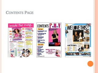
1) IN WHAT WAYS DOES YOUR MEDIA PRODUCT
USE, DEVELOP OR CHALLENGE FORMS AND
CONVENTIONS OF REAL MEDIA PRODUCTS?
FRONT COVER
MASTHEAD
 The first convention to evaluate is the masthead, the
similarity with other magazines of the same genre is
evident, the predominant colour of pop music
magazines is pink therefore my masthead follows this
convention.
SKYLINE
 The use of a skyline can be seen in my magazine as
well as the other two pop magazines, this is another
similarity; the skylines advertise the magazine with
offers or proving it’s a limited edition drawing in
readers with the promise of something different and
exclusive to that particular product.
FEATURE STORIES
 The small feature stories are placed at the side of my
magazine, exhibiting a bright colour scheme, similar to
that of the Justin magazine. They are also in bright
boxes with opposite and vibrant coloured text on top
which is identical to my front cover, showing I’ve
taken the conventions of a pop music magazine
seriously.
COLOUR
 The colour scheme is identical with the Justin magazine,
blue, pink, yellow, black and white, this is similar to the
Top of the Pops magazine but without the blue.
 My magazine also flaunts a purple colour within the scheme
which is different to the other two magazines. The main
feature stories in all three products have the same colour
scheme of pink and white, they also push the reader to
believe it’s an exclusive or private feature by adding a
quote or an inside into what the story is about.
 The white, plain background of my magazine is the same as
the other two magazines; this is to exaggerate the other
colours on the cover, also making the main feature story
artist/s stand out from the background.
PRICE AND BARCODE
 The price and barcode of my magazine is in the bottom
left corner of it, this is the same for the Justin, and the
Top of the Pops barcode and price are to the bottom
right of the magazine. The issue and month of dispatch
is also placed there with the price and barcode.
PLUG AND FOOTER
 My magazine has a plug; this is the same with the
Justin magazine it stands out from the rest of the
magazine to pull in readers. Another similarity to the
Justin magazine is the footer; it evens out the
magazine, adding extra information to the front cover.
CONTENTS PAGE
PAGE NUMBERS
 My product follows the convention of page numbers
with a bit of information about the feature story itself.
The pages are separated into sections for the reader
to find what they’re looking for easier, also the page
numbers on the images change colour depending on
the colour of the image itself.
INFORMATION
 The front cover is also visible on the contents page as
well as the page number corresponding to the main
feature story. My product offers more information
about subscribing to the magazine unlike the other two
magazine contents pages.
TITLE AND SECONDARY IMAGES
 There’s a clear title on each contents page, mine is
different to the other two as it’s more formal, whereas
the other two end with an ellipsis’. Secondary images
are used in all three products this allows the contents
page to look busier and more colourful.
WEBSITE AND BORDER
 On the WE <3 POP magazine contents page there’s a
website address next to the page number, this is
identical to my product. One thing that’s different is
the border around the WE <3 POP contents page this
helps the page numbers and the images to stand out
and adds more colour to the contents page itself.

Evaluation Question 1

  • 1.
    1) IN WHATWAYS DOES YOUR MEDIA PRODUCT USE, DEVELOP OR CHALLENGE FORMS AND CONVENTIONS OF REAL MEDIA PRODUCTS?
  • 2.
  • 3.
    MASTHEAD  The firstconvention to evaluate is the masthead, the similarity with other magazines of the same genre is evident, the predominant colour of pop music magazines is pink therefore my masthead follows this convention.
  • 4.
    SKYLINE  The useof a skyline can be seen in my magazine as well as the other two pop magazines, this is another similarity; the skylines advertise the magazine with offers or proving it’s a limited edition drawing in readers with the promise of something different and exclusive to that particular product.
  • 5.
    FEATURE STORIES  Thesmall feature stories are placed at the side of my magazine, exhibiting a bright colour scheme, similar to that of the Justin magazine. They are also in bright boxes with opposite and vibrant coloured text on top which is identical to my front cover, showing I’ve taken the conventions of a pop music magazine seriously.
  • 6.
    COLOUR  The colourscheme is identical with the Justin magazine, blue, pink, yellow, black and white, this is similar to the Top of the Pops magazine but without the blue.  My magazine also flaunts a purple colour within the scheme which is different to the other two magazines. The main feature stories in all three products have the same colour scheme of pink and white, they also push the reader to believe it’s an exclusive or private feature by adding a quote or an inside into what the story is about.  The white, plain background of my magazine is the same as the other two magazines; this is to exaggerate the other colours on the cover, also making the main feature story artist/s stand out from the background.
  • 7.
    PRICE AND BARCODE The price and barcode of my magazine is in the bottom left corner of it, this is the same for the Justin, and the Top of the Pops barcode and price are to the bottom right of the magazine. The issue and month of dispatch is also placed there with the price and barcode.
  • 8.
    PLUG AND FOOTER My magazine has a plug; this is the same with the Justin magazine it stands out from the rest of the magazine to pull in readers. Another similarity to the Justin magazine is the footer; it evens out the magazine, adding extra information to the front cover.
  • 9.
  • 10.
    PAGE NUMBERS  Myproduct follows the convention of page numbers with a bit of information about the feature story itself. The pages are separated into sections for the reader to find what they’re looking for easier, also the page numbers on the images change colour depending on the colour of the image itself.
  • 11.
    INFORMATION  The frontcover is also visible on the contents page as well as the page number corresponding to the main feature story. My product offers more information about subscribing to the magazine unlike the other two magazine contents pages.
  • 12.
    TITLE AND SECONDARYIMAGES  There’s a clear title on each contents page, mine is different to the other two as it’s more formal, whereas the other two end with an ellipsis’. Secondary images are used in all three products this allows the contents page to look busier and more colourful.
  • 13.
    WEBSITE AND BORDER On the WE <3 POP magazine contents page there’s a website address next to the page number, this is identical to my product. One thing that’s different is the border around the WE <3 POP contents page this helps the page numbers and the images to stand out and adds more colour to the contents page itself.