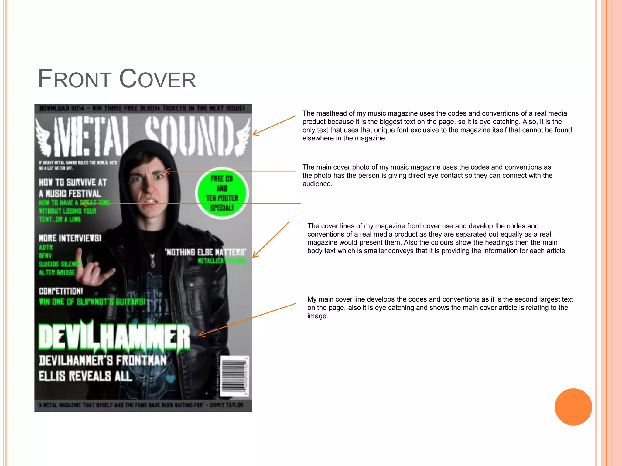
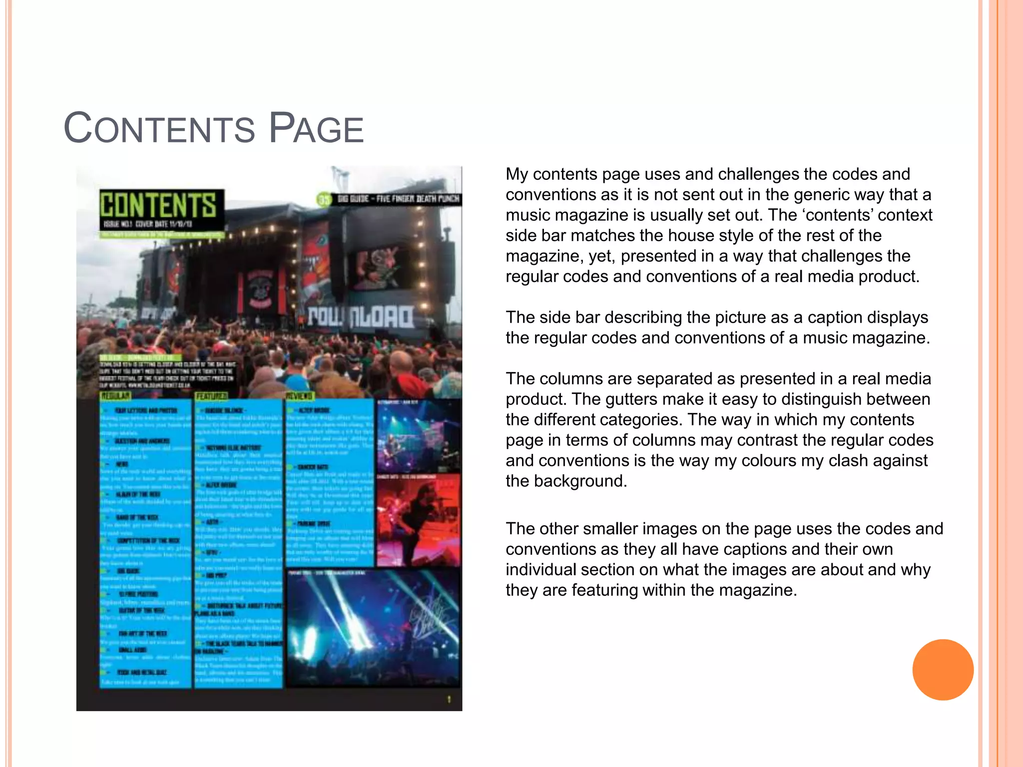
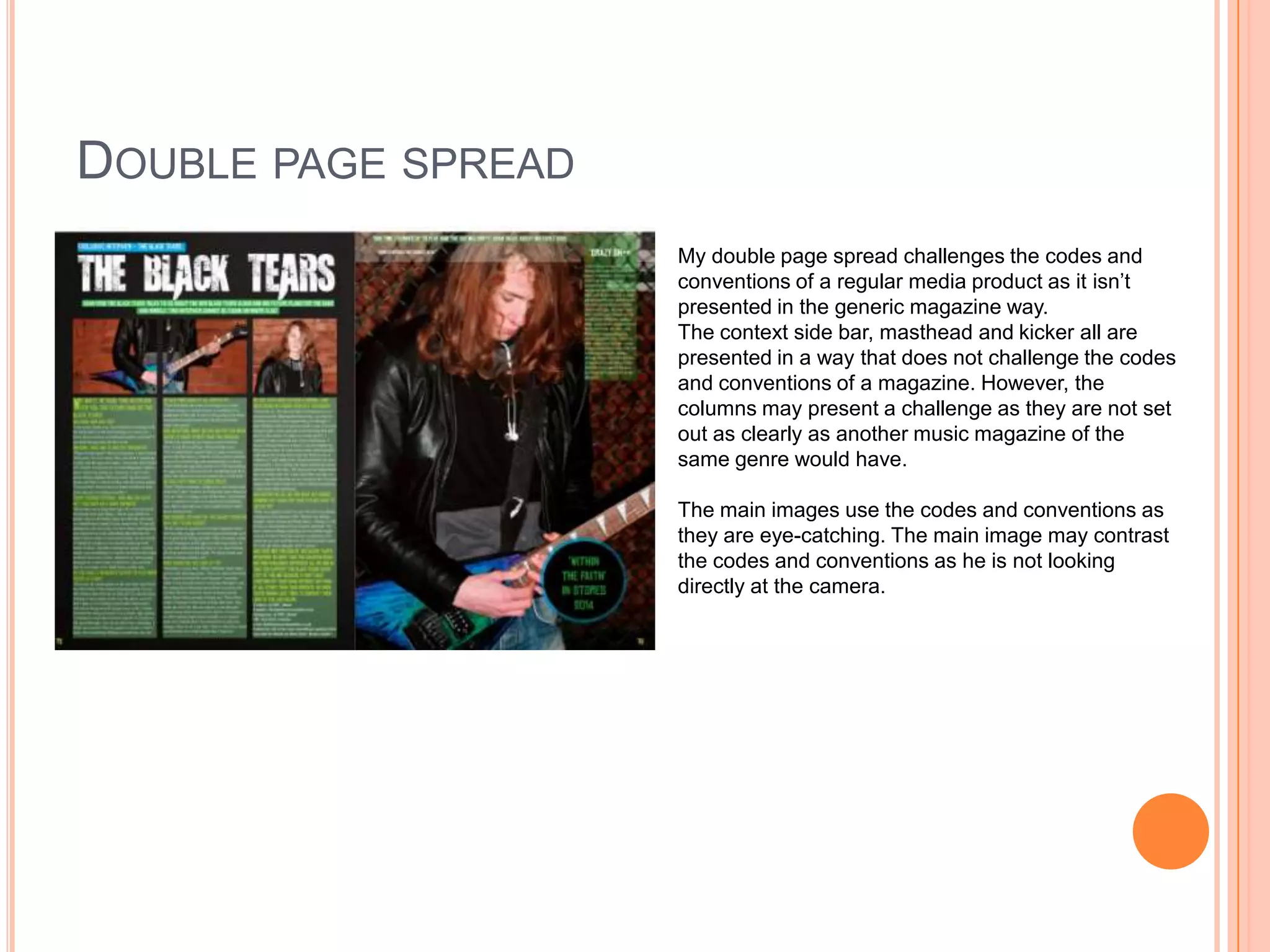
My media product both uses and challenges conventions of real music magazines.
It uses conventions such as having an eye-catching masthead in a unique font, photos that make direct eye contact, and clearly separated cover lines and columns on the contents page.
However, it also challenges conventions by not presenting content in a generic magazine layout. The contents page and double-page spread challenge conventions through their non-standard column arrangements and use of color clashes on the backgrounds. While some images and text boxes still follow conventions, the overall designs present information in unconventional ways.