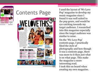
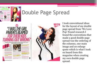
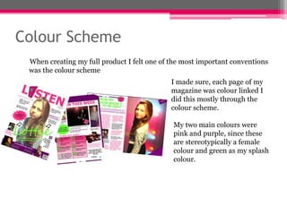
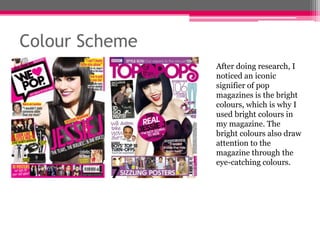
How my media product uses,
develops and challenges forms and
conventions of real media
products...
By Sarah Collumb
Front Cover
To create a sense of realism in my magazine, I researched into
other Pop magazines and included iconic codes and conventions,
for example, on the front cover; barcode, one main image
(medium camera shot), date, sell lines, headlines/articles,
masthead and colour scheme. I found it was important to include
all of these features in order to gain realism of my product.
Front Cover

When moving on from my
preliminary product to my full
product, I developed my
magazine by doing research into
what was already on the market.
I used ‘Top Of The Pops’
magazine to develop the layout
of my product since I found it
was very conventional and well
suited to my target audience
and to how I wanted my
magazine to look.
Contents Page
When I researched into the contents page, the conventions I found
important were; the layout, photography, articles, page numbers
with references to what is on each page and sell lines. After looking
into my research a lot more, I knew exactly what I should and
shouldn't include in my full product in comparison to my
preliminary product.
Contents Page

I used the layout of ‘We Love
Pop’ magazine to develop my
music magazine since I
found it was well suited to
the pop genre, and would be
eye catching towards my
target audience. I researched
into this magazine especially
since the target audience was
similar to mine.
On the ‘We Love Pop’
contents page, I practically
liked the style of
photography and how though
it was a contents page, there
was more to it than just what
is on what page. This make
the magazine a more
interesting read.
I took this on board when
creating my own magazine.
Double Page Spread
The next thing I researched was my double page spread, I found the
most important convention of double page was the layout. I order to
create a sense of realism and to make my magazine presentable the
layout had to be done correctly. I did this by ordering my text in
columns, a technique which I found was done my most magazines. I
also found, an enlarged quote as a headline on my double page
spread had a big impact and drew in the readers attention.
Double Page Spread
I took conventional ideas
for the layout of my double
page spread from ‘We Love
Pop’ Found research I
found the conventions that
made a good double page
spread was the ordering of
the columns, one main
image and an enlarge
quote which is what I took
on board from this
magazine when creating
my own double page
spread.
Colour Scheme
When creating my full product I felt one of the most important conventions
was the colour scheme
I made sure, each page of my
magazine was colour linked I
did this mostly through the
colour scheme.
My two main colours were
pink and purple, since these
are stereotypically a female
colour and green as my splash
colour.
Colour Scheme
After doing research, I
noticed an iconic
signifier of pop
magazines is the bright
colours, which is why I
used bright colours in
my magazine. The
bright colours also draw
attention to the
magazine through the
eye-catching colours.

111111

  • 1.
    How my mediaproduct uses, develops and challenges forms and conventions of real media products... By Sarah Collumb
  • 2.
    Front Cover To createa sense of realism in my magazine, I researched into other Pop magazines and included iconic codes and conventions, for example, on the front cover; barcode, one main image (medium camera shot), date, sell lines, headlines/articles, masthead and colour scheme. I found it was important to include all of these features in order to gain realism of my product.
  • 3.
    Front Cover When movingon from my preliminary product to my full product, I developed my magazine by doing research into what was already on the market. I used ‘Top Of The Pops’ magazine to develop the layout of my product since I found it was very conventional and well suited to my target audience and to how I wanted my magazine to look.
  • 4.
    Contents Page When Iresearched into the contents page, the conventions I found important were; the layout, photography, articles, page numbers with references to what is on each page and sell lines. After looking into my research a lot more, I knew exactly what I should and shouldn't include in my full product in comparison to my preliminary product.
  • 5.
    Contents Page I usedthe layout of ‘We Love Pop’ magazine to develop my music magazine since I found it was well suited to the pop genre, and would be eye catching towards my target audience. I researched into this magazine especially since the target audience was similar to mine. On the ‘We Love Pop’ contents page, I practically liked the style of photography and how though it was a contents page, there was more to it than just what is on what page. This make the magazine a more interesting read. I took this on board when creating my own magazine.
  • 6.
    Double Page Spread Thenext thing I researched was my double page spread, I found the most important convention of double page was the layout. I order to create a sense of realism and to make my magazine presentable the layout had to be done correctly. I did this by ordering my text in columns, a technique which I found was done my most magazines. I also found, an enlarged quote as a headline on my double page spread had a big impact and drew in the readers attention.
  • 7.
    Double Page Spread Itook conventional ideas for the layout of my double page spread from ‘We Love Pop’ Found research I found the conventions that made a good double page spread was the ordering of the columns, one main image and an enlarge quote which is what I took on board from this magazine when creating my own double page spread.
  • 8.
    Colour Scheme When creatingmy full product I felt one of the most important conventions was the colour scheme I made sure, each page of my magazine was colour linked I did this mostly through the colour scheme. My two main colours were pink and purple, since these are stereotypically a female colour and green as my splash colour.
  • 9.
    Colour Scheme After doingresearch, I noticed an iconic signifier of pop magazines is the bright colours, which is why I used bright colours in my magazine. The bright colours also draw attention to the magazine through the eye-catching colours.