How does your media product
represent particular social groups?
My music magazine represents females which would attract the target female audience but also
uses the female gaze, using women for the gratification of men, to draw the attention of the
target male audience.
The models used in my magazine are all young females. This is because my target audience are
young adults aged 15-30 so by using young models they are more likely to be able to relate to
the people in the magazine and find it more relevant to their lives. Also by using young female
models the male target audience would be attracted in because of the female gaze.
I chose for my magazine to mainly
represent females and have very few
articles dominated by any other
because I believe that by keeping it
simple and just using females will have
the same effect and appeal to the same
type of audiences. Any rock fan can
read this magazine and using females
will interest both genders. Just because
I have not used a range of different
types of people, I don’t believe that it
limits the target audience.
What kind of media institution
might distribute your media product
and why?
One example of a media institution that I think might distribute my music magazine
would be ‘Bauermedia’.
This company already distributes magazines such as ‘Q’ and ‘Kerrang’ so they
would already have the interest of the audience I am targeting.
Some of the conventions I have in my magazine were imitated and developed
from ‘Q’ magazine so because of this I believe that the company would be
interested in distributing my magazine also.
This may also lead onto my magazine using synergy because ‘Kerrang’ also has a radio
station so if my magazine was a success with this company I may be able to do the same
and gain a larger audience.
Who would be the audience for
your media product?
My target audience is teenagers/ young adults that are fans of rock. The models
that feature in the magazine are also young adults so this would be more relevant
to my target audience and allow them to be able to relate to each other.
The content itself is quite casual and reads like having a conversation. This would
help people relate to the artist and also give a feel of speaking to them yourselves.
Everything is aimed towards the target audience age for example the people featured are mostly
supported by the same target audience as my magazine, the festival line up would be of interest
to all the rock fans, the content of the interviews and other musical relations would all attract
my target audience of rock fans ages 15-30.
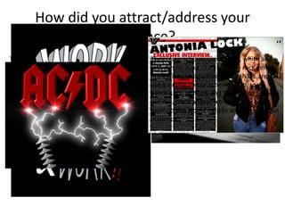
How did you attract/address your
audience?
The double page spread article would interest
my target audience because the interview is
quite informal so it would be read like they are
talking to the artist themselves.
The article content is about the artist’s
work and personal life which the target
audience, as rock fans, would be
interested in.
Knowing why an artist does certain things
such as meanings behind songs or the name
of songs can help you relate to the artist even
more so when you know more about their
personal life straight from the artist like in my
double page spread interview.
The colour scheme used, black, white and
red, can be associated with the rock genre.
Professional magazines such as NME and Q
use a similar colour scheme. Also, rock
bands such as ACDC and The Rolling Stones
use red, black and/or white in their band
logos so this would help to attract the target
audience.
What have you learnt about
technologies from the process of
constructing this product?
I have learnt more about the program Photoshop and
how its tools can be used effectively to make a
professional looking magazine. Effects such as fades
and strokes can be used to make things stand out
whereas before I would just make things bigger or
bold. I have also learned how to cut bits of an image
out using the magic wand or lasso tools so it does not
look obvious that something is missing whereas before
I would just cut around it the best I could. I have used
these new skills when making my music magazine and I
they have been used to a high standard, making my
magazine look professional.
Looking back at your preliminary
task, what do you feel you have learnt
in the progression from it to the full
product?
From the preliminary task to my final product I
have learned a lot about how important a layout
and a colour scheme are and how the images
used can draw in different audiences. I have
developed my skills a lot since my preliminary
task which was to create a school magazine.
I understand how to use a variety of tools on
Paintshop effectively such as the magic wand
tool, gradient tool and lasso tool as well has how
to arrange my layers effectively.
Another important convention that I have
developed since my preliminary task is branding.
In my school magazine there was little or no
branding, the only links from my contents page
to my from cover was the use of the colour blue.
In my music magazine there is a clear use of
branding throughout. I have a set colour scheme
and the masthead is on every page. This helps to
link each page of the magazine together and
would help the target audience recognise my
magazine.

Evaluation question 2

  • 1.
    How does yourmedia product represent particular social groups? My music magazine represents females which would attract the target female audience but also uses the female gaze, using women for the gratification of men, to draw the attention of the target male audience. The models used in my magazine are all young females. This is because my target audience are young adults aged 15-30 so by using young models they are more likely to be able to relate to the people in the magazine and find it more relevant to their lives. Also by using young female models the male target audience would be attracted in because of the female gaze. I chose for my magazine to mainly represent females and have very few articles dominated by any other because I believe that by keeping it simple and just using females will have the same effect and appeal to the same type of audiences. Any rock fan can read this magazine and using females will interest both genders. Just because I have not used a range of different types of people, I don’t believe that it limits the target audience.
  • 2.
    What kind ofmedia institution might distribute your media product and why? One example of a media institution that I think might distribute my music magazine would be ‘Bauermedia’. This company already distributes magazines such as ‘Q’ and ‘Kerrang’ so they would already have the interest of the audience I am targeting. Some of the conventions I have in my magazine were imitated and developed from ‘Q’ magazine so because of this I believe that the company would be interested in distributing my magazine also. This may also lead onto my magazine using synergy because ‘Kerrang’ also has a radio station so if my magazine was a success with this company I may be able to do the same and gain a larger audience.
  • 3.
    Who would bethe audience for your media product? My target audience is teenagers/ young adults that are fans of rock. The models that feature in the magazine are also young adults so this would be more relevant to my target audience and allow them to be able to relate to each other. The content itself is quite casual and reads like having a conversation. This would help people relate to the artist and also give a feel of speaking to them yourselves. Everything is aimed towards the target audience age for example the people featured are mostly supported by the same target audience as my magazine, the festival line up would be of interest to all the rock fans, the content of the interviews and other musical relations would all attract my target audience of rock fans ages 15-30.
  • 4.
    How did youattract/address your audience? The double page spread article would interest my target audience because the interview is quite informal so it would be read like they are talking to the artist themselves. The article content is about the artist’s work and personal life which the target audience, as rock fans, would be interested in. Knowing why an artist does certain things such as meanings behind songs or the name of songs can help you relate to the artist even more so when you know more about their personal life straight from the artist like in my double page spread interview. The colour scheme used, black, white and red, can be associated with the rock genre. Professional magazines such as NME and Q use a similar colour scheme. Also, rock bands such as ACDC and The Rolling Stones use red, black and/or white in their band logos so this would help to attract the target audience.
  • 5.
    What have youlearnt about technologies from the process of constructing this product? I have learnt more about the program Photoshop and how its tools can be used effectively to make a professional looking magazine. Effects such as fades and strokes can be used to make things stand out whereas before I would just make things bigger or bold. I have also learned how to cut bits of an image out using the magic wand or lasso tools so it does not look obvious that something is missing whereas before I would just cut around it the best I could. I have used these new skills when making my music magazine and I they have been used to a high standard, making my magazine look professional.
  • 6.
    Looking back atyour preliminary task, what do you feel you have learnt in the progression from it to the full product? From the preliminary task to my final product I have learned a lot about how important a layout and a colour scheme are and how the images used can draw in different audiences. I have developed my skills a lot since my preliminary task which was to create a school magazine. I understand how to use a variety of tools on Paintshop effectively such as the magic wand tool, gradient tool and lasso tool as well has how to arrange my layers effectively. Another important convention that I have developed since my preliminary task is branding. In my school magazine there was little or no branding, the only links from my contents page to my from cover was the use of the colour blue. In my music magazine there is a clear use of branding throughout. I have a set colour scheme and the masthead is on every page. This helps to link each page of the magazine together and would help the target audience recognise my magazine.