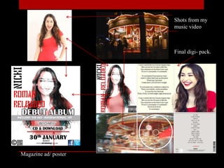
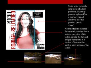
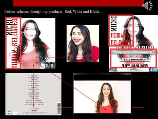
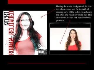
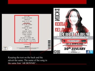
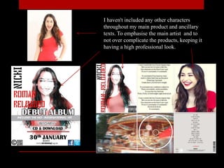
2. How effective is the combination of your
main product and ancillary texts?
Shots from my
music video
Magazine ad/ poster
Final digi- pack.
Album front cover
Shots from the video
The continuous influence of the main character
through both products. Showing her
characteristics, and enhancing the fact that she's a
strong, independent women. Another think is the use of
the colour red, using the same red dress throughout. As
well as matching it with her red lip stick and the red
title on the front cover.
Main artist being the
sole focus of all my
products. Not only
promoting herself as
a new developed
artist but also her
product (music
video)
Added effect to enhance
the creativity and to link it
to the expression of the
video, setting the fun and
unique element to it. a
similar effect was also
used in short scenes of the
video.
Colour scheme through my products: Red, White and Black.
Having the white background for both
the album cover and the individual
singing parts of the video. To enhance
the artist and make her stand out. This
also shows a clear link between both
products.
‘I can't control the way I'm moving my
hips
Bet you never ever seen it like this
I'm a monster on the floor I can't quit
No no it's automatic, it's automatic’
I added the Parental Advisory Explicit
Content logo on the album cover to let the
audience know that the video my contain
images or lyrical content that my not be
suitable for all ages.
The lyrical content of the
video, (the lyrics above) may
suggest that its not suitable for a
younger audience.
I used the same Font and colours for the
artist name and album name for the
audience to be able to find the album
easier, if they have only seen the advert/
poster in a magazine or billboard .
Building a relationship between both.
Keeping the text on the back and the
advert the same. The name of the song in
the same font ‘AR BONNIE’ .
I haven't included any other characters
throughout my main product and ancillary
texts. To emphasise the main artist and to
not over complicate the products, keeping it
having a high professional look.

Evaluation q2

  • 1.
    2. How effectiveis the combination of your main product and ancillary texts?
  • 2.
    Shots from my musicvideo Magazine ad/ poster Final digi- pack.
  • 3.
    Album front cover Shotsfrom the video The continuous influence of the main character through both products. Showing her characteristics, and enhancing the fact that she's a strong, independent women. Another think is the use of the colour red, using the same red dress throughout. As well as matching it with her red lip stick and the red title on the front cover.
  • 4.
    Main artist beingthe sole focus of all my products. Not only promoting herself as a new developed artist but also her product (music video) Added effect to enhance the creativity and to link it to the expression of the video, setting the fun and unique element to it. a similar effect was also used in short scenes of the video.
  • 5.
    Colour scheme throughmy products: Red, White and Black.
  • 6.
    Having the whitebackground for both the album cover and the individual singing parts of the video. To enhance the artist and make her stand out. This also shows a clear link between both products.
  • 7.
    ‘I can't controlthe way I'm moving my hips Bet you never ever seen it like this I'm a monster on the floor I can't quit No no it's automatic, it's automatic’ I added the Parental Advisory Explicit Content logo on the album cover to let the audience know that the video my contain images or lyrical content that my not be suitable for all ages. The lyrical content of the video, (the lyrics above) may suggest that its not suitable for a younger audience.
  • 8.
    I used thesame Font and colours for the artist name and album name for the audience to be able to find the album easier, if they have only seen the advert/ poster in a magazine or billboard . Building a relationship between both.
  • 10.
    Keeping the texton the back and the advert the same. The name of the song in the same font ‘AR BONNIE’ .
  • 11.
    I haven't includedany other characters throughout my main product and ancillary texts. To emphasise the main artist and to not over complicate the products, keeping it having a high professional look.

Editor's Notes

  • #2 The combination of my main product and ancillary texts correspond with each other, they have similarities throughout.
  • #10 Were my product would be available.