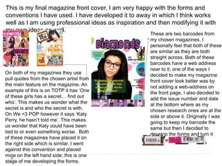
Tiffany Malcolm evaluates her media foundation portfolio, specifically questions 1, 6, and 7. For question 1, she discusses how her magazine product follows conventions of real magazines by looking at layouts, structures, and designs from Top of the Pops and We <3 POP magazines. For question 6, she discusses learning photo editing software like Photoshop and InDesign, and technologies like blogs and online document sharing. For question 7, she reflects on improvements from her preliminary magazine cover, noting how the final product is more professionally designed and considers important magazine elements like layout, images, and conventions.
2024.06.01 Introducing a competency framework for languag learning materials ...Sandy Millin
http://sandymillin.wordpress.com/iateflwebinar2024
Published classroom materials form the basis of syllabuses, drive teacher professional development, and have a potentially huge influence on learners, teachers and education systems. All teachers also create their own materials, whether a few sentences on a blackboard, a highly-structured fully-realised online course, or anything in between. Despite this, the knowledge and skills needed to create effective language learning materials are rarely part of teacher training, and are mostly learnt by trial and error.
Knowledge and skills frameworks, generally called competency frameworks, for ELT teachers, trainers and managers have existed for a few years now. However, until I created one for my MA dissertation, there wasn’t one drawing together what we need to know and do to be able to effectively produce language learning materials.
This webinar will introduce you to my framework, highlighting the key competencies I identified from my research. It will also show how anybody involved in language teaching (any language, not just English!), teacher training, managing schools or developing language learning materials can benefit from using the framework.
How to Create Map Views in the Odoo 17 ERPCeline George
The map views are useful for providing a geographical representation of data. They allow users to visualize and analyze the data in a more intuitive manner.
Unit 8 - Information and Communication Technology (Paper I).pdfThiyagu K
This slides describes the basic concepts of ICT, basics of Email, Emerging Technology and Digital Initiatives in Education. This presentations aligns with the UGC Paper I syllabus.
Operation “Blue Star” is the only event in the history of Independent India where the state went into war with its own people. Even after about 40 years it is not clear if it was culmination of states anger over people of the region, a political game of power or start of dictatorial chapter in the democratic setup.
The people of Punjab felt alienated from main stream due to denial of their just demands during a long democratic struggle since independence. As it happen all over the word, it led to militant struggle with great loss of lives of military, police and civilian personnel. Killing of Indira Gandhi and massacre of innocent Sikhs in Delhi and other India cities was also associated with this movement.
The Art Pastor's Guide to Sabbath | Steve ThomasonSteve Thomason
What is the purpose of the Sabbath Law in the Torah. It is interesting to compare how the context of the law shifts from Exodus to Deuteronomy. Who gets to rest, and why?
How to Split Bills in the Odoo 17 POS ModuleCeline George
Bills have a main role in point of sale procedure. It will help to track sales, handling payments and giving receipts to customers. Bill splitting also has an important role in POS. For example, If some friends come together for dinner and if they want to divide the bill then it is possible by POS bill splitting. This slide will show how to split bills in odoo 17 POS.
Welcome to TechSoup New Member Orientation and Q&A (May 2024).pdfTechSoup
In this webinar you will learn how your organization can access TechSoup's wide variety of product discount and donation programs. From hardware to software, we'll give you a tour of the tools available to help your nonprofit with productivity, collaboration, financial management, donor tracking, security, and more.
This is a presentation by Dada Robert in a Your Skill Boost masterclass organised by the Excellence Foundation for South Sudan (EFSS) on Saturday, the 25th and Sunday, the 26th of May 2024.
He discussed the concept of quality improvement, emphasizing its applicability to various aspects of life, including personal, project, and program improvements. He defined quality as doing the right thing at the right time in the right way to achieve the best possible results and discussed the concept of the "gap" between what we know and what we do, and how this gap represents the areas we need to improve. He explained the scientific approach to quality improvement, which involves systematic performance analysis, testing and learning, and implementing change ideas. He also highlighted the importance of client focus and a team approach to quality improvement.
2. Question 1- In what ways does your media product
use, develop or challenge forms and conventions of
real media products?
To follow the conventions is when you go along with the
flow, follow the rules and to do what everyone else is
doing. Challenging the convention is when you do
something different to create an effect such as interest
and or surprise.
The ways I decided to follow the conventions is by
looking at two ‘pop’ magazines. The two magazines I
decided to focus on were, ‘Top Of The Pops (TOTP) and
We <3 POP’. From both of these magazines I looked at
the front cover, contents page and double page spreads.
The reason I decided to look at more than one music
magazine was so that I could look at the different
structures. By doing this I decided it would enable me to
have more options and maybe even make my music
layout better then what I was looking at in the magazines.
3. Comparison
I had decided to try and use two different inspirations
from my two chosen magazines. The masthead on
‘TOTP’ is very bold and girly. All the way around the
masthead we can see stars which symbolises the fact
that the magazine is aimed at young girls. On the ‘We <3’
pop magazine it stands out different to the ‘TOTP’ one.
This is because it is in a speech bubble and this appears
on every magazine which makes it iconic to girls allowing
them to point it out on the shelves easier. With my
magazine diamonds I decided that I would make it girly
as the word diamonds is seen to be something that girls
would enjoy as ‘diamonds are a girls best friend’. I have
dotted the ‘I’ with a heart as some girls may do this and I
thought it linked to my target audience well.
4. Front Cover
Colour scheme: the main colour scheme is very girly as it
mainly has the colour purple. The bar at the bottom and the
main masthead are both purple which creates a link and it
shows it has a house-style.
Style of photography: this is a mid-shot, a mid-shot is when it
cuts off at the waist. I chose this sort of image because I think
that it works well. If I had used a full body shot I don’t think that
it would have worked as well. A closer shot is a lot more
personal as though it is directed to you. By the main photo
looking at you in your eyes it makes it look like she is looking
directly at you. The other image of Harry Patterson is a close
shot which is cut off at the shoulders. If it was any larger it
wouldn’t look in proportion to the rest of the page. I think that it
works well because it is close and suits the style.
Pull Quotes: one quote which I find good is ‘Its amazing I have
been in the same room as people I have watched on the TV;
Rita Ora being one of them!’ this is very direct because even if
you haven’t heard of Rhi, you will know who Rita Ora is. This
will make you want to know why she has been mentioned.
5. This is my final magazine front cover, I am very happy with the forms and
conventions I have used. I have developed it to away in which I think works
well as I am using professional ideas as inspiration and then modifying it with
my own ideas as well.
On both of my magazines they use
pull quotes from the chosen artist from
the main feature on the magazine. An
example of this is on TOTP it has ‘One
of these girls has a secret… find out
who’. This makes us wonder what the
secret is and who the secret is with.
On We <3 POP however it says ‘Katy
Perry, he hasn’t told me’. This makes
us wonder that Katy could have been
lied to or even something worse. Both
of these magazines have placed it on
the right side which is similar. I went
against this convention and placed
mine on the left hand side; this is one
stage of me developing the forms.
These are two barcodes from
my chosen magazines, I
personally feel that both of these
are similar as they are both
straight across. Both of these
barcodes have a web address
near to it, one of the ways I
decided to make my magazine
front cover look better was by
not adding a web-address on
the front page. I also decided to
add the issue number and date
at the bottom where as my
chosen research ones are at the
side or above it. Originally I was
going to keep my barcode the
same but then I decided to
develop the forms and turn it
onto the side.
6. Question 6- What have you learnt about technologies
from the process of constructing this product?
Just before I started on my full music magazine product I didn't really
have much experience using manipulation programmes such as In-
design and Photo-shop While I was constructing the music magazine
I learnt a lot about these two programmes as I thought that they
would be really useful and it would help me create the best music
magazine possible. For the main image on my front cover I took the
photo myself and used the magic wand tool. I then decided to
smooth the edges out using the rubber tool on a low opacity. The
way I got into photo-shop and in-design was by playing with all the
different tools and figuring out what each tool did. I also watched a lot
of You-tube video which enabled me to figure out what was going on
during this process and I could work along side with it. I used basic
things such as shape and different photos to make it look like my
chosen artists groups. I used the same method as the one I did on
my front cover which was cutting around the photo with the magic
wand tool then smoothing over the edges. Another thing I learnt how
to do was by using many different fonts from dafonts.com this
website was very useful as it gave me a selection to chose from
which would suit my magazine better.
7. Question 6
Many other things I learnt how to do was take photos on a
professional camera. These images I took to use on my front
cover, contents page and double page spread. I learnt how
important the different angle an all the different shot types as
well as how I should portray them in my magazine.
During the whole of my coursework portfolio I had to update
my personal blog. My personal blog address of
http://0512tiffanymalcolm.blogspot.co.uk/
This is a way that my media teachers could keep an eye on
my work and they could see the progress I was making.
However the first time I used blogger I didn't know how to post
things and how I checked who viewed my profile However I
got used to it and did research online and I also asked my
media teachers for help. I finally learnt how to update, add
photos, files just using blogger alone.
However for longer pieces of work I used “Scribd” few times. I
think this was more effective as it allowed me to upload it
easier.
8. Question 7- Looking back at your preliminary task,
what do you feel you have learnt in the progression
from it to the full project?
7) My front cover on my preliminary task was very basic as I had
never used photo-shop before so it was done unprofessionally
because I had no idea how to use these design programmes so I
used Microsoft word instead. I think that it looks very basic and
unprofessional as my knowledge about magazine front covers and
contents pages where very minimal I think that I have made a lot of
progression on both pieces. On my front cover for the final
production I had to think about layouts, colour scheme, images and
loads of other points. However on my preliminary task I didn't take
any of these into consideration and just flung a photo on there and
thought it looked good. I think that the main progression from my
preliminary task to my final piece was very significant as I took a lot
more time on it and a lot more care rather then just throwing it
together in one hour.
I have learnt many different things for example the significant of
conventions of music magazines. Another one I learnt was about all
the different house styles and all the codes and conventions of a
certain magazine. By me understanding these aspects and many
more it helped me make my full front cover and contents page look a
lot more professional rather then a magazine that looks like it was
made by 12 year olds.
9. My front cover from my preliminary task is very basic and is done on
Microsoft words which has very many limitations. However I passed my
expectations because I never thought I would be able to create something I
would be able to sell on a magazine stand.
10. This is the difference from my preliminary task contents page and my final
piece contents page. I think that I have made a huge improvement as it
looks a lot more professional.