SlideShare a Scribd company logo
EVALUATION
1. In what ways does your media product use, develop or
challenge forms and conventions of real media products?
For my front cover I included many features that would be seen on a real
magazine, like; cover lines on either side of the page. I also included cover lines
with a background at the bottom and top of the page.
I used a font that would be relative to the page and change different bits of the
text by making them bold to stand out and seem more important.
I also included a date, price and barcode in the corner of my front cover; as this is
always found on real magazines.
My masthead has a bold, dark red background at the top of the page; the
colouring relates to the rest of the magazine – showing continuity.
I’ve only used one image on the page which is a close up of my model’s face; this
makes her stand out against the cover lines and headlines and draws attention to
her, to allow the reader to realise her interview inside the magazine is the most
important.
1. For my contents page I included many features that would be seen on a
  real magazine, like;

  I have included three images on this page; another one of my model’s
  been used with the page number over it, to remind the readers of the
  exclusive and main story in the magazine. I’ve also used two other images
  of original concert pictures I’ve taken to make sure their realistic; this is
  then used to show other stories within the magazine and show their
  relevance.
  I have also followed the colour scheme I began on my front cover;
  following a dark red, black and white scheme, to show their linked.
  An editor’s note is shown on the page at the bottom as it’s found in many
  other magazines; it helps show the editor’s involvement and reasoning for
  the features included.
  I’ve also put text boxes around the page, either referring to articles in the
  magazine and a competition entry shown at the bottom.
1.   For my double page spread I included many features that would be seen
     on a real magazine, like;
     the main image shown to the right of the angle, on the second page of the
     spread; this adds colour to the page and links to the story about the artist.
     I have included a varied font size within the article to split the story into
     different sections and split up huge amounts of text, to make it more
     readable.
     I have also put page numbers at the bottom of the page to relate to a real
     magazine; and help readers navigate around the magazine and follow the
     contents page.#


     I've split the text into three columns on one page and another one columns
     next to the image. By doing this I've allowed myself to fit more text in
     and make it easier for the reader to follow. It's also able to split up
     different parts of the article.
     I’ve also put a text box in the middle of the article on first the page with a
     quote from the interview; to help break up the article so it isn't as dull.
2. How does your media
product represent particular
      social groups?
I have aimed my magazine at both genders, but mostly female as a
female is shown on the front cover and can be seen to be relatable
and inspiring for teenage girls.
However, the music included within the magazine is mostly of an
alternative genre, with some rock and electro being included as well
– this is approachable for males as well as female, but just depends
on the musical interests of the reader.
The colour scheme I’ve used interacts with teenagers the most as
it’s quite modern and sophisticated; with following the simple
colours of dark red, black and white.
Also, the language and fonts I’ve used are sophisticated enough for
those of a higher education but are still students; as it’s not too
linguistic to not be understood.
The articles I’ve included are of a fun and light humour which helps
reach teenagers as it’s not too serious.
3. What kind of media institution
might distribute your media product
             and why?
My magazine has an audience of those between 14 and
20, so they go into town and shops around town.
Therefore, I mostly see my magazine been distributed in
local newsagents and shops like WH Smith in shopping
centres. Also, they may be sold in supermarkets as they’re
usually visited by families. My magazine could also be
sold at small gig venues like O2 Academy’s as they’re
usually attended by my market audience.
I will also set up a webzine for my magazines; so that the
readers are able to access the news through the internet,
making it easier and more frequently.
4. Who would be the audience
   for your media product?
Through the research made by my questionnaires I found that my
magazine should reach teenagers, mostly between the ages of 14-20, as
my research wanted to hear about old and new artists in the genre of
alternative; which is mostly listened to by this age group.
I made the price of my magazine of £2.10, so it’s affordable for those who
don’t have a well paid job, like students.

I chose this target audience because I’m able to relate to it because I’m
currently within this group. Therefore, it wasn’t too hard to aim for as I
knew the kind of music within this genre and range, and I was able to aim
the contents on a personal influence.
5. How do you attract/address
      your audience?
I have tried to link my magazine to my target audience through many
different features;
-My images included are of my main artist, ‘Elle’, reaches my audience
because it relates to the female readers as it shows her as a fun, young
artists and can be seen as an inspiration to the younger female readers.
The gig images included relate to my target audience as they show
alternative artists like Florence and the Machine and Jake Bugg.
-The Features included attract my target audience because they look at
current, alternative artists and the news about them. Through my research
I found that my audience wanted to find out news and gossip about the
artists; so therefore I’ve included this.
6. What have you learnt about techniques from the process
              of constructing this product?
In the process of creating my magazine pages I used Adobe Photoshop CS3, Adobe Illustrator
CS3 and Adobe InDesign CS3.
Adobe Photoshop CS3: showed me how to manipulate images by using air brush to get rid of
blemishes, change the colour of the models lips or hair and intensify them. You could also
create a drop shadow behind the image to help intensify the effect and crop around the image to
get rid of the original background; all of these effects helped to make the image look more
professional.
Adobe Illustrator CS3: This helped me edit my text, especially the cover lines or my
masthead. I was able to create a border around the text, to make it bold, or insert a type of font
to stand out amongst the rest of the text and change the colour of certain bits.
Adobe InDesign CS3: This helped me create my DPS as it allowed me to insert columns and
set out the text of the article in a neat ordered column. On the second page I was able to place
an image, that was edited in photoshop, and arrange it to sit next to the article. I was able to
insert a masthead for the page of ‘Elle Goes Solo’ over the two pages, to make them seem
connected.
Also, through the planning and construction of my coursework I learnt how to use websites like
Prezi, Slideshare and Wordpress; which I can then use in other subjects when I need to present
to the class.
7. Looking back at your preliminary task, what do you feel
you’ve learnt in the progression from it to the full product?
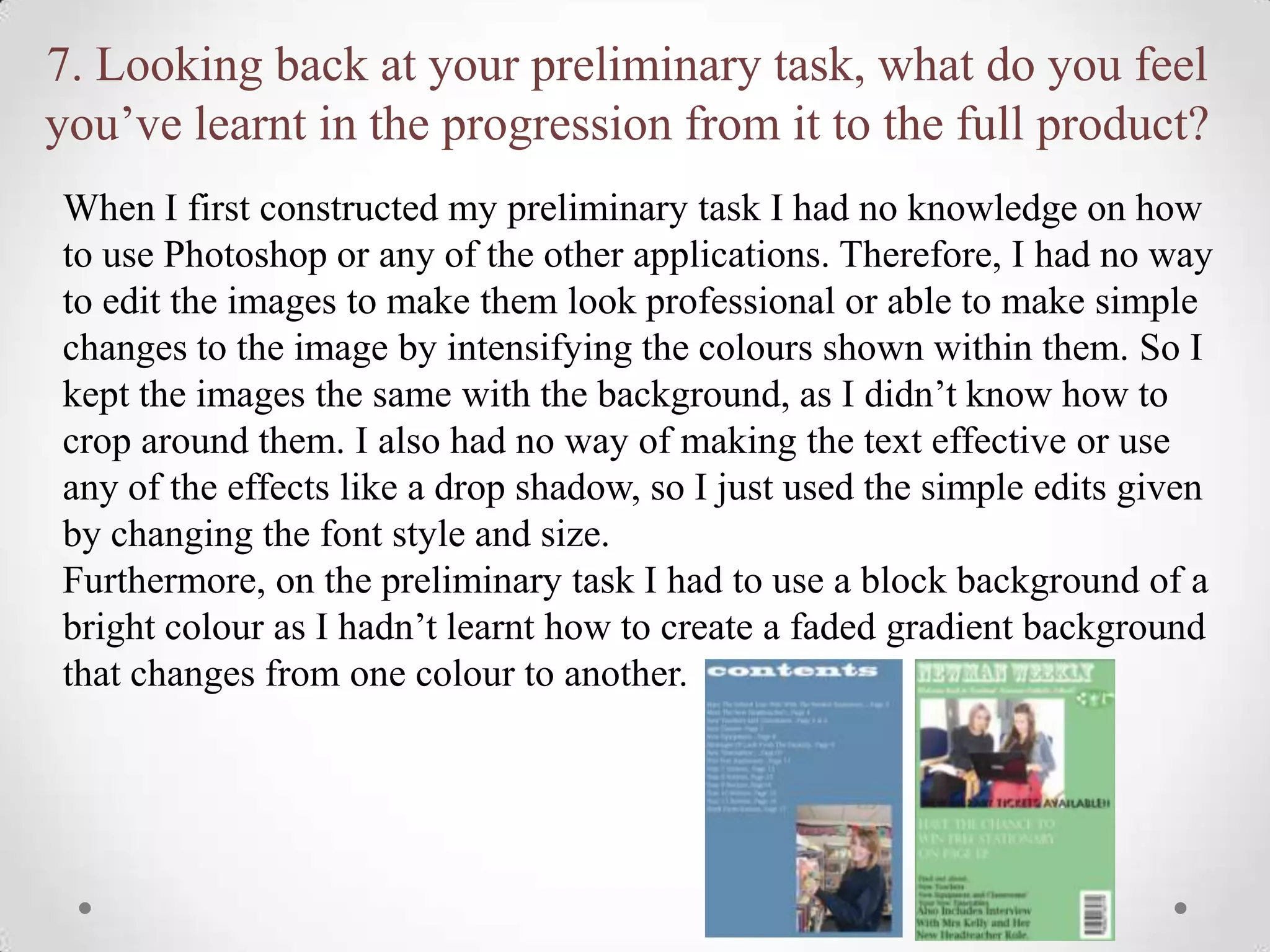
When I first constructed my preliminary task I had no knowledge on how
to use Photoshop or any of the other applications. Therefore, I had no way
to edit the images to make them look professional or able to make simple
changes to the image by intensifying the colours shown within them. So I
kept the images the same with the background, as I didn’t know how to
crop around them. I also had no way of making the text effective or use
any of the effects like a drop shadow, so I just used the simple edits given
by changing the font style and size.
Furthermore, on the preliminary task I had to use a block background of a
bright colour as I hadn’t learnt how to create a faded gradient background
that changes from one colour to another.

More Related Content

What's hot (17)

Evaluation
EvaluationEvaluation
Evaluation
 
Evaluation of my final music magazine
Evaluation of my final music magazineEvaluation of my final music magazine
Evaluation of my final music magazine
 
Music Evaluation
Music EvaluationMusic Evaluation
Music Evaluation
 
Music Evaluation
Music EvaluationMusic Evaluation
Music Evaluation
 
Evaluation
EvaluationEvaluation
Evaluation
 
Uptown evaluation
Uptown   evaluationUptown   evaluation
Uptown evaluation
 
Steffan harris final powerpoint
Steffan harris final powerpointSteffan harris final powerpoint
Steffan harris final powerpoint
 
Evaluation
EvaluationEvaluation
Evaluation
 
Evaluation
EvaluationEvaluation
Evaluation
 
Evaluation
EvaluationEvaluation
Evaluation
 
Evaluation
EvaluationEvaluation
Evaluation
 
Evaluation questions 2&3
Evaluation questions 2&3Evaluation questions 2&3
Evaluation questions 2&3
 
New music magazine evaul ryo panis
New music magazine evaul ryo panisNew music magazine evaul ryo panis
New music magazine evaul ryo panis
 
Evaluation.
Evaluation.Evaluation.
Evaluation.
 
Media Evaluation- Questions 1-5
Media Evaluation- Questions 1-5Media Evaluation- Questions 1-5
Media Evaluation- Questions 1-5
 
Harry seager
Harry seagerHarry seager
Harry seager
 
Music Magazine Plan
Music Magazine PlanMusic Magazine Plan
Music Magazine Plan
 

Viewers also liked

The inner heart 7
The inner heart 7The inner heart 7
The inner heart 7
nikolaus8
 
EF-Monocle Magazine
EF-Monocle MagazineEF-Monocle Magazine
EF-Monocle Magazine
Silvia Fern
 
Corporate Governance Greece
Corporate Governance GreeceCorporate Governance Greece
Corporate Governance Greece
Evy Kyttari
 

Viewers also liked (19)

أثر النمو السكاني على بعض قطاعات التنمية في محافظة جرش
أثر النمو السكاني على بعض قطاعات التنمية في محافظة جرشأثر النمو السكاني على بعض قطاعات التنمية في محافظة جرش
أثر النمو السكاني على بعض قطاعات التنمية في محافظة جرش
 
The inner heart 7
The inner heart 7The inner heart 7
The inner heart 7
 
Assignment 7
Assignment 7Assignment 7
Assignment 7
 
Arduino Tre reference
Arduino Tre referenceArduino Tre reference
Arduino Tre reference
 
Automotive engine transmission fluid refill pump
Automotive engine transmission fluid refill pumpAutomotive engine transmission fluid refill pump
Automotive engine transmission fluid refill pump
 
Brick Kiln
Brick KilnBrick Kiln
Brick Kiln
 
Tomasz Machała: Grupa NaTemat.pl – wydawnictwo z najwyższym poziomem ‘cool fa...
Tomasz Machała: Grupa NaTemat.pl – wydawnictwo z najwyższym poziomem ‘cool fa...Tomasz Machała: Grupa NaTemat.pl – wydawnictwo z najwyższym poziomem ‘cool fa...
Tomasz Machała: Grupa NaTemat.pl – wydawnictwo z najwyższym poziomem ‘cool fa...
 
Tecnologia
TecnologiaTecnologia
Tecnologia
 
NCC:s koncernpresentation
NCC:s koncernpresentationNCC:s koncernpresentation
NCC:s koncernpresentation
 
Aspectos clave de la regulación del control de Legionella e inspección: Model...
Aspectos clave de la regulación del control de Legionella e inspección: Model...Aspectos clave de la regulación del control de Legionella e inspección: Model...
Aspectos clave de la regulación del control de Legionella e inspección: Model...
 
JavaScript WTFs Episode 4
JavaScript WTFs Episode 4JavaScript WTFs Episode 4
JavaScript WTFs Episode 4
 
מצגת כנס קופות גמל באילת 30 בנובמבר 2015
מצגת כנס קופות גמל באילת 30 בנובמבר 2015מצגת כנס קופות גמל באילת 30 בנובמבר 2015
מצגת כנס קופות גמל באילת 30 בנובמבר 2015
 
Wildlife presentation with Bow Wow! and Meaow!
Wildlife presentation with Bow Wow! and Meaow!Wildlife presentation with Bow Wow! and Meaow!
Wildlife presentation with Bow Wow! and Meaow!
 
ing. Fabio Viero e arch. Maurizio Varratta, Manens-Tifs S.p.A., Studio Varratta
ing. Fabio Viero e arch. Maurizio Varratta, Manens-Tifs S.p.A., Studio Varrattaing. Fabio Viero e arch. Maurizio Varratta, Manens-Tifs S.p.A., Studio Varratta
ing. Fabio Viero e arch. Maurizio Varratta, Manens-Tifs S.p.A., Studio Varratta
 
JavaScript WTFs Episode 3
JavaScript WTFs Episode 3JavaScript WTFs Episode 3
JavaScript WTFs Episode 3
 
EF-Monocle Magazine
EF-Monocle MagazineEF-Monocle Magazine
EF-Monocle Magazine
 
Corporate Governance Greece
Corporate Governance GreeceCorporate Governance Greece
Corporate Governance Greece
 
Intervento di PROGETTO A NORMA
Intervento di PROGETTO A NORMAIntervento di PROGETTO A NORMA
Intervento di PROGETTO A NORMA
 
20 Digital Marketing Trends & Predictions for 2016
20 Digital Marketing Trends & Predictions for 201620 Digital Marketing Trends & Predictions for 2016
20 Digital Marketing Trends & Predictions for 2016
 

Similar to Evaluation (20)

Evaluation task 7pp
Evaluation task 7ppEvaluation task 7pp
Evaluation task 7pp
 
Evaluation task 7pp
Evaluation task 7ppEvaluation task 7pp
Evaluation task 7pp
 
Media evaluation
Media evaluationMedia evaluation
Media evaluation
 
Evaluation
EvaluationEvaluation
Evaluation
 
Presentation
PresentationPresentation
Presentation
 
Presentation
PresentationPresentation
Presentation
 
Presentation
PresentationPresentation
Presentation
 
Questions 1-5
Questions 1-5Questions 1-5
Questions 1-5
 
Evaluatio ndlwd
Evaluatio ndlwdEvaluatio ndlwd
Evaluatio ndlwd
 
Evaluation
EvaluationEvaluation
Evaluation
 
Rosie's Evaluation 2010
Rosie's Evaluation 2010Rosie's Evaluation 2010
Rosie's Evaluation 2010
 
Evaluation
Evaluation Evaluation
Evaluation
 
Sophie davies evaluation
Sophie davies evaluationSophie davies evaluation
Sophie davies evaluation
 
Magazine evaluation
Magazine evaluationMagazine evaluation
Magazine evaluation
 
Evaluation.ppt 123
Evaluation.ppt 123Evaluation.ppt 123
Evaluation.ppt 123
 
Evaluation
EvaluationEvaluation
Evaluation
 
Evaluation
EvaluationEvaluation
Evaluation
 
Evaluation.ppt 123
Evaluation.ppt 123Evaluation.ppt 123
Evaluation.ppt 123
 
Sophie Davies Evaluation
Sophie Davies EvaluationSophie Davies Evaluation
Sophie Davies Evaluation
 
Main task evaluation
Main task evaluationMain task evaluation
Main task evaluation
 

More from catereidy

Media Evaluation Question Two
Media Evaluation Question TwoMedia Evaluation Question Two
Media Evaluation Question Two
catereidy
 
Poster and Magazine Cover Drafts
Poster and Magazine Cover DraftsPoster and Magazine Cover Drafts
Poster and Magazine Cover Drafts
catereidy
 
Film poster and magazine draft layouts
Film poster and magazine draft layoutsFilm poster and magazine draft layouts
Film poster and magazine draft layouts
catereidy
 
Trailer Editing and Sound
Trailer Editing and SoundTrailer Editing and Sound
Trailer Editing and Sound
catereidy
 
Media evaluation
Media evaluationMedia evaluation
Media evaluation
catereidy
 
Poster and Magazine Dafts
Poster and Magazine DaftsPoster and Magazine Dafts
Poster and Magazine Dafts
catereidy
 
Poster and Magazine Drafts
Poster and Magazine DraftsPoster and Magazine Drafts
Poster and Magazine Drafts
catereidy
 
Image Manipulation
Image ManipulationImage Manipulation
Image Manipulation
catereidy
 
Image Manipulation
Image ManipulationImage Manipulation
Image Manipulation
catereidy
 
Film Magazine Analysis
Film Magazine AnalysisFilm Magazine Analysis
Film Magazine Analysis
catereidy
 
Film Magazine Analysis
Film Magazine AnalysisFilm Magazine Analysis
Film Magazine Analysis
catereidy
 
Media Poster Analysis
Media Poster AnalysisMedia Poster Analysis
Media Poster Analysis
catereidy
 
Film posters
Film postersFilm posters
Film posters
catereidy
 
Horror Films; Research
Horror Films; ResearchHorror Films; Research
Horror Films; Research
catereidy
 
Front Covers
Front CoversFront Covers
Front Covers
catereidy
 

More from catereidy (20)

Media Evaluation Question Two
Media Evaluation Question TwoMedia Evaluation Question Two
Media Evaluation Question Two
 
Poster and Magazine Cover Drafts
Poster and Magazine Cover DraftsPoster and Magazine Cover Drafts
Poster and Magazine Cover Drafts
 
Film poster and magazine draft layouts
Film poster and magazine draft layoutsFilm poster and magazine draft layouts
Film poster and magazine draft layouts
 
Trailer Editing and Sound
Trailer Editing and SoundTrailer Editing and Sound
Trailer Editing and Sound
 
Media evaluation
Media evaluationMedia evaluation
Media evaluation
 
Poster and Magazine Dafts
Poster and Magazine DaftsPoster and Magazine Dafts
Poster and Magazine Dafts
 
Poster and Magazine Drafts
Poster and Magazine DraftsPoster and Magazine Drafts
Poster and Magazine Drafts
 
Image Manipulation
Image ManipulationImage Manipulation
Image Manipulation
 
Image Manipulation
Image ManipulationImage Manipulation
Image Manipulation
 
Film Magazine Analysis
Film Magazine AnalysisFilm Magazine Analysis
Film Magazine Analysis
 
Film Magazine Analysis
Film Magazine AnalysisFilm Magazine Analysis
Film Magazine Analysis
 
Media Poster Analysis
Media Poster AnalysisMedia Poster Analysis
Media Poster Analysis
 
Film posters
Film postersFilm posters
Film posters
 
Horror
HorrorHorror
Horror
 
Horror Films; Research
Horror Films; ResearchHorror Films; Research
Horror Films; Research
 
Contents
ContentsContents
Contents
 
Dps
DpsDps
Dps
 
Front Covers
Front CoversFront Covers
Front Covers
 
Dps
DpsDps
Dps
 
Contents
ContentsContents
Contents
 

Evaluation

  • 2. 1. In what ways does your media product use, develop or challenge forms and conventions of real media products? For my front cover I included many features that would be seen on a real magazine, like; cover lines on either side of the page. I also included cover lines with a background at the bottom and top of the page. I used a font that would be relative to the page and change different bits of the text by making them bold to stand out and seem more important. I also included a date, price and barcode in the corner of my front cover; as this is always found on real magazines. My masthead has a bold, dark red background at the top of the page; the colouring relates to the rest of the magazine – showing continuity. I’ve only used one image on the page which is a close up of my model’s face; this makes her stand out against the cover lines and headlines and draws attention to her, to allow the reader to realise her interview inside the magazine is the most important.
  • 3. 1. For my contents page I included many features that would be seen on a real magazine, like; I have included three images on this page; another one of my model’s been used with the page number over it, to remind the readers of the exclusive and main story in the magazine. I’ve also used two other images of original concert pictures I’ve taken to make sure their realistic; this is then used to show other stories within the magazine and show their relevance. I have also followed the colour scheme I began on my front cover; following a dark red, black and white scheme, to show their linked. An editor’s note is shown on the page at the bottom as it’s found in many other magazines; it helps show the editor’s involvement and reasoning for the features included. I’ve also put text boxes around the page, either referring to articles in the magazine and a competition entry shown at the bottom.
  • 4. 1. For my double page spread I included many features that would be seen on a real magazine, like; the main image shown to the right of the angle, on the second page of the spread; this adds colour to the page and links to the story about the artist. I have included a varied font size within the article to split the story into different sections and split up huge amounts of text, to make it more readable. I have also put page numbers at the bottom of the page to relate to a real magazine; and help readers navigate around the magazine and follow the contents page.# I've split the text into three columns on one page and another one columns next to the image. By doing this I've allowed myself to fit more text in and make it easier for the reader to follow. It's also able to split up different parts of the article. I’ve also put a text box in the middle of the article on first the page with a quote from the interview; to help break up the article so it isn't as dull.
  • 5. 2. How does your media product represent particular social groups?
  • 6. I have aimed my magazine at both genders, but mostly female as a female is shown on the front cover and can be seen to be relatable and inspiring for teenage girls. However, the music included within the magazine is mostly of an alternative genre, with some rock and electro being included as well – this is approachable for males as well as female, but just depends on the musical interests of the reader. The colour scheme I’ve used interacts with teenagers the most as it’s quite modern and sophisticated; with following the simple colours of dark red, black and white. Also, the language and fonts I’ve used are sophisticated enough for those of a higher education but are still students; as it’s not too linguistic to not be understood. The articles I’ve included are of a fun and light humour which helps reach teenagers as it’s not too serious.
  • 7. 3. What kind of media institution might distribute your media product and why?
  • 8. My magazine has an audience of those between 14 and 20, so they go into town and shops around town. Therefore, I mostly see my magazine been distributed in local newsagents and shops like WH Smith in shopping centres. Also, they may be sold in supermarkets as they’re usually visited by families. My magazine could also be sold at small gig venues like O2 Academy’s as they’re usually attended by my market audience. I will also set up a webzine for my magazines; so that the readers are able to access the news through the internet, making it easier and more frequently.
  • 9. 4. Who would be the audience for your media product?
  • 10. Through the research made by my questionnaires I found that my magazine should reach teenagers, mostly between the ages of 14-20, as my research wanted to hear about old and new artists in the genre of alternative; which is mostly listened to by this age group. I made the price of my magazine of £2.10, so it’s affordable for those who don’t have a well paid job, like students. I chose this target audience because I’m able to relate to it because I’m currently within this group. Therefore, it wasn’t too hard to aim for as I knew the kind of music within this genre and range, and I was able to aim the contents on a personal influence.
  • 11. 5. How do you attract/address your audience?
  • 12. I have tried to link my magazine to my target audience through many different features; -My images included are of my main artist, ‘Elle’, reaches my audience because it relates to the female readers as it shows her as a fun, young artists and can be seen as an inspiration to the younger female readers. The gig images included relate to my target audience as they show alternative artists like Florence and the Machine and Jake Bugg. -The Features included attract my target audience because they look at current, alternative artists and the news about them. Through my research I found that my audience wanted to find out news and gossip about the artists; so therefore I’ve included this.
  • 13. 6. What have you learnt about techniques from the process of constructing this product? In the process of creating my magazine pages I used Adobe Photoshop CS3, Adobe Illustrator CS3 and Adobe InDesign CS3. Adobe Photoshop CS3: showed me how to manipulate images by using air brush to get rid of blemishes, change the colour of the models lips or hair and intensify them. You could also create a drop shadow behind the image to help intensify the effect and crop around the image to get rid of the original background; all of these effects helped to make the image look more professional. Adobe Illustrator CS3: This helped me edit my text, especially the cover lines or my masthead. I was able to create a border around the text, to make it bold, or insert a type of font to stand out amongst the rest of the text and change the colour of certain bits. Adobe InDesign CS3: This helped me create my DPS as it allowed me to insert columns and set out the text of the article in a neat ordered column. On the second page I was able to place an image, that was edited in photoshop, and arrange it to sit next to the article. I was able to insert a masthead for the page of ‘Elle Goes Solo’ over the two pages, to make them seem connected. Also, through the planning and construction of my coursework I learnt how to use websites like Prezi, Slideshare and Wordpress; which I can then use in other subjects when I need to present to the class.
  • 14. 7. Looking back at your preliminary task, what do you feel you’ve learnt in the progression from it to the full product? When I first constructed my preliminary task I had no knowledge on how to use Photoshop or any of the other applications. Therefore, I had no way to edit the images to make them look professional or able to make simple changes to the image by intensifying the colours shown within them. So I kept the images the same with the background, as I didn’t know how to crop around them. I also had no way of making the text effective or use any of the effects like a drop shadow, so I just used the simple edits given by changing the font style and size. Furthermore, on the preliminary task I had to use a block background of a bright colour as I hadn’t learnt how to create a faded gradient background that changes from one colour to another.