Download to read offline
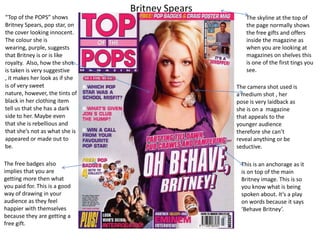
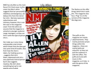
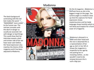

This document contains summaries of magazine covers featuring Britney Spears, Lily Allen, and Madonna: 1) The Britney Spears cover suggests she has a sweet nature but also a dark side, as her purple clothing implies royalty but black hints imply rebelliousness. 2) The Lily Allen cover uses her rebellious red shirt and messy makeup to portray her as depressed, mysterious, and having gotten into trouble. 3) The Madonna cover shows her in a black hood to respect her age, with a close-up capturing her mysterious and hostile expression matching the magazine's dark theme.


