The document summarizes the application and challenges of conventions used in the creation of magazine front covers and contents pages using QuarkXPress and Photoshop.
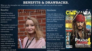
For the front cover, conventions like limited color scheme, simple background, barcode, and relevant image were applied. Challenges included a patterned background and same-colored cover lines and heading.
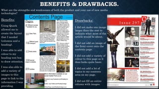
For the contents page, conventions like limited color scheme, no background design, bold numbers and heading, and ordered numbers were applied. Challenges included same-sized images, no front cover shown, and no magazine name.
The use of software allowed for high quality products but limited font options and basic design. Benefits included exploring tools, but draw