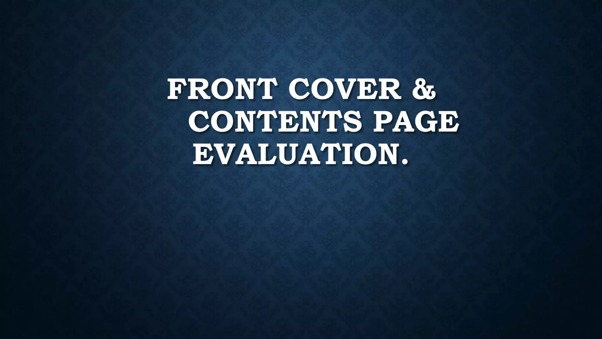
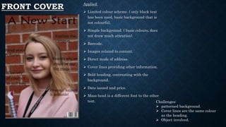
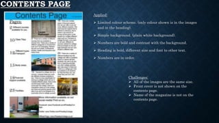
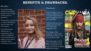
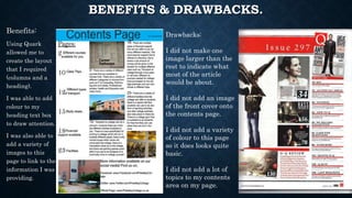
This document evaluates the front cover and contents page of a magazine that was created using QuarkXPress and Adobe Photoshop. For the front cover, benefits included using a limited color scheme and simple background, while challenges included the patterned background and cover lines being the same color as the heading. For the contents page, benefits were the limited color scheme and bold numbers, while challenges included all images being the same size and lacking the front cover or magazine name. The document also discusses benefits and drawbacks of using each program, such as Photoshop allowing for high quality images but limiting fonts, while QuarkXPress enabled columns but the contents page looked basic.