Overall evaluation of funk magazine (State
O’Mind)

Mary Nzeh
In what ways does your media product use,
develop or challenge forms and conventions of
real media products?

  • My double page spread can be said to challenge certain codes and conventions of double
    page spreads. I say this because, I have tried to avoid the use of colours to attract both my
    primary and secondary audience. However, professional double page spreads use colours
    to achieve this. A good example of this could be my style model (below)


                                    Having said this, I acknowledge that the use if
                          black and white tends to appeal to funk artists and the
                          older generations, rather than the young. To me this is a
                          positive because they (the older generations) are the
                          primary audience for the magazine.

                                             However, I have used certain conventional
                                   feature such as the bold Bold heading used to attract
                                   the audience, the use of a sharp image, which keeps
                                   the audience attached to the article. Just like my style
                                   model; I included a drop cap to show where the article
                                   begins.

            Style model.
How does your media product represent particular
                      social groups?


                     • Funk is stereotypically seen as a “wild” way of expressing ones self, this is
                       because when an individual is classified as funky they are perceived as
                       different. I could not avoid this stereotype when creating my double page
                       spread. (and also although out the making of my magazine) having said this, I
                       had use this stereotype to demarcate my magazine from every other
                       magazine, as it was my unique selling point.


         However, having said this, I tried to avoid making
this a negative as it would be seen as an “insult” to my
target audience.
           I achieved this th0rough the use of positive
quotes such as “its not about the freakish hair, or the
ridiculous outfits, its about the individualism” quotes such
as this allows funk fans to and non fans to see funk in a
positive light, different from the way it was seen as in the
1960.
What kind of media institution might distribute your
media product and why?

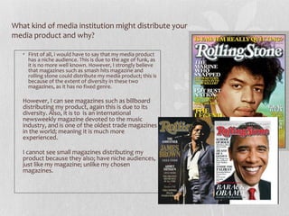
   • First of all, i would have to say that my media product
     has a niche audience. This is due to the age of funk, as
     it is no more well known. However, I strongly believe
     that magazines such as smash hits magazine and
     rolling stone could distribute my media product; this is
     because of the extent of diversity in these two
     magazines, as it has no fixed genre.

   However, I can see magazines such as billboard
   distributing my product, again this is due to its
   diversity. Also, it is to is an international
   newsweekly magazine devoted to the music
   industry, and is one of the oldest trade magazines
   in the world; meaning it is much more
   experienced.

   I cannot see small magazines distributing my
   product because they also; have niche audiences,
   just like my magazine; unlike my chosen
   magazines.
Who would be the audience for your media
product?


 • My media product has been created for a niche social group. That is, funk
   fans. Due to this, I have created my magazine for my primary audience
   rather than for my secondary and primary audience.
 • Having said this, my product would be for the older generation (30 and
   above) this is because they were around during the rain of funk.

 My target audience would have to be people who are in love
 with soul full music, people who not afraid to be their selves
 and people who are not afraid to be different. (these are all
 stereotypes of funk)
How did you attract/address your audience?
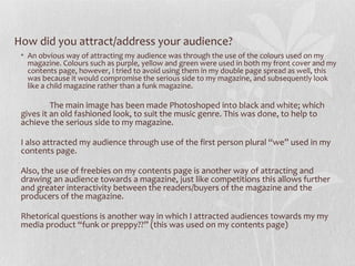
 • An obvious way of attracting my audience was through the use of the colours used on my
   magazine. Colours such as purple, yellow and green were used in both my front cover and my
   contents page, however, I tried to avoid using them in my double page spread as well, this
   was because it would compromise the serious side to my magazine, and subsequently look
   like a child magazine rather than a funk magazine.

          The main image has been made Photoshoped into black and white; which
 gives it an old fashioned look, to suit the music genre. This was done, to help to
 achieve the serious side to my magazine.

 I also attracted my audience through use of the first person plural “we” used in my
 contents page.

 Also, the use of freebies on my contents page is another way of attracting and
 drawing an audience towards a magazine, just like competitions this allows further
 and greater interactivity between the readers/buyers of the magazine and the
 producers of the magazine.

 Rhetorical questions is another way in which I attracted audiences towards my my
 media product “funk or preppy??” (this was used on my contents page)
What have you learnt about technologies
from the process of constructing this product
    • All throughout the making of my contents page, front cover and double page spread, I was
      constantly learning new skills and techniques of certain software's. I was already quite familiar
      with the use of Photoshop, However, found it quite hard trying to grasp how to use Indesign,
      this was because I was not familiar with it. (but with time; became familiar with it)


           While producing my product, I found out that Photoshop is used to
    manipulating and editing images while indesgn was used for page layouts and
    constructions.
                                                       While using Photoshop to
                                             manipulate my front cover image, I found it
                                             quote difficult trying to change the colour
                                             and extent of brightness of my characters
                                             hair. So i searched curve adjustment.
                                             This was because although I am quite
                                             familiar with Photoshop, I do not use
                                             curves on my image.


                                               Curve ajustment found
Looking back at your preliminary task, what do you
feel you have learnt from it in progression of the full
product

 Since the making of my preliminary task, I think I have learnt a lot more
 about manipulating images to suit my magazine genre. This is thought
 the use of props and background. These make my magazine much more
 believable.

 I have also noticed that I have learnt more about magazine codes and
 conventions which I applied in the making of my front page, contents
 page and double page spread unlike in my preliminary task

 Since the making of my preliminary task I have become much more aware
 of the use of colours and how to link the front page and the contents
 page; through the use of a colour scheme.

 I have so been able to put my creativity and individuality to my product.
 This is through the use of original images and computer generated
 images on my products.

Evaluation

  • 1.
    Overall evaluation offunk magazine (State O’Mind) Mary Nzeh
  • 2.
    In what waysdoes your media product use, develop or challenge forms and conventions of real media products? • My double page spread can be said to challenge certain codes and conventions of double page spreads. I say this because, I have tried to avoid the use of colours to attract both my primary and secondary audience. However, professional double page spreads use colours to achieve this. A good example of this could be my style model (below) Having said this, I acknowledge that the use if black and white tends to appeal to funk artists and the older generations, rather than the young. To me this is a positive because they (the older generations) are the primary audience for the magazine. However, I have used certain conventional feature such as the bold Bold heading used to attract the audience, the use of a sharp image, which keeps the audience attached to the article. Just like my style model; I included a drop cap to show where the article begins. Style model.
  • 3.
    How does yourmedia product represent particular social groups? • Funk is stereotypically seen as a “wild” way of expressing ones self, this is because when an individual is classified as funky they are perceived as different. I could not avoid this stereotype when creating my double page spread. (and also although out the making of my magazine) having said this, I had use this stereotype to demarcate my magazine from every other magazine, as it was my unique selling point. However, having said this, I tried to avoid making this a negative as it would be seen as an “insult” to my target audience. I achieved this th0rough the use of positive quotes such as “its not about the freakish hair, or the ridiculous outfits, its about the individualism” quotes such as this allows funk fans to and non fans to see funk in a positive light, different from the way it was seen as in the 1960.
  • 4.
    What kind ofmedia institution might distribute your media product and why? • First of all, i would have to say that my media product has a niche audience. This is due to the age of funk, as it is no more well known. However, I strongly believe that magazines such as smash hits magazine and rolling stone could distribute my media product; this is because of the extent of diversity in these two magazines, as it has no fixed genre. However, I can see magazines such as billboard distributing my product, again this is due to its diversity. Also, it is to is an international newsweekly magazine devoted to the music industry, and is one of the oldest trade magazines in the world; meaning it is much more experienced. I cannot see small magazines distributing my product because they also; have niche audiences, just like my magazine; unlike my chosen magazines.
  • 5.
    Who would bethe audience for your media product? • My media product has been created for a niche social group. That is, funk fans. Due to this, I have created my magazine for my primary audience rather than for my secondary and primary audience. • Having said this, my product would be for the older generation (30 and above) this is because they were around during the rain of funk. My target audience would have to be people who are in love with soul full music, people who not afraid to be their selves and people who are not afraid to be different. (these are all stereotypes of funk)
  • 6.
    How did youattract/address your audience? • An obvious way of attracting my audience was through the use of the colours used on my magazine. Colours such as purple, yellow and green were used in both my front cover and my contents page, however, I tried to avoid using them in my double page spread as well, this was because it would compromise the serious side to my magazine, and subsequently look like a child magazine rather than a funk magazine. The main image has been made Photoshoped into black and white; which gives it an old fashioned look, to suit the music genre. This was done, to help to achieve the serious side to my magazine. I also attracted my audience through use of the first person plural “we” used in my contents page. Also, the use of freebies on my contents page is another way of attracting and drawing an audience towards a magazine, just like competitions this allows further and greater interactivity between the readers/buyers of the magazine and the producers of the magazine. Rhetorical questions is another way in which I attracted audiences towards my my media product “funk or preppy??” (this was used on my contents page)
  • 7.
    What have youlearnt about technologies from the process of constructing this product • All throughout the making of my contents page, front cover and double page spread, I was constantly learning new skills and techniques of certain software's. I was already quite familiar with the use of Photoshop, However, found it quite hard trying to grasp how to use Indesign, this was because I was not familiar with it. (but with time; became familiar with it) While producing my product, I found out that Photoshop is used to manipulating and editing images while indesgn was used for page layouts and constructions. While using Photoshop to manipulate my front cover image, I found it quote difficult trying to change the colour and extent of brightness of my characters hair. So i searched curve adjustment. This was because although I am quite familiar with Photoshop, I do not use curves on my image. Curve ajustment found
  • 8.
    Looking back atyour preliminary task, what do you feel you have learnt from it in progression of the full product Since the making of my preliminary task, I think I have learnt a lot more about manipulating images to suit my magazine genre. This is thought the use of props and background. These make my magazine much more believable. I have also noticed that I have learnt more about magazine codes and conventions which I applied in the making of my front page, contents page and double page spread unlike in my preliminary task Since the making of my preliminary task I have become much more aware of the use of colours and how to link the front page and the contents page; through the use of a colour scheme. I have so been able to put my creativity and individuality to my product. This is through the use of original images and computer generated images on my products.