Evaluation
In what ways does your media product use, develop or
challenge forms and conventions of real media products?
My music magazine has a familiar look to most in the form of a magazine, all the models are
the wearing stereotypically fashionable clothes, my models have tried to look physically
attractive to the audience, in pose. In research I found that the front page is usually quite
packed with contents within the magazine, such as articles, and pictures. With my front
cover I have tried as minimalistic as possible, on my front cover I have tried to advertise only
the “major” contents within the magazine, this is so that my audience, don’t get
overwhelmed right at the start I think the less there is on the front cover, the more
concentration from the audience is put on more important contents such as the main double
page spread. Apart from this I have tried to keep the traditional look of a
magazine, especially on my contents and double paged spread , this is because, I don’t
think that the traditional look needs to be changed, I have the usual conventions on the front
cover such as , the masthead, the plugs, barcode, the date and price, the main image, and
sub heading. These are all vital for my front cover . On my contents page I have images of
the main articles and also, the main album review, there is of course the actual contents as
well as issue number and page numbers. On my DPS I again have tried to make it look
minimalistic this is so that the concentration is on the DPS rather than other things, my
opinion on magazines is that less is better, it also makes it look more professional.
How does your media product represent particular social
groups?
I have tried to make my magazine a unisex magazine, this is reflected in
my colour scheme, the colours I have used are quite bland (red, white,
grey) but then is brightened up by the occasional use of red. My magazine
does not have any other ethnic groups, this is because York (where I live)
is not as ethically diverse as other cities. My magazine maybe more
appetising to straight females, this because there is only males on the
pages I have created, however, this doesn’t necessarily mean that
females wouldn’t be used on other pages or articles within the magazine.
Due to the price of my magazine it likely that the magazine will only be
bought by a higher or middle economical class. The teenagers in my
magazine are represented to look older, this is supported by the clothes
they are wearing, the fashionable look, makes them more adult, in
magazines, try to make the teens look younger, this is so that adults think
there more “adorable”.
What kind of media institution might distribute your media
product and why?
My magazine will most likely be published by Future PLC, this is because
Bauer Media publishes Q magazine and IPC Media publishes NME, both
are similar to my magazine BUZZED. Future PLC does not have any
similar magazines to BUZZED however it does have a variety of
magazines that are aimed at variety of target audiences. The
advantage, of Future PLC publishing BUZZED is because it will give a
different area of magazine that Future PLC hasn’t already covered. Future
PLC usually makes throwaway magazines, my magazine is a glossy
magazine, this will make BUZZED stand out from the rest. The
disadvantage of this is that there will be a “sales” war between IPC
Media, Future PLC and Bauer Media over the amount of sales between
Q, NME and BUZZED and as BUZZED is new this will be a disadvantage
as people will not consider something that they don’t know.
Who would be the audience for your media product?
At the researching stages of this coursework, I identified through a
questionnaire that I needed my magazine to be a unisex magazine for
people aged between 16-29. My magazine in my opinion can be seen
to be a unisex magazine, it supports cultural hegemony, in fashion and
if the full magazine was produced, would have a pretty even split of
male and female models, the colour scheme supports both genders,
however red in some ways can be seen to be a more masculine
colour, however the models being boys this could support a female
version of the male gaze, the female gaze if you like. If I had to decide
whether my magazine was aimed more at males or females, I would
say males, simply because of the more masculine contents, for age
although d like to say that I have done well in trying to make this a
magazine that all ages can read, I would have to say that this is
definitely a magazine for people aged around 16-22.
How did you attract/address your audience?
I tried to attract my audience by using one colour that would stand out, for
instance, I used the colour red only occasionally on the front cover, this was
so to attract both genders, I also used white as a background on my main
image, white is a bright colour, and it reflects light, this is for when its on
shelves in a shop. I also tried to use a font that I though was appealing to the
audience, I used the same font throughout the magazine, and the only time I
changed it was to fit with my bands “official” logo, when the LeeWills are
mentioned the font changes, this font will be noticeable to people who know
the LeeWills. With my photography I tried to use my basic plan as a guide, I
used a lamb skull on an album cover that I have pre created and incorporated
this into my main image on the front cover. Addressing my audience I used a
casual modern English language, I tried to be formal with a little informal, I did
an interview with my models and came up with text for my double page
spread, they also tried to use this modern day language, we didn’t use really
informal language that people might not understand, but we used a normal
way of talking as you would to a friend, the props I used as mentioned before
was a simple lamb skull, this addresses to the audience that the magazine is
going to have exclusives on the LeeWills new album “Lamb Skull”, this is
particularly addressing fans of them.
What have you learnt about technologies from the process of
constructing this product?
In this project I have learnt a lot about technologies used on and off the computer, for
instance I have learnt how to use the vital aspects of Photoshop, something that before
this project I was useless with, I have learn the simple things like how to get an image
up on Photoshop to how to cut out and move a persons forehead so that it is on top of
text to getting rid of the spots on a persons face, I think if I had to point out the
programme I have learnt to use the most it would be Photoshop, with no second
thoughts about it. I have learnt how useful PowerPoint can be especially as most of my
coursework has been completed on it, although I have known how to use a camera for a
long time, I have learnt how to use light to my advantage when taking pictures with my
models, I have learnt that you can use the angle of the camera to your advantage
(especially when it comes to page orientation). Using blogs was very new to me as I
have never had a blog before, understanding how to upload my work has taken me time
but now I have got there, the blog I used was Word Press, my blog has helped me
dramatically, especially when I lost a lot of my coursework, however I have learnt that
uploading my coursework when I have finished is probably the best thing to do. The
website Drop box at the start of this coursework has helped me also, after my little
memory stick incident where I left it on a bus, I have learnt that I need lots of copies of
my work saved in different places in order to ensure I wont lose my work.
Looking back at your preliminary task, what do you feel you
have learnt in the progression from it to the full product?
Looking back at your preliminary task, what do you feel you
have learnt in the progression from it to the full product?
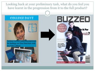
As you can see form the previous slide, my Photoshop
skills have dramatically increased, I am now familiar
with the lasso tool, as well as the basic zoom and
move, I have learnt how to use colour and contrast, I
have also learnt the basic filter tool, and spot healing
tool, the eye dropper tool and the paint brush tool, I
have learnt how use the gradient tool, I have learnt a
lot about this programme so much so that I have
adopted to using it within my course so that I can use
it for design, this has helped me drastically.

Evaluation 123

  • 1.
  • 2.
    In what waysdoes your media product use, develop or challenge forms and conventions of real media products? My music magazine has a familiar look to most in the form of a magazine, all the models are the wearing stereotypically fashionable clothes, my models have tried to look physically attractive to the audience, in pose. In research I found that the front page is usually quite packed with contents within the magazine, such as articles, and pictures. With my front cover I have tried as minimalistic as possible, on my front cover I have tried to advertise only the “major” contents within the magazine, this is so that my audience, don’t get overwhelmed right at the start I think the less there is on the front cover, the more concentration from the audience is put on more important contents such as the main double page spread. Apart from this I have tried to keep the traditional look of a magazine, especially on my contents and double paged spread , this is because, I don’t think that the traditional look needs to be changed, I have the usual conventions on the front cover such as , the masthead, the plugs, barcode, the date and price, the main image, and sub heading. These are all vital for my front cover . On my contents page I have images of the main articles and also, the main album review, there is of course the actual contents as well as issue number and page numbers. On my DPS I again have tried to make it look minimalistic this is so that the concentration is on the DPS rather than other things, my opinion on magazines is that less is better, it also makes it look more professional.
  • 3.
    How does yourmedia product represent particular social groups? I have tried to make my magazine a unisex magazine, this is reflected in my colour scheme, the colours I have used are quite bland (red, white, grey) but then is brightened up by the occasional use of red. My magazine does not have any other ethnic groups, this is because York (where I live) is not as ethically diverse as other cities. My magazine maybe more appetising to straight females, this because there is only males on the pages I have created, however, this doesn’t necessarily mean that females wouldn’t be used on other pages or articles within the magazine. Due to the price of my magazine it likely that the magazine will only be bought by a higher or middle economical class. The teenagers in my magazine are represented to look older, this is supported by the clothes they are wearing, the fashionable look, makes them more adult, in magazines, try to make the teens look younger, this is so that adults think there more “adorable”.
  • 4.
    What kind ofmedia institution might distribute your media product and why? My magazine will most likely be published by Future PLC, this is because Bauer Media publishes Q magazine and IPC Media publishes NME, both are similar to my magazine BUZZED. Future PLC does not have any similar magazines to BUZZED however it does have a variety of magazines that are aimed at variety of target audiences. The advantage, of Future PLC publishing BUZZED is because it will give a different area of magazine that Future PLC hasn’t already covered. Future PLC usually makes throwaway magazines, my magazine is a glossy magazine, this will make BUZZED stand out from the rest. The disadvantage of this is that there will be a “sales” war between IPC Media, Future PLC and Bauer Media over the amount of sales between Q, NME and BUZZED and as BUZZED is new this will be a disadvantage as people will not consider something that they don’t know.
  • 5.
    Who would bethe audience for your media product? At the researching stages of this coursework, I identified through a questionnaire that I needed my magazine to be a unisex magazine for people aged between 16-29. My magazine in my opinion can be seen to be a unisex magazine, it supports cultural hegemony, in fashion and if the full magazine was produced, would have a pretty even split of male and female models, the colour scheme supports both genders, however red in some ways can be seen to be a more masculine colour, however the models being boys this could support a female version of the male gaze, the female gaze if you like. If I had to decide whether my magazine was aimed more at males or females, I would say males, simply because of the more masculine contents, for age although d like to say that I have done well in trying to make this a magazine that all ages can read, I would have to say that this is definitely a magazine for people aged around 16-22.
  • 6.
    How did youattract/address your audience? I tried to attract my audience by using one colour that would stand out, for instance, I used the colour red only occasionally on the front cover, this was so to attract both genders, I also used white as a background on my main image, white is a bright colour, and it reflects light, this is for when its on shelves in a shop. I also tried to use a font that I though was appealing to the audience, I used the same font throughout the magazine, and the only time I changed it was to fit with my bands “official” logo, when the LeeWills are mentioned the font changes, this font will be noticeable to people who know the LeeWills. With my photography I tried to use my basic plan as a guide, I used a lamb skull on an album cover that I have pre created and incorporated this into my main image on the front cover. Addressing my audience I used a casual modern English language, I tried to be formal with a little informal, I did an interview with my models and came up with text for my double page spread, they also tried to use this modern day language, we didn’t use really informal language that people might not understand, but we used a normal way of talking as you would to a friend, the props I used as mentioned before was a simple lamb skull, this addresses to the audience that the magazine is going to have exclusives on the LeeWills new album “Lamb Skull”, this is particularly addressing fans of them.
  • 7.
    What have youlearnt about technologies from the process of constructing this product? In this project I have learnt a lot about technologies used on and off the computer, for instance I have learnt how to use the vital aspects of Photoshop, something that before this project I was useless with, I have learn the simple things like how to get an image up on Photoshop to how to cut out and move a persons forehead so that it is on top of text to getting rid of the spots on a persons face, I think if I had to point out the programme I have learnt to use the most it would be Photoshop, with no second thoughts about it. I have learnt how useful PowerPoint can be especially as most of my coursework has been completed on it, although I have known how to use a camera for a long time, I have learnt how to use light to my advantage when taking pictures with my models, I have learnt that you can use the angle of the camera to your advantage (especially when it comes to page orientation). Using blogs was very new to me as I have never had a blog before, understanding how to upload my work has taken me time but now I have got there, the blog I used was Word Press, my blog has helped me dramatically, especially when I lost a lot of my coursework, however I have learnt that uploading my coursework when I have finished is probably the best thing to do. The website Drop box at the start of this coursework has helped me also, after my little memory stick incident where I left it on a bus, I have learnt that I need lots of copies of my work saved in different places in order to ensure I wont lose my work.
  • 8.
    Looking back atyour preliminary task, what do you feel you have learnt in the progression from it to the full product?
  • 9.
    Looking back atyour preliminary task, what do you feel you have learnt in the progression from it to the full product? As you can see form the previous slide, my Photoshop skills have dramatically increased, I am now familiar with the lasso tool, as well as the basic zoom and move, I have learnt how to use colour and contrast, I have also learnt the basic filter tool, and spot healing tool, the eye dropper tool and the paint brush tool, I have learnt how use the gradient tool, I have learnt a lot about this programme so much so that I have adopted to using it within my course so that I can use it for design, this has helped me drastically.