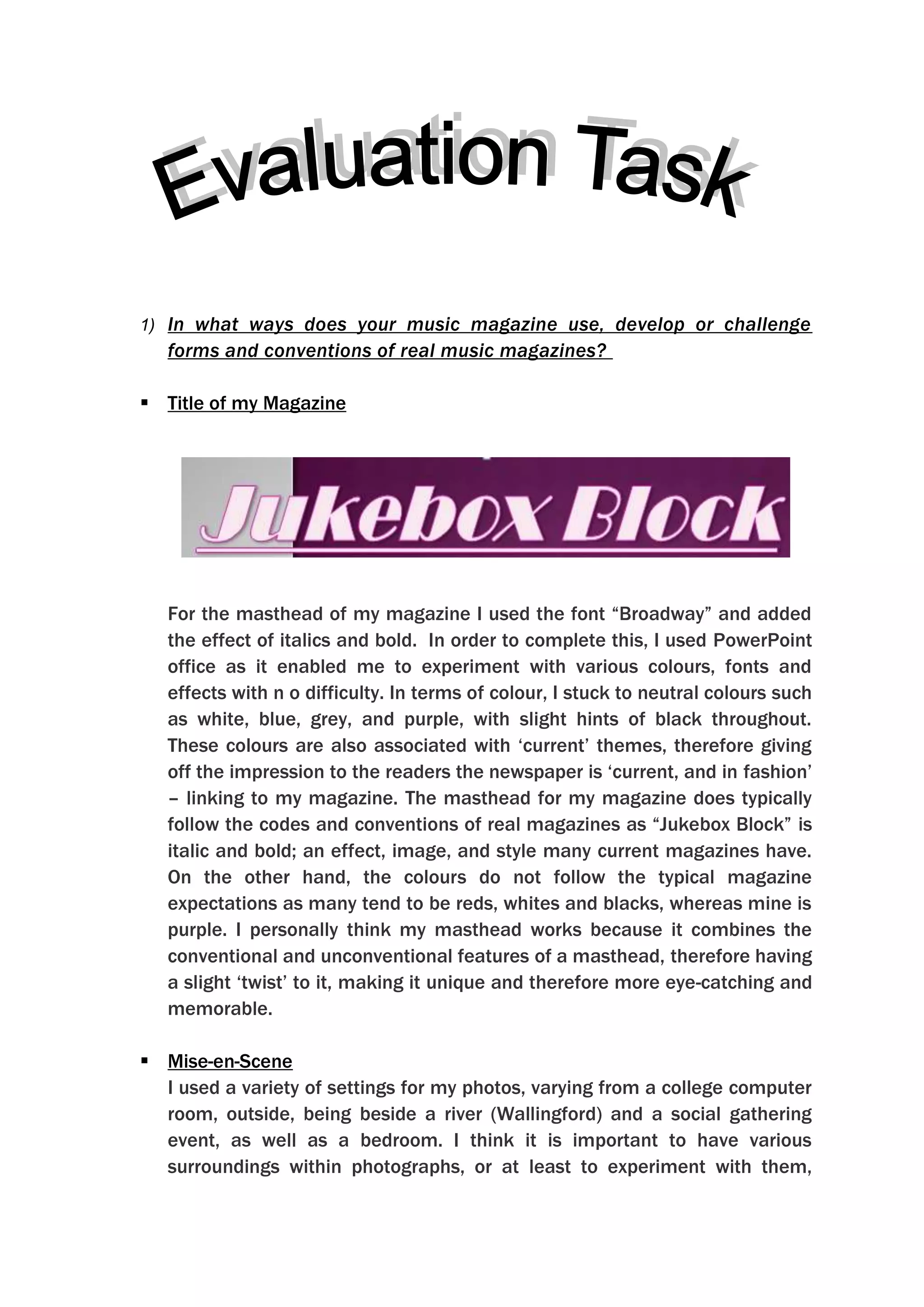
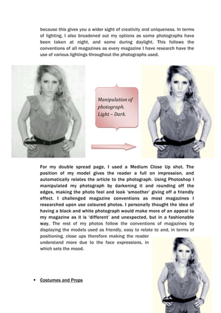
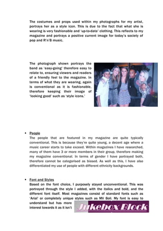
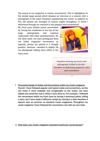
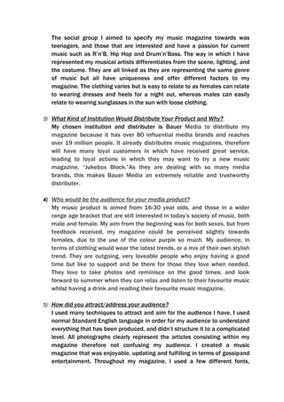
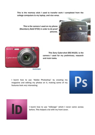
In what ways does your music magazine use, develop or challenge forms and conventions of real music magazines? 
Title of my Magazine
571500313690
For the masthead of my magazine I used the font “Broadway” and added the effect of italics and bold.  In order to complete this, I used PowerPoint office as it enabled me to experiment with various colours, fonts and effects with n o difficulty. In terms of colour, I stuck to neutral colours such as white, blue, grey, and purple, with slight hints of black throughout. These colours are also associated with ‘current’ themes, therefore giving off the impression to the readers the newspaper is ‘current, and in fashion’ – linking to my magazine. The masthead for my magazine does typically follow the codes and conventions of real magazines as “Jukebox Block” is italic and bold; an effect, image, and style many current magazines have. On the other hand, the colours do not follow the typical magazine expectations as many tend to be reds, whites and blacks, whereas mine is purple. I personally think my masthead works because it combines the conventional and unconventional features of a masthead, therefore having a slight ‘twist’ to it, making it unique and therefore more eye-catching and memorable.
Mise-en-Scene
I used a variety of settings for my photos, varying from a college computer room, outside, being beside a river (Wallingford) and a social gathering event, as well as a bedroom. I think it is important to have various surroundings within photographs, or at least to experiment with them, because this gives you a wider sight of creativity and uniqueness. In terms of lighting, I also broadened out my options as some photographs have been taken at night, and some during daylight. This follows the conventions of all magazines as every magazine I have research have the use of various lightings throughout the photographs used.
391033011430-52324013335
Manipulation of photograph. Light – Dark.
For my double spread page, I used a Medium Close Up shot. The position of my model gives the reader a full on impression, and automatically relates the article to the photograph. Using Photoshop I manipulated my photograph by darkening it and rounding off the edges, making the photo feel and look ‘smoother’ giving off a friendly effect. I challenged magazine conventions as most magazines I researched upon use coloured photos. I personally thought the idea of having a black and white photograph would make more of an appeal to my magazine as it is ‘different’ and unexpected, but in a fashionable way. The rest of my photos follow the conventions of magazines by displaying the models used as friendly, easy to relate to and, in terms of positioning, close ups therefore making the reader understand more due to the face expressions, in which sets the mood.
4293235-203200Costumes and Props
The costumes and props used within my photographs for my artist, portrays her as a style icon. This is due to the fact that what she is wearing is very fashionable and ‘up-to-date’ clothing. This reflects to my magazine and portrays a positive current image for today’s society of pop and R’n’B music.
344805044450The photograph shown portrays the band as ‘easy-going’ therefore easy to relate to, ensuring viewers and readers of a friendly feel to the magazine. In terms of what they are wearing, again is conventional as it is fashionable, therefore keeping their image of ‘looking good’ such as ‘style icons.’

Final Media Evaluation

  • 1.
    In what waysdoes your music magazine use, develop or challenge forms and conventions of real music magazines? 
  • 2.
    Title of myMagazine
  • 3.
  • 4.
    For the mastheadof my magazine I used the font “Broadway” and added the effect of italics and bold. In order to complete this, I used PowerPoint office as it enabled me to experiment with various colours, fonts and effects with n o difficulty. In terms of colour, I stuck to neutral colours such as white, blue, grey, and purple, with slight hints of black throughout. These colours are also associated with ‘current’ themes, therefore giving off the impression to the readers the newspaper is ‘current, and in fashion’ – linking to my magazine. The masthead for my magazine does typically follow the codes and conventions of real magazines as “Jukebox Block” is italic and bold; an effect, image, and style many current magazines have. On the other hand, the colours do not follow the typical magazine expectations as many tend to be reds, whites and blacks, whereas mine is purple. I personally think my masthead works because it combines the conventional and unconventional features of a masthead, therefore having a slight ‘twist’ to it, making it unique and therefore more eye-catching and memorable.
  • 5.
  • 6.
    I used avariety of settings for my photos, varying from a college computer room, outside, being beside a river (Wallingford) and a social gathering event, as well as a bedroom. I think it is important to have various surroundings within photographs, or at least to experiment with them, because this gives you a wider sight of creativity and uniqueness. In terms of lighting, I also broadened out my options as some photographs have been taken at night, and some during daylight. This follows the conventions of all magazines as every magazine I have research have the use of various lightings throughout the photographs used.
  • 7.
  • 8.
  • 9.
    For my doublespread page, I used a Medium Close Up shot. The position of my model gives the reader a full on impression, and automatically relates the article to the photograph. Using Photoshop I manipulated my photograph by darkening it and rounding off the edges, making the photo feel and look ‘smoother’ giving off a friendly effect. I challenged magazine conventions as most magazines I researched upon use coloured photos. I personally thought the idea of having a black and white photograph would make more of an appeal to my magazine as it is ‘different’ and unexpected, but in a fashionable way. The rest of my photos follow the conventions of magazines by displaying the models used as friendly, easy to relate to and, in terms of positioning, close ups therefore making the reader understand more due to the face expressions, in which sets the mood.
  • 10.
  • 11.
    The costumes andprops used within my photographs for my artist, portrays her as a style icon. This is due to the fact that what she is wearing is very fashionable and ‘up-to-date’ clothing. This reflects to my magazine and portrays a positive current image for today’s society of pop and R’n’B music.
  • 12.
    344805044450The photograph shownportrays the band as ‘easy-going’ therefore easy to relate to, ensuring viewers and readers of a friendly feel to the magazine. In terms of what they are wearing, again is conventional as it is fashionable, therefore keeping their image of ‘looking good’ such as ‘style icons.’