Downloaded 66 times

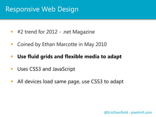


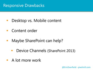
![Mobile First and IE8 / IE7
Will only load mobile view
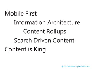
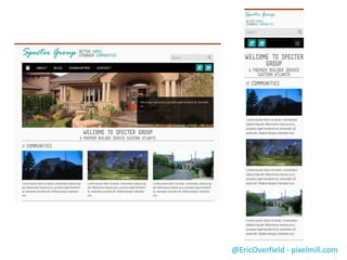
@EricOverfield - pixelmill.com
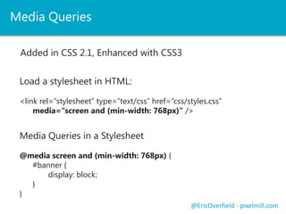
Fix with CSS Media Queries
JS Library: http://pxml.ly/zcw2jb2 (Among others)
So we need to use JS?
<!--[if lt IE 9]>
<script src="http://css3-mediaqueries-js.googlecode.com/files/css3-mediaqueries.js"></script>
<![endif]-->
Or an IE8- stylesheet
<!--[if lt IE 9]>
<link rel="stylesheet" type="text/css“ href=“/styles/styles-ie8.css” />
<![endif]-->](https://image.slidesharecdn.com/enhancingsharepointwithrwd-v1-121015170820-phpapp02/85/Enhancing-SharePoint-with-Responsive-Web-Design-34-320.jpg)

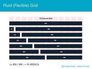
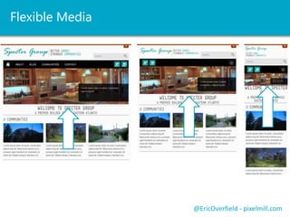
This document discusses responsive web design (RWD) and how to apply it to SharePoint sites. It covers the fundamentals of RWD including fluid grids, flexible media, and CSS media queries. It emphasizes planning and designing for different devices from the start. Converting HTML prototypes to SharePoint involves creating master pages and page layouts. SharePoint 2013 features like device channels can further tailor the experience for different devices. The presenter provides resources for responsive frameworks that work with SharePoint and tips for developing responsive SharePoint sites.


