Downloaded 272 times


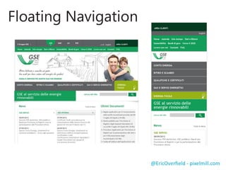

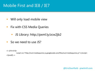


![Mobile First and IE8 / IE7
Will only load mobile view
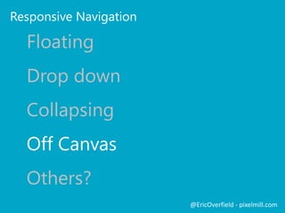
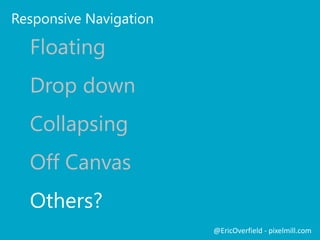
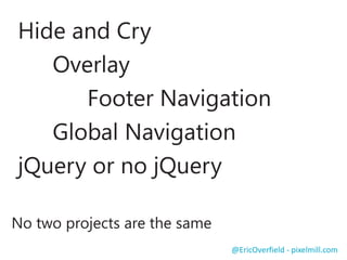
@EricOverfield - pixelmill.com
Fix with CSS Media Queries
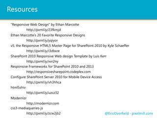
JS Library: http://pxml.ly/zcw2jb2
So we need to use JS?
<!--[if lt IE 9]>
<sciprt src="http://css3-mediaqueries-js.googlecode.com/files/css3-mediaqueries.js"></script>
<![endif]-->](https://image.slidesharecdn.com/enhancesharepoint2013withresponsivedesign-130518182759-phpapp02/85/Enhance-SharePoint-2013-with-Responsive-Web-Design-46-320.jpg)


The document discusses responsive web design (RWD) and its application to SharePoint 2013, highlighting content strategy, flexible grids, and the importance of designing for various devices. Eric Overfield, a SharePoint expert, emphasizes the need for a mobile-first approach and provides practical tips for integrating RWD with SharePoint. Additionally, it references various resources and frameworks to assist developers in creating responsive designs.