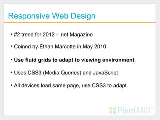
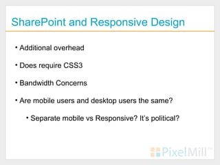
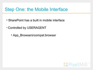
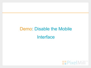
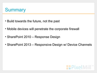
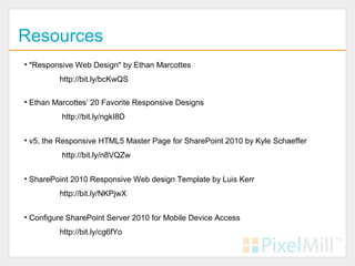
Branding SharePoint for Evolving Internet DevicesEric Overfield
The document discusses how organizations need to prepare their SharePoint intranets for the increasing use of mobile devices. It examines options for making SharePoint accessible across different devices, including device-specific interfaces, responsive web design, and the new device channels feature in SharePoint 2013. The author advocates for using responsive design to create a single interface that adapts to different screens through CSS. He also suggests using device channels in SharePoint 2013 to handle special device cases.
Enhancing SharePoint with Responsive Web DesignEric Overfield
This document discusses responsive web design (RWD) and how to apply it to SharePoint sites. It covers the fundamentals of RWD including fluid grids, flexible media, and CSS media queries. It emphasizes planning and designing for different devices from the start. Converting HTML prototypes to SharePoint involves creating master pages and page layouts. SharePoint 2013 features like device channels can further tailor the experience for different devices. The presenter provides resources for responsive frameworks that work with SharePoint and tips for developing responsive SharePoint sites.
The Design Dilemma of Mobile and SharePointEric Overfield
Are tablets and smartphone going to access your SharePoint 2010 site? Hint: They will. How will the presentation of your SharePoint site be affected by the growing trend of mobile workstyles? Traditional branding for SharePoint 2010 has its shortcomings with modern mobile devices. In this session we will review the available options to enhance the look and feel of your SharePoint site, and create a unified experience across modern internet devices. We will discuss current design trends and how to utilize them in your SharePoint project. We will finish by considering how this will be impacted by SharePoint 2013.
The Design Dilemma of Mobile and SharePointEric Overfield
Eric Overfield presented on the design dilemma of building mobile and SharePoint interfaces. He discussed how accessing the web has changed with the proliferation of different devices like phones, tablets, and televisions. These devices have varying screen sizes, functionality, and usability which makes designing interfaces that work across all of them challenging. Overfield presented different options for SharePoint like device-specific interfaces, progressive enhancement, and responsive web design. He concluded by discussing how SharePoint 2013's new device channels feature could help but responsive design remains the best approach to build interfaces that adapt to any device.
Enhance SharePoint with Responsive Web DesignEric Overfield
Eric Overfield gave a presentation on enhancing SharePoint with responsive web design. He discussed what responsive web design is, why it is needed given the variety of devices used to access websites, and the responsive design process. He covered considerations for joining responsive design and SharePoint, including navigation challenges and opportunities in SharePoint 2013 like device channels. He demonstrated responsive navigation patterns and frameworks that can be used, and emphasized starting with content and designing for all devices rather than specific ones.
How many of your users will access your SharePoint site on a mobile device? Hint: more than you think. Will your SharePoint site handle it well? Configuring SharePoint 2010 for mobile devices had its issues, but now with SharePoint 2013, new options are available to us. In this session we will review how to enhance SharePoint 2013 and create a unified experience across modern internet devices. We will discuss in-depth the current trends and how to utilize them in your SharePoint 2013 projects. We will start with OOTB and progress to custom and hybrid options including creating a Responsive Design, amplified by Device Channels.
This document provides an overview of Salesforce1 and Salesforce Lightning. Salesforce1 is a platform and mobile app that allows users to access Salesforce from any device with a lightweight mobile interface. It can be used to create customer and employee applications, connect products, and build company communities. Salesforce Lightning is the next generation of the Salesforce platform that features a new streamlined user interface designed to work across any screen size or device, along with components, an app builder, process builder, and schema builder to more easily develop applications.
This document provides instructions for building a basic native iPhone app in 30 minutes or less using the NimbleKit framework. It begins with definitions of native apps versus web apps. It then outlines the steps to create a new NimbleKit project in Xcode, add HTML, CSS, jQuery, graphics and JavaScript, run and compile the app, and publish it to the App Store or for internal enterprise use. Alternately, a native Objective-C version could be built. It concludes with a brief discussion of local versus external data storage and transactions using SQLite and Ajax.
This document appears to be a survey conducted by Kelley Walker Howell regarding UI/UX professionals. It includes questions about respondents' backgrounds, roles and responsibilities, programming languages used, and topics of interest. Respondents represented a variety of areas of expertise including usability, front-end engineering, graphic design, and project management. Tools and topics mentioned included jQuery, CSS, Ajax, information architecture, and user experience design.
SilverStripe is an open source content management system (CMS) that provides a flexible and customizable PHP web application framework. It allows developers to easily build and extend websites and applications. SilverStripe includes features for both end users, like drag and drop content editing, and developers, like extensive customization and integration with other systems.
SharePoint Saturday - From P to Shining Pzollinger
This document summarizes Kevin Zollinger's presentation on SharePoint program management at Nu Skin. Some of the key points covered include implementing SharePoint correctly with the right information architecture, design, and performance. It also discusses making the SharePoint site engaging with an intuitive and simple design. The presentation outlines both obvious strategies like having a clear strategy and focus on usability as well as less obvious tactics like leveraging the SharePoint community, super users, and outsourcing for app development. Areas still needing work mentioned are document management, social functionality, and analytics/measurement.
Slides from my presentation 6/24/2014 to the San Antonio SharePoint User Group at Rackspace's HQ.
I blogged about SharePoint on the SharePoint platform for 6 years and now I'm back to WordPress. One reason? Azure Web Sites are cool
The document outlines a project called DuckPad that will create an interactive brochure app for Cyber-Duck on the iPad over 6 weeks. The goals are to build skills in HTML5, CSS3, jQuery and SVG for mobile development, explore iPad possibilities, and showcase Cyber-Duck's skills and services at an upcoming conference. A small team will take inspiration from an acclaimed Wired iPad app to rapidly develop a superior user experience from concept to final product in just 6 weeks.
This document discusses different approaches for building mobile sites and apps with Drupal, including native apps, mobile sites, responsive design, and Drupal 8 initiatives. Native apps are extremely popular but time consuming to build and require additional skills. Mobile sites require maintaining multiple versions, while responsive design uses a single, adaptive design that scales across devices using CSS media queries. Drupal 7 supports responsive design out of the box as well as services and mobile tools modules. Drupal 8 aims to improve the mobile experience through initiatives focused on mobile, HTML5, and web services.
This document discusses strategies for mobile development and cross-platform solutions using Microsoft technologies. It introduces Xamarin and Visual Studio Tools for Apache Cordova as cross-platform options that allow building native mobile apps using C# and .NET in Visual Studio. It outlines features like sharing code and UI development across platforms, and also covers the Android emulator in Visual Studio. The presentation ends with questions and information about following the presenter on social media.
Demystifying UX – A toolkit approach to better, cheaper & faster experience d...dtremonte
This document provides an overview of user experience (UX) design and introduces a UX toolkit. It discusses what UX is and why it matters, different UX job roles, and why planning and testing are important. The toolkit includes templates and guidance for conducting user research like creating personas, auditing content and site maps, designing workflows, navigation, and wireframes. It emphasizes testing assumptions and using analytics. The goal is to provide tools to help with strategic design of intuitive digital experiences that are persuasive, educational, profitable and delightful.
React Native allows developers to build mobile apps using JavaScript and React by rendering native UI components. It works by implementing React components as native platform views using JavaScript, allowing React code to be compiled to native mobile applications for iOS and Android. Some benefits include using JavaScript, native controls for performance, and React features for UI. Cons include documentation, expertise for native modules, third-party components, lagging SDK updates, and lack of support for Windows Phone.
RADcube| Leveraging Digital Experiences for Enterprises Ty Alden Cole
We believe digital experiences can change consumer behavior, influence perception, and bring incredible results. But they have to mean something to the audience and they have to work, everywhere. We keep strategy, creative, and technology woven tightly together. This means you get fresh, relevant concepts that resonate with target audiences and digital solutions that engage customers in powerful new ways.
We only call it a success when an idea becomes a seamless, memorable experience across devices, platforms, and channels.
We can take care of your entire digital program, but if you already have a program in place and just need to cover a few essential pieces in your marketing plan, we’re happy to help. We understand how each tactic supports the greater program.
Mobile Website or Responsive Design? The Answer is NEITHER.TWG
By Derek Watson, Senior Developer at The Working Group
Reviews the two most popular strategies for creating mobile web properties (separate mobile-specific sites vs. responsive css), the pros and cons of each, and a little known third technique that marries the best of both worlds.
Should I Build a Separate Mobile Site or a Responsive Site? Neither! with Der...FITC
Save 10% off ANY FITC event with discount code 'slideshare'
See our upcoming events at www.fitc.ca
OVERVIEW
Derek Watson, Senior Developer at TWG, reviews the two most popular strategies for creating mobile web properties (separate mobile-specific sites vs. responsive css), the pros and cons of each, and and a little known third technique that marries the best of both worlds.
Yarden Jacobson did an introduction on Whichit:
"I will do a review of architecture and notes about the way we selected the components. In conclusion, we will give you few tips and points to think about when you are developing a software product (examples from our android experience)."
Enhancing SharePoint with Responsive Web DesignEric Overfield
One of the hottest topics in Web Design over the last few years has been Responsive Web Design (RWD). The theory of one site structure for current web devices, including tablets and smartphones, has also attracted SharePoint developers, but the complexity of RWD has been a stumbling block. In this session we will start with an overview of what is Responsive Web Design followed by an in-depth look into the pros and cons of applying a responsive design on SharePoint. We will then dive into the code and learn how to create a SharePoint site that is both responsive and attractive. We will finish with a look at SharePoint 2013 and Device Channels, and review how Responsive Web Design can play a role in current and future SharePoint Branding projects.
Session Take-aways:
Building off what was learned in the previous session, Branding SharePoint for Evolving Internet Devices, this session is geared towards web developers, programmers and IT to learn "how" to code for modern Internet devices. Attendees will have been exposed to not only what Responsive Web Design is and how it functions, but also how to apply it directly to SharePoint. As with all techniques, there are pros and cons to Responsive Web Design, not only in general but also how it is applied to, and utilized by SharePoint. After a thorough review and multiple demos attendees will have seen the code and learned what to expect. Finally attendees will learn how SharePoint 2013 handles mobile computing and how Responsive Web Design can help solve SharePoint 2013's mobile computing shortcomings.
Highlights:
Find out what the hot web design topic Response Web Design is all about.
See how to utilize Response Web Design in your SharePoint project.
Learn how to leverage this knowledge in SharePoint 2013 as well.
Beyond Branding SharePoint - SharePoint and Today's WebEric Overfield
How does your SharePoint site handle the growing number of devices that are or will be soon accessing your site? Traditional branding for SharePoint has its shortcomings with modern devices. In this session we will review available options to enhance SharePoint and create a unified experience across modern internet devices with an in-depth review of current trends and how to utilize them in your current or upcoming SharePoint project. We will finish by considering how this might be impacted by SharePoint 2013.
Session Take-aways:
As an introduction session to modern Internet devices and how they affect the presentation of a SharePoint 2010 site, each attendee should leave the session with a solid understanding of how different devices and viewports treat SharePoint including the good and the bad. Further they will have been exposed to multiple techniques and methods in which SharePoint can be modified to enhance SharePoint for modern Internet devices including tablets and smartphones with a look at the benefits and shortcomings of each method. After a review of SharePoint 2013's addition of devices channels, attendees will also learn how to leverage this new understanding of Internet devices with device channels for a truly usable, maintainable SharePoint branding initiative moving forward.
Highlights:
Learn the shortcomings of SharePoint's interface with modern Internet devices.
See modern techniques Branding experts use to solve the mobile problems.
Find out how to leverage this knowledge in SharePoint 2010 and SharePoint 2013.
Uncovering the Latest in SharePoint DevelopmentEric Overfield
The document discusses modern approaches to SharePoint development. It outlines traditional development models for SharePoint like full trust solutions and sandboxed solutions, as well as more modern client-side approaches using the SharePoint Framework, Add-ins, and Microsoft Graph API. The document recommends transitioning to client-side development using these modern tools and the new SharePoint Framework for building web parts that work across SharePoint platforms. It provides an overview of Microsoft's roadmap for SharePoint development in 2017, focusing on continued evolution of the SharePoint Framework and client-side capabilities.
SharePoint 2013 Web Content Management for Developers TSPUGEd Musters
As presented to the Toronto SharePoint User Group on March 20, 2013. With powerful new content search capabilities, metadata driven navigation, and new features such as design manager and cross site publishing, this presents a paradigm shift for developers with a focus on WCM publishing sites (intranet, internet). These new features and capabilities will be presented at an introductory level during this talk. The session will then focus on your typical Visual Studio “Publishing Solution” in SharePoint 2010. How do you get this running on a SharePoint 2013 Farm “as is” (migration)? What is involved if I want to convert my existing visual studio solution to SP 2013 developer tools and then fully over to the SP 2013 publishing paradigm? We’re already in development of a SharePoint 2010 site - can we deploy SharePoint 2013 now or should we wait? This session will provide insight into how you should develop today, and be ready for the new world that awaits in SharePoint 2013!
SharePoint 2013 Web Content Management for Developers HSPUGEd Musters
This document provides an overview of Ed Musters' background and expertise. It lists that he is a current SharePoint MVP, author of two SharePoint 2010 development books, and SharePoint architect. It also outlines some of his additional qualifications including Microsoft certifications and experience as a trainer. The document promotes Ed as an expert in areas like full trust SharePoint solutions, apps, and web content management in SharePoint 2013. It provides high-level summaries of these topics and when each approach is most suitable.
This document is a resume for Dario Di Felice, an experienced multimedia developer and senior front end developer. It outlines his technical skills which include languages like PHP, jQuery, CSS and tools like Photoshop. His professional experience includes roles developing websites for Rogers Communications and Bell Media. He is seeking a challenging position developing rich media and web applications where he can apply his skills in areas like user experience design, search engine optimization and social media.
Convert your Full Trust Solutions to the SharePoint Framework (SPFx)Brian Culver
This is a walkthrough where we convert a common full trust solution to a SharePoint Framework solution. I will show you the general workflow for converting your full trust solutions to SPFx solutions. I show you the proper configuration for your development environment. We walk through building the SPFx solutions and deploying it to Office 365. Lots of DO’s and DON’Ts will be shared. I’ll show you some of my scars too. From this session forward, you will want to hone your skills in modern SharePoint and convert everything to SPFx solutions.
Attendee Takeaways:
1. Understand the why, the how, and what make up the SharePoint Framework (SPFx).
2. A demonstration where we take a common Full Trust Solutions and covert it to the SharePoint Framework (SPFx) in less than 1 hour.
3. I share lots of tips, DO’s and DON’Ts to save you hours and days of your life. Yes, you are welcome :)
tTecniche di sviluppo mobile per share point 2013 e office 365 Fabio Franzini
This document discusses techniques for developing mobile apps for SharePoint 2013 and Office 365. It covers the mobile browsing experience in SharePoint 2013 including the contemporary view and device channels. It also discusses publishing infrastructure, image renditions, and using Bootstrap to create responsive designs for SharePoint. The document demonstrates some of these techniques and provides recommendations on when to use device channels versus responsive design.
User Interface Tips and Tricks for the Power User - Penelope CoventrySPC Adriatics
Often information workers are asked to make their SharePoint site look pretty. This session will look at what a power user should and should not do to enhance the User Interface of sites. It will include explanations of page types, master pages and Page Layouts as well as what is responsive web design. Then using no-code, Penny will amend the look and feel of page, including composed looks, adding buttons to the Ribbon and the List Item Menu. This is not a developer session and will cover both SharePoint in Office 365, and on-premises installations of SharePoint 2013.
SPS Monaco 2017 - The Lay of the Land of Client-Side Development circa 2017Marc D Anderson
Are you dazzled by all the noises you hear about client-side development? Do the grunts and gulps leave you a little confused? In this session, we’ll talk about the types of things you can do with client-side development, how SharePoint can be used as a service (SPaaS?) and what the popular tool sets are. This are moving fast, so it's guaranteed that between writing this abstract and doing the session, things will have changed.
Whether you’re a server-side developer who wants to catch up with the new trends, a power user wanting to flex your muscles in new ways, or an end user who would like to speak more intelligently with IT, this session will provide useful foundation information as well as a guide to where your learning should progress to work with "modern" SharePoint.
Broaden your dev skillset with SharePoint branding optionsEric Overfield
The document discusses options for branding SharePoint sites. It begins with the evolution of branding options from early versions of SharePoint to current versions. It then covers current branding options for SharePoint Online and on-premises environments like alternative CSS, master pages, and themes. The document also reviews tools for branding like SharePoint Designer, JavaScript, and the SharePoint Framework. It concludes with an overview of deployment and maintenance methodologies.
«I knew there had to be a better way to build mobile app»FDConf
I knew there had to be a better way to build mobile apps.
The time has never been better to learn mobile application development. For many app ideas, you don’t even need any prior native development knowledge. You can get started today with knowledge of HTML, CSS and JavaScript. Unlike native mobile development, mobile applications using web technologies can support many mobile platforms.
So during this session will gain experience how to start from very basics and build mobile apps with zero knowledge. Alius will share his own experience on building hybryd applications based on PhoneGap also he promised to explain why he suddenly changed his own opinion about native apps and switched back to Xamarin.
Intro to the SharePoint Framework Philly Code Camp Oct 2016Jennifer Kenderdine
Jennifer Kenderdine gave a presentation on the SharePoint Framework (SPFx) which allows building client-side web parts for SharePoint using modern web technologies. SPFx uses the same context and connection as the browser, allows controls to render in the DOM, and is framework agnostic. It supports both classic and modern pages in SharePoint. Developers need an Office 365 developer tenant and tools like Node.js, Yeoman and Gulp to build SPFx solutions. The development workflow involves creating a project, editing the web part with TypeScript, testing locally and deploying to a CDN.
The document provides an overview of HTML5 features and recommendations for adopting them today. It discusses core technologies like semantic elements, Canvas, geolocation, audio/video, and web storage. For each technology, it covers browser support, recommendations on whether it can be used now, and polyfill options. The document aims to help practitioners embrace new HTML5 features while addressing cross-browser compatibility issues.
Move past bootstrap and build our lightweight responsive framework w.v1.2Eric Overfield
This document discusses building a lightweight responsive framework for SharePoint branding and customization. It begins by covering existing SharePoint branding options and their limitations. It then presents a modern toolchain using Node.js, Gulp and other tools to improve the development process. The document reviews options for repeatable deployment and maintenance using SharePoint PnP PowerShell. It also discusses using responsive grids, external libraries like Office UI Fabric, and client-side frameworks to customize SharePoint without using custom master pages. Resources are provided to learn more about these techniques.
Sumit Yadav has over 7 years of experience in IT with a focus on Microsoft technologies and SharePoint. He has extensive experience designing, developing and customizing SharePoint sites, workflows and applications. He has worked on various projects involving migrations from other systems to SharePoint.
This document outlines several projects involving website development, content creation, and social media management. Key details include:
1) Website redesign and development projects for Wipro and Cisco including wireframing, responsive design, coding, backend integration, and SEO optimization.
2) Content creation of videos, infographics, and presentations for Wipro, Onmobile, Honeywell, and Atria Convergence promoting whitepapers, products, and brands.
3) Setup and management of social media pages on Facebook and LinkedIn for Xerox India and reputation management for ACT Broadband brands on platforms like Facebook.
4) Digital marketing projects for Igate/Cap Gemini and Enate including social media
Similar to Enhancing SharePoint with Responsive Web Design (20)
What is an RPA CoE? Session 1 – CoE VisionDianaGray10
In the first session, we will review the organization's vision and how this has an impact on the COE Structure.
Topics covered:
• The role of a steering committee
• How do the organization’s priorities determine CoE Structure?
Speaker:
Chris Bolin, Senior Intelligent Automation Architect Anika Systems
AppSec PNW: Android and iOS Application Security with MobSFAjin Abraham
Mobile Security Framework - MobSF is a free and open source automated mobile application security testing environment designed to help security engineers, researchers, developers, and penetration testers to identify security vulnerabilities, malicious behaviours and privacy concerns in mobile applications using static and dynamic analysis. It supports all the popular mobile application binaries and source code formats built for Android and iOS devices. In addition to automated security assessment, it also offers an interactive testing environment to build and execute scenario based test/fuzz cases against the application.
This talk covers:
Using MobSF for static analysis of mobile applications.
Interactive dynamic security assessment of Android and iOS applications.
Solving Mobile app CTF challenges.
Reverse engineering and runtime analysis of Mobile malware.
How to shift left and integrate MobSF/mobsfscan SAST and DAST in your build pipeline.
Northern Engraving | Nameplate Manufacturing Process - 2024Northern Engraving
Manufacturing custom quality metal nameplates and badges involves several standard operations. Processes include sheet prep, lithography, screening, coating, punch press and inspection. All decoration is completed in the flat sheet with adhesive and tooling operations following. The possibilities for creating unique durable nameplates are endless. How will you create your brand identity? We can help!
Introduction of Cybersecurity with OSS at Code Europe 2024Hiroshi SHIBATA
I develop the Ruby programming language, RubyGems, and Bundler, which are package managers for Ruby. Today, I will introduce how to enhance the security of your application using open-source software (OSS) examples from Ruby and RubyGems.
The first topic is CVE (Common Vulnerabilities and Exposures). I have published CVEs many times. But what exactly is a CVE? I'll provide a basic understanding of CVEs and explain how to detect and handle vulnerabilities in OSS.
Next, let's discuss package managers. Package managers play a critical role in the OSS ecosystem. I'll explain how to manage library dependencies in your application.
I'll share insights into how the Ruby and RubyGems core team works to keep our ecosystem safe. By the end of this talk, you'll have a better understanding of how to safeguard your code.
Ivanti’s Patch Tuesday breakdown goes beyond patching your applications and brings you the intelligence and guidance needed to prioritize where to focus your attention first. Catch early analysis on our Ivanti blog, then join industry expert Chris Goettl for the Patch Tuesday Webinar Event. There we’ll do a deep dive into each of the bulletins and give guidance on the risks associated with the newly-identified vulnerabilities.
Freshworks Rethinks NoSQL for Rapid Scaling & Cost-EfficiencyScyllaDB
Freshworks creates AI-boosted business software that helps employees work more efficiently and effectively. Managing data across multiple RDBMS and NoSQL databases was already a challenge at their current scale. To prepare for 10X growth, they knew it was time to rethink their database strategy. Learn how they architected a solution that would simplify scaling while keeping costs under control.
Your One-Stop Shop for Python Success: Top 10 US Python Development Providersakankshawande
Simplify your search for a reliable Python development partner! This list presents the top 10 trusted US providers offering comprehensive Python development services, ensuring your project's success from conception to completion.
Have you ever been confused by the myriad of choices offered by AWS for hosting a website or an API?
Lambda, Elastic Beanstalk, Lightsail, Amplify, S3 (and more!) can each host websites + APIs. But which one should we choose?
Which one is cheapest? Which one is fastest? Which one will scale to meet our needs?
Join me in this session as we dive into each AWS hosting service to determine which one is best for your scenario and explain why!
Main news related to the CCS TSI 2023 (2023/1695)Jakub Marek
An English 🇬🇧 translation of a presentation to the speech I gave about the main changes brought by CCS TSI 2023 at the biggest Czech conference on Communications and signalling systems on Railways, which was held in Clarion Hotel Olomouc from 7th to 9th November 2023 (konferenceszt.cz). Attended by around 500 participants and 200 on-line followers.
The original Czech 🇨🇿 version of the presentation can be found here: https://www.slideshare.net/slideshow/hlavni-novinky-souvisejici-s-ccs-tsi-2023-2023-1695/269688092 .
The videorecording (in Czech) from the presentation is available here: https://youtu.be/WzjJWm4IyPk?si=SImb06tuXGb30BEH .
Dandelion Hashtable: beyond billion requests per second on a commodity serverAntonios Katsarakis
This slide deck presents DLHT, a concurrent in-memory hashtable. Despite efforts to optimize hashtables, that go as far as sacrificing core functionality, state-of-the-art designs still incur multiple memory accesses per request and block request processing in three cases. First, most hashtables block while waiting for data to be retrieved from memory. Second, open-addressing designs, which represent the current state-of-the-art, either cannot free index slots on deletes or must block all requests to do so. Third, index resizes block every request until all objects are copied to the new index. Defying folklore wisdom, DLHT forgoes open-addressing and adopts a fully-featured and memory-aware closed-addressing design based on bounded cache-line-chaining. This design offers lock-free index operations and deletes that free slots instantly, (2) completes most requests with a single memory access, (3) utilizes software prefetching to hide memory latencies, and (4) employs a novel non-blocking and parallel resizing. In a commodity server and a memory-resident workload, DLHT surpasses 1.6B requests per second and provides 3.5x (12x) the throughput of the state-of-the-art closed-addressing (open-addressing) resizable hashtable on Gets (Deletes).
5th LF Energy Power Grid Model Meet-up SlidesDanBrown980551
5th Power Grid Model Meet-up
It is with great pleasure that we extend to you an invitation to the 5th Power Grid Model Meet-up, scheduled for 6th June 2024. This event will adopt a hybrid format, allowing participants to join us either through an online Mircosoft Teams session or in person at TU/e located at Den Dolech 2, Eindhoven, Netherlands. The meet-up will be hosted by Eindhoven University of Technology (TU/e), a research university specializing in engineering science & technology.
Power Grid Model
The global energy transition is placing new and unprecedented demands on Distribution System Operators (DSOs). Alongside upgrades to grid capacity, processes such as digitization, capacity optimization, and congestion management are becoming vital for delivering reliable services.
Power Grid Model is an open source project from Linux Foundation Energy and provides a calculation engine that is increasingly essential for DSOs. It offers a standards-based foundation enabling real-time power systems analysis, simulations of electrical power grids, and sophisticated what-if analysis. In addition, it enables in-depth studies and analysis of the electrical power grid’s behavior and performance. This comprehensive model incorporates essential factors such as power generation capacity, electrical losses, voltage levels, power flows, and system stability.
Power Grid Model is currently being applied in a wide variety of use cases, including grid planning, expansion, reliability, and congestion studies. It can also help in analyzing the impact of renewable energy integration, assessing the effects of disturbances or faults, and developing strategies for grid control and optimization.
What to expect
For the upcoming meetup we are organizing, we have an exciting lineup of activities planned:
-Insightful presentations covering two practical applications of the Power Grid Model.
-An update on the latest advancements in Power Grid -Model technology during the first and second quarters of 2024.
-An interactive brainstorming session to discuss and propose new feature requests.
-An opportunity to connect with fellow Power Grid Model enthusiasts and users.
For the full video of this presentation, please visit: https://www.edge-ai-vision.com/2024/06/how-axelera-ai-uses-digital-compute-in-memory-to-deliver-fast-and-energy-efficient-computer-vision-a-presentation-from-axelera-ai/
Bram Verhoef, Head of Machine Learning at Axelera AI, presents the “How Axelera AI Uses Digital Compute-in-memory to Deliver Fast and Energy-efficient Computer Vision” tutorial at the May 2024 Embedded Vision Summit.
As artificial intelligence inference transitions from cloud environments to edge locations, computer vision applications achieve heightened responsiveness, reliability and privacy. This migration, however, introduces the challenge of operating within the stringent confines of resource constraints typical at the edge, including small form factors, low energy budgets and diminished memory and computational capacities. Axelera AI addresses these challenges through an innovative approach of performing digital computations within memory itself. This technique facilitates the realization of high-performance, energy-efficient and cost-effective computer vision capabilities at the thin and thick edge, extending the frontier of what is achievable with current technologies.
In this presentation, Verhoef unveils his company’s pioneering chip technology and demonstrates its capacity to deliver exceptional frames-per-second performance across a range of standard computer vision networks typical of applications in security, surveillance and the industrial sector. This shows that advanced computer vision can be accessible and efficient, even at the very edge of our technological ecosystem.
In the realm of cybersecurity, offensive security practices act as a critical shield. By simulating real-world attacks in a controlled environment, these techniques expose vulnerabilities before malicious actors can exploit them. This proactive approach allows manufacturers to identify and fix weaknesses, significantly enhancing system security.
This presentation delves into the development of a system designed to mimic Galileo's Open Service signal using software-defined radio (SDR) technology. We'll begin with a foundational overview of both Global Navigation Satellite Systems (GNSS) and the intricacies of digital signal processing.
The presentation culminates in a live demonstration. We'll showcase the manipulation of Galileo's Open Service pilot signal, simulating an attack on various software and hardware systems. This practical demonstration serves to highlight the potential consequences of unaddressed vulnerabilities, emphasizing the importance of offensive security practices in safeguarding critical infrastructure.
HCL Notes and Domino License Cost Reduction in the World of DLAUpanagenda
Webinar Recording: https://www.panagenda.com/webinars/hcl-notes-and-domino-license-cost-reduction-in-the-world-of-dlau/
The introduction of DLAU and the CCB & CCX licensing model caused quite a stir in the HCL community. As a Notes and Domino customer, you may have faced challenges with unexpected user counts and license costs. You probably have questions on how this new licensing approach works and how to benefit from it. Most importantly, you likely have budget constraints and want to save money where possible. Don’t worry, we can help with all of this!
We’ll show you how to fix common misconfigurations that cause higher-than-expected user counts, and how to identify accounts which you can deactivate to save money. There are also frequent patterns that can cause unnecessary cost, like using a person document instead of a mail-in for shared mailboxes. We’ll provide examples and solutions for those as well. And naturally we’ll explain the new licensing model.
Join HCL Ambassador Marc Thomas in this webinar with a special guest appearance from Franz Walder. It will give you the tools and know-how to stay on top of what is going on with Domino licensing. You will be able lower your cost through an optimized configuration and keep it low going forward.
These topics will be covered
- Reducing license cost by finding and fixing misconfigurations and superfluous accounts
- How do CCB and CCX licenses really work?
- Understanding the DLAU tool and how to best utilize it
- Tips for common problem areas, like team mailboxes, functional/test users, etc
- Practical examples and best practices to implement right away
HCL Notes and Domino License Cost Reduction in the World of DLAU
Enhancing SharePoint with Responsive Web Design
1. Your SharePoint Branding
Experts
Enhancing SharePoint with
Responsive Web Design
Eric Overfield
SharePoint Branding and UI Lead
PixelMill
2. Introduction – Eric Overfield
• Founder and SharePoint Branding Lead, PixelMill
• Working with SharePoint since 2004
• Web Designer since 1998
• Located in Davis, CA
blog.pixelmill.com/ericoverfield
@EricOverfield
linkedin.com/in/ericoverfield
3. PixelMill
• Developing SharePoint solutions since 2004
• SharePoint Branding and UI Specialists
• Developer of Cost effective SharePoint Templates
• Your SharePoint Branding Experts
4. Agenda
• What is Responsive Web Design (RWD)?
• Why Should We Use It
• Joining RWD and SharePoint
• What about SharePoint 2013?
5. Responsive Web Design
• #2 trend for 2012 - .net Magazine
• Coined by Ethan Marcotte in May 2010
• Use fluid grids to adapt to viewing environment
• Uses CSS3 (Media Queries) and JavaScript
• All devices load same page, use CSS3 to adapt
6. What About Progressive Enhancement
• “Mobile First” and Progressive Enhancement
• Unobtrusive JavaScript
7. Progressive Enhancement
• #1 trend for 2012 - .net Magazine
• Coined by Steven Champeon in 2003
• Content first, then add styling
• Separate Content from Presentation
8. SharePoint and Progressive Enhancement
• SharePoint was not built with PE in mind
• JavaScript and SharePoint
• Too much presentation baked into html
• i.e. Tables, Inline styles
16. Why We Use Responsive Web Design
"There’s a plethora of devices out there with widely differing abilities
– it’s never been more confusing or challenging to create brilliant
interfaces that work across them all.” ~ Jeffery Zeldman
• Screen Size
• Functionality
• Usability
17. Why We Care
• Mobile Devices are Invading
• If not now then in a few years.
• How old is your Intranet?
• Build towards the future, not the past
18. SharePoint and Responsive Design
• Uses CSS3 (media queries) and possibly HTML5.
• SharePoint already has a mobile view
• Configure with compat.browser
• Generally only one Master Page for all devices.
• Wide lists and Site Settings pages are not mobile friendly
• Primary issues are with RWD itself!
19. SharePoint and Responsive Design
• Additional overhead
• Does require CSS3
• Bandwidth Concerns
• Are mobile users and desktop users the same?
• Separate mobile vs Responsive? It’s political?
24. Step 2: Install a template
• Download a Template
• v5, Responsive HTML5 Master Page for SharePoint 2010
by Kyle Schaeffer
http://bit.ly/n8VQZw
• SharePoint 2010 Responsive Web design Template
by Luis Kerr
http://bit.ly/NKPjwX
30. Device Channels Anyone?
• New to SharePoint 2013
• Interfaces tailored and maps to specific device(s)
• Custom Master Pages per Channel
• Custom DeviceChannelPanels
31. Devices Channels, the Good and Bad
• Tailored interfaces
• Only works with Publishing Sites
• Maintain multiple Master Pages and/or sites
• New devices? Maintain that list too?
32. The Best of Both Worlds?
• Responsive Design and Device Channels
• Built a Responsive site for all devices
• Use DeviceChannelPanels
• Create a Device Channel for special cases
• But we have to wait
33. Summary
• Build towards the future, not the past
• Mobile devices will penetrate the corporate firewall
• SharePoint 2010 – Response Design
• SharePoint 2013 – Responsive Design w/ Device Channels
34. Resources
• "Responsive Web Design" by Ethan Marcottes
http://bit.ly/bcKwQS
• Ethan Marcottes’ 20 Favorite Responsive Designs
http://bit.ly/ngkI8D
• v5, the Responsive HTML5 Master Page for SharePoint 2010 by Kyle Schaeffer
http://bit.ly/n8VQZw
• SharePoint 2010 Responsive Web design Template by Luis Kerr
http://bit.ly/NKPjwX
• Configure SharePoint Server 2010 for Mobile Device Access
http://bit.ly/cg6fYo
35. Resources
• FireBug and Responsive Design View (Ctrl-Shift-M) in Firefox
• Ethan Marcottes’ 20 Favorite Responsive Designs
http://bit.ly/ngkI8D
• v5, the Responsive HTML5 Master Page for SharePoint 2010 by Kyle Schaeffer
http://bit.ly/n8VQZw
• SharePoint 2010 Responsive Web design Template by Luis Kerr
http://bit.ly/NKPjwX
• Configure SharePoint Server 2010 for Mobile Device Access
http://bit.ly/cg6fYo
36. Your SharePoint Branding
Experts
Thank You
Eric Overfield
@EricOverfield
blog.pixelmill.com/ericoverfield
eoverfield@pixelmill.com
Editor's Notes
Recording session Slides will be available from blog and twitter Indepth look at SharePoint and we can apply RWD to SharePoint. Devs should be happy, we will walk through the process. Business users, you will see what is possible. Meat will be in the demos
Recording session and will make available on blog and twitter, so if you remember one of those then you can always review everything we discuss tonight
In joining together we will use readily available solution so as not to reinvent the wheel. This will give us a chance to review how the code works.
fluid proportion-based grids (which use percentages pixels) to adapt the layout to the viewing environment All clients effectively load the entire page but using css, hides or replaces elements to tailor the experience to the screen. DOES NOT USE USERAGENT, browser detection, rather works of screen width. As a result, users across a broad range of devices and browsers will have access to a single source of content, laid out so as to be easy to read and navigate with a minimum of resizing, panning, and scrolling.
Html is very clean and simple Using javascript to determine functionality and add on features as allowed. Yahoo, amazon, etc
A true PE site should work without JS, SP will not do that. Tables and inline styles breaks the idea of separating content and presentation.
Mississippi Department of IT
Midwest and European brand that manufactures outdoor power equipment
European renewalable energy company
Mr Zeldman founded A List Apart , best practices and innovations in web design. sure, you can zoom in on many smart phones or tablets, but what if you can make tailored expereince for each device? Modern devices share basic ability with css, js though which his a plus
mobile is invading, for the good, all organizations. if not now then in the next few years. Iphone is estimated to provide 1/3% of gdp. What, you think your next web initiative is only going to last a few years? How long did you last intranet or public facing site last? Built towards to future, not the past, you MUST consider tablets and smart phones.
Uses css3 media queries and js, which is ok with SP. Turn mobile view off in compat.browser found in web applications directory. Look it up. Issues are on next slide.
Also a lot of overhead, but SP already has a lot of that as well. Not IE7 and IE8 friendly Require CSS3? There is a js ability with jQuery’s help. Does a mobile user need the same information as a desktop user? Adding information vs consuming information. Less real estate and is the navigation necessarily the same? http://mobile.smashingmagazine.com/2012/08/22/separate-mobile-responsive-website-presidential-smackdown/
Let’s look at what we have OOTB as well as with just minor modifications. Stay away from total code re-write
Build particular interfaces for specific devices SP 2010 has mobile detection, but it's not good, and difficult to brand What about 2013? We will get to that Design and code an interface that can scale itself to different devices
Let’s look at what we have OOTB as well as with just minor modifications. Stay away from total code re-write
Complex enough that it is far better to start with a template. You can still move a lot around, but we want to a lot of the plumbing started for us. V5 handles the ribbon a little better but does not include layouts. Although any OOTB page layout should work.
After downloading a template, move all components to the correct location, check in and publish.
Device Channels work only with Publishing Sites Allow for one interface for all desktops and another for most tablets let's say. Only 10 device channels per site collection, but do you really want to maintain 10 MP’s?
I propose that sites be built using RWD principles If you organization will have primarily one mobile device, say an ipad or iphone, then look to create a device channel just for that device. this way you have a site that will respond to almost all devices but a tailored experience towards your primary devices.
In 2010 I suggest RWD as it is the most compatible with SP allows for the targeting of most devices, Needs one Master page In 2013 still use RWD, but you can think about DC for particular devices if the need arises One primary interface that will work with most devices have the ability to allow a target for a few particular devices easier to manage 2-3 branding efforts rather than many if you attempted to tailor your site to all devices.
Html5shiv
Html5shiv
Thank You! Don’t forget to check out my blog where you can download this presentation or the recording. Easiest way to get to the material I referenced