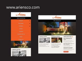
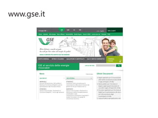
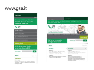
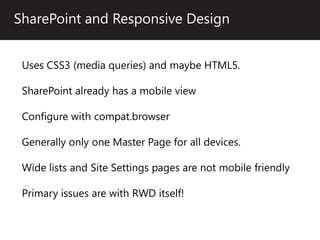
One of the hottest topics in Web Design over the last few years has been Responsive Web Design (RWD). The theory of one site structure for current web devices, including tablets and smartphones, has also attracted SharePoint developers, but the complexity of RWD has been a stumbling block. In this session we will start with an overview of what is Responsive Web Design followed by an in-depth look into the pros and cons of applying a responsive design on SharePoint. We will then dive into the code and learn how to create a SharePoint site that is both responsive and attractive. We will finish with a look at SharePoint 2013 and Device Channels, and review how Responsive Web Design can play a role in current and future SharePoint Branding projects. Session Take-aways: Building off what was learned in the previous session, Branding SharePoint for Evolving Internet Devices, this session is geared towards web developers, programmers and IT to learn "how" to code for modern Internet devices. Attendees will have been exposed to not only what Responsive Web Design is and how it functions, but also how to apply it directly to SharePoint. As with all techniques, there are pros and cons to Responsive Web Design, not only in general but also how it is applied to, and utilized by SharePoint. After a thorough review and multiple demos attendees will have seen the code and learned what to expect. Finally attendees will learn how SharePoint 2013 handles mobile computing and how Responsive Web Design can help solve SharePoint 2013's mobile computing shortcomings. Highlights: Find out what the hot web design topic Response Web Design is all about. See how to utilize Response Web Design in your SharePoint project. Learn how to leverage this knowledge in SharePoint 2013 as well.