
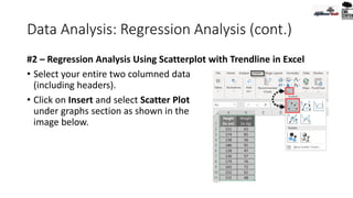
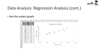
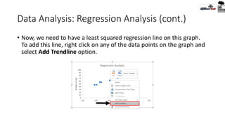
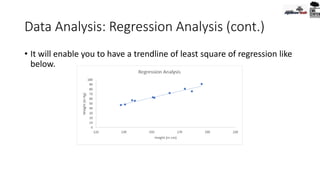
![Today’s Agenda
- Statistics, Hypothesis
- Regression Analysis, Trend Line [Practical x 02]
- T-Test [Practical]
- Solver [Practical]
- Goal Seek [Practical x 02]
- Idea : Z-Test, ANOVA Test, P-Value
- Pivot Table and Interactive Dashboard, Charts [Practical x 02]
- Pivot Table with Open Office Platform
- Dashboard
20-Jul-20
All the contents collected from internet, is mentioned with
sources at the bottom slide
2](https://image.slidesharecdn.com/basicdataanalysisforsmeusingmsexcelday-05-200916161723/85/Elementary-Data-Analysis-with-MS-Excel_Day-5-2-320.jpg)


![Pivot Table
• Pivot Meaning:
• According to dictionary: “the central point, pin, or shaft on which a
mechanism turns or oscillates.”
• Meaning in Bengali [According to Google Translate]:
“অপরিহার্য গুরুত্বপূর্য ব্যারি” (!!)](https://image.slidesharecdn.com/basicdataanalysisforsmeusingmsexcelday-05-200916161723/85/Elementary-Data-Analysis-with-MS-Excel_Day-5-59-320.jpg)
![1st Step
• Find all the available properties of the dataset in Word Format.
• Example:
• Number of Rows, Columns
• What is this dataset about [Place, Date, Time]
• Number of Unique Properties of the dataset [columns]
• If there is any missing data
• Sorted/ Curated
• Objective of the analysis](https://image.slidesharecdn.com/basicdataanalysisforsmeusingmsexcelday-05-200916161723/85/Elementary-Data-Analysis-with-MS-Excel_Day-5-61-320.jpg)
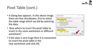
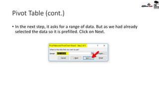
![Pivot Table in Libre Office [Open Office]
To create a Pivot Table in Open Office (Calc):
• Select only one cell from your data.
• Choose the Insert Pivot Table
command from the main menu or
click the from the Standard toolbar.
• Calc automatically selects all the
cells and opens the Select Source
dialog.
• Click OK to continue](https://image.slidesharecdn.com/basicdataanalysisforsmeusingmsexcelday-05-200916161723/85/Elementary-Data-Analysis-with-MS-Excel_Day-5-83-320.jpg)
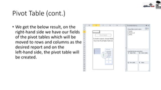
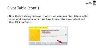
![Pivot Table in Libre Office [Open Office]
• In the Pivot Table Layout Dialog
you set up the pivot table.
• In general you drag fields from
the Available Fields pane to the
other white areas.](https://image.slidesharecdn.com/basicdataanalysisforsmeusingmsexcelday-05-200916161723/85/Elementary-Data-Analysis-with-MS-Excel_Day-5-84-320.jpg)
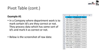
![Pivot Table in Libre Office [Open Office]
• Drag the employee field to the Row fields are and the sales field to
the Data Fields area and click OK.](https://image.slidesharecdn.com/basicdataanalysisforsmeusingmsexcelday-05-200916161723/85/Elementary-Data-Analysis-with-MS-Excel_Day-5-85-320.jpg)
![Pivot Table in Libre Office [Open Office]
• The pivot table is created in a new sheet. Now we get a summary of
the sum of sales for each employee.](https://image.slidesharecdn.com/basicdataanalysisforsmeusingmsexcelday-05-200916161723/85/Elementary-Data-Analysis-with-MS-Excel_Day-5-86-320.jpg)
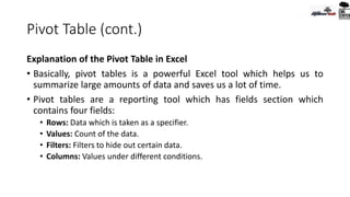
![Pivot Table in Libre Office [Open Office]
Pivot Table Layout
• The layout of the pivot table is divided into 4 parts: Rows, Columns,
Data and Page. If you understand the layout you will be able to create
more complex pivot tables and extract important information from
your data.](https://image.slidesharecdn.com/basicdataanalysisforsmeusingmsexcelday-05-200916161723/85/Elementary-Data-Analysis-with-MS-Excel_Day-5-87-320.jpg)
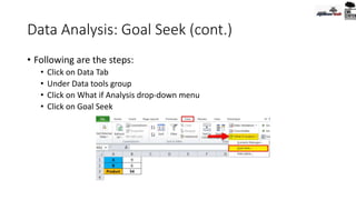
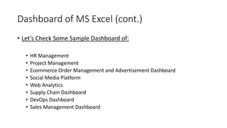
![Dashboard of MS Excel (cont.)
• General steps of making Dashboard in MS Excel:
• Sourcing/ Jotting the raw data / dataset
• Create Excel Dashboard file/ Sheet
• Sort and sync data in tabular format
• Analyze the Data using the tools [pivot/table/validation/range/chart/macro…]
• Build the Dashboard [Interactive Charts, Pivot Table-Charts]
• Customization [Color, Interpretation, Macro, representation]](https://image.slidesharecdn.com/basicdataanalysisforsmeusingmsexcelday-05-200916161723/85/Elementary-Data-Analysis-with-MS-Excel_Day-5-91-320.jpg)


The document provides a comprehensive overview of elementary data analysis using MS Excel, covering topics such as statistics, hypothesis testing, regression analysis, t-tests, solvers, and goal seeks. It explains various statistical methods and their applications in manufacturing and data evaluation, as well as practical steps for utilizing Excel tools to perform these analyses. The content is sourced from the internet and aims to facilitate an understanding of data analysis techniques for effective decision-making.


![Road to 4th Industrial Revolution [for NDC Science Club]](https://cdn.slidesharecdn.com/ss_thumbnails/roadto4thirndc12mar22-220311194333-thumbnail.jpg?width=640&height=640&fit=bounds)


