SlideShare a Scribd company logo
Alice McIntosh
 AS Media Studies
    Evaluation
1. In what ways does your media product
   use, develop or challenge forms and
   conventions of real media products?
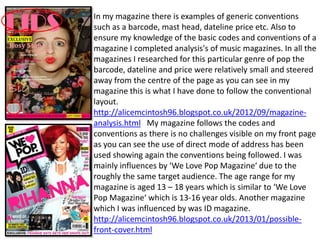
In my magazine there is examples of generic conventions
such as a barcode, mast head, dateline price etc. Also to
ensure my knowledge of the basic codes and conventions of a
magazine I completed analysis's of music magazines. In all the
magazines I researched for this particular genre of pop the
barcode, dateline and price were relatively small and steered
away from the centre of the page as you can see in my
magazine this is what I have done to follow the conventional
layout.
http://alicemcintosh96.blogspot.co.uk/2012/09/magazine-
analysis.html My magazine follows the codes and
conventions as there is no challenges visible on my front page
as you can see the use of direct mode of address has been
used showing again the conventions being followed. I was
mainly influences by ‘We Love Pop Magazine‘ due to the
roughly the same target audience. The age range for my
magazine is aged 13 – 18 years which is similar to ‘We Love
Pop Magazine‘ which is 13-16 year olds. Another magazine
which I was influenced by was ID magazine.
http://alicemcintosh96.blogspot.co.uk/2013/01/possible-
front-cover.html
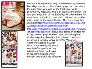
My contents page has mainly be influenced by ‘We Love
Pop Magazine’ as on the contents page the cover star is
the main focus who was on the front cover which is
shown in my magazine. This is an example I found in ‘ we
love pop magazine’ of The Saturdays who were the main
cover stars on the front cover and continued to stay the
main image on the contents page. There are also other
exampleshttp://alicemcintosh96.blogspot.co.uk/2012/1
1/analysis-for-front-coverof-status.html
http://alicemcintosh96.blogspot.co.uk/2012/11/analysis
-of-contents-page.html I have also added an editors not
to my contents page as when I was researching into
similar magazines I realised that this was constantly
occurring, especially in ‘We Love Pop Magazine’.
Another magazine in which
I was influenced by the layout
was ‘Mizz’ magazine as they
advertised there front cover
in the contents page which I
thought was useful and effective.
My double page spread was mainly influenced by ‘We
                                      Love Pop’ Magazine, both the layout and the language. I
                                      particularly like the layout with the article on the left
                                      hand side and the cover star posing on the right which I
                                      think suits my demographic as there is not awful lot of
                                      writing which could be off putting towards the target
                                      audience which is relatively young. I have also
                                      highlighted her name at the top of the page and used a
                                      quote from the article as the heading which as you cans
                                      see has been used in ‘We Love Pop Magazine’ There
                                      many magazines that I researched into to write my
                                      article mainly ‘Top of The Pops’ Magazine, I realised that
                                      the language had to be simple and chatty as complex
                                      words would be off putting to read. I also found that in
                                      many there were interviews with the cover star not just
Have you ever been in love?           a load of information written up as I felt this would hold
[laughs] ‘I have never been in        a stronger connection between the cover star and
love with someone but I can say I
have had relationships where I        audience if it was the cover star actually answering the
have loved and cared for that         questions. I found when reading magazines especially
person but its everything has just    ‘Mizz’ magazine hat during the interview when the cover
became so hectic and crazy there is
literally no time and it would be     star laughed or used their body language it would be
silly to consider a relationship      written in brackets to help the audience visualise
now.’                                 actually being there.
2. How does your media product represent
        particular social groups?
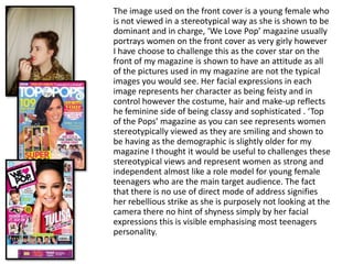
The image used on the front cover is a young female who
is not viewed in a stereotypical way as she is shown to be
dominant and in charge, ‘We Love Pop’ magazine usually
portrays women on the front cover as very girly however
I have choose to challenge this as the cover star on the
front of my magazine is shown to have an attitude as all
of the pictures used in my magazine are not the typical
images you would see. Her facial expressions in each
image represents her character as being feisty and in
control however the costume, hair and make-up reflects
he feminine side of being classy and sophisticated . ‘Top
of the Pops’ magazine as you can see represents women
stereotypically viewed as they are smiling and shown to
be having as the demographic is slightly older for my
magazine I thought it would be useful to challenges these
stereotypical views and represent women as strong and
independent almost like a role model for young female
teenagers who are the main target audience. The fact
that there is no use of direct mode of address signifies
her rebellious strike as she is purposely not looking at the
camera there no hint of shyness simply by her facial
expressions this is visible emphasising most teenagers
personality.
3. What kind of media institution might
distribute your media product and why?
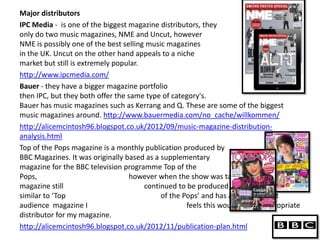
Major distributors
IPC Media - is one of the biggest magazine distributors, they
only do two music magazines, NME and Uncut, however
NME is possibly one of the best selling music magazines
in the UK. Uncut on the other hand appeals to a niche
market but still is extremely popular.
http://www.ipcmedia.com/
Bauer - they have a bigger magazine portfolio
then IPC, but they both offer the same type of category's.
Bauer has music magazines such as Kerrang and Q. These are some of the biggest
music magazines around. http://www.bauermedia.com/no_cache/willkommen/
http://alicemcintosh96.blogspot.co.uk/2012/09/music-magazine-distribution-
analysis.html
Top of the Pops magazine is a monthly publication produced by
BBC Magazines. It was originally based as a supplementary
magazine for the BBC television programme Top of the
Pops,                             however when the show was taken off air, the
magazine still                         continued to be produced. As my magazine is
similar to ‘Top                             of the Pops’ and has a similar target
audience magazine I                                 feels this would be the appropriate
distributor for my magazine.
http://alicemcintosh96.blogspot.co.uk/2012/11/publication-plan.html
4. Who would be the audience for your media
                 product?
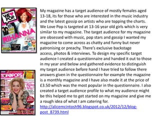
My magazine has a target audience of mostly females aged
13-18, its for those who are interested in the music industry
and the latest gossip on artists who are topping the charts.
We Love Pop is targeted at 13-16 year old girls which is very
similar to my magazine. The target audience for my magazine
are obsessed with music, pop stars and gossip I wanted my
magazine to come across as chatty and funny but never
patronising or preachy. There’s exclusive backstage
access, photos & interviews. To design my specific target
audience I created a questionnaire and handed it out to those
in my year and below and gathered evidence to distinguish
my target audience before hand I have tried to follow there
answers given in the questionnaire for example the magazine
is a monthly magazine and I have also made it at the price of
£3.50 which was the most popular in the questionnaire. I also
created a target audience profile to what my audience might
be this helped me to get started on my magazine and give me
a rough idea of what I am catering for.
http://alicemcintosh96.blogspot.co.uk/2012/12/blog-
post_8739.html
5. How did you attract/address your audience?
Colours
The main colour that I have chosen through out my magazine is pink as the target
audience is mainly females I felt this was an appropriate colour and suitable as it
displays a girl feminine side to the magazine. However there is other uses of
colours such as yellow and black, I used these combination of colours to highlight
and exclusive in the magazine to indicate an importance.
CoverLines
Cover lines are one of the main aspects in the magazine as they offer information
of what is going to be included in the magazine therefore I had to think carefully
and choose the most suitable for my target audience, as the magazine is mainly
aimed at women I choose the specific cover line ‘Women can rap’ as I felt this
really stands up for women rappers who are stereotypically viewed as not very
good and males outnumbering them. I felt by displaying this gives young female
rappers who are interested in the music industry a female rapper to look up to.
Pictures
My first attempt of original photography showed to lack of good quality due to
the camera that the images were taken on did not have a flash, therefore I had to
repeat this task with a camera that did have a flash.
http://alicemcintosh96.blogspot.co.uk/2012_12_01_archive.html
I wanted to convey a strong, independent look as I wanted the readers to look up
to the cover star as a role model who they can take inspiration from. The images
that are shown in the magazine are not very girly like showing a rebellious
attitude as I felt that teenagers were more able to connect with this type of
attitude however still showing her sophisticated look through here clothing.
http://alicemcintosh96.blogspot.co.uk/2013/01/images.html
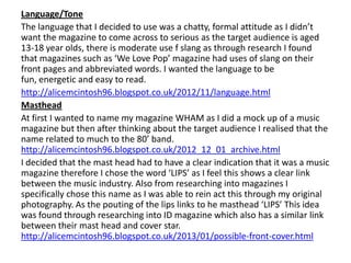
Language/Tone
The language that I decided to use was a chatty, formal attitude as I didn’t
want the magazine to come across to serious as the target audience is aged
13-18 year olds, there is moderate use f slang as through research I found
that magazines such as ‘We Love Pop’ magazine had uses of slang on their
front pages and abbreviated words. I wanted the language to be
fun, energetic and easy to read.
http://alicemcintosh96.blogspot.co.uk/2012/11/language.html
Masthead
At first I wanted to name my magazine WHAM as I did a mock up of a music
magazine but then after thinking about the target audience I realised that the
name related to much to the 80’ band.
http://alicemcintosh96.blogspot.co.uk/2012_12_01_archive.html
I decided that the mast head had to have a clear indication that it was a music
magazine therefore I chose the word ‘LIPS’ as I feel this shows a clear link
between the music industry. Also from researching into magazines I
specifically chose this name as I was able to rein act this through my original
photography. As the pouting of the lips links to he masthead ‘LIPS’ This idea
was found through researching into ID magazine which also has a similar link
between their mast head and cover star.
http://alicemcintosh96.blogspot.co.uk/2013/01/possible-front-cover.html
6. What have you learnt about technologies
from the process of constructing the product?
The main programme that I used was paint.net this was specifically used to
edit my images, and neaten them up more to make them look more
proficient.
Strengths
• It is very easy to discard the background by using the magic wand, this was
   also relatively easy to get to grips with considering I had never used the
   software before
http://alicemcintosh96.blogspot.co.uk/2013/01/draft_8.html
• Another strength was the amount of effects that was included on the
   software as you were able to highlight the image using a variety of colours
   even though I didn’t use this n my magazine I found it useful to
   experiment with.
Weaknesses
• If you have never used the software before in which case I was in that
   position it is hard to learn how to work the soft ware for it to benefit your
   work
• On lots of occasions I had to restart my computer as errors kept occurring
   of not enough memory available.
• It is also easy to use to much editing and cut of half of the image which
   does not look very good as it is very visible.
Publisher
Another software that I used to make my magazine, mainly my
double page spread was publisher. This was much easier to use
as I was able to work on two pages instead of two single pages
on paint.net. The main advantage that think publisher has is it
is very easy to use and work with, its very easy to edit your
text and images with out the hassle of inserting a new layer.
Also by using the preview button you are able to look at you
work and see how well it looks and any improvement needed
to be done.
However there is also a disadvantage using publisher which is
mainly that it does not have the amount of editing effects that
are included on paint.net.
Blogger
The other main programme that we had to use was blogger to
upload our research it was very easy again to use as you were
able to change your posts if you changed your mind or delete
previous ones. Never the less time management was a big
issue for me as you could not insert a blog between dates
therefore time management had to be accurate.
7. Looking back to your preliminary task, what
    do you feel that you have learnt in the
    progression from it to the full product?
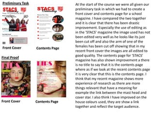
Preliminary Task                   At the start of the course we were all given our
                                   preliminary task in which we had to create a
                                   front cover and contents page for a school
                                   magazine. I have compared the two together
                                   and it is clear that there has been drastic
                                   improvement. Especially the use of editing as
                                   in the ‘STACS’ magazine the image used has not
                                   been edited very well as he looks like its just
                                   been cut off and also the arm of one of the
Front Cover                        females has been cut off showing that in my
                   Contents Page
                                   recent front cover the images are all edited to
                                   good quality. The contents page for ‘STACS’
Final Proof
                                   magazine has also shown improvement a there
                                   is no title to say that it is the contents page
                                   where as if we look at the recent contents page
                                   it is very clear that this is the contents page. I
                                   think that my recent magazine shows more
                                   experience of research as there are more
                                   things relevant that have a meaning for
                                   example the link between the mast head and
                                   cover star. I also think I have improved on the
Front Cover        Contents Page   house colours used, they are show a link
                                   together and reflect the target audience.
How successful do you feel your end product is
 in fulfilling the task? How well does it fit the
                       brief?
Positives
• I really like the fact that I was able to come up with the mast head a show a clear
    indication that there is a link between the cover star and the mast head through her
    facial expressions.
• I think that my front cover has had a lot of improvement from my first proof , as the
    colours are consistent through out and the final image I used shows hat it is a music
    magazine.
• The cover lines included are appropriate and show how dedicated the magazine is to
    music.
Negatives
• My weakness for me would be my contents page as I feel the main image has been
    enlarged to much however this shows the main cover star is the centre of the magazine.
• Another weakness would be my double page spread as I would of liked to of added
    more colours on to the double page spread as mot magazines I have researched have
    used vibrant colours throughout.
• Also I would of like to include more images through out the magazine as I thing the
    target audience will more enticed to looking at pictures rather than reading lots of text.
Over all I think have followed the codes and conventions of a music magazine sufficiently
well as it is clear and obvious on the particular genre of a music magazine of pop. There is
consistency through out on the house colours and fonts used. I have researched into similar
magazines and reinforced this into my own magazine. I think that the original photography
that I have used works well with the magazine challenging the typical views on women
being advertised in magazines.

More Related Content

What's hot

Evaluation of my music magazine
Evaluation of my music magazineEvaluation of my music magazine
Evaluation of my music magazinepopolopi
 
In what ways does your media product use, develop or challenge forms and conv...
In what ways does your media product use, develop or challenge forms and conv...In what ways does your media product use, develop or challenge forms and conv...
In what ways does your media product use, develop or challenge forms and conv...
charlotte_abbott
 
evaluation - question 5
evaluation - question 5evaluation - question 5
evaluation - question 5sophiebellexox
 
Research and Planning
Research and Planning Research and Planning
Research and Planning
charlotte_abbott
 
Megan Howarth media AS evaluation
Megan Howarth  media AS evaluationMegan Howarth  media AS evaluation
Megan Howarth media AS evaluationablizz
 
Evaluation 2
Evaluation 2Evaluation 2
Evaluation 2chloegs
 
Question 5 how did you attarct address your audience
Question 5 how did you attarct address your audienceQuestion 5 how did you attarct address your audience
Question 5 how did you attarct address your audiencesapphire29
 
Evaluation Question 1
Evaluation Question 1Evaluation Question 1
Evaluation Question 1stephdagg
 
Media studies magazine evaluation
Media studies   magazine evaluationMedia studies   magazine evaluation
Media studies magazine evaluationjessiemc
 
Shannon Haines' evaluation
Shannon Haines' evaluationShannon Haines' evaluation
Shannon Haines' evaluationmrsmwlms
 
Audience Feedback
Audience FeedbackAudience Feedback
Audience Feedback
MrsHouseLND
 
Questio 5
Questio 5Questio 5
Questio 5
oliviagracexx99
 
Questio 5
Questio 5Questio 5
Questio 5
oliviadoug
 
Evaluation questions
Evaluation questions Evaluation questions
Evaluation questions Emmafoley123
 

What's hot (18)

Evaluation of my music magazine
Evaluation of my music magazineEvaluation of my music magazine
Evaluation of my music magazine
 
In what ways does your media product use, develop or challenge forms and conv...
In what ways does your media product use, develop or challenge forms and conv...In what ways does your media product use, develop or challenge forms and conv...
In what ways does your media product use, develop or challenge forms and conv...
 
evaluation - question 5
evaluation - question 5evaluation - question 5
evaluation - question 5
 
Research and Planning
Research and Planning Research and Planning
Research and Planning
 
Megan Howarth media AS evaluation
Megan Howarth  media AS evaluationMegan Howarth  media AS evaluation
Megan Howarth media AS evaluation
 
Evaluation 2
Evaluation 2Evaluation 2
Evaluation 2
 
Evalutation
EvalutationEvalutation
Evalutation
 
Music mag evaluation
Music mag evaluationMusic mag evaluation
Music mag evaluation
 
Question 5 how did you attarct address your audience
Question 5 how did you attarct address your audienceQuestion 5 how did you attarct address your audience
Question 5 how did you attarct address your audience
 
Evaluation Question 1
Evaluation Question 1Evaluation Question 1
Evaluation Question 1
 
Media studies magazine evaluation
Media studies   magazine evaluationMedia studies   magazine evaluation
Media studies magazine evaluation
 
Shannon Haines' evaluation
Shannon Haines' evaluationShannon Haines' evaluation
Shannon Haines' evaluation
 
Audience Feedback
Audience FeedbackAudience Feedback
Audience Feedback
 
Questio 5
Questio 5Questio 5
Questio 5
 
Questio 5
Questio 5Questio 5
Questio 5
 
Evaluation copy
Evaluation copyEvaluation copy
Evaluation copy
 
Evaluation questions
Evaluation questions Evaluation questions
Evaluation questions
 
Questions 1-5
Questions 1-5Questions 1-5
Questions 1-5
 

Viewers also liked

Colegios y Universidades que Ofrecen Cursos Gratuitos en Linea
Colegios y Universidades que Ofrecen Cursos Gratuitos en LineaColegios y Universidades que Ofrecen Cursos Gratuitos en Linea
Colegios y Universidades que Ofrecen Cursos Gratuitos en Linea
masterpnl07
 
History project 8.15.41 pm copy
History project 8.15.41 pm copyHistory project 8.15.41 pm copy
History project 8.15.41 pm copy5pwillia
 
OT Insights Chapter 3
OT Insights Chapter 3OT Insights Chapter 3
OT Insights Chapter 3
OceanTomo
 
20151202 f project
20151202 f project20151202 f project
20151202 f project
崇 押切
 
Blog carnaval 2013
Blog carnaval 2013Blog carnaval 2013
Blog carnaval 2013nacho4653627
 
Economía tema 9 Nicole Szabla
Economía tema 9  Nicole SzablaEconomía tema 9  Nicole Szabla
Economía tema 9 Nicole Szabla
nicoleszabla
 
отруєння,укуси
отруєння,укусиотруєння,укуси
отруєння,укусиlidiagus
 
AIMs Software
AIMs SoftwareAIMs Software
AIMs Software
Ali Oskuie
 
Web2.0/3.0 Vocab
Web2.0/3.0 VocabWeb2.0/3.0 Vocab
Web2.0/3.0 Vocab5agroene
 
Nem tudo o que parece é
Nem tudo o que parece é Nem tudo o que parece é
Nem tudo o que parece é Gabriel Ribeiro
 
A física do diagnóstico com raios
A física do diagnóstico com raiosA física do diagnóstico com raios
A física do diagnóstico com raiosClaudia Sanches
 
Aprendizaje social de bandura
Aprendizaje social de banduraAprendizaje social de bandura
Aprendizaje social de bandura
123alis45
 
alle linee guida per la gestione dei patrimonei arborei pubblici_ALLEGATO_1
 alle linee guida per la gestione dei patrimonei arborei pubblici_ALLEGATO_1 alle linee guida per la gestione dei patrimonei arborei pubblici_ALLEGATO_1
alle linee guida per la gestione dei patrimonei arborei pubblici_ALLEGATO_1
Giovanni Poletti
 
Cancun + Avianca
Cancun + AviancaCancun + Avianca
Cancun + Aviancaelibedoya15
 
Sunat siscont 2007
Sunat siscont 2007Sunat siscont 2007
Sunat siscont 2007Diego Estelo
 
Vocab 6 slides copy
Vocab 6 slides copyVocab 6 slides copy
Vocab 6 slides copy5mgodfre
 
Echinoderms
EchinodermsEchinoderms
Echinoderms
Nur Syifa Fauziah
 

Viewers also liked (20)

Colegios y Universidades que Ofrecen Cursos Gratuitos en Linea
Colegios y Universidades que Ofrecen Cursos Gratuitos en LineaColegios y Universidades que Ofrecen Cursos Gratuitos en Linea
Colegios y Universidades que Ofrecen Cursos Gratuitos en Linea
 
History project 8.15.41 pm copy
History project 8.15.41 pm copyHistory project 8.15.41 pm copy
History project 8.15.41 pm copy
 
OT Insights Chapter 3
OT Insights Chapter 3OT Insights Chapter 3
OT Insights Chapter 3
 
Evaluation Q1
Evaluation Q1Evaluation Q1
Evaluation Q1
 
20151202 f project
20151202 f project20151202 f project
20151202 f project
 
Blog carnaval 2013
Blog carnaval 2013Blog carnaval 2013
Blog carnaval 2013
 
Economía tema 9 Nicole Szabla
Economía tema 9  Nicole SzablaEconomía tema 9  Nicole Szabla
Economía tema 9 Nicole Szabla
 
Eritro intro01
Eritro intro01Eritro intro01
Eritro intro01
 
отруєння,укуси
отруєння,укусиотруєння,укуси
отруєння,укуси
 
AIMs Software
AIMs SoftwareAIMs Software
AIMs Software
 
Cuadernillo24
Cuadernillo24Cuadernillo24
Cuadernillo24
 
Web2.0/3.0 Vocab
Web2.0/3.0 VocabWeb2.0/3.0 Vocab
Web2.0/3.0 Vocab
 
Nem tudo o que parece é
Nem tudo o que parece é Nem tudo o que parece é
Nem tudo o que parece é
 
A física do diagnóstico com raios
A física do diagnóstico com raiosA física do diagnóstico com raios
A física do diagnóstico com raios
 
Aprendizaje social de bandura
Aprendizaje social de banduraAprendizaje social de bandura
Aprendizaje social de bandura
 
alle linee guida per la gestione dei patrimonei arborei pubblici_ALLEGATO_1
 alle linee guida per la gestione dei patrimonei arborei pubblici_ALLEGATO_1 alle linee guida per la gestione dei patrimonei arborei pubblici_ALLEGATO_1
alle linee guida per la gestione dei patrimonei arborei pubblici_ALLEGATO_1
 
Cancun + Avianca
Cancun + AviancaCancun + Avianca
Cancun + Avianca
 
Sunat siscont 2007
Sunat siscont 2007Sunat siscont 2007
Sunat siscont 2007
 
Vocab 6 slides copy
Vocab 6 slides copyVocab 6 slides copy
Vocab 6 slides copy
 
Echinoderms
EchinodermsEchinoderms
Echinoderms
 

Similar to Alice macca media

As media portfolio powerpoint
As media portfolio powerpointAs media portfolio powerpoint
As media portfolio powerpointCharlotte
 
Emma whitehand 2
Emma whitehand 2Emma whitehand 2
Emma whitehand 2afrench14
 
Evaluation question 1
Evaluation question 1Evaluation question 1
Evaluation question 1jodiea
 
Inwhatwaysdoesyourproductuse 160315165700
Inwhatwaysdoesyourproductuse 160315165700Inwhatwaysdoesyourproductuse 160315165700
Inwhatwaysdoesyourproductuse 160315165700
sofiahowarth22
 
Sofia1234x2
Sofia1234x2Sofia1234x2
Sofia1234x2
sofiahowarth22
 
Media Evaluationdd
Media EvaluationddMedia Evaluationdd
Media Evaluationddguest11ad11d
 
Emma whitehand
Emma whitehandEmma whitehand
Emma whitehandafrench14
 
Media Studies Presentation
Media Studies PresentationMedia Studies Presentation
Media Studies Presentation
Swoobat
 
Media evaluation presentation
Media evaluation presentationMedia evaluation presentation
Media evaluation presentationmuminab
 
Media evaluation presentation
Media evaluation presentationMedia evaluation presentation
Media evaluation presentationmuminab
 
Media evaluation (2)
Media evaluation (2)Media evaluation (2)
Media evaluation (2)maisie123
 
Media evaluation (2)
Media evaluation (2)Media evaluation (2)
Media evaluation (2)maisie123
 
Evaluation 1: In what way does my media product use, develop or challenge the...
Evaluation 1: In what way does my media product use, develop or challenge the...Evaluation 1: In what way does my media product use, develop or challenge the...
Evaluation 1: In what way does my media product use, develop or challenge the...erinmillerr
 
Emma whitehand
Emma whitehandEmma whitehand
Emma whitehandafrench14
 

Similar to Alice macca media (20)

As media portfolio powerpoint
As media portfolio powerpointAs media portfolio powerpoint
As media portfolio powerpoint
 
Evaluation – question_1
Evaluation – question_1Evaluation – question_1
Evaluation – question_1
 
Emma whitehand 2
Emma whitehand 2Emma whitehand 2
Emma whitehand 2
 
Evaluation question 1
Evaluation question 1Evaluation question 1
Evaluation question 1
 
Media
MediaMedia
Media
 
Inwhatwaysdoesyourproductuse 160315165700
Inwhatwaysdoesyourproductuse 160315165700Inwhatwaysdoesyourproductuse 160315165700
Inwhatwaysdoesyourproductuse 160315165700
 
Sofia1234x2
Sofia1234x2Sofia1234x2
Sofia1234x2
 
Media Evaluationdd
Media EvaluationddMedia Evaluationdd
Media Evaluationdd
 
1
11
1
 
1
11
1
 
Emma whitehand
Emma whitehandEmma whitehand
Emma whitehand
 
Media Studies Presentation
Media Studies PresentationMedia Studies Presentation
Media Studies Presentation
 
Wham!
Wham!Wham!
Wham!
 
Media evaluation presentation
Media evaluation presentationMedia evaluation presentation
Media evaluation presentation
 
Media evaluation presentation
Media evaluation presentationMedia evaluation presentation
Media evaluation presentation
 
Media evaluation (2)
Media evaluation (2)Media evaluation (2)
Media evaluation (2)
 
Media evaluation (2)
Media evaluation (2)Media evaluation (2)
Media evaluation (2)
 
Evaluation 1: In what way does my media product use, develop or challenge the...
Evaluation 1: In what way does my media product use, develop or challenge the...Evaluation 1: In what way does my media product use, develop or challenge the...
Evaluation 1: In what way does my media product use, develop or challenge the...
 
Emma whitehand
Emma whitehandEmma whitehand
Emma whitehand
 
One.
One.One.
One.
 

Alice macca media

  • 1. Alice McIntosh AS Media Studies Evaluation
  • 2. 1. In what ways does your media product use, develop or challenge forms and conventions of real media products?
  • 3. In my magazine there is examples of generic conventions such as a barcode, mast head, dateline price etc. Also to ensure my knowledge of the basic codes and conventions of a magazine I completed analysis's of music magazines. In all the magazines I researched for this particular genre of pop the barcode, dateline and price were relatively small and steered away from the centre of the page as you can see in my magazine this is what I have done to follow the conventional layout. http://alicemcintosh96.blogspot.co.uk/2012/09/magazine- analysis.html My magazine follows the codes and conventions as there is no challenges visible on my front page as you can see the use of direct mode of address has been used showing again the conventions being followed. I was mainly influences by ‘We Love Pop Magazine‘ due to the roughly the same target audience. The age range for my magazine is aged 13 – 18 years which is similar to ‘We Love Pop Magazine‘ which is 13-16 year olds. Another magazine which I was influenced by was ID magazine. http://alicemcintosh96.blogspot.co.uk/2013/01/possible- front-cover.html
  • 4. My contents page has mainly be influenced by ‘We Love Pop Magazine’ as on the contents page the cover star is the main focus who was on the front cover which is shown in my magazine. This is an example I found in ‘ we love pop magazine’ of The Saturdays who were the main cover stars on the front cover and continued to stay the main image on the contents page. There are also other exampleshttp://alicemcintosh96.blogspot.co.uk/2012/1 1/analysis-for-front-coverof-status.html http://alicemcintosh96.blogspot.co.uk/2012/11/analysis -of-contents-page.html I have also added an editors not to my contents page as when I was researching into similar magazines I realised that this was constantly occurring, especially in ‘We Love Pop Magazine’. Another magazine in which I was influenced by the layout was ‘Mizz’ magazine as they advertised there front cover in the contents page which I thought was useful and effective.
  • 5. My double page spread was mainly influenced by ‘We Love Pop’ Magazine, both the layout and the language. I particularly like the layout with the article on the left hand side and the cover star posing on the right which I think suits my demographic as there is not awful lot of writing which could be off putting towards the target audience which is relatively young. I have also highlighted her name at the top of the page and used a quote from the article as the heading which as you cans see has been used in ‘We Love Pop Magazine’ There many magazines that I researched into to write my article mainly ‘Top of The Pops’ Magazine, I realised that the language had to be simple and chatty as complex words would be off putting to read. I also found that in many there were interviews with the cover star not just Have you ever been in love? a load of information written up as I felt this would hold [laughs] ‘I have never been in a stronger connection between the cover star and love with someone but I can say I have had relationships where I audience if it was the cover star actually answering the have loved and cared for that questions. I found when reading magazines especially person but its everything has just ‘Mizz’ magazine hat during the interview when the cover became so hectic and crazy there is literally no time and it would be star laughed or used their body language it would be silly to consider a relationship written in brackets to help the audience visualise now.’ actually being there.
  • 6. 2. How does your media product represent particular social groups?
  • 7. The image used on the front cover is a young female who is not viewed in a stereotypical way as she is shown to be dominant and in charge, ‘We Love Pop’ magazine usually portrays women on the front cover as very girly however I have choose to challenge this as the cover star on the front of my magazine is shown to have an attitude as all of the pictures used in my magazine are not the typical images you would see. Her facial expressions in each image represents her character as being feisty and in control however the costume, hair and make-up reflects he feminine side of being classy and sophisticated . ‘Top of the Pops’ magazine as you can see represents women stereotypically viewed as they are smiling and shown to be having as the demographic is slightly older for my magazine I thought it would be useful to challenges these stereotypical views and represent women as strong and independent almost like a role model for young female teenagers who are the main target audience. The fact that there is no use of direct mode of address signifies her rebellious strike as she is purposely not looking at the camera there no hint of shyness simply by her facial expressions this is visible emphasising most teenagers personality.
  • 8. 3. What kind of media institution might distribute your media product and why?
  • 9. Major distributors IPC Media - is one of the biggest magazine distributors, they only do two music magazines, NME and Uncut, however NME is possibly one of the best selling music magazines in the UK. Uncut on the other hand appeals to a niche market but still is extremely popular. http://www.ipcmedia.com/ Bauer - they have a bigger magazine portfolio then IPC, but they both offer the same type of category's. Bauer has music magazines such as Kerrang and Q. These are some of the biggest music magazines around. http://www.bauermedia.com/no_cache/willkommen/ http://alicemcintosh96.blogspot.co.uk/2012/09/music-magazine-distribution- analysis.html Top of the Pops magazine is a monthly publication produced by BBC Magazines. It was originally based as a supplementary magazine for the BBC television programme Top of the Pops, however when the show was taken off air, the magazine still continued to be produced. As my magazine is similar to ‘Top of the Pops’ and has a similar target audience magazine I feels this would be the appropriate distributor for my magazine. http://alicemcintosh96.blogspot.co.uk/2012/11/publication-plan.html
  • 10. 4. Who would be the audience for your media product?
  • 11. My magazine has a target audience of mostly females aged 13-18, its for those who are interested in the music industry and the latest gossip on artists who are topping the charts. We Love Pop is targeted at 13-16 year old girls which is very similar to my magazine. The target audience for my magazine are obsessed with music, pop stars and gossip I wanted my magazine to come across as chatty and funny but never patronising or preachy. There’s exclusive backstage access, photos & interviews. To design my specific target audience I created a questionnaire and handed it out to those in my year and below and gathered evidence to distinguish my target audience before hand I have tried to follow there answers given in the questionnaire for example the magazine is a monthly magazine and I have also made it at the price of £3.50 which was the most popular in the questionnaire. I also created a target audience profile to what my audience might be this helped me to get started on my magazine and give me a rough idea of what I am catering for. http://alicemcintosh96.blogspot.co.uk/2012/12/blog- post_8739.html
  • 12. 5. How did you attract/address your audience?
  • 13. Colours The main colour that I have chosen through out my magazine is pink as the target audience is mainly females I felt this was an appropriate colour and suitable as it displays a girl feminine side to the magazine. However there is other uses of colours such as yellow and black, I used these combination of colours to highlight and exclusive in the magazine to indicate an importance. CoverLines Cover lines are one of the main aspects in the magazine as they offer information of what is going to be included in the magazine therefore I had to think carefully and choose the most suitable for my target audience, as the magazine is mainly aimed at women I choose the specific cover line ‘Women can rap’ as I felt this really stands up for women rappers who are stereotypically viewed as not very good and males outnumbering them. I felt by displaying this gives young female rappers who are interested in the music industry a female rapper to look up to. Pictures My first attempt of original photography showed to lack of good quality due to the camera that the images were taken on did not have a flash, therefore I had to repeat this task with a camera that did have a flash. http://alicemcintosh96.blogspot.co.uk/2012_12_01_archive.html I wanted to convey a strong, independent look as I wanted the readers to look up to the cover star as a role model who they can take inspiration from. The images that are shown in the magazine are not very girly like showing a rebellious attitude as I felt that teenagers were more able to connect with this type of attitude however still showing her sophisticated look through here clothing. http://alicemcintosh96.blogspot.co.uk/2013/01/images.html
  • 14. Language/Tone The language that I decided to use was a chatty, formal attitude as I didn’t want the magazine to come across to serious as the target audience is aged 13-18 year olds, there is moderate use f slang as through research I found that magazines such as ‘We Love Pop’ magazine had uses of slang on their front pages and abbreviated words. I wanted the language to be fun, energetic and easy to read. http://alicemcintosh96.blogspot.co.uk/2012/11/language.html Masthead At first I wanted to name my magazine WHAM as I did a mock up of a music magazine but then after thinking about the target audience I realised that the name related to much to the 80’ band. http://alicemcintosh96.blogspot.co.uk/2012_12_01_archive.html I decided that the mast head had to have a clear indication that it was a music magazine therefore I chose the word ‘LIPS’ as I feel this shows a clear link between the music industry. Also from researching into magazines I specifically chose this name as I was able to rein act this through my original photography. As the pouting of the lips links to he masthead ‘LIPS’ This idea was found through researching into ID magazine which also has a similar link between their mast head and cover star. http://alicemcintosh96.blogspot.co.uk/2013/01/possible-front-cover.html
  • 15. 6. What have you learnt about technologies from the process of constructing the product?
  • 16. The main programme that I used was paint.net this was specifically used to edit my images, and neaten them up more to make them look more proficient. Strengths • It is very easy to discard the background by using the magic wand, this was also relatively easy to get to grips with considering I had never used the software before http://alicemcintosh96.blogspot.co.uk/2013/01/draft_8.html • Another strength was the amount of effects that was included on the software as you were able to highlight the image using a variety of colours even though I didn’t use this n my magazine I found it useful to experiment with. Weaknesses • If you have never used the software before in which case I was in that position it is hard to learn how to work the soft ware for it to benefit your work • On lots of occasions I had to restart my computer as errors kept occurring of not enough memory available. • It is also easy to use to much editing and cut of half of the image which does not look very good as it is very visible.
  • 17. Publisher Another software that I used to make my magazine, mainly my double page spread was publisher. This was much easier to use as I was able to work on two pages instead of two single pages on paint.net. The main advantage that think publisher has is it is very easy to use and work with, its very easy to edit your text and images with out the hassle of inserting a new layer. Also by using the preview button you are able to look at you work and see how well it looks and any improvement needed to be done. However there is also a disadvantage using publisher which is mainly that it does not have the amount of editing effects that are included on paint.net. Blogger The other main programme that we had to use was blogger to upload our research it was very easy again to use as you were able to change your posts if you changed your mind or delete previous ones. Never the less time management was a big issue for me as you could not insert a blog between dates therefore time management had to be accurate.
  • 18. 7. Looking back to your preliminary task, what do you feel that you have learnt in the progression from it to the full product?
  • 19. Preliminary Task At the start of the course we were all given our preliminary task in which we had to create a front cover and contents page for a school magazine. I have compared the two together and it is clear that there has been drastic improvement. Especially the use of editing as in the ‘STACS’ magazine the image used has not been edited very well as he looks like its just been cut off and also the arm of one of the Front Cover females has been cut off showing that in my Contents Page recent front cover the images are all edited to good quality. The contents page for ‘STACS’ Final Proof magazine has also shown improvement a there is no title to say that it is the contents page where as if we look at the recent contents page it is very clear that this is the contents page. I think that my recent magazine shows more experience of research as there are more things relevant that have a meaning for example the link between the mast head and cover star. I also think I have improved on the Front Cover Contents Page house colours used, they are show a link together and reflect the target audience.
  • 20. How successful do you feel your end product is in fulfilling the task? How well does it fit the brief?
  • 21. Positives • I really like the fact that I was able to come up with the mast head a show a clear indication that there is a link between the cover star and the mast head through her facial expressions. • I think that my front cover has had a lot of improvement from my first proof , as the colours are consistent through out and the final image I used shows hat it is a music magazine. • The cover lines included are appropriate and show how dedicated the magazine is to music. Negatives • My weakness for me would be my contents page as I feel the main image has been enlarged to much however this shows the main cover star is the centre of the magazine. • Another weakness would be my double page spread as I would of liked to of added more colours on to the double page spread as mot magazines I have researched have used vibrant colours throughout. • Also I would of like to include more images through out the magazine as I thing the target audience will more enticed to looking at pictures rather than reading lots of text. Over all I think have followed the codes and conventions of a music magazine sufficiently well as it is clear and obvious on the particular genre of a music magazine of pop. There is consistency through out on the house colours and fonts used. I have researched into similar magazines and reinforced this into my own magazine. I think that the original photography that I have used works well with the magazine challenging the typical views on women being advertised in magazines.