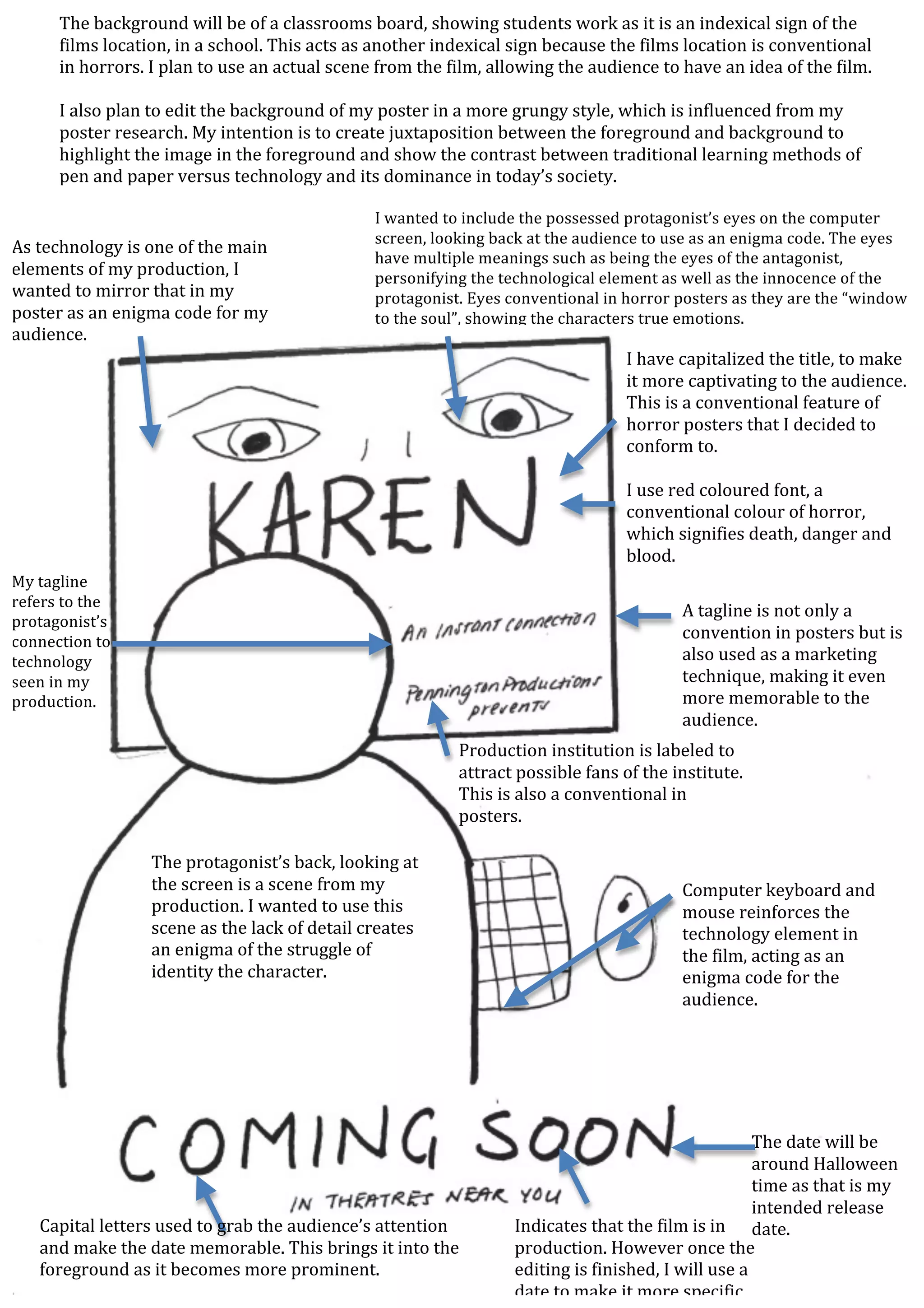
Indicates	
  that	
  the	
  film	
  is	
  in	
  
production.	
  However	
  once	
  the	
  
editing	
  is	
  finished,	
  I	
  will	
  use	
  a	
  
date	
  to	
  make	
  it	
  more	
  specific.	
  
The	
  date	
  will	
  be	
  
around	
  Halloween	
  
time	
  as	
  that	
  is	
  my	
  
intended	
  release	
  
date.	
  	
  Capital	
  letters	
  used	
  to	
  grab	
  the	
  audience’s	
  attention	
  
and	
  make	
  the	
  date	
  memorable.	
  This	
  brings	
  it	
  into	
  the	
  
foreground	
  as	
  it	
  becomes	
  more	
  prominent.	
  
The	
  background	
  will	
  be	
  of	
  a	
  classrooms	
  board,	
  showing	
  students	
  work	
  as	
  it	
  is	
  an	
  indexical	
  sign	
  of	
  the	
  
films	
  location,	
  in	
  a	
  school.	
  This	
  acts	
  as	
  another	
  indexical	
  sign	
  because	
  the	
  films	
  location	
  is	
  conventional	
  
in	
  horrors.	
  I	
  plan	
  to	
  use	
  an	
  actual	
  scene	
  from	
  the	
  film,	
  allowing	
  the	
  audience	
  to	
  have	
  an	
  idea	
  of	
  the	
  film.	


I	
  also	
  plan	
  to	
  edit	
  the	
  background	
  of	
  my	
  poster	
  in	
  a	
  more	
  grungy	
  style,	
  which	
  is	
  influenced	
  from	
  my	
  
poster	
  research.	
  My	
  intention	
  is	
  to	
  create	
  juxtaposition	
  between	
  the	
  foreground	
  and	
  background	
  to	
  
highlight	
  the	
  image	
  in	
  the	
  foreground	
  and	
  show	
  the	
  contrast	
  between	
  traditional	
  learning	
  methods	
  of	
  
pen	
  and	
  paper	
  versus	
  technology	
  and	
  its	
  dominance	
  in	
  today’s	
  society.	
  	
  
Computer	
  keyboard	
  and	
  
mouse	
  reinforces	
  the	
  
technology	
  element	
  in	
  
the	
  film,	
  acting	
  as	
  an	
  
enigma	
  code	
  for	
  the	
  
audience.	
  	
  
The	
  protagonist’s	
  back,	
  looking	
  at	
  
the	
  screen	
  is	
  a	
  scene	
  from	
  my	
  
production.	
  I	
  wanted	
  to	
  use	
  this	
  
scene	
  as	
  the	
  lack	
  of	
  detail	
  creates	
  
an	
  enigma	
  of	
  the	
  struggle	
  of	
  
identity	
  the	
  character.	
  
Production	
  institution	
  is	
  labeled	
  to	
  
attract	
  possible	
  fans	
  of	
  the	
  institute.	
  
This	
  is	
  also	
  a	
  conventional	
  in	
  
posters.	
  
A	
  tagline	
  is	
  not	
  only	
  a	
  
convention	
  in	
  posters	
  but	
  is	
  
also	
  used	
  as	
  a	
  marketing	
  
technique,	
  making	
  it	
  even	
  
more	
  memorable	
  to	
  the	
  
audience.	
  
My	
  tagline	
  
refers	
  to	
  the	
  
protagonist’s	
  
connection	
  to	
  
technology	
  
seen	
  in	
  my	
  
production.	


I	
  have	
  capitalized	
  the	
  title,	
  to	
  make	
  
it	
  more	
  captivating	
  to	
  the	
  audience.	
  
This	
  is	
  a	
  conventional	
  feature	
  of	
  
horror	
  posters	
  that	
  I	
  decided	
  to	
  
conform	
  to.	


I	
  use	
  red	
  coloured	
  font,	
  a	
  
conventional	
  colour	
  of	
  horror,	
  
which	
  signifies	
  death,	
  danger	
  and	
  
blood.	
  
I	
  wanted	
  to	
  include	
  the	
  possessed	
  protagonist’s	
  eyes	
  on	
  the	
  computer	
  
screen,	
  looking	
  back	
  at	
  the	
  audience	
  to	
  use	
  as	
  an	
  enigma	
  code.	
  The	
  eyes	
  
have	
  multiple	
  meanings	
  such	
  as	
  being	
  the	
  eyes	
  of	
  the	
  antagonist,	
  
personifying	
  the	
  technological	
  element	
  as	
  well	
  as	
  the	
  innocence	
  of	
  the	
  
protagonist.	
  Eyes	
  conventional	
  in	
  horror	
  posters	
  as	
  they	
  are	
  the	
  “window	
  
to	
  the	
  soul”,	
  showing	
  the	
  characters	
  true	
  emotions.	
  	
  
As	
  technology	
  is	
  one	
  of	
  the	
  main	
  
elements	
  of	
  my	
  production,	
  I	
  
wanted	
  to	
  mirror	
  that	
  in	
  my	
  
poster	
  as	
  an	
  enigma	
  code	
  for	
  my	
  
audience.	


Draft 1 Poster Analysis

  • 1.
      Indicates  that  the  film  is  in   production.  However  once  the   editing  is  finished,  I  will  use  a   date  to  make  it  more  specific.   The  date  will  be   around  Halloween   time  as  that  is  my   intended  release   date.    Capital  letters  used  to  grab  the  audience’s  attention   and  make  the  date  memorable.  This  brings  it  into  the   foreground  as  it  becomes  more  prominent.   The  background  will  be  of  a  classrooms  board,  showing  students  work  as  it  is  an  indexical  sign  of  the   films  location,  in  a  school.  This  acts  as  another  indexical  sign  because  the  films  location  is  conventional   in  horrors.  I  plan  to  use  an  actual  scene  from  the  film,  allowing  the  audience  to  have  an  idea  of  the  film.       I  also  plan  to  edit  the  background  of  my  poster  in  a  more  grungy  style,  which  is  influenced  from  my   poster  research.  My  intention  is  to  create  juxtaposition  between  the  foreground  and  background  to   highlight  the  image  in  the  foreground  and  show  the  contrast  between  traditional  learning  methods  of   pen  and  paper  versus  technology  and  its  dominance  in  today’s  society.     Computer  keyboard  and   mouse  reinforces  the   technology  element  in   the  film,  acting  as  an   enigma  code  for  the   audience.     The  protagonist’s  back,  looking  at   the  screen  is  a  scene  from  my   production.  I  wanted  to  use  this   scene  as  the  lack  of  detail  creates   an  enigma  of  the  struggle  of   identity  the  character.   Production  institution  is  labeled  to   attract  possible  fans  of  the  institute.   This  is  also  a  conventional  in   posters.   A  tagline  is  not  only  a   convention  in  posters  but  is   also  used  as  a  marketing   technique,  making  it  even   more  memorable  to  the   audience.   My  tagline   refers  to  the   protagonist’s   connection  to   technology   seen  in  my   production.       I  have  capitalized  the  title,  to  make   it  more  captivating  to  the  audience.   This  is  a  conventional  feature  of   horror  posters  that  I  decided  to   conform  to.       I  use  red  coloured  font,  a   conventional  colour  of  horror,   which  signifies  death,  danger  and   blood.   I  wanted  to  include  the  possessed  protagonist’s  eyes  on  the  computer   screen,  looking  back  at  the  audience  to  use  as  an  enigma  code.  The  eyes   have  multiple  meanings  such  as  being  the  eyes  of  the  antagonist,   personifying  the  technological  element  as  well  as  the  innocence  of  the   protagonist.  Eyes  conventional  in  horror  posters  as  they  are  the  “window   to  the  soul”,  showing  the  characters  true  emotions.     As  technology  is  one  of  the  main   elements  of  my  production,  I   wanted  to  mirror  that  in  my   poster  as  an  enigma  code  for  my   audience.