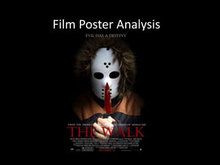
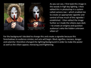
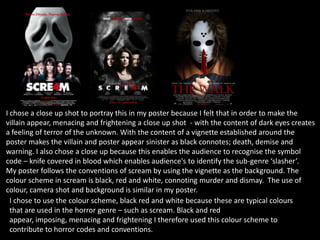
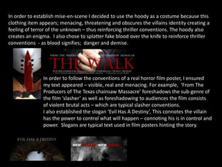
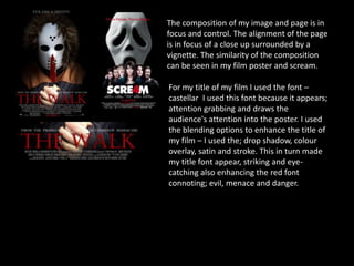
The document analyzes a film poster created by the author. It discusses design choices like using a close-up shot of the villain to create intrigue, applying a vignette to suggest sinister acts, and employing a black, red, and white color scheme common to horror genre posters. Text elements on the poster like production company credits and a slogan are meant to provide context clues about the slasher film's violent and brutal nature. Alignment, composition, and an attention-grabbing title font are aimed to draw the audience's eye to the menacing imagery and reinforce thriller conventions.
