By Michael Bangura
 The complete project consisted of the combination of
my main task and my ancillary texts in which I
exploited other mediums and I utilized them to my
advantage to make all of my products look professional
and it also made it look like it was following
conventions of the Horror Genre. I used other media
technology such as Adobe Fireworks and Wix which is
a website creator to create my ancillary texts.
Theatrical Poster.
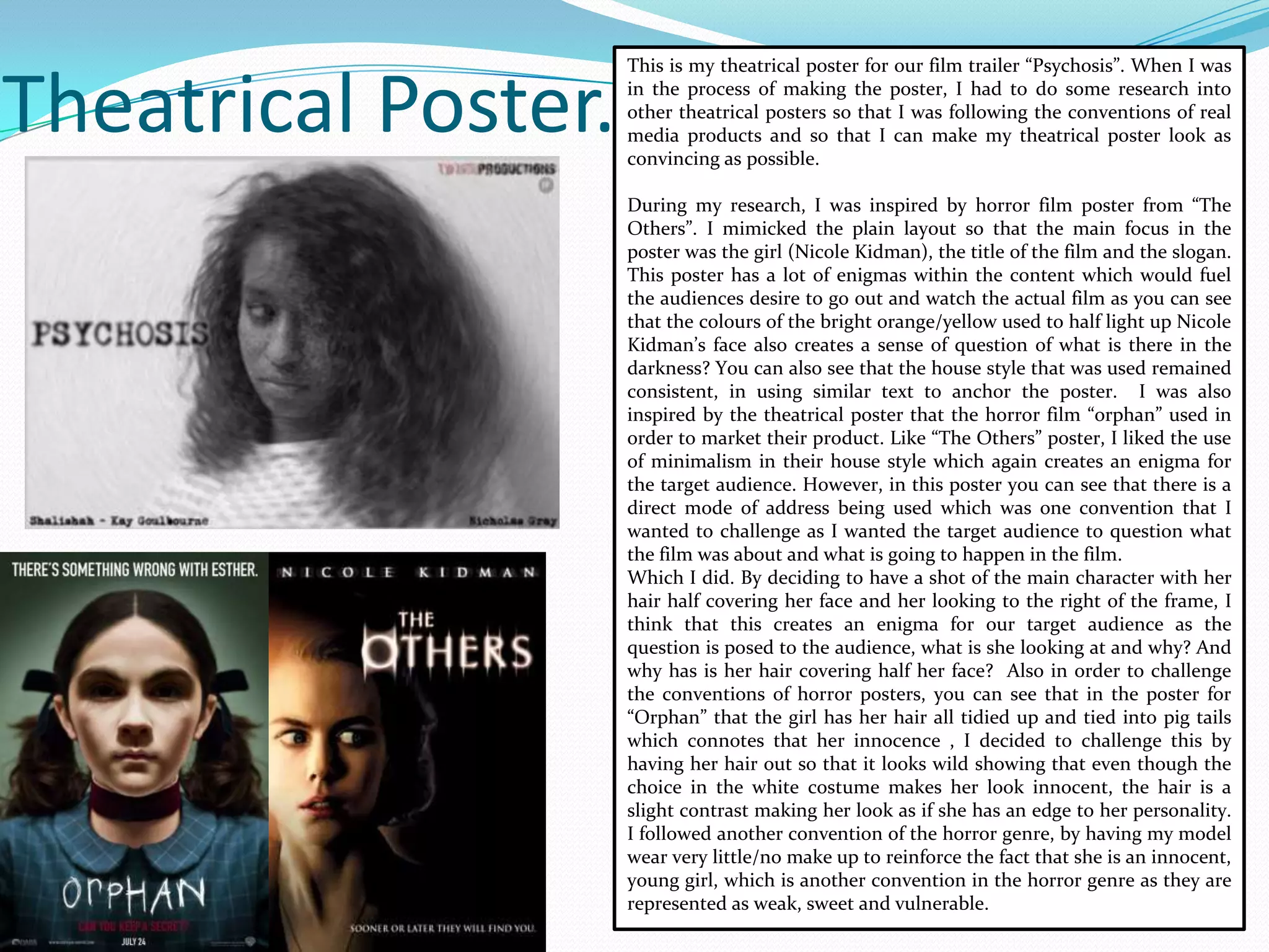
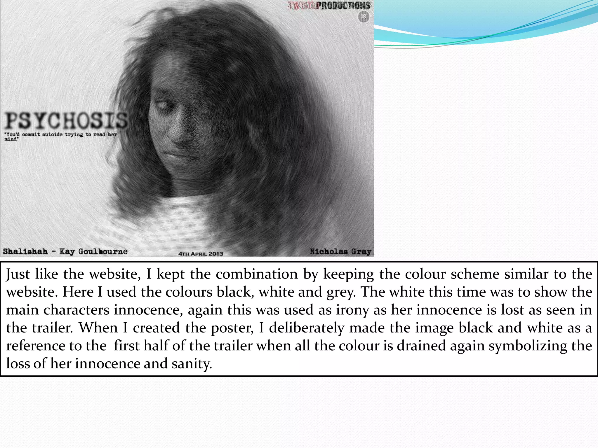
This is my theatrical poster for our film trailer “Psychosis”. When I was
in the process of making the poster, I had to do some research into
other theatrical posters so that I was following the conventions of real
media products and so that I can make my theatrical poster look as
convincing as possible.
During my research, I was inspired by horror film poster from “The
Others”. I mimicked the plain layout so that the main focus in the
poster was the girl (Nicole Kidman), the title of the film and the slogan.
This poster has a lot of enigmas within the content which would fuel
the audiences desire to go out and watch the actual film as you can see
that the colours of the bright orange/yellow used to half light up Nicole
Kidman’s face also creates a sense of question of what is there in the
darkness? You can also see that the house style that was used remained
consistent, in using similar text to anchor the poster. I was also
inspired by the theatrical poster that the horror film “orphan” used in
order to market their product. Like “The Others” poster, I liked the use
of minimalism in their house style which again creates an enigma for
the target audience. However, in this poster you can see that there is a
direct mode of address being used which was one convention that I
wanted to challenge as I wanted the target audience to question what
the film was about and what is going to happen in the film.
Which I did. By deciding to have a shot of the main character with her
hair half covering her face and her looking to the right of the frame, I
think that this creates an enigma for our target audience as the
question is posed to the audience, what is she looking at and why? And
why has is her hair covering half her face? Also in order to challenge
the conventions of horror posters, you can see that in the poster for
“Orphan” that the girl has her hair all tidied up and tied into pig tails
which connotes that her innocence , I decided to challenge this by
having her hair out so that it looks wild showing that even though the
choice in the white costume makes her look innocent, the hair is a
slight contrast making her look as if she has an edge to her personality.
I followed another convention of the horror genre, by having my model
wear very little/no make up to reinforce the fact that she is an innocent,
young girl, which is another convention in the horror genre as they are
represented as weak, sweet and vulnerable.
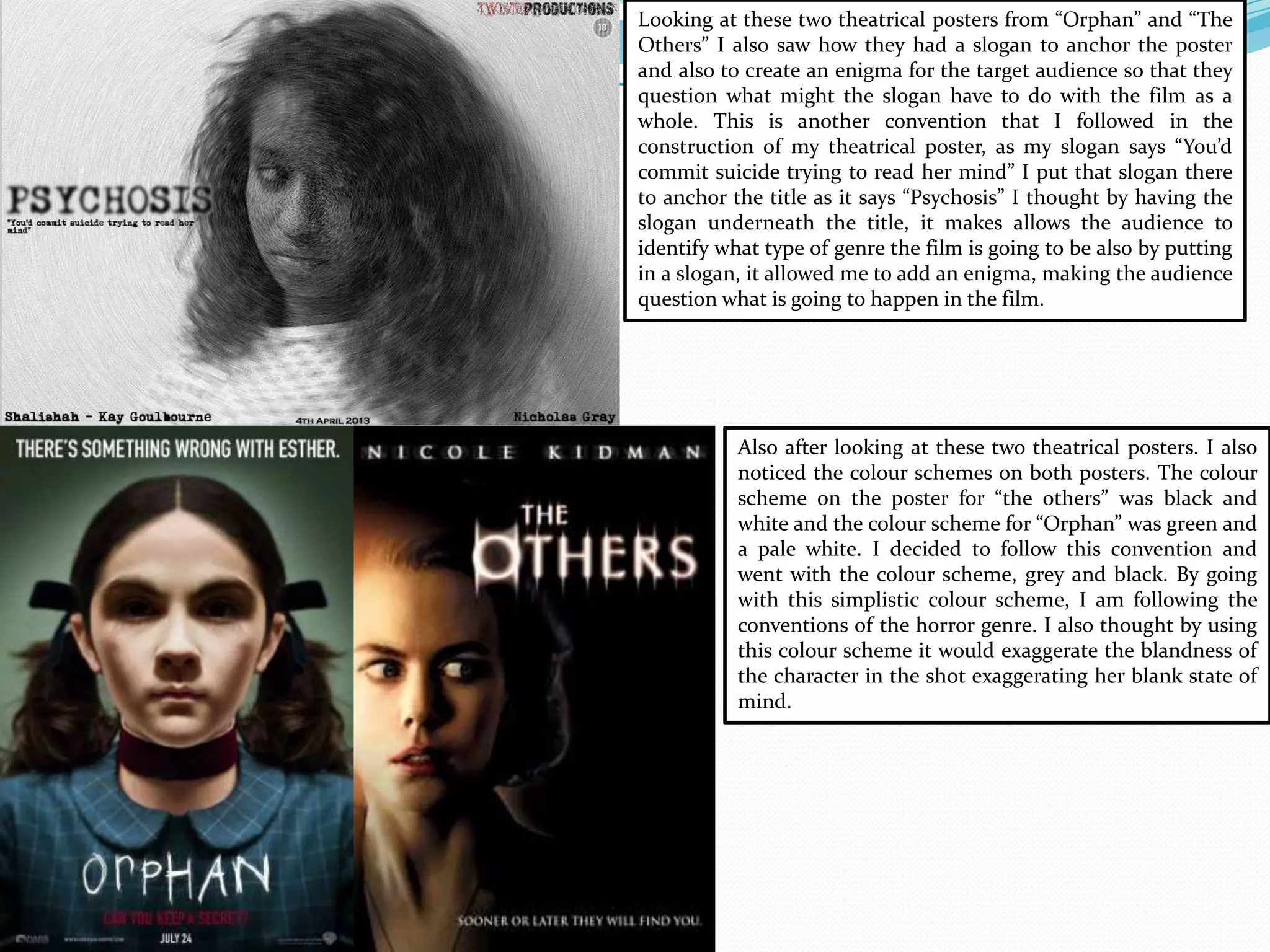
Looking at these two theatrical posters from “Orphan” and “The
Others” I also saw how they had a slogan to anchor the poster
and also to create an enigma for the target audience so that they
question what might the slogan have to do with the film as a
whole. This is another convention that I followed in the
construction of my theatrical poster, as my slogan says “You’d
commit suicide trying to read her mind” I put that slogan there
to anchor the title as it says “Psychosis” I thought by having the
slogan underneath the title, it makes allows the audience to
identify what type of genre the film is going to be also by putting
in a slogan, it allowed me to add an enigma, making the audience
question what is going to happen in the film.
Also after looking at these two theatrical posters. I also
noticed the colour schemes on both posters. The colour
scheme on the poster for “the others” was black and
white and the colour scheme for “Orphan” was green and
a pale white. I decided to follow this convention and
went with the colour scheme, grey and black. By going
with this simplistic colour scheme, I am following the
conventions of the horror genre. I also thought by using
this colour scheme it would exaggerate the blandness of
the character in the shot exaggerating her blank state of
mind.
Website for the Movie.
For the homepage of my website, I looked at other websites for horror
films such as “The Devil Inside where I was inspired by the layout. They
had placed the trailer on the homepage. This may have been so that
when the audience access the website, the trailer will be the first thing
they see, which means that they would inclined to watch the trailer
fuelling their desire to watch the film when it is released. I followed this
convention of websites for horror films by putting the final trailer on
the homepage of the website. This way, it will be the first thing the
target audience sees when they log on the website, which means , just as
the homepage on the devil inside, they may be encouraged to watch the
film trailer and because of the enigmas in the trailer, they may want to
go out and watch the film when it is released.
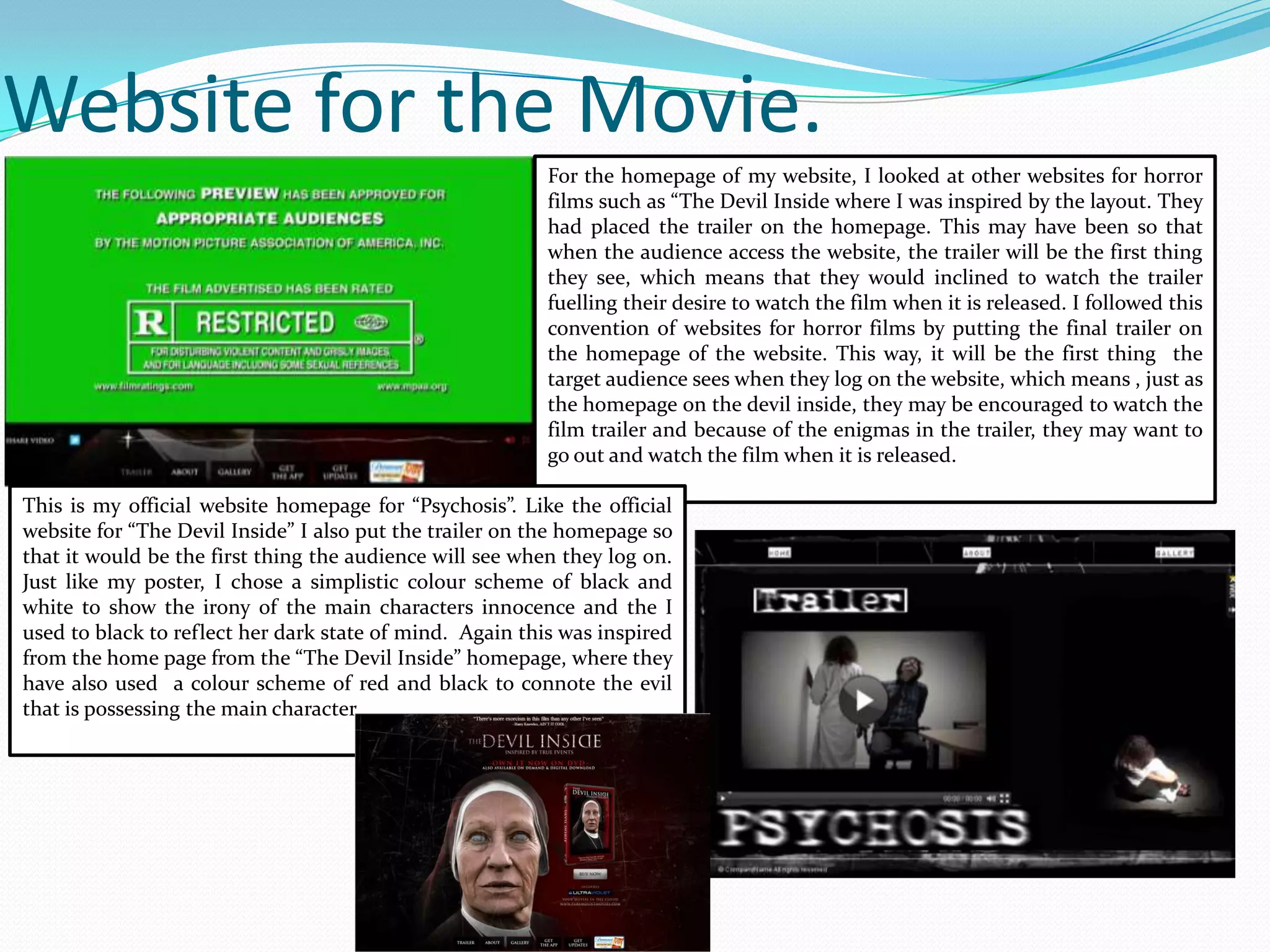
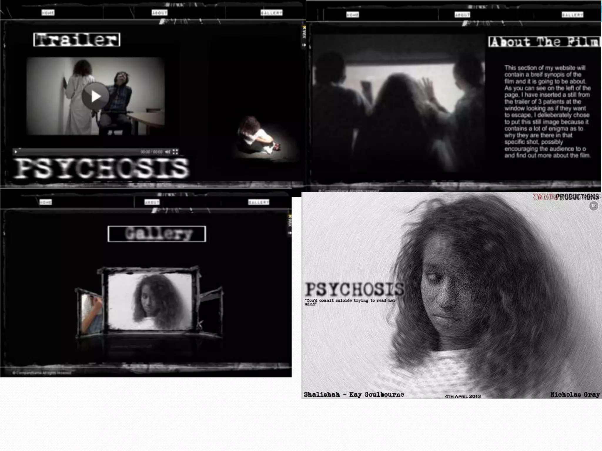
This is my official website homepage for “Psychosis”. Like the official
website for “The Devil Inside” I also put the trailer on the homepage so
that it would be the first thing the audience will see when they log on.
Just like my poster, I chose a simplistic colour scheme of black and
white to show the irony of the main characters innocence and the I
used to black to reflect her dark state of mind. Again this was inspired
from the home page from the “The Devil Inside” homepage, where they
have also used a colour scheme of red and black to connote the evil
that is possessing the main character.
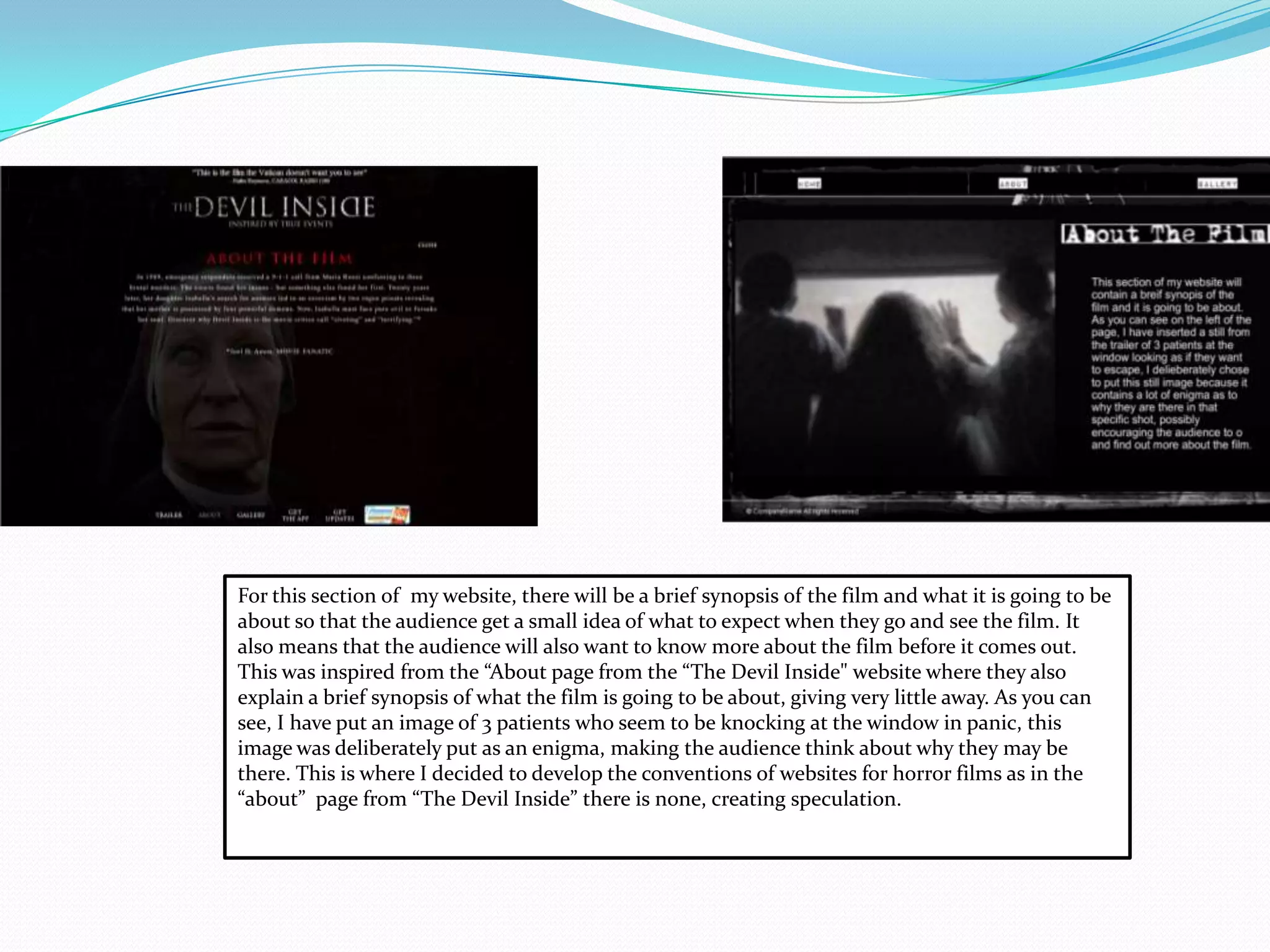
For this section of my website, there will be a brief synopsis of the film and what it is going to be
about so that the audience get a small idea of what to expect when they go and see the film. It
also means that the audience will also want to know more about the film before it comes out.
This was inspired from the “About page from the “The Devil Inside" website where they also
explain a brief synopsis of what the film is going to be about, giving very little away. As you can
see, I have put an image of 3 patients who seem to be knocking at the window in panic, this
image was deliberately put as an enigma, making the audience think about why they may be
there. This is where I decided to develop the conventions of websites for horror films as in the
“about” page from “The Devil Inside” there is none, creating speculation.
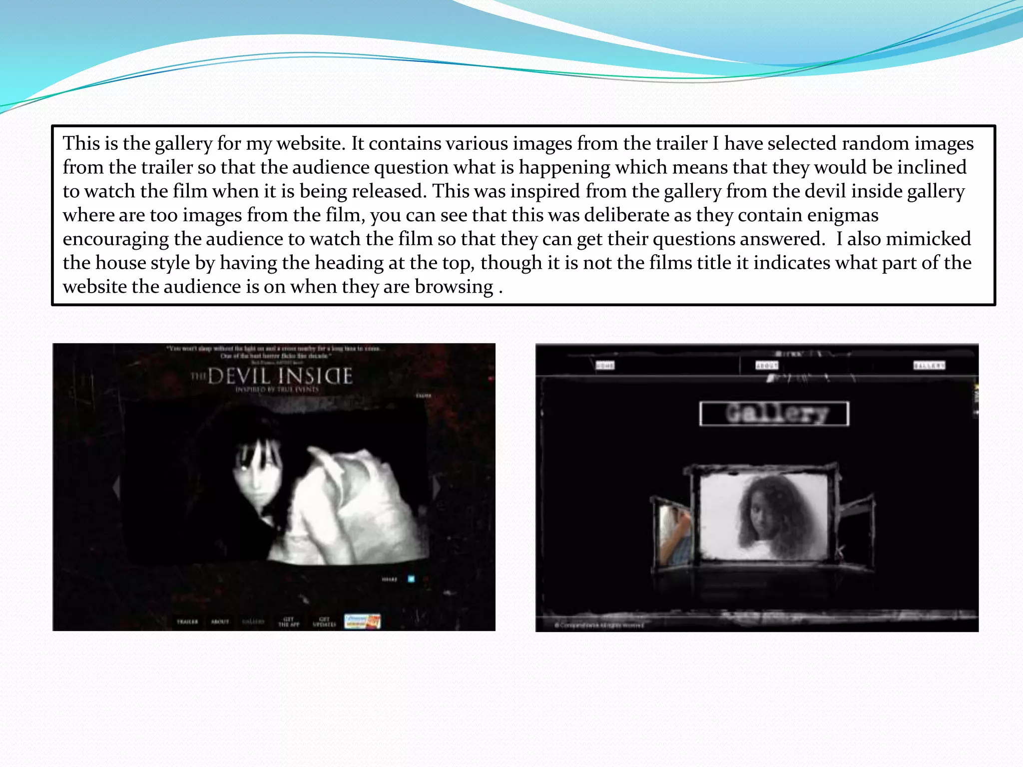
This is the gallery for my website. It contains various images from the trailer I have selected random images
from the trailer so that the audience question what is happening which means that they would be inclined
to watch the film when it is being released. This was inspired from the gallery from the devil inside gallery
where are too images from the film, you can see that this was deliberate as they contain enigmas
encouraging the audience to watch the film so that they can get their questions answered. I also mimicked
the house style by having the heading at the top, though it is not the films title it indicates what part of the
website the audience is on when they are browsing .
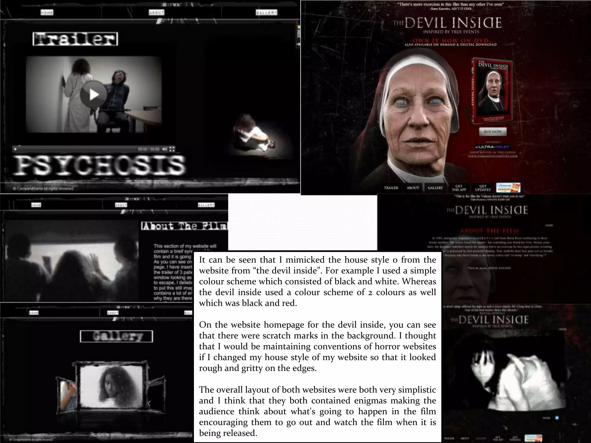
It can be seen that I mimicked the house style o from the
website from “the devil inside”. For example I used a simple
colour scheme which consisted of black and white. Whereas
the devil inside used a colour scheme of 2 colours as well
which was black and red.
On the website homepage for the devil inside, you can see
that there were scratch marks in the background. I thought
that I would be maintaining conventions of horror websites
if I changed my house style of my website so that it looked
rough and gritty on the edges.
The overall layout of both websites were both very simplistic
and I think that they both contained enigmas making the
audience think about what's going to happen in the film
encouraging them to go out and watch the film when it is
being released.
The combination of my ancillary
and main task.
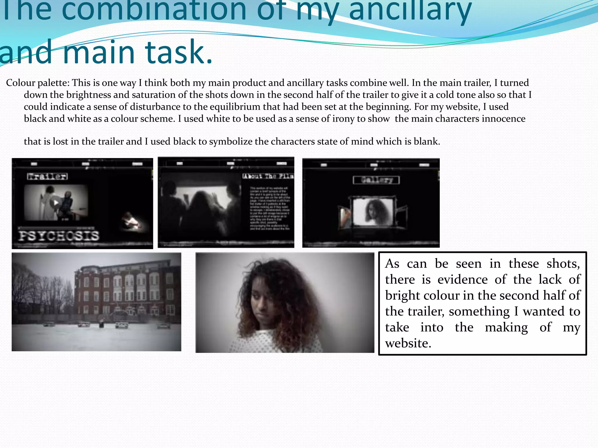
Colour palette: This is one way I think both my main product and ancillary tasks combine well. In the main trailer, I turned
down the brightness and saturation of the shots down in the second half of the trailer to give it a cold tone also so that I
could indicate a sense of disturbance to the equilibrium that had been set at the beginning. For my website, I used
black and white as a colour scheme. I used white to be used as a sense of irony to show the main characters innocence
that is lost in the trailer and I used black to symbolize the characters state of mind which is blank.
As can be seen in these shots,
there is evidence of the lack of
bright colour in the second half of
the trailer, something I wanted to
take into the making of my
website.
Just like the website, I kept the combination by keeping the colour scheme similar to the
website. Here I used the colours black, white and grey. The white this time was to show the
main characters innocence, again this was used as irony as her innocence is lost as seen in
the trailer. When I created the poster, I deliberately made the image black and white as a
reference to the first half of the trailer when all the colour is drained again symbolizing the
loss of her innocence and sanity.
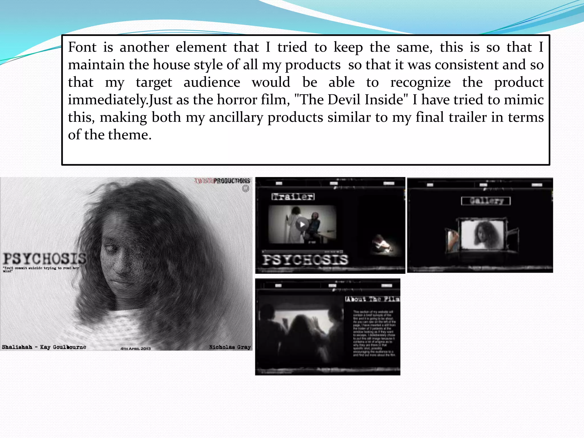
Font is another element that I tried to keep the same, this is so that I
maintain the house style of all my products so that it was consistent and so
that my target audience would be able to recognize the product
immediately.Just as the horror film, "The Devil Inside" I have tried to mimic
this, making both my ancillary products similar to my final trailer in terms
of the theme.
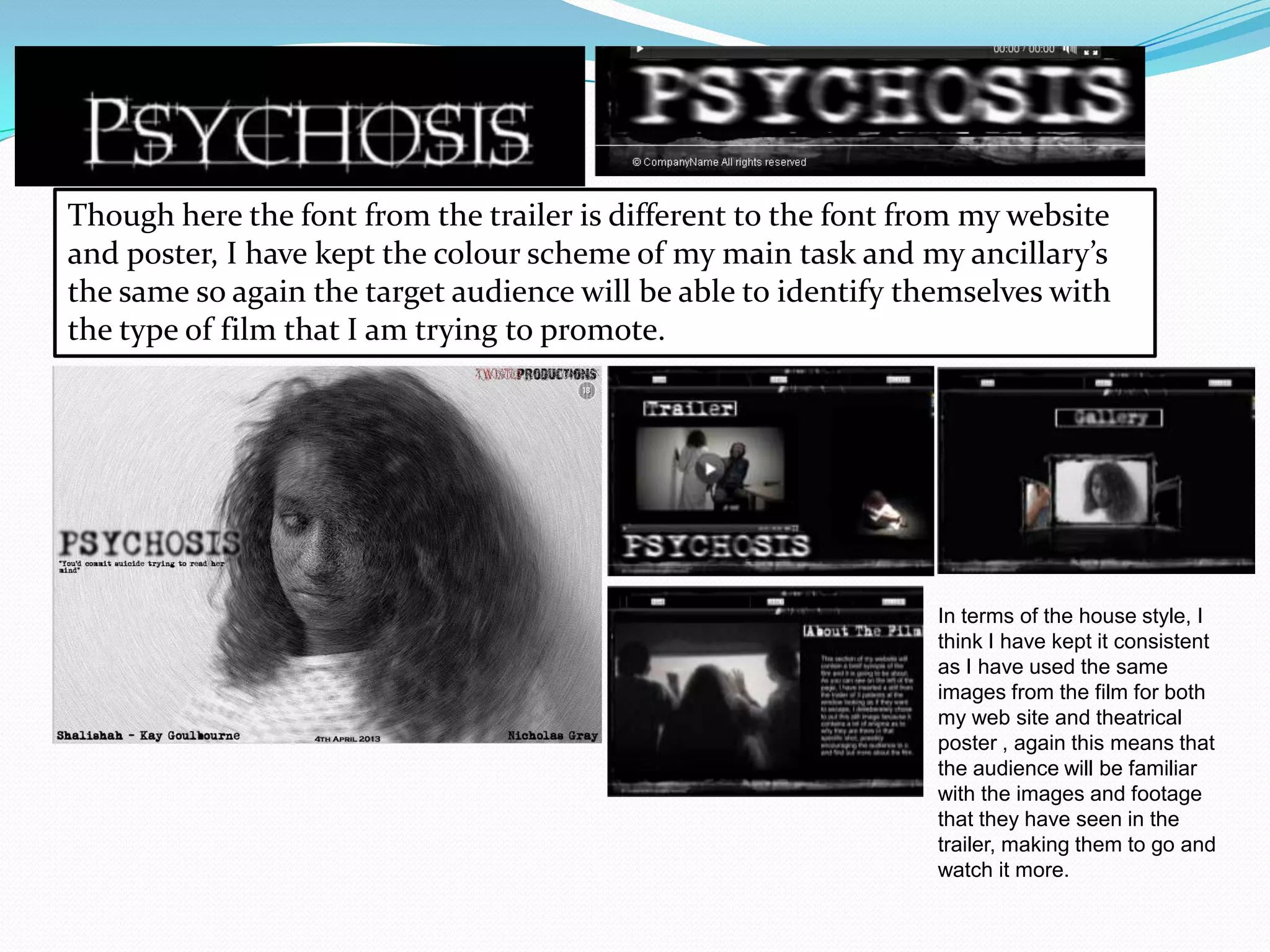
Though here the font from the trailer is different to the font from my website
and poster, I have kept the colour scheme of my main task and my ancillary’s
the same so again the target audience will be able to identify themselves with
the type of film that I am trying to promote.
In terms of the house style, I
think I have kept it consistent
as I have used the same
images from the film for both
my web site and theatrical
poster , again this means that
the audience will be familiar
with the images and footage
that they have seen in the
trailer, making them to go and
watch it more.
 Overall, I think that all of my media products all work alongside
effectively to advertise the film as a whole. This is because of all the
enigmas that are in the film trailer itself and because of the simplistic
layout that the Poster and website both have. In the poster, you can see
that the main character is looking away from the camera, this is an
enigma, making the audience question where she is looking to, giving
nothing away. On the website, you can see that the layout has the
trailer, synopsis and the gallery with images from the trailer. Again you
can see that both my products are giving nothing away and because of
the enigmas all of my products give off to the audience, I think that the
combination of both my ancillary products and my main product are
very effective.

Question 2

  • 1.
  • 2.
     The completeproject consisted of the combination of my main task and my ancillary texts in which I exploited other mediums and I utilized them to my advantage to make all of my products look professional and it also made it look like it was following conventions of the Horror Genre. I used other media technology such as Adobe Fireworks and Wix which is a website creator to create my ancillary texts.
  • 3.
    Theatrical Poster. This ismy theatrical poster for our film trailer “Psychosis”. When I was in the process of making the poster, I had to do some research into other theatrical posters so that I was following the conventions of real media products and so that I can make my theatrical poster look as convincing as possible. During my research, I was inspired by horror film poster from “The Others”. I mimicked the plain layout so that the main focus in the poster was the girl (Nicole Kidman), the title of the film and the slogan. This poster has a lot of enigmas within the content which would fuel the audiences desire to go out and watch the actual film as you can see that the colours of the bright orange/yellow used to half light up Nicole Kidman’s face also creates a sense of question of what is there in the darkness? You can also see that the house style that was used remained consistent, in using similar text to anchor the poster. I was also inspired by the theatrical poster that the horror film “orphan” used in order to market their product. Like “The Others” poster, I liked the use of minimalism in their house style which again creates an enigma for the target audience. However, in this poster you can see that there is a direct mode of address being used which was one convention that I wanted to challenge as I wanted the target audience to question what the film was about and what is going to happen in the film. Which I did. By deciding to have a shot of the main character with her hair half covering her face and her looking to the right of the frame, I think that this creates an enigma for our target audience as the question is posed to the audience, what is she looking at and why? And why has is her hair covering half her face? Also in order to challenge the conventions of horror posters, you can see that in the poster for “Orphan” that the girl has her hair all tidied up and tied into pig tails which connotes that her innocence , I decided to challenge this by having her hair out so that it looks wild showing that even though the choice in the white costume makes her look innocent, the hair is a slight contrast making her look as if she has an edge to her personality. I followed another convention of the horror genre, by having my model wear very little/no make up to reinforce the fact that she is an innocent, young girl, which is another convention in the horror genre as they are represented as weak, sweet and vulnerable.
  • 4.
    Looking at thesetwo theatrical posters from “Orphan” and “The Others” I also saw how they had a slogan to anchor the poster and also to create an enigma for the target audience so that they question what might the slogan have to do with the film as a whole. This is another convention that I followed in the construction of my theatrical poster, as my slogan says “You’d commit suicide trying to read her mind” I put that slogan there to anchor the title as it says “Psychosis” I thought by having the slogan underneath the title, it makes allows the audience to identify what type of genre the film is going to be also by putting in a slogan, it allowed me to add an enigma, making the audience question what is going to happen in the film. Also after looking at these two theatrical posters. I also noticed the colour schemes on both posters. The colour scheme on the poster for “the others” was black and white and the colour scheme for “Orphan” was green and a pale white. I decided to follow this convention and went with the colour scheme, grey and black. By going with this simplistic colour scheme, I am following the conventions of the horror genre. I also thought by using this colour scheme it would exaggerate the blandness of the character in the shot exaggerating her blank state of mind.
  • 5.
    Website for theMovie. For the homepage of my website, I looked at other websites for horror films such as “The Devil Inside where I was inspired by the layout. They had placed the trailer on the homepage. This may have been so that when the audience access the website, the trailer will be the first thing they see, which means that they would inclined to watch the trailer fuelling their desire to watch the film when it is released. I followed this convention of websites for horror films by putting the final trailer on the homepage of the website. This way, it will be the first thing the target audience sees when they log on the website, which means , just as the homepage on the devil inside, they may be encouraged to watch the film trailer and because of the enigmas in the trailer, they may want to go out and watch the film when it is released. This is my official website homepage for “Psychosis”. Like the official website for “The Devil Inside” I also put the trailer on the homepage so that it would be the first thing the audience will see when they log on. Just like my poster, I chose a simplistic colour scheme of black and white to show the irony of the main characters innocence and the I used to black to reflect her dark state of mind. Again this was inspired from the home page from the “The Devil Inside” homepage, where they have also used a colour scheme of red and black to connote the evil that is possessing the main character.
  • 6.
    For this sectionof my website, there will be a brief synopsis of the film and what it is going to be about so that the audience get a small idea of what to expect when they go and see the film. It also means that the audience will also want to know more about the film before it comes out. This was inspired from the “About page from the “The Devil Inside" website where they also explain a brief synopsis of what the film is going to be about, giving very little away. As you can see, I have put an image of 3 patients who seem to be knocking at the window in panic, this image was deliberately put as an enigma, making the audience think about why they may be there. This is where I decided to develop the conventions of websites for horror films as in the “about” page from “The Devil Inside” there is none, creating speculation.
  • 7.
    This is thegallery for my website. It contains various images from the trailer I have selected random images from the trailer so that the audience question what is happening which means that they would be inclined to watch the film when it is being released. This was inspired from the gallery from the devil inside gallery where are too images from the film, you can see that this was deliberate as they contain enigmas encouraging the audience to watch the film so that they can get their questions answered. I also mimicked the house style by having the heading at the top, though it is not the films title it indicates what part of the website the audience is on when they are browsing .
  • 8.
    It can beseen that I mimicked the house style o from the website from “the devil inside”. For example I used a simple colour scheme which consisted of black and white. Whereas the devil inside used a colour scheme of 2 colours as well which was black and red. On the website homepage for the devil inside, you can see that there were scratch marks in the background. I thought that I would be maintaining conventions of horror websites if I changed my house style of my website so that it looked rough and gritty on the edges. The overall layout of both websites were both very simplistic and I think that they both contained enigmas making the audience think about what's going to happen in the film encouraging them to go out and watch the film when it is being released.
  • 10.
    The combination ofmy ancillary and main task. Colour palette: This is one way I think both my main product and ancillary tasks combine well. In the main trailer, I turned down the brightness and saturation of the shots down in the second half of the trailer to give it a cold tone also so that I could indicate a sense of disturbance to the equilibrium that had been set at the beginning. For my website, I used black and white as a colour scheme. I used white to be used as a sense of irony to show the main characters innocence that is lost in the trailer and I used black to symbolize the characters state of mind which is blank. As can be seen in these shots, there is evidence of the lack of bright colour in the second half of the trailer, something I wanted to take into the making of my website.
  • 11.
    Just like thewebsite, I kept the combination by keeping the colour scheme similar to the website. Here I used the colours black, white and grey. The white this time was to show the main characters innocence, again this was used as irony as her innocence is lost as seen in the trailer. When I created the poster, I deliberately made the image black and white as a reference to the first half of the trailer when all the colour is drained again symbolizing the loss of her innocence and sanity.
  • 12.
    Font is anotherelement that I tried to keep the same, this is so that I maintain the house style of all my products so that it was consistent and so that my target audience would be able to recognize the product immediately.Just as the horror film, "The Devil Inside" I have tried to mimic this, making both my ancillary products similar to my final trailer in terms of the theme.
  • 13.
    Though here thefont from the trailer is different to the font from my website and poster, I have kept the colour scheme of my main task and my ancillary’s the same so again the target audience will be able to identify themselves with the type of film that I am trying to promote. In terms of the house style, I think I have kept it consistent as I have used the same images from the film for both my web site and theatrical poster , again this means that the audience will be familiar with the images and footage that they have seen in the trailer, making them to go and watch it more.
  • 14.
     Overall, Ithink that all of my media products all work alongside effectively to advertise the film as a whole. This is because of all the enigmas that are in the film trailer itself and because of the simplistic layout that the Poster and website both have. In the poster, you can see that the main character is looking away from the camera, this is an enigma, making the audience question where she is looking to, giving nothing away. On the website, you can see that the layout has the trailer, synopsis and the gallery with images from the trailer. Again you can see that both my products are giving nothing away and because of the enigmas all of my products give off to the audience, I think that the combination of both my ancillary products and my main product are very effective.