Download to read offline

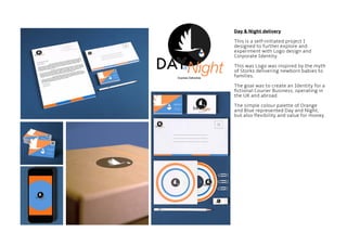
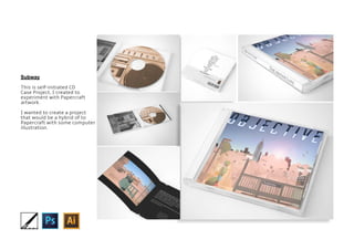
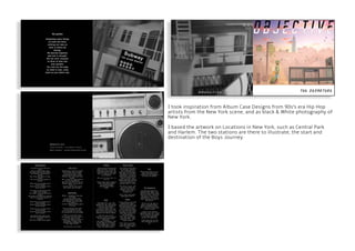
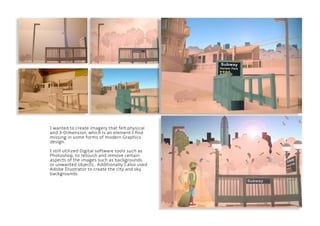
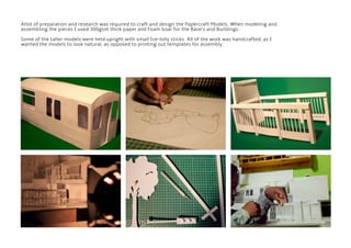
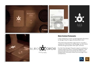
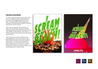
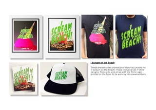

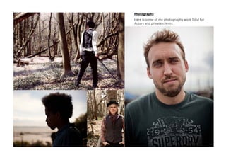


This portfolio document summarizes Jeffrey Lagden's graphic design work. It includes logos and identities he created for fictional companies as well as real clients. Some of the projects featured are logos for a delivery service, subway artwork, a photography business, and a film. The document also outlines his skills and work experience in graphic design, photography, and media production.


![[Pro forma] - mographics - case study](https://cdn.slidesharecdn.com/ss_thumbnails/pro-forma-mographics-casestudy-171023110131-thumbnail.jpg?width=640&height=640&fit=bounds)


![[Pro forma] - mographics - case study(1) (1)](https://cdn.slidesharecdn.com/ss_thumbnails/pro-forma-mographics-casestudy11-171005103637-thumbnail.jpg?width=640&height=640&fit=bounds)


![[Pro forma] - mographics - case study(1) (1)](https://cdn.slidesharecdn.com/ss_thumbnails/pro-forma-mographics-casestudy11-171018140841-thumbnail.jpg?width=640&height=640&fit=bounds)

![[Pro forma] - mographics - case study](https://cdn.slidesharecdn.com/ss_thumbnails/pro-forma-mographics-casestudy-171005104517-thumbnail.jpg?width=640&height=640&fit=bounds)


