Font styles
•Download as PPTX, PDF•
0 likes•330 views
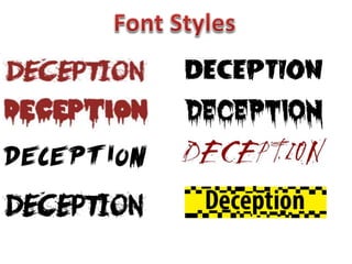
We tested different font styles for the title of our film "Deception" with our target audience and tallied the results. The last font style received the most votes and was preferred, so we decided to use that style as the final title for our film.
Report
Share
Report
Share

Recommended
Company ident
The document provides examples of movie trailer idents from similar films like The Usual Suspects and The Dark Knight that appear for up to 3 seconds. Most ident designs follow a blue/purple color scheme with the company name in gold to portray a professional, slick appearance. Other effective ident designs use a black background with bold central image or animation to draw attention like the Dream Works ident that visually represents the title with flashing lights.
Font research
This document discusses the importance of fonts in setting the tone for horror films. It provides examples of how the fonts for films like "SAW" and "Orphan" were designed to convey scary themes through visual elements of the font itself. The document also explores searching the website dafont.com for horror-themed fonts to use for the title of a student film called "Adeline", ultimately selecting one called "face your fears" that resembles smeared blood to match the intended red color scheme.
Company Ident Research
The document discusses company idents that appear in film trailers. It provides examples of idents from several films, noting the company (e.g. 20th Century Fox), time of appearance in the trailer, and duration on screen. Most idents appear within the first 10 seconds for up to 3 seconds. The document also examines color schemes and designs of common idents, such as blue/purple with gold text, or black backgrounds with bold center images. It cites the DreamWorks ident as inspiration due to its visual representation of the title and animated lights that emphasize the name.
Production logo’s
Production logos are used by movie studios to identify and brand themselves. There are hundreds of different movie studios, each with their own unique logo. When creating a logo for a horror movie production company, designers should use dark colors like red and black and include images related to the genre, such as weapons. The text should stand out from the background using a bold font. This document discusses examples of existing studio logos and shows logos designed by students for a fictional horror production company called "Bludgeoned Movies" that incorporates common horror logo elements.
Creating CD Covers
The document discusses the design decisions made for the front and back covers of an indie-pop CD. For the front cover, a sans serif font was chosen over a wood effect font to better represent the genre. The text was positioned down the side of the cover rather than across to work better with the chosen black and white photo. For the back cover, one photo was deemed too plain while another better fit the genre and linked to the front cover image. The back cover was also made black and white to match the front, with color used only on the insert.
Q2 media
The document discusses the effectiveness of combining a main product with ancillary texts for an indie pop band. It describes choosing the colors red and white for the text to represent love and peace in a girly yet indie style. An online tool was used to test 9 fonts and get feedback, which resulted in changing to a second more girly and legible font that worked better with the background. In the end, the group felt the main product and ancillary texts were very effective together as the final product matched their planned representation of the indie pop genre.
Title inspiration
Our trailer was named 'Deception' because our target audience chose it as the best title, as it provides insight into the film involving someone being deceived. The title was also inspired by the movie 'Inception' which connotes danger and intrigue similar to our narrative. The title design uses black and yellow tape to resemble crime scene tape and give viewers a glimpse that the film may involve deception within a crime scenario.
Bbfc research
The BBFC examines films and videos before release to independently classify them based on age ratings. Two examiners will view theatrical releases and a senior examiner will confirm the rating. They consider issues like discrimination, drugs, horror, violence, language, nudity and sex when deciding ratings. Context and impact on the audience are also factors. The BBFC conducts public consultations every 4-5 years to ensure standards meet public expectations and adjusts guidelines accordingly.
Bbfc age ratings
This document summarizes the different age rating classifications used by the British Board of Film Classification (BBFC). It outlines the types of content that may be present at each rating level, from U for universal to 18 for adults only. The ratings provide guidelines about what content is appropriate for different age groups, to help inform viewers and enforce age restrictions at cinemas and for home media releases. Content involving violence, language, sexual activity, drugs and discrimination becomes more explicit as the ratings increase from U to 15 to 18.
First and final atteempt magazine
The document compares the first and final attempts of a magazine cover. The first attempt used a plain black background with a brightened face image as the main focus. It lacked details, colors, and elements to engage readers. The final attempt significantly improved by adding a left third pull sticker for more information. It used brighter, eye-catching colors for text elements. The layout and font styles were also changed to direct attention to key areas and make the cover look more complete and professional.
Question 1 evaluation
The document discusses the conventions of film trailers and how they were used and developed in the author's trailer. It begins by outlining typical elements of trailers such as runtime, release date, titles, and certification. It then analyzes the conventions of crime thriller trailers, including editing techniques, camera shots, sound, mise-en-scene, characters, and settings that build tension and suspense. The author explains how they applied these conventions in their own trailer through shots, editing, sound, costumes, lighting, and other elements to engage the audience and effectively communicate the genre.
Evaluation q1 a2
The document discusses the conventions used in crime thriller film trailers and magazines. It analyzes how the student's media products follow these conventions. For the trailer, it examines the use of shots, editing techniques, sound, characters, and mise-en-scene to build tension and suspense as is typical in the genre. It also analyzes how the student's film magazine includes key conventions like the masthead, cover lines, and main image to attract readers and market the film. The document demonstrates how understanding and applying genre conventions helps create media products that will appeal to target audiences.
In what way does your media product use (1)
The document discusses the conventions of crime thriller trailers and how they were applied to a student media project trailer. It begins by outlining some of the key conventions included in most crime thriller trailers, such as editing techniques, camera shots, sound, characters, and setting/location. It then provides details about how these various conventions were implemented in the student's own trailer, with examples of the shots used, soundtrack selected, costumes of the characters, and locations featured. The document demonstrates how the student's trailer adhered to typical crime thriller conventions while also attempting to challenge some expectations.
A2 Evaluation Q1
The document discusses the conventions of crime thriller trailers and how they were applied to a student media project trailer. It begins by outlining some of the key conventions like editing techniques, camera shots, sound, characters, and setting/mise-en-scene. It then provides examples of how these conventions were followed in the student's trailer, such as using fast cuts and tense music to build suspense. Character archetypes like the innocent victim and villain were also employed. Overall, the document demonstrates how the student's trailer adhered to typical crime thriller trailer codes and conventions to engage the target audience.
Crime thriller trailer analysis
This analysis summarizes the key elements of the trailer for the crime thriller film The Raid 2. It identifies the genre as crime/thriller based on the mise-en-scene, music, and setting shown. The narrative is about a main character who has made enemies and must act fast to protect his family from those seeking retaliation. Through fight training and battles between criminal families, he prepares to face off against his enemy. The trailer employs techniques like dialogue, music, camera work and special effects to immerse viewers and build intrigue around the characters and action.
Crime thriller trailer analysis
This document analyzes the trailer for a crime/thriller genre film. It breaks down the trailer shot-by-shot, describing how each shot establishes important details like the main character, the setting, and hints that a disaster is about to occur which the main character is trying to prevent by driving fast. Shots of men in masks walking with bags also hints that the characters are up to something terrible.
Front cover analysis
This magazine cover is promoting the film Inception, starring Leonardo DiCaprio. There is a large image of DiCaprio in the center holding a gun to emphasize he is the main character. The masthead "Empire" is at the top in red letters. Beneath the image is the film title "Inception" in red and bold letters. Additional information about the film and other articles in the issue are provided in text boxes and banners around the cover.
step to step for front cover
Sana Gillani describes the process of designing the front cover for a music magazine. Key elements included adding a grey background, a yellow header saying "20 PAGE SUMMER TOUR SPECIAL", and a matching yellow footer listing featured artists. A red and white masthead was used along with the artist's name and a pull quote to grab attention. Flashes in yellow and black advertise the price and preview inside content to intrigue readers into buying the magazine.
Evaluation Question 4
Sana Gillani addressed her target audience of rock music fans aged 20-35 by designing magazine pages that follow rock music conventions. She used bold colors like red, black, and yellow that appeal to this audience. Large images of artists make direct eye contact to intrigue readers. Pull quotes tease articles without giving too much away. The layout uses columns and placement of images next to related articles to clearly guide readers through the content. These design choices aim to attract and engage the target audience according to research on rock music magazine formats.
Questionnaire Results
Sana Gillani conducted a questionnaire about her final music magazine project, distributing it to 20 people ages 20 and older, including 10 males and 10 females. Most respondents felt the magazine looked like a rock magazine and that the cover image and color scheme were appealing for the rock music genre. While most thought the £4.99 price was reasonable, some females and males did not. All said they would buy the magazine and pages seemed cohesive, though a few males and one female felt not all features would attract the target audience. Sana plans to survey more age groups to expand the magazines appeal.
Questionnaire
The document is a questionnaire for feedback on a rock music magazine prototype. It asks 10 multiple choice questions to gather information on the respondent's age, gender, opinions on the magazine's design matching the rock genre, appeal of the front cover image, appropriateness of the price, likelihood of purchasing it, target audience, and inclusion of features for the target group. The questionnaire aims to help improve the creator's future music magazines.
Evaluation question 1
The document is an evaluation of a student's media magazine project. It provides extensive details on how the student followed conventions of real rock magazines in developing the form and layout of the magazine. This includes using typical masthead styles, images of musicians posing with guitars and doing rock signs, pull quotes from interviews, and grouping content into common sections like features. The document discusses the design choices made for the cover, contents page, and a double-page artist interview spread, explaining how research into other rock magazines informed the design to match reader expectations of the genre.
Evaluation Q2
The document summarizes how the media product represents particular social groups. It discusses using images of people in their 20s to represent that age group. Language and styles were used that would appeal to middle and upper class readers. Both male and female models of different ethnicities were featured to make rock music more inclusive. The magazine was aimed at representing independent young adults from a range of backgrounds.
Contents step to step
1) The document outlines the steps taken to create a magazine contents page, including inserting a background, masthead, date, feature headings, subheadings and descriptions, images of artists with accompanying text boxes of names and page numbers, a subscribe box, and editorial section.
2) Key elements like the masthead, date, feature headings, and images were styled and positioned based on research of other music magazine contents pages to guide an intuitive layout.
3) The goal was to clearly guide the reader through the various content sections and intrigue them with images and excerpts to encourage reading further in the magazine.
action plan
The document outlines an action plan for producing a rock magazine, including tasks to write an article, take photos, produce the front cover, contents page, and double page spread. It also includes holding a focus group discussion to evaluate the final magazine. Key deadlines are assigned to complete writing by November 25th, taking photos by January 6th, and the evaluation by March 7th. Sana is responsible for many of the tasks except clothes/props and location, which are assigned to Hina.
Untitleddocument
The document outlines an action plan for producing a rock magazine, including tasks to write an article, take photos, produce the front cover, contents page, and double page spread. It also includes holding a focus group discussion to evaluate the final magazine. Key deadlines are assigned to complete writing by November 25th, taking photos by January 6th, and the evaluation by March 7th. Sana is responsible for many of the tasks except clothes/props and location, which are assigned to Hina.
Risk asessment
The document identifies several risks involved in taking photos at school and producing a magazine cover. For taking photos, the risks include students tripping over equipment or a wet floor posing a slip hazard. These risks can be minimized by warning others about equipment and using caution signs for wet floors. When producing covers, the risks include distraction from noise, spills on the computer, and tripping over wires. These risks can be addressed by working in a quiet space, keeping food and drinks away from computers, and tidying wires. Damaged expensive equipment and batteries running out are also identified risks that can be minimized by storing equipment carefully when not in use and ensuring cameras have a full charge.
Practise of different photo shots
The document discusses three different photo shots - a dirty shot, reflection shot, and lead shot. For the dirty shot, the model is too far away and there is too much headroom, making the focus unclear. For the reflection shot, the background could be changed to draw more attention to the model. And for the lead shot, there is too much headroom, which makes it seem like something may fall on the subject; less headroom would improve clarity.
The History of Stoke Newington Street Names
Presented at the Stoke Newington Literary Festival on 9th June 2024
www.StokeNewingtonHistory.com
More Related Content
More from sana0001
Bbfc age ratings
This document summarizes the different age rating classifications used by the British Board of Film Classification (BBFC). It outlines the types of content that may be present at each rating level, from U for universal to 18 for adults only. The ratings provide guidelines about what content is appropriate for different age groups, to help inform viewers and enforce age restrictions at cinemas and for home media releases. Content involving violence, language, sexual activity, drugs and discrimination becomes more explicit as the ratings increase from U to 15 to 18.
First and final atteempt magazine
The document compares the first and final attempts of a magazine cover. The first attempt used a plain black background with a brightened face image as the main focus. It lacked details, colors, and elements to engage readers. The final attempt significantly improved by adding a left third pull sticker for more information. It used brighter, eye-catching colors for text elements. The layout and font styles were also changed to direct attention to key areas and make the cover look more complete and professional.
Question 1 evaluation
The document discusses the conventions of film trailers and how they were used and developed in the author's trailer. It begins by outlining typical elements of trailers such as runtime, release date, titles, and certification. It then analyzes the conventions of crime thriller trailers, including editing techniques, camera shots, sound, mise-en-scene, characters, and settings that build tension and suspense. The author explains how they applied these conventions in their own trailer through shots, editing, sound, costumes, lighting, and other elements to engage the audience and effectively communicate the genre.
Evaluation q1 a2
The document discusses the conventions used in crime thriller film trailers and magazines. It analyzes how the student's media products follow these conventions. For the trailer, it examines the use of shots, editing techniques, sound, characters, and mise-en-scene to build tension and suspense as is typical in the genre. It also analyzes how the student's film magazine includes key conventions like the masthead, cover lines, and main image to attract readers and market the film. The document demonstrates how understanding and applying genre conventions helps create media products that will appeal to target audiences.
In what way does your media product use (1)
The document discusses the conventions of crime thriller trailers and how they were applied to a student media project trailer. It begins by outlining some of the key conventions included in most crime thriller trailers, such as editing techniques, camera shots, sound, characters, and setting/location. It then provides details about how these various conventions were implemented in the student's own trailer, with examples of the shots used, soundtrack selected, costumes of the characters, and locations featured. The document demonstrates how the student's trailer adhered to typical crime thriller conventions while also attempting to challenge some expectations.
A2 Evaluation Q1
The document discusses the conventions of crime thriller trailers and how they were applied to a student media project trailer. It begins by outlining some of the key conventions like editing techniques, camera shots, sound, characters, and setting/mise-en-scene. It then provides examples of how these conventions were followed in the student's trailer, such as using fast cuts and tense music to build suspense. Character archetypes like the innocent victim and villain were also employed. Overall, the document demonstrates how the student's trailer adhered to typical crime thriller trailer codes and conventions to engage the target audience.
Crime thriller trailer analysis
This analysis summarizes the key elements of the trailer for the crime thriller film The Raid 2. It identifies the genre as crime/thriller based on the mise-en-scene, music, and setting shown. The narrative is about a main character who has made enemies and must act fast to protect his family from those seeking retaliation. Through fight training and battles between criminal families, he prepares to face off against his enemy. The trailer employs techniques like dialogue, music, camera work and special effects to immerse viewers and build intrigue around the characters and action.
Crime thriller trailer analysis
This document analyzes the trailer for a crime/thriller genre film. It breaks down the trailer shot-by-shot, describing how each shot establishes important details like the main character, the setting, and hints that a disaster is about to occur which the main character is trying to prevent by driving fast. Shots of men in masks walking with bags also hints that the characters are up to something terrible.
Front cover analysis
This magazine cover is promoting the film Inception, starring Leonardo DiCaprio. There is a large image of DiCaprio in the center holding a gun to emphasize he is the main character. The masthead "Empire" is at the top in red letters. Beneath the image is the film title "Inception" in red and bold letters. Additional information about the film and other articles in the issue are provided in text boxes and banners around the cover.
step to step for front cover
Sana Gillani describes the process of designing the front cover for a music magazine. Key elements included adding a grey background, a yellow header saying "20 PAGE SUMMER TOUR SPECIAL", and a matching yellow footer listing featured artists. A red and white masthead was used along with the artist's name and a pull quote to grab attention. Flashes in yellow and black advertise the price and preview inside content to intrigue readers into buying the magazine.
Evaluation Question 4
Sana Gillani addressed her target audience of rock music fans aged 20-35 by designing magazine pages that follow rock music conventions. She used bold colors like red, black, and yellow that appeal to this audience. Large images of artists make direct eye contact to intrigue readers. Pull quotes tease articles without giving too much away. The layout uses columns and placement of images next to related articles to clearly guide readers through the content. These design choices aim to attract and engage the target audience according to research on rock music magazine formats.
Questionnaire Results
Sana Gillani conducted a questionnaire about her final music magazine project, distributing it to 20 people ages 20 and older, including 10 males and 10 females. Most respondents felt the magazine looked like a rock magazine and that the cover image and color scheme were appealing for the rock music genre. While most thought the £4.99 price was reasonable, some females and males did not. All said they would buy the magazine and pages seemed cohesive, though a few males and one female felt not all features would attract the target audience. Sana plans to survey more age groups to expand the magazines appeal.
Questionnaire
The document is a questionnaire for feedback on a rock music magazine prototype. It asks 10 multiple choice questions to gather information on the respondent's age, gender, opinions on the magazine's design matching the rock genre, appeal of the front cover image, appropriateness of the price, likelihood of purchasing it, target audience, and inclusion of features for the target group. The questionnaire aims to help improve the creator's future music magazines.
Evaluation question 1
The document is an evaluation of a student's media magazine project. It provides extensive details on how the student followed conventions of real rock magazines in developing the form and layout of the magazine. This includes using typical masthead styles, images of musicians posing with guitars and doing rock signs, pull quotes from interviews, and grouping content into common sections like features. The document discusses the design choices made for the cover, contents page, and a double-page artist interview spread, explaining how research into other rock magazines informed the design to match reader expectations of the genre.
Evaluation Q2
The document summarizes how the media product represents particular social groups. It discusses using images of people in their 20s to represent that age group. Language and styles were used that would appeal to middle and upper class readers. Both male and female models of different ethnicities were featured to make rock music more inclusive. The magazine was aimed at representing independent young adults from a range of backgrounds.
Contents step to step
1) The document outlines the steps taken to create a magazine contents page, including inserting a background, masthead, date, feature headings, subheadings and descriptions, images of artists with accompanying text boxes of names and page numbers, a subscribe box, and editorial section.
2) Key elements like the masthead, date, feature headings, and images were styled and positioned based on research of other music magazine contents pages to guide an intuitive layout.
3) The goal was to clearly guide the reader through the various content sections and intrigue them with images and excerpts to encourage reading further in the magazine.
action plan
The document outlines an action plan for producing a rock magazine, including tasks to write an article, take photos, produce the front cover, contents page, and double page spread. It also includes holding a focus group discussion to evaluate the final magazine. Key deadlines are assigned to complete writing by November 25th, taking photos by January 6th, and the evaluation by March 7th. Sana is responsible for many of the tasks except clothes/props and location, which are assigned to Hina.
Untitleddocument
The document outlines an action plan for producing a rock magazine, including tasks to write an article, take photos, produce the front cover, contents page, and double page spread. It also includes holding a focus group discussion to evaluate the final magazine. Key deadlines are assigned to complete writing by November 25th, taking photos by January 6th, and the evaluation by March 7th. Sana is responsible for many of the tasks except clothes/props and location, which are assigned to Hina.
Risk asessment
The document identifies several risks involved in taking photos at school and producing a magazine cover. For taking photos, the risks include students tripping over equipment or a wet floor posing a slip hazard. These risks can be minimized by warning others about equipment and using caution signs for wet floors. When producing covers, the risks include distraction from noise, spills on the computer, and tripping over wires. These risks can be addressed by working in a quiet space, keeping food and drinks away from computers, and tidying wires. Damaged expensive equipment and batteries running out are also identified risks that can be minimized by storing equipment carefully when not in use and ensuring cameras have a full charge.
Practise of different photo shots
The document discusses three different photo shots - a dirty shot, reflection shot, and lead shot. For the dirty shot, the model is too far away and there is too much headroom, making the focus unclear. For the reflection shot, the background could be changed to draw more attention to the model. And for the lead shot, there is too much headroom, which makes it seem like something may fall on the subject; less headroom would improve clarity.
More from sana0001 (20)
Recently uploaded
The History of Stoke Newington Street Names
Presented at the Stoke Newington Literary Festival on 9th June 2024
www.StokeNewingtonHistory.com
South African Journal of Science: Writing with integrity workshop (2024)
South African Journal of Science: Writing with integrity workshop (2024)Academy of Science of South Africa
A workshop hosted by the South African Journal of Science aimed at postgraduate students and early career researchers with little or no experience in writing and publishing journal articles.The Diamonds of 2023-2024 in the IGRA collection
A review of the growth of the Israel Genealogy Research Association Database Collection for the last 12 months. Our collection is now passed the 3 million mark and still growing. See which archives have contributed the most. See the different types of records we have, and which years have had records added. You can also see what we have for the future.
Executive Directors Chat Leveraging AI for Diversity, Equity, and Inclusion
Let’s explore the intersection of technology and equity in the final session of our DEI series. Discover how AI tools, like ChatGPT, can be used to support and enhance your nonprofit's DEI initiatives. Participants will gain insights into practical AI applications and get tips for leveraging technology to advance their DEI goals.
How to Build a Module in Odoo 17 Using the Scaffold Method
Odoo provides an option for creating a module by using a single line command. By using this command the user can make a whole structure of a module. It is very easy for a beginner to make a module. There is no need to make each file manually. This slide will show how to create a module using the scaffold method.
How to Make a Field Mandatory in Odoo 17
In Odoo, making a field required can be done through both Python code and XML views. When you set the required attribute to True in Python code, it makes the field required across all views where it's used. Conversely, when you set the required attribute in XML views, it makes the field required only in the context of that particular view.
What is Digital Literacy? A guest blog from Andy McLaughlin, University of Ab...
What is Digital Literacy? A guest blog from Andy McLaughlin, University of Aberdeen
Your Skill Boost Masterclass: Strategies for Effective Upskilling
Your Skill Boost Masterclass: Strategies for Effective UpskillingExcellence Foundation for South Sudan
Strategies for Effective Upskilling is a presentation by Chinwendu Peace in a Your Skill Boost Masterclass organisation by the Excellence Foundation for South Sudan on 08th and 09th June 2024 from 1 PM to 3 PM on each day.DRUGS AND ITS classification slide share
Any substance (other than food) that is used to prevent, diagnose, treat, or relieve symptoms of a
disease or abnormal condition
Recently uploaded (20)
South African Journal of Science: Writing with integrity workshop (2024)
South African Journal of Science: Writing with integrity workshop (2024)
Executive Directors Chat Leveraging AI for Diversity, Equity, and Inclusion
Executive Directors Chat Leveraging AI for Diversity, Equity, and Inclusion
Film vocab for eal 3 students: Australia the movie
Film vocab for eal 3 students: Australia the movie
How to Build a Module in Odoo 17 Using the Scaffold Method
How to Build a Module in Odoo 17 Using the Scaffold Method
Pride Month Slides 2024 David Douglas School District
Pride Month Slides 2024 David Douglas School District
What is Digital Literacy? A guest blog from Andy McLaughlin, University of Ab...
What is Digital Literacy? A guest blog from Andy McLaughlin, University of Ab...
Digital Artefact 1 - Tiny Home Environmental Design
Digital Artefact 1 - Tiny Home Environmental Design
Your Skill Boost Masterclass: Strategies for Effective Upskilling
Your Skill Boost Masterclass: Strategies for Effective Upskilling
Font styles
- 2. As a group we came up with lots of different font styles for our chosen film title ‘Deception’. We asked our chosen target audience which font style they think looks the best . Below is a table of the results. Font styles Tally IIIII II 0 I 0 III II IIIIIIII From the results we found that our target audience preferred the last font style, so we decided to use this as the final title for our film.