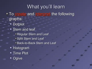
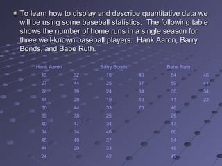
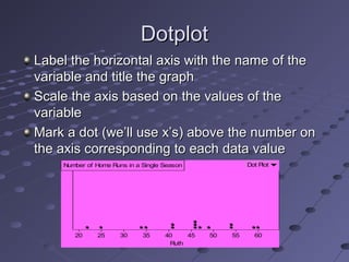
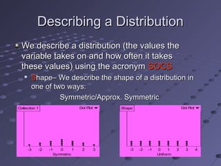
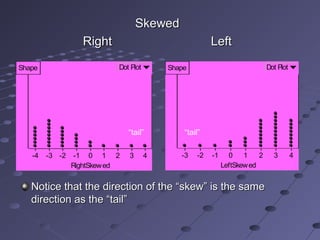
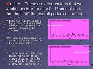
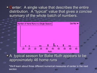
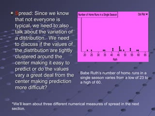
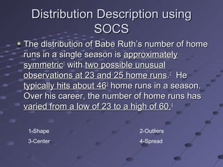
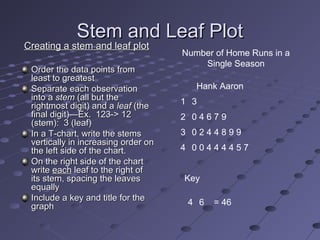
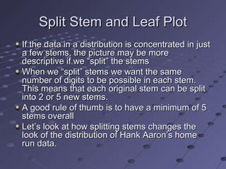
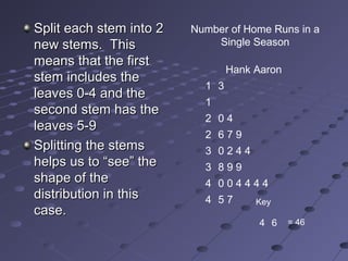
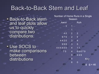
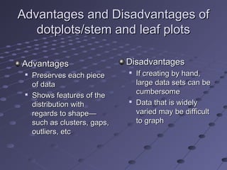
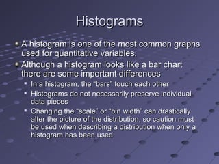
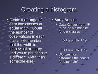
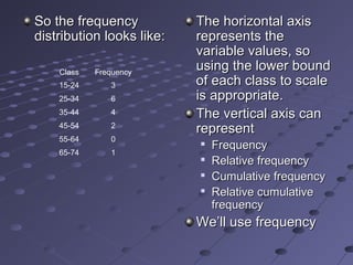
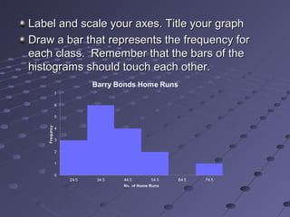
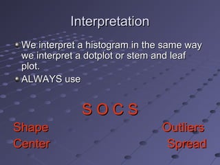
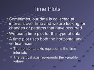
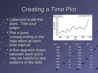
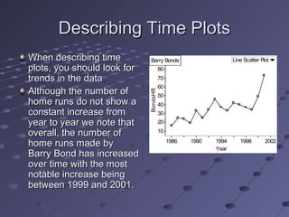
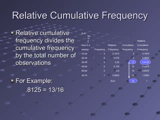
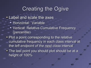
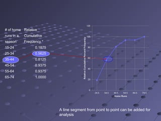
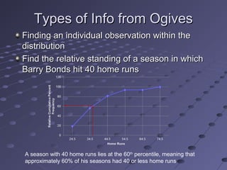
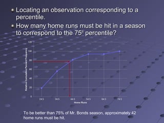
The document discusses various graphs used to display quantitative data, including dot plots, stem-and-leaf plots, histograms, and time plots. It provides instructions on how to create each graph type and describes how to interpret the graphs using the SOCS method of describing distributions in terms of shape, outliers, center, and spread. Examples using baseball player home run statistics are included to demonstrate each graph.