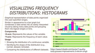
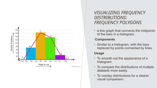
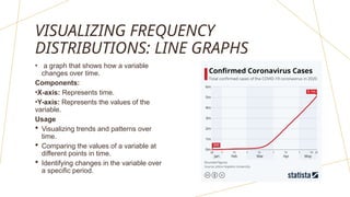
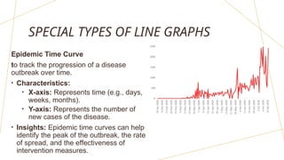
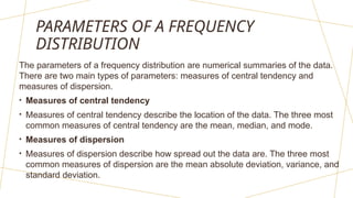
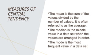
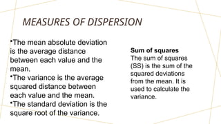
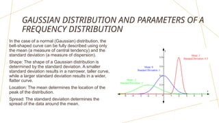
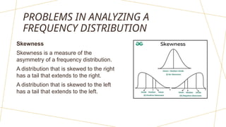
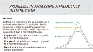
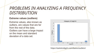
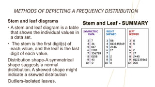
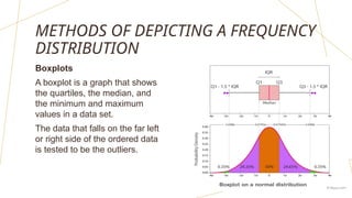
FREQUENCY
DISTRIBUTION:
FREQUENCY
DISTRIBUTIONS OF
CONTINUOUS
VARIABLES
I M M A N U E L T. S A N D I E G O
RANGE OF A VARIABLE
Recall: Continuous data- numeric in nature
-the difference between the largest and
smallest values in a data set.
• Example:
Suppose you have the following data set of
heights (in cm) for 10 people:
160, 165, 170, 175, 180, 185, 190, 195,
200, 205
The range of this data set is 205 - 160 = 45 cm.
REAL AND THEORETICAL FREQUENCY
DISTRIBUTIONS
• A frequency distribution is a table or graph that
shows how often different values of a variable occur
in a data set.
• A real frequency distribution is based on actual data,
while a theoretical frequency distribution is based on
a mathematical model.
GAUSSIAN (NORMAL DISTRIBUTION)
• a theoretical frequency
distribution that is often used to
model continuous variables in
biostatistics.
• It is characterized by its
symmetrical shape and the fact
that most of the observations
are clustered around the
mean.
https://scales.arabpsychology.com/stats/what-are-
some-real-life-examples-of-the-normal-distribution/
VISUALIZING FREQUENCY
DISTRIBUTIONS: HISTOGRAMS
Graphical representation of data points organized
into user-specified ranges.
Similar in appearance to a bar graph but
condenses a data series into an easily interpreted
visual by taking many data points and grouping
them into logical ranges or bins.
Components
•X-axis: Represents the values of the variable.
•Y-axis: Represents the frequency of each value.
Usage
• Showing the distribution of a continuous variable.
• Identifying the shape of the distribution (e.g.,
normal, skewed, bimodal).
• Comparing the distributions of different datasets. https://www.linkedin.com/pulse/7-quality-
tools-process-improvements-3-vikram-singh
VISUALIZING FREQUENCY
DISTRIBUTIONS:
FREQUENCY POLYGONS
• a line graph that connects the midpoints
of the bars in a histogram.
:Components
• Similar to a histogram, with the bars
replaced by points connected by lines.
Usage
• To smooth out the appearance of a
histogram.
• To compare the distributions of multiple
datasets more easily.
• To overlay distributions for a clearer
visual comparison.
VISUALIZING FREQUENCY
DISTRIBUTIONS: LINE GRAPHS
• a graph that shows how a variable
changes over time.
Components:
•X-axis: Represents time.
•Y-axis: Represents the values of the
variable.
Usage
 Visualizing trends and patterns over
time.
 Comparing the values of a variable at
different points in time.
 Identifying changes in the variable over
a specific period.
SPECIAL TYPES OF LINE GRAPHS
Epidemic Time Curve
to track the progression of a disease
outbreak over time.
• Characteristics:
• X-axis: Represents time (e.g., days,
weeks, months).
• Y-axis: Represents the number of
new cases of the disease.
• Insights: Epidemic time curves can help
identify the peak of the outbreak, the rate
of spread, and the effectiveness of
intervention measures.
SPECIAL TYPES OF
LINE GRAPHS
Arithmetic Line Graph
To visualize data where the differences
between values are meaningful.
• Characteristics:
• Y-axis: Uses an arithmetic scale,
where the distance between values is
proportional to the difference
between the values.
• Common uses: Arithmetic line graphs
are suitable for data such as:
• Sales figures over time
• Stock prices
• Temperature measurements
SPECIAL TYPES OF
LINE GRAPHS
Semilogarithmic Line Graph
To visualize data where the ratio
between values is meaningful.
• Characteristics
• Y-axis: Uses a logarithmic scale,
where the distance between
values is proportional to the ratio
between the values.
• Common uses
• Population growth
• Bacterial growth
• Radioactive decay
https://schaechter.asmblog.org/schaechter/2018/07/
why-you-must-plot-your-growth-data-on-semi-log-
graph-paper.html
PARAMETERS OF A FREQUENCY
DISTRIBUTION
The parameters of a frequency distribution are numerical summaries of the data.
There are two main types of parameters: measures of central tendency and
measures of dispersion.
• Measures of central tendency
• Measures of central tendency describe the location of the data. The three most
common measures of central tendency are the mean, median, and mode.
• Measures of dispersion
• Measures of dispersion describe how spread out the data are. The three most
common measures of dispersion are the mean absolute deviation, variance, and
standard deviation.
MEASURES OF
CENTRAL
TENDENCY
•The mean is the sum of the
values divided by the
number of values. It is often
referred to as the average.
•The median is the middle
value in a data set when the
values are arranged in order.
•The mode is the most
frequent value in a data set.
MEASURES OF DISPERSION
•The mean absolute deviation
is the average distance
between each value and the
mean.
•The variance is the average
squared distance between
each value and the mean.
•The standard deviation is the
square root of the variance.
Sum of squares
The sum of squares
(SS) is the sum of the
squared deviations
from the mean. It is
used to calculate the
variance.
GAUSSIAN DISTRIBUTION AND PARAMETERS OF A
FREQUENCY DISTRIBUTION
In the case of a normal (Gaussian) distribution, the
bell-shaped curve can be fully described using only
the mean (a measure of central tendency) and the
standard deviation (a measure of dispersion).
Shape: The shape of a Gaussian distribution is
determined by the standard deviation. A smaller
standard deviation results in a narrower, taller curve,
while a larger standard deviation results in a wider,
flatter curve.
Location: The mean determines the location of the
peak of the distribution.
Spread: The standard deviation determines the
spread of the data around the mean.
PROBLEMS IN ANALYZING A
FREQUENCY DISTRIBUTION
Skewness
Skewness is a measure of the
asymmetry of a frequency distribution.
A distribution that is skewed to the right
has a tail that extends to the right.
A distribution that is skewed to the left
has a tail that extends to the left.
PROBLEMS IN ANALYZING A FREQUENCY
DISTRIBUTION
Kurtosis
Kurtosis is a measure of the peakedness of a
frequency distribution. A distribution that is
leptokurtic is more peaked than a normal
distribution. A distribution that is platykurtic is
less peaked than a normal distribution.
• Leptokurtic - the tails are fatter compared
to a normal distribution.
• Platykurtic - the tails are thinner compared
to a normal distribution.
• Mesokurtic - the tails are the same as a
normal distribution.
PROBLEMS IN ANALYZING A FREQUENCY
DISTRIBUTION
Extreme values (outliers)
Extreme values, also known as
outliers, are values that are far
from the rest of the data.
Outliers can have a large impact
on the mean and standard
deviation of a data set.
https://statisticsbyjim.com/basics/outliers/
METHODS OF DEPICTING A FREQUENCY DISTRIBUTION
Stem and leaf diagrams
• A stem and leaf diagram is a table
that shows the individual values in
a data set.
• The stem is the first digit(s) of
each value, and the leaf is the last
digit of each value.
Distribution shape-A symmetrical
shape suggests a normal
distribution. A skewed shape might
indicate a skewed distribution
Outliers-isolated leaves.
METHODS OF DEPICTING A FREQUENCY
DISTRIBUTION
Quantiles
Quantiles are values that divide a data set into equal parts.
For example, the quartiles (Q1, Q2 and Q3) divide a data set into four equal
parts. The median is the second quartile.
Symmetrical distribution- If the distance between Q1 and the median is
approximately equal to the distance between the median and Q3
Skewed distribution- If the distance between Q1 and the median is significantly
different from the distance between the median and Q3
• Interquartile range (IQR):
• The IQR is the difference between Q3 and Q1.
METHODS OF DEPICTING A FREQUENCY
DISTRIBUTION
Boxplots
A boxplot is a graph that shows
the quartiles, the median, and
the minimum and maximum
values in a data set.
The data that falls on the far left
or right side of the ordered data
is tested to be the outliers.

Frequency Distribution Continuous Data.pptx

  • 1.
  • 2.
    RANGE OF AVARIABLE Recall: Continuous data- numeric in nature -the difference between the largest and smallest values in a data set. • Example: Suppose you have the following data set of heights (in cm) for 10 people: 160, 165, 170, 175, 180, 185, 190, 195, 200, 205 The range of this data set is 205 - 160 = 45 cm.
  • 3.
    REAL AND THEORETICALFREQUENCY DISTRIBUTIONS • A frequency distribution is a table or graph that shows how often different values of a variable occur in a data set. • A real frequency distribution is based on actual data, while a theoretical frequency distribution is based on a mathematical model.
  • 4.
    GAUSSIAN (NORMAL DISTRIBUTION) •a theoretical frequency distribution that is often used to model continuous variables in biostatistics. • It is characterized by its symmetrical shape and the fact that most of the observations are clustered around the mean. https://scales.arabpsychology.com/stats/what-are- some-real-life-examples-of-the-normal-distribution/
  • 5.
    VISUALIZING FREQUENCY DISTRIBUTIONS: HISTOGRAMS Graphicalrepresentation of data points organized into user-specified ranges. Similar in appearance to a bar graph but condenses a data series into an easily interpreted visual by taking many data points and grouping them into logical ranges or bins. Components •X-axis: Represents the values of the variable. •Y-axis: Represents the frequency of each value. Usage • Showing the distribution of a continuous variable. • Identifying the shape of the distribution (e.g., normal, skewed, bimodal). • Comparing the distributions of different datasets. https://www.linkedin.com/pulse/7-quality- tools-process-improvements-3-vikram-singh
  • 6.
    VISUALIZING FREQUENCY DISTRIBUTIONS: FREQUENCY POLYGONS •a line graph that connects the midpoints of the bars in a histogram. :Components • Similar to a histogram, with the bars replaced by points connected by lines. Usage • To smooth out the appearance of a histogram. • To compare the distributions of multiple datasets more easily. • To overlay distributions for a clearer visual comparison.
  • 7.
    VISUALIZING FREQUENCY DISTRIBUTIONS: LINEGRAPHS • a graph that shows how a variable changes over time. Components: •X-axis: Represents time. •Y-axis: Represents the values of the variable. Usage  Visualizing trends and patterns over time.  Comparing the values of a variable at different points in time.  Identifying changes in the variable over a specific period.
  • 8.
    SPECIAL TYPES OFLINE GRAPHS Epidemic Time Curve to track the progression of a disease outbreak over time. • Characteristics: • X-axis: Represents time (e.g., days, weeks, months). • Y-axis: Represents the number of new cases of the disease. • Insights: Epidemic time curves can help identify the peak of the outbreak, the rate of spread, and the effectiveness of intervention measures.
  • 9.
    SPECIAL TYPES OF LINEGRAPHS Arithmetic Line Graph To visualize data where the differences between values are meaningful. • Characteristics: • Y-axis: Uses an arithmetic scale, where the distance between values is proportional to the difference between the values. • Common uses: Arithmetic line graphs are suitable for data such as: • Sales figures over time • Stock prices • Temperature measurements
  • 10.
    SPECIAL TYPES OF LINEGRAPHS Semilogarithmic Line Graph To visualize data where the ratio between values is meaningful. • Characteristics • Y-axis: Uses a logarithmic scale, where the distance between values is proportional to the ratio between the values. • Common uses • Population growth • Bacterial growth • Radioactive decay https://schaechter.asmblog.org/schaechter/2018/07/ why-you-must-plot-your-growth-data-on-semi-log- graph-paper.html
  • 11.
    PARAMETERS OF AFREQUENCY DISTRIBUTION The parameters of a frequency distribution are numerical summaries of the data. There are two main types of parameters: measures of central tendency and measures of dispersion. • Measures of central tendency • Measures of central tendency describe the location of the data. The three most common measures of central tendency are the mean, median, and mode. • Measures of dispersion • Measures of dispersion describe how spread out the data are. The three most common measures of dispersion are the mean absolute deviation, variance, and standard deviation.
  • 12.
    MEASURES OF CENTRAL TENDENCY •The meanis the sum of the values divided by the number of values. It is often referred to as the average. •The median is the middle value in a data set when the values are arranged in order. •The mode is the most frequent value in a data set.
  • 13.
    MEASURES OF DISPERSION •Themean absolute deviation is the average distance between each value and the mean. •The variance is the average squared distance between each value and the mean. •The standard deviation is the square root of the variance. Sum of squares The sum of squares (SS) is the sum of the squared deviations from the mean. It is used to calculate the variance.
  • 14.
    GAUSSIAN DISTRIBUTION ANDPARAMETERS OF A FREQUENCY DISTRIBUTION In the case of a normal (Gaussian) distribution, the bell-shaped curve can be fully described using only the mean (a measure of central tendency) and the standard deviation (a measure of dispersion). Shape: The shape of a Gaussian distribution is determined by the standard deviation. A smaller standard deviation results in a narrower, taller curve, while a larger standard deviation results in a wider, flatter curve. Location: The mean determines the location of the peak of the distribution. Spread: The standard deviation determines the spread of the data around the mean.
  • 15.
    PROBLEMS IN ANALYZINGA FREQUENCY DISTRIBUTION Skewness Skewness is a measure of the asymmetry of a frequency distribution. A distribution that is skewed to the right has a tail that extends to the right. A distribution that is skewed to the left has a tail that extends to the left.
  • 16.
    PROBLEMS IN ANALYZINGA FREQUENCY DISTRIBUTION Kurtosis Kurtosis is a measure of the peakedness of a frequency distribution. A distribution that is leptokurtic is more peaked than a normal distribution. A distribution that is platykurtic is less peaked than a normal distribution. • Leptokurtic - the tails are fatter compared to a normal distribution. • Platykurtic - the tails are thinner compared to a normal distribution. • Mesokurtic - the tails are the same as a normal distribution.
  • 17.
    PROBLEMS IN ANALYZINGA FREQUENCY DISTRIBUTION Extreme values (outliers) Extreme values, also known as outliers, are values that are far from the rest of the data. Outliers can have a large impact on the mean and standard deviation of a data set. https://statisticsbyjim.com/basics/outliers/
  • 18.
    METHODS OF DEPICTINGA FREQUENCY DISTRIBUTION Stem and leaf diagrams • A stem and leaf diagram is a table that shows the individual values in a data set. • The stem is the first digit(s) of each value, and the leaf is the last digit of each value. Distribution shape-A symmetrical shape suggests a normal distribution. A skewed shape might indicate a skewed distribution Outliers-isolated leaves.
  • 19.
    METHODS OF DEPICTINGA FREQUENCY DISTRIBUTION Quantiles Quantiles are values that divide a data set into equal parts. For example, the quartiles (Q1, Q2 and Q3) divide a data set into four equal parts. The median is the second quartile. Symmetrical distribution- If the distance between Q1 and the median is approximately equal to the distance between the median and Q3 Skewed distribution- If the distance between Q1 and the median is significantly different from the distance between the median and Q3 • Interquartile range (IQR): • The IQR is the difference between Q3 and Q1.
  • 20.
    METHODS OF DEPICTINGA FREQUENCY DISTRIBUTION Boxplots A boxplot is a graph that shows the quartiles, the median, and the minimum and maximum values in a data set. The data that falls on the far left or right side of the ordered data is tested to be the outliers.

Editor's Notes

  • #1 Good morning/afternoon/evening, everyone. Have you ever wondered how we can make sense of vast amounts of data? Today, we'll explore the concept of frequency distributions, specifically focusing on continuous variables. We'll define continuous variables, discuss different types of frequency distributions, and explore their applications in data analysis. By the end of this presentation, you'll have a solid grasp of how these distributions can help you analyze data and make informed decisions.
  • #2 Building on our understanding of continuous data, let's delve into the concept of range. Recall that continuous data is numeric in nature. The range of continuous data is simply the difference between the largest and smallest values in a data set. For instance, imagine you have the following data set of heights (in cm) for 10 people: 160, 165, 170, 175, 180, 185, 190, 195, 200, 205 To find the range of this data set, we subtract the smallest value (160 cm) from the largest value (205 cm). Therefore, the range is 205 - 160 = 45 cm.
  • #3 Continuing our exploration of frequency distributions, let's differentiate between real and theoretical distributions. A frequency distribution is a table or graph that illustrates how often different values of a variable appear in a data set. Real frequency distributions are derived from actual data collected through observation or experimentation. They provide a snapshot of the data's distribution in a specific context. In contrast, theoretical frequency distributions are based on mathematical models or theories. These distributions are often idealized representations of how data might be distributed under certain assumptions. They serve as benchmarks or expectations against which real data can be compared.
  • #4 Let's now delve into a specific theoretical frequency distribution that's commonly used in biostatistics: the Gaussian, or normal, distribution. The Gaussian distribution is often employed to model continuous variables. It's characterized by its symmetrical shape, with the majority of observations clustered around the mean. This distribution is a fundamental tool in many statistical analyses.
  • #5 To effectively understand and communicate frequency distributions, we often employ visual aids. Histograms are a popular choice for this purpose. A histogram is a graphical representation of data points organized into user-specified ranges. It's similar to a bar graph but condenses a data series into a more easily interpreted visual by grouping data points into logical ranges or bins. Key components of a histogram include: X-axis: Represents the values of the variable. Y-axis: Represents the frequency of each value. Histograms are particularly useful for: Showing the distribution of a continuous variable. Identifying the shape of the distribution (e.g., normal, skewed, bimodal). Comparing the distributions of different datasets.
  • #6 Building upon our understanding of histograms, let's explore another method for visualizing frequency distributions: frequency polygons. A frequency polygon is essentially a line graph that connects the midpoints of the bars in a histogram. It's similar in structure to a histogram, but instead of bars, it uses points connected by lines. Frequency polygons are particularly useful for: Smoothing out the appearance of a histogram, creating a more continuous representation. Comparing the distributions of multiple datasets more easily. Overlaying distributions for a clearer visual comparison.
  • #7 While histograms and frequency polygons are primarily used for visualizing the distribution of data, line graphs are particularly effective for showing how a variable changes over time. A line graph is a graph that plots the values of a variable against time. It consists of: X-axis: Represents time. Y-axis: Represents the values of the variable. Line graphs are useful for: Visualizing trends and patterns over time. Comparing the values of a variable at different points in time. Identifying changes in the variable over a specific period.
  • #8 When dealing with epidemiological data, a specific type of line graph known as the epidemic time curve is particularly valuable. An epidemic time curve is used to track the progression of a disease outbreak over time. It provides a visual representation of the number of new cases of a disease occurring over a specific period. Key characteristics of an epidemic time curve include: X-axis: Represents time (e.g., days, weeks, months). Y-axis: Represents the number of new cases of the disease. By analyzing epidemic time curves, researchers can gain valuable insights such as: Identifying the peak of the outbreak. Determining the rate of spread of the disease. Assessing the effectiveness of intervention measures.
  • #9 Continuing our exploration of line graphs, let's delve into a specific type: the arithmetic line graph. Arithmetic line graphs are particularly useful when you want to visualize data where the differences between values are meaningful. This means that the actual differences in the values are important, not just the relative changes. For example: Stock Prices: If you're tracking the price of a stock over time, the actual difference between the prices on two consecutive days is meaningful. A $10 increase on one day might be more significant than a $10 increase on another day, depending on the overall price level. Temperature Measurements: The difference between two temperature readings is meaningful. A temperature increase of 5 degrees Celsius on a cold day is more significant than a 5-degree increase on a hot day. Key characteristics of an arithmetic line graph include: Y-axis: Uses an arithmetic scale, where the distance between values is proportional to the difference between the values. This means that equal distances on the y-axis represent equal differences in the values. Arithmetic line graphs are commonly used for data such as: Sales figures over time: To track changes in sales revenue or volume. Stock prices: To analyze price trends and identify potential buying or selling opportunities. Temperature measurements: To monitor temperature fluctuations over time. Economic indicators: To study changes in GDP, inflation, or unemployment rates. By using an arithmetic line graph, you can easily visualize and interpret the actual differences between values, making it a valuable tool for analyzing data in various fields.
  • #10 Beyond arithmetic line graphs, let's explore another special type: the semilogarithmic line graph. Semilogarithmic line graphs are particularly useful when the ratio between consecutive values is meaningful, rather than the absolute difference. This means you're interested in how much one value has increased or decreased compared to another value. For example: Population Growth: When studying population growth, we're often interested in the rate of growth, which is the percentage increase in population size over time. A semilogarithmic graph will effectively display exponential growth, where the population increases at a constant rate. Bacterial Growth: Bacterial populations often grow exponentially, where the number of bacteria doubles or triples over a specific interval. A semilogarithmic graph will clearly show this exponential trend. Radioactive Decay: Radioactive materials decay exponentially over time, meaning they lose half their radioactivity in a fixed period. A semilogarithmic graph allows you to visualize this decay process. Key characteristics of a semilogarithmic line graph include: Y-axis: Uses a logarithmic scale. This means the distance between values on the y-axis represents the ratio between the values themselves, not the absolute difference. Common uses of semilogarithmic line graphs include: Visualizing exponential growth or decay: These graphs excel at displaying data that grows or decays at a constant rate. Comparing data sets with vastly different scales: If you have two data sets where one set has much higher values than the other, a semilogarithmic graph can help you compare them effectively. By understanding how semilogarithmic line graphs work, you can analyze data where the rate of change or the ratios between values hold greater significance.
  • #11 Now that we've explored various ways to visualize frequency distributions, let's delve into the numerical summaries of data known as parameters. Parameters of a frequency distribution provide valuable insights into the key characteristics of the data. They can be categorized into two main types: measures of central tendency and measures of dispersion. Measures of Central Tendency Measures of central tendency describe the location or center of the data. The three most common measures of central tendency are: Mean: The average value of the data. Median: The middle value when the data is arranged in order. Mode: The most frequent value in the data. Measures of Dispersion Measures of dispersion describe how spread out the data are. The three most common measures of dispersion are: Mean Absolute Deviation (MAD): The average distance of each data point from the mean. Variance: The average squared distance of each data point from the mean. Standard Deviation: The square root of the variance, which provides a measure of dispersion in the same units as the data. By understanding these parameters, you can gain a deeper understanding of the characteristics of your data and make informed conclusions.
  • #12 Let's delve deeper into the three primary measures of central tendency: 1. Mean: Definition: The mean, often referred to as the average, is calculated by summing all the values in a dataset and then dividing by the total number of values. Formula: Mean = (Sum of all values) / (Number of values) Interpretation: The mean represents the central point of the data, providing a typical value. 2. Median: Definition: The median is the middle value in a dataset when the values are arranged in order. If there's an even number of values, the median is the average of the two middle values.   1. github.com github.com Interpretation: The median is a robust measure of central tendency, less sensitive to outliers compared to the mean. It's particularly useful when dealing with skewed distributions. 3. Mode: Definition: The mode is the most frequently occurring value in a dataset. Interpretation: The mode can be used to identify the most common or popular choice or value. It's especially useful for categorical data. Choosing the Right Measure: The most appropriate measure of central tendency depends on the nature of your data and the specific questions you're trying to answer. For example: Symmetrical distributions: The mean, median, and mode are generally equal. Skewed distributions: The median is often a better choice than the mean, as it's less influenced by outliers. Categorical data: The mode is the most suitable measure. By understanding these measures, you can effectively describe the central location of your data and gain valuable insights. Sources and related content
  • #13 Now that we've explored measures of central tendency, let's delve into measures of dispersion, which describe how spread out the data are. 1. Mean Absolute Deviation (MAD): Definition: The MAD is the average distance between each value and the mean. Formula: MAD = (Sum of |X - Mean|) / (Number of values) Interpretation: The MAD provides a measure of how much the data points deviate from the mean on average. 2. Variance: Definition: The variance is the average squared distance between each value and the mean. Formula: Variance = (Sum of (X - Mean)^2) / (Number of values) Interpretation: The variance is a measure of how spread out the data is, with larger values indicating greater dispersion. 3. Standard Deviation: Definition: The standard deviation is the square root of the variance. Formula: Standard Deviation = √(Variance) Interpretation: The standard deviation provides a measure of dispersion in the same units as the data, making it easier to interpret compared to the variance. Choosing the Right Measure: The choice of measure of dispersion depends on the specific needs of your analysis. For example: MAD: Provides a simple and intuitive measure of dispersion. Variance: Useful for statistical calculations and comparisons. Standard Deviation: Commonly used due to its interpretability and its role in many statistical tests. By understanding these measures, you can effectively quantify the spread of your data and gain valuable insights into its variability.
  • #14 Let's revisit the Gaussian (normal) distribution and its relationship to the parameters of a frequency distribution. In the case of a normal distribution, the bell-shaped curve can be fully described using only two parameters: Mean: This measure of central tendency determines the location of the peak of the distribution. Standard Deviation: This measure of dispersion determines the spread of the data around the mean. Shape: Standard Deviation: The shape of a Gaussian distribution is determined by the standard deviation. A smaller standard deviation results in a narrower, taller curve, indicating that most of the data points are clustered closely around the mean. A larger standard deviation results in a wider, flatter curve, indicating that the data points are more spread out from the mean. Location: Mean: The mean determines the location of the peak of the distribution. This means that the center of the bell curve is located at the mean value. Spread: Standard Deviation: The standard deviation determines the spread of the data around the mean. A smaller standard deviation means that most of the data points are close to the mean. A larger standard deviation means that the data points are more spread out from the mean. By understanding the relationship between the mean and standard deviation in a Gaussian distribution, you can effectively describe and interpret the shape, location, and spread of your data.
  • #15 While frequency distributions provide valuable insights, it's important to be aware of potential challenges in their analysis. One such challenge is skewness, which refers to the asymmetry of a frequency distribution. Skewness to the Right (Positively Skewed): A distribution skewed to the right has a tail that extends to the right. This means that there are a few extremely high values that pull the mean to the right, making it greater than the median. Skewness to the Left (Negatively Skewed): A distribution skewed to the left has a tail that extends to the left. This indicates that there are a few extremely low values that pull the mean to the left, making it smaller than the median. Understanding skewness is crucial because it can affect the interpretation of measures of central tendency and dispersion. In a skewed distribution, the mean may not be a representative measure of the central location, and the median might be a more appropriate choice.
  • #16 Another challenge in analyzing frequency distributions is kurtosis, which measures the peakedness of the distribution. Leptokurtic: A leptokurtic distribution is more peaked than a normal distribution. This means that the tails are fatter, indicating a higher concentration of data points in the center and the tails. Platykurtic: A platykurtic distribution is less peaked than a normal distribution. This means that the tails are thinner, indicating a flatter shape and a more spread-out distribution. Mesokurtic: A mesokurtic distribution has the same tails as a normal distribution. Understanding kurtosis is important because it can affect the shape of the distribution and the likelihood of extreme values. A leptokurtic distribution may have more extreme values, while a platykurtic distribution may have fewer extreme values.
  • #17 A third challenge in analyzing frequency distributions is the presence of extreme values, also known as outliers. Outliers are data points that are significantly different from the majority of the data. They can be either unusually high or unusually low. Impact of Outliers: Mean: Outliers can have a significant impact on the mean, especially in small datasets. A single outlier can dramatically shift the mean towards its value, potentially distorting the central tendency of the data. Standard Deviation: Outliers can also affect the standard deviation, leading to an overestimation of the spread of the data. This is because outliers contribute significantly to the squared deviations from the mean. Identifying and Handling Outliers: It's important to identify and consider the impact of outliers when analyzing frequency distributions. There are various methods to detect outliers, such as using statistical measures like the Z-score or the interquartile range. Once identified, you can decide whether to exclude them from the analysis or investigate the reasons for their occurrence. By understanding the potential impact of outliers, you can make more accurate and reliable conclusions from your data analysis.
  • #18 Beyond histograms and frequency polygons, stem and leaf diagrams offer a unique approach to visualizing frequency distributions. By preserving individual data points, they provide a detailed and informative representation of your data. Stem and leaf diagrams offer a unique approach to visualizing frequency distributions while preserving individual data points. They provide a detailed and informative representation of your data. To construct a stem and leaf diagram: Determine the stem and leaf: The stem consists of the first digit(s) of each value, and the leaf consists of the last digit of each value. Arrange the stems: Arrange the stems in ascending order. List the leaves: For each stem, list the corresponding leaves in ascending order. Interpreting Stem and Leaf Diagrams: Distribution Shape: A symmetrical shape (where the leaves are evenly distributed on both sides of the stem) suggests a normal distribution. A skewed shape might indicate a skewed distribution. Outliers: Isolated leaves, far from the majority of the data, can be potential outliers. Advantages of Stem and Leaf Diagrams: Preserves Individual Data: Unlike histograms or frequency polygons, stem and leaf diagrams retain the individual values, allowing for detailed analysis. Visualizes Distribution: They provide a clear visual representation of the data distribution. Identifies Outliers: Outliers can be easily spotted as isolated leaves. By using stem and leaf diagrams, you can gain a deeper understanding of your data while maintaining the underlying details.
  • #19 Quantiles offer another valuable tool for understanding the distribution of data. They are values that divide a dataset into equal parts. Quartiles: The quartiles (Q1, Q2, and Q3) divide a dataset into four equal parts. Q1: The first quartile, also known as the lower quartile, separates the lower 25% of the data from the upper 75%. Q2: The second quartile is the median, separating the lower 50% from the upper 50%. Q3: The third quartile, also known as the upper quartile, separates the lower 75% from the upper 25%. Distribution Shape: Symmetrical Distribution: If the distance between Q1 and the median is approximately equal to the distance between the median and Q3, the distribution is considered symmetrical. Skewed Distribution: If the distance between Q1 and the median is significantly different from the distance between the median and Q3, the distribution is skewed. Interquartile Range (IQR): The IQR is a measure of dispersion that provides a robust alternative to the standard deviation. It's calculated as the difference between the third quartile (Q3) and the first quartile (Q1). IQR = Q3 - Q1 The IQR represents the range of the middle 50% of the data, making it less sensitive to outliers compared to the standard deviation. It's particularly useful for understanding the spread of data in skewed distributions. By analyzing quantiles and the IQR, you can gain valuable insights into the distribution of your data, including its shape, central location, and spread.
  • #20 Boxplots offer a concise visual representation of the key characteristics of a dataset, including its central tendency, spread, and the presence of outliers. Components of a Boxplot: Box: The box represents the interquartile range (IQR), with the median marked within it. Whiskers: The whiskers extend from the box to the minimum and maximum values, excluding outliers. Outliers: Data points that fall beyond the whiskers are considered outliers and are plotted individually. Interpreting Boxplots: Central Tendency: The position of the median within the box indicates the central tendency of the data. Spread: The length of the box represents the spread of the middle 50% of the data (the IQR). The length of the whiskers indicates the overall spread of the data, excluding outliers. Shape: Symmetrical Distribution: If the median is centered within the box, and the whiskers are of similar length, the distribution is likely symmetrical. Skewed Distribution: If the median is shifted towards one end of the box, or if the whiskers have significantly different lengths, the distribution is likely skewed. Outliers: The presence of outliers can also affect the shape of the distribution. If there are many outliers on one side, the distribution may be skewed in that direction. Identifying Outliers: Outliers are typically defined as data points that fall beyond a certain distance from the whiskers. A common method is to use the following formula to calculate the outlier boundaries: Lower bound = Q1 - 1.5 * IQR Upper bound = Q3 + 1.5 * IQR Any data points that fall below the lower bound or above the upper bound are considered outliers.   1. www.numerade.com www.numerade.com Advantages of Boxplots: Concise Representation: Boxplots provide a clear and concise summary of the data distribution. Easy Comparison: They are useful for comparing multiple datasets, especially when the sample sizes are different. Identifies Outliers: Outliers are easily visualized as individual points outside the whiskers. By using boxplots and understanding their components, you can effectively visualize and analyze the key characteristics of your data, including its central tendency, spread, shape, and the presence of outliers.