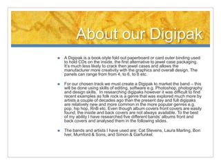
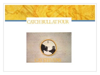
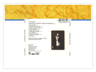
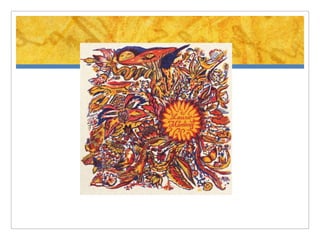
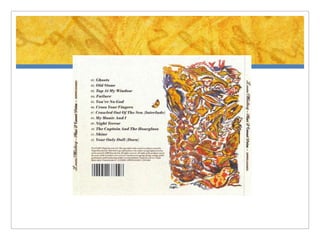
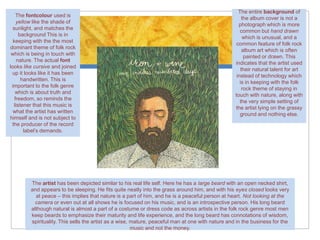
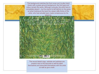
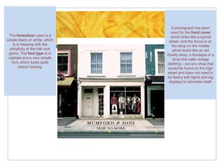
Digipak Research
       Folk Rock
      Hanan Mohamed 5161
About our Digipak
   A Digipak is a book-style fold out paperboard or card outer binding used
    to hold CDs on the inside, the first alternative to jewel case packaging.
    It’s much less likely to crack then jewel cases and allows the
    manufacturer more creativity with the graphics and overall design. The
    panels can range from from 4, to 6, to 8 etc.

   For our chosen track we must create a Digipak to market the band – this
    will be done using skills of editing, software e.g. Photoshop, photography
    and design skills. In researching digipaks however it was difficult to find
    recent examples as folk rock is a genre that was explored much more by
    artists a couple of decades ago than the present day and full digipaks
    are relatively new and more common in the more popular genres e.g.
    pop, hip hop, RnB etc. Even though album covers front covers are easily
    found, the inside and back covers are not always available. To the best
    of my ability I have researched five different bands’ albums front and
    back covers and analysed them in the following slides.

   The bands and artists I have used are: Cat Stevens, Laura Marling, Bon
    Iver, Mumford & Sons, and Simon & Garfunkel.
The entire background of
    The fontcolour used is
                                                                                                       the album cover is not a
    yellow like the shade of
                                                                                                     photograph which is more
  sunlight, and matches the
                                                                                                      common but hand drawn
      background This is in
                                                                                                       which is unusual, and a
  keeping with the the most
                                                                                                    common feature of folk rock
dominant theme of folk rock
                                                                                                       album art which is often
 which is being in touch with
                                                                                                        painted or drawn. This
     nature. The actual font
                                                                                                   indicates that the artist used
looks like cursive and joined
                                                                                                      their natural talent for art
 up it looks like it has been
                                                                                                    instead of technology which
       handwritten. This is
                                                                                                      is in keeping with the folk
 important to the folk genre
                                                                                                       rock theme of staying in
    which is about truth and
                                                                                                   touch with nature, along with
   freedom, so reminds the
                                                                                                      the very simple setting of
   listener that this music is
                                                                                                   the artist lying on the grassy
  what the artist has written
                                                                                                      ground and nothing else.
himself and is not subject to
 the producer of the record
        label’s demands.


         The artist has been depicted similar to his real life self. Here he has a large beard with an open necked shirt,
         and appears to be sleeping. He fits quite neatly into the grass around him, and with his eyes closed looks very
           at peace – this implies that nature is a part of him, and he is a peaceful person at heart. Not looking at the
           camera or even out at all shows he is focused on his music, and is an introspective person. His long beard
         although natural is almost a part of a costume or dress code as across artists in the folk rock genre most men
         keep beards to emphasize their maturity and life experience, and the long beard has connotations of wisdom,
         spirituality. This sells the artist as a wise, mature, peaceful man at one with nature and in the business for the
                                                        music and not the money.
The background matches the front cover as it is also hand
  drawn with a grass ground background, the font type and
colour remain the same. Although curiously, the artist here is
completely absent – but his imprint is left behind on the grass
  so when looking at the back the viewer stills thinks of the
   artist, who has actually been made conspicuous by his
                           absence.


    The record label’s logo, website and address are
      present next to the barcode to sell the label
  themselves and associate themselves with the artist
                 as well as give credit.
A photograph has been
                                  used for the front cover
  The fontcolour used is a        which looks like a typical
simple black on white, which     street, and the focus is on
    is in keeping with the         the shop on the middle
  simplicity of the folk rock      which looks like an old
 genre. The font type is in     charity shop, a boutique or a
 capitals and a very simple        shop that sells vintage
   font, which looks quite      clothing – not any shop that
        classic looking.         would be found on the high
                                street and does not need to
                                be flashy with lights and big
                                 displays to advertise itself.
Digipak research folk rock 2

Digipak research folk rock 2

  • 1.
    Digipak Research Folk Rock Hanan Mohamed 5161
  • 2.
    About our Digipak  A Digipak is a book-style fold out paperboard or card outer binding used to hold CDs on the inside, the first alternative to jewel case packaging. It’s much less likely to crack then jewel cases and allows the manufacturer more creativity with the graphics and overall design. The panels can range from from 4, to 6, to 8 etc.  For our chosen track we must create a Digipak to market the band – this will be done using skills of editing, software e.g. Photoshop, photography and design skills. In researching digipaks however it was difficult to find recent examples as folk rock is a genre that was explored much more by artists a couple of decades ago than the present day and full digipaks are relatively new and more common in the more popular genres e.g. pop, hip hop, RnB etc. Even though album covers front covers are easily found, the inside and back covers are not always available. To the best of my ability I have researched five different bands’ albums front and back covers and analysed them in the following slides.  The bands and artists I have used are: Cat Stevens, Laura Marling, Bon Iver, Mumford & Sons, and Simon & Garfunkel.
  • 7.
    The entire backgroundof The fontcolour used is the album cover is not a yellow like the shade of photograph which is more sunlight, and matches the common but hand drawn background This is in which is unusual, and a keeping with the the most common feature of folk rock dominant theme of folk rock album art which is often which is being in touch with painted or drawn. This nature. The actual font indicates that the artist used looks like cursive and joined their natural talent for art up it looks like it has been instead of technology which handwritten. This is is in keeping with the folk important to the folk genre rock theme of staying in which is about truth and touch with nature, along with freedom, so reminds the the very simple setting of listener that this music is the artist lying on the grassy what the artist has written ground and nothing else. himself and is not subject to the producer of the record label’s demands. The artist has been depicted similar to his real life self. Here he has a large beard with an open necked shirt, and appears to be sleeping. He fits quite neatly into the grass around him, and with his eyes closed looks very at peace – this implies that nature is a part of him, and he is a peaceful person at heart. Not looking at the camera or even out at all shows he is focused on his music, and is an introspective person. His long beard although natural is almost a part of a costume or dress code as across artists in the folk rock genre most men keep beards to emphasize their maturity and life experience, and the long beard has connotations of wisdom, spirituality. This sells the artist as a wise, mature, peaceful man at one with nature and in the business for the music and not the money.
  • 8.
    The background matchesthe front cover as it is also hand drawn with a grass ground background, the font type and colour remain the same. Although curiously, the artist here is completely absent – but his imprint is left behind on the grass so when looking at the back the viewer stills thinks of the artist, who has actually been made conspicuous by his absence. The record label’s logo, website and address are present next to the barcode to sell the label themselves and associate themselves with the artist as well as give credit.
  • 9.
    A photograph hasbeen used for the front cover The fontcolour used is a which looks like a typical simple black on white, which street, and the focus is on is in keeping with the the shop on the middle simplicity of the folk rock which looks like an old genre. The font type is in charity shop, a boutique or a capitals and a very simple shop that sells vintage font, which looks quite clothing – not any shop that classic looking. would be found on the high street and does not need to be flashy with lights and big displays to advertise itself.