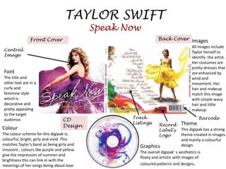
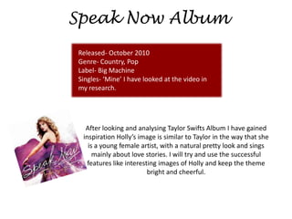
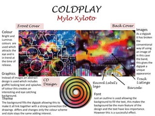
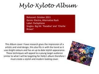
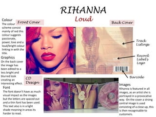
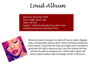
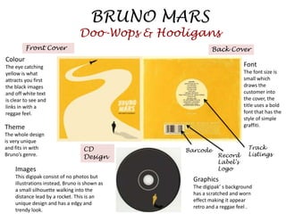
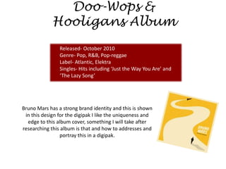
2. TAYLOR SWIFT
Speak Now
Front Cover Back Cover Images
All images include
Central Taylor herself to
Image identify the artist.
Her costumes are
pretty dresses that
Font are enhanced by
The title and wind and
other text are in a movement. Her
curly and hair and makeup
feminine style match this image
which is with simple wavy
decorative and hair and little
pretty appealing makeup.
to the target
Track Barcode
audience. CD
Listings Record Theme
Colour Design
Label’s This digipak has a strong
The colour scheme for this digipak is, Logo theme created in images
colourful, bright, girly and vivid. This and mainly a colourful
matches Taylor’s band as being girly and Graphics design.
innocent , colours like purple and yellow
The overall digipak’ s aesthetics is
give the impression of summer and
floaty and artistic with images of
brightness this can link in with the
meanings of her songs being about love. coloured patterns and designs.
3. Speak Now Album
Released- October 2010
Genre- Country, Pop
Label- Big Machine
Singles- ‘Mine’ I have looked at the video in
my research.
After looking and analysing Taylor Swifts Album I have gained
inspiration Holly’s image is similar to Taylor in the way that she
is a young female artist, with a natural pretty look and sings
mainly about love stories. I will try and use the successful
features like interesting images of Holly and keep the theme
bright and cheerful.
4. COLDPLAY
Mylo Xyloto
Front Cover Back Cover
Images
Colour As a digipak
Bright and it has broken
Luminas the
colours are conventional
used which way of using
attracts the an image of
eye and is in this case
in trend at the band,
the time of this gives the
release. digipak a
unique
Graphics appearance
Instead of images an abstract Track
design is used which includes CD
Record Label's Listings
graffiti looking text and splashes Design
logo Barcode
of colour this creates an
interesting and eye catching
background. Font
Theme Just an outline is used allowing the
The background fills the digipak allowing this to background to fill the text, this makes the
make it all link together with a strong connection the background be the main feature of the
drawings differs and changes only the colour scheme design and the text have less importance.
and style stays the same adding interest. However this is a successful effect.
5. Mylo Xyloto Album
Released- October 2011
Genre- Electro, Alternative Rock
Label- Parlophone
Singles- Big Hit ‘Paradise’ and ‘Charlie
Brown’
This Album cover I have research gives the impression of a
artistic and vivid design, this also fits in with the trend as it
uses bright colours and has an up to date stylish appearance.
These techniques will appeal to a young target audience
similar to what I will be targeting for Holly’s album therefore I
must create a stylish and modern looking cover.
6. RIHANNA
Colour
Front Cover
Loud Back Cover
The colour
scheme consist
mainly of red this
colour suggests
passionate,
power, love and a Track
loud/bright colour Listings
linking in with the
title.
Record
Graphics Label’s
On the back cover Logo
the image has
been edited to a
less bright and
blurred look Barcode
creating an CD
interesting effect. Design Images
Font Rihanna is featured in all
The font doesn’t have as much images, as an artist she is
visual impact as the images portrayed in a provocative
but the letters are spaced out way. On the cover a strong
and a thin font has been used. central image is used
This text also is in a light consisting of a close up, this
shade meaning in areas its is then recognisable to
harder to read. customers.
7. Loud Album
Released- November 2010
Genre- R&B, Dance, Pop
Label- Def Jam
Singles- ‘ California King Bed’ the video I have
analysed and gained inspiration from.
Rihanna’s album has given me ideas of how to make a Digipak
have a strong colour scheme with mainly red being used giving
visual impact, I also think the close-up images which would be a
good idea for Holly’s album as this is her first release and fans
will then be able to recognise her. I think Holly’s album will
need a stylish modern look and design similar to Rihanna’s.
8. BRUNO MARS
Doo-Wops & Hooligans
Front Cover Back Cover
Colour
The eye catching Font
yellow is what The font size is
attracts you first small which
the black images draws the
and off white text customer into
is clear to see and the cover, the
links in with a title uses a bold
reggae feel. font that has the
style of simple
Theme graffiti.
The whole design
is very unique
and fits in with CD Barcode Track
Bruno’s genre. Design Record Listings
Label’s
Images Logo
This digipak consist of no photos but
Graphics
illustrations instead, Bruno is shown as
The digipak’ s background
a small silhouette walking into the
has a scratched and worn
distance lead by a rocket. This is an
effect making it appear
unique design and has a edgy and
retro and a reggae feel .
trendy look.
9. Doo-Wops &
Hooligans Album
Released- October 2010
Genre- Pop, R&B, Pop-reggae
Label- Atlantic, Elektra
Singles- Hits including ‘Just the Way You Are’ and
‘The Lazy Song’
Bruno Mars has a strong brand identity and this is shown
in this design for the digipak I like the uniqueness and
edge to this album cover, something I will take after
researching this album is that and how to addresses and
portray this in a digipak.