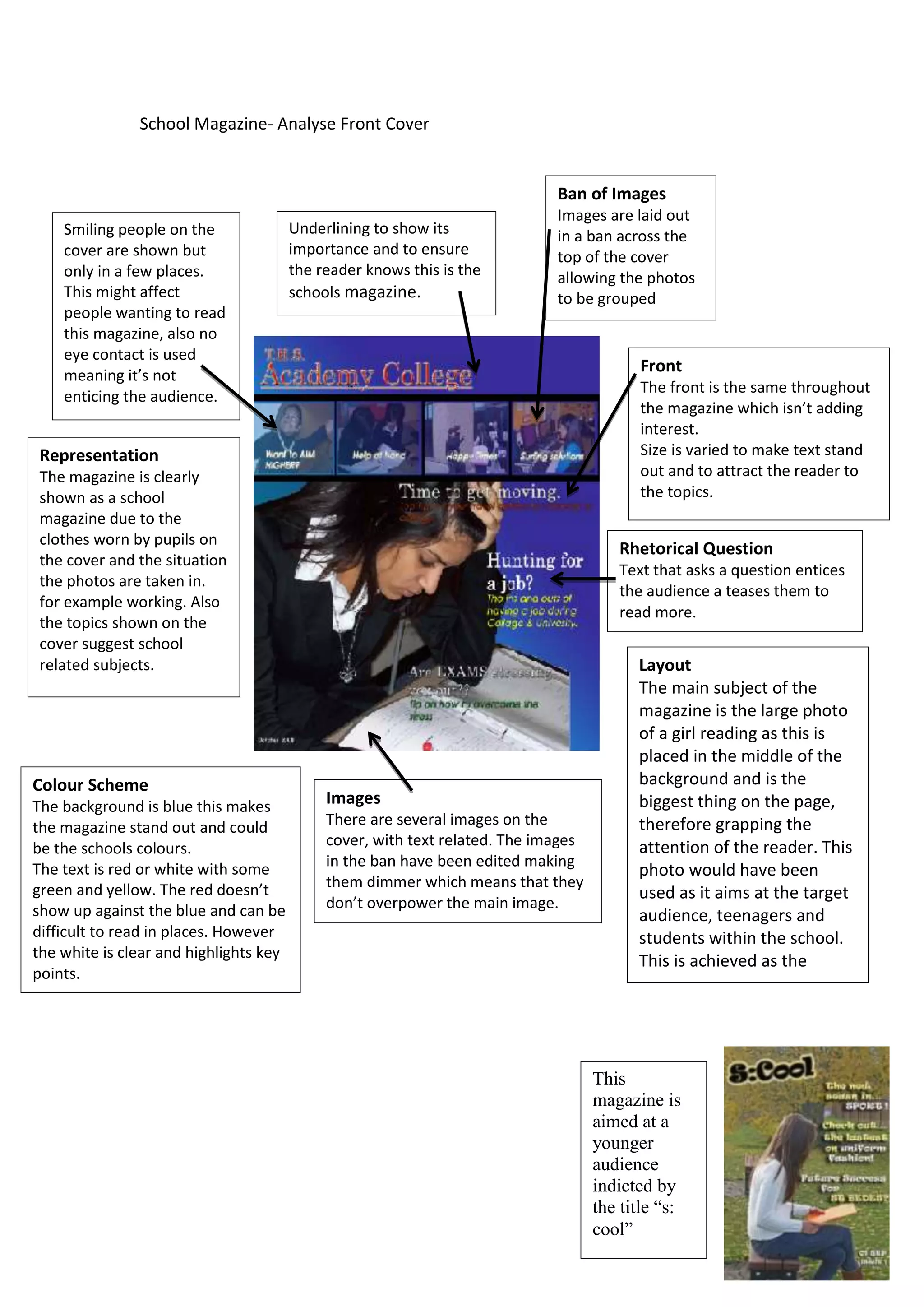
School Magazine- Analyse Front Cover


                                                                             Ban of Images
                                                                             Images are laid out
    Smiling people on the               Underlining to show its              in a ban across the
    cover are shown but                 importance and to ensure             top of the cover
    only in a few places.               the reader knows this is the         allowing the photos
    This might affect                   schools magazine.                    to be grouped
    people wanting to read
    this magazine, also no
    eye contact is used
    meaning it’s not
                                                                                           Front
                                                                                           The front is the same throughout
    enticing the audience.
                                                                                           the magazine which isn’t adding
                                                                                           interest.
 Representation                                                                            Size is varied to make text stand
 The magazine is clearly                                                                   out and to attract the reader to
 shown as a school                                                                         the topics.
 magazine due to the
 clothes worn by pupils on
                                                                                       Rhetorical Question
 the cover and the situation
                                                                                       Text that asks a question entices
 the photos are taken in.
                                                                                       the audience a teases them to
 for example working. Also
                                                                                       read more.
 the topics shown on the
 cover suggest school
 related subjects.                                                                        Layout
                                                                                          The main subject of the
                                                                                          magazine is the large photo
                                                                                          of a girl reading as this is
                                                                                          placed in the middle of the
Colour Scheme                                                                             background and is the
The background is blue this makes            Images                                       biggest thing on the page,
the magazine stand out and could             There are several images on the              therefore grapping the
be the schools colours.                      cover, with text related. The images         attention of the reader. This
The text is red or white with some           in the ban have been edited making
                                                                                          photo would have been
green and yellow. The red doesn’t            them dimmer which means that they
                                                                                          used as it aims at the target
show up against the blue and can be          don’t overpower the main image.
                                                                                          audience, teenagers and
difficult to read in places. However                                                      students within the school.
the white is clear and highlights key
                                                                                          This is achieved as the
points.
                                                                                          student is a young girl.


                                                                                    This
                                                                                    magazine is
                                                                                    aimed at a
                                                                                    younger
                                                                                    audience
                                                                                    indicted by
                                                                                    the title “s:
                                                                                    cool”

School magazine

  • 1.
    School Magazine- AnalyseFront Cover Ban of Images Images are laid out Smiling people on the Underlining to show its in a ban across the cover are shown but importance and to ensure top of the cover only in a few places. the reader knows this is the allowing the photos This might affect schools magazine. to be grouped people wanting to read this magazine, also no eye contact is used meaning it’s not Front The front is the same throughout enticing the audience. the magazine which isn’t adding interest. Representation Size is varied to make text stand The magazine is clearly out and to attract the reader to shown as a school the topics. magazine due to the clothes worn by pupils on Rhetorical Question the cover and the situation Text that asks a question entices the photos are taken in. the audience a teases them to for example working. Also read more. the topics shown on the cover suggest school related subjects. Layout The main subject of the magazine is the large photo of a girl reading as this is placed in the middle of the Colour Scheme background and is the The background is blue this makes Images biggest thing on the page, the magazine stand out and could There are several images on the therefore grapping the be the schools colours. cover, with text related. The images attention of the reader. This The text is red or white with some in the ban have been edited making photo would have been green and yellow. The red doesn’t them dimmer which means that they used as it aims at the target show up against the blue and can be don’t overpower the main image. audience, teenagers and difficult to read in places. However students within the school. the white is clear and highlights key This is achieved as the points. student is a young girl. This magazine is aimed at a younger audience indicted by the title “s: cool”