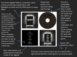
The 1975 – Digipak Analysis
Saeed Moulai
The whole digipak follows a simplistic colour
scheme containing mainly black, with
highlights of white and the effect gives it a grey
effect
The back cover with the lyrics are on a board with a
light placed behind it which gives it an ominous glow
The CD is
completely
black apart
from a small
white circle on
the inside and
the 1975 in a
darker black
font which is
barely
noticeable. this
gives it a
classic looking
effect which
fits well with
the indie pop
genre,
It gives off a
mysterious effect
There is a wire
hanging from the
board which gives it
an authentic feel
which is popular in
the indie pop genre
because it makes
the consumer feel
closer to the
performer
Simple font
which is the
same the whole
way through
There company
ident and labels
are clear to see as
they are in white
and presented in
a bold way
Basic information is all
presented on small print
inside of the digipak

Digipak Analysis The 1975

  • 1.
    The 1975 –Digipak Analysis Saeed Moulai
  • 3.
    The whole digipakfollows a simplistic colour scheme containing mainly black, with highlights of white and the effect gives it a grey effect The back cover with the lyrics are on a board with a light placed behind it which gives it an ominous glow The CD is completely black apart from a small white circle on the inside and the 1975 in a darker black font which is barely noticeable. this gives it a classic looking effect which fits well with the indie pop genre, It gives off a mysterious effect There is a wire hanging from the board which gives it an authentic feel which is popular in the indie pop genre because it makes the consumer feel closer to the performer Simple font which is the same the whole way through There company ident and labels are clear to see as they are in white and presented in a bold way Basic information is all presented on small print inside of the digipak