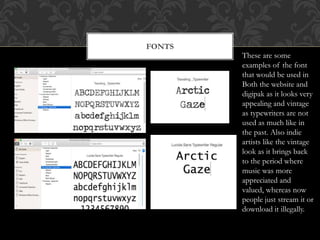
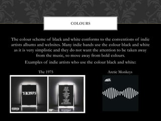
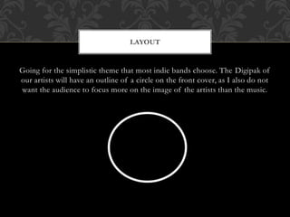
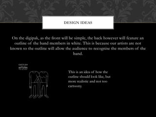
call girls in Kamla Market (DELHI) 🔝 >༒9953330565🔝 genuine Escort Service 🔝✔️✔️
Blog post 50: Short list
1. By Nazmin Jahan
BLOG POST 50: SHORTLIST OF FONTS,
COLOURS, LAYOUT AND DESIGN
IDEAS
2. FONTS
These are some
examples of the font
that would be used in
Both the website and
digipak as it looks very
appealing and vintage
as typewriters are not
used as much like in
the past. Also indie
artists like the vintage
look as it brings back
to the period where
music was more
appreciated and
valued, whereas now
people just stream it or
download it illegally.
3. The colour scheme of black and white conforms to the conventions of indie
artists albums and websites. Many indie bands use the colour black and white
as it is very simplistic and they do not want the attention to be taken away
from the music, so move away from bold colours.
Examples of indie artists who use the colour black and white:
COLOURS
Arctic MonkeysThe 1975
4. Going for the simplistic theme that most indie bands choose. The Digipak of
our artists will have an outline of a circle on the front cover, as I also do not
want the audience to focus more on the image of the artists than the music.
LAYOUT
5. On the digipak, as the front will be simple, the back however will feature an
outline of the band members in white. This is because our artists are not
known so the outline will allow the audience to recognise the members of the
band.
DESIGN IDEAS
This is an idea of how the
outline should look like, but
more realistic and not too
cartoony.