More Related Content


Similar to Digipak Analysis (Inside Cover)


Digipak Analysis (Inside Cover)
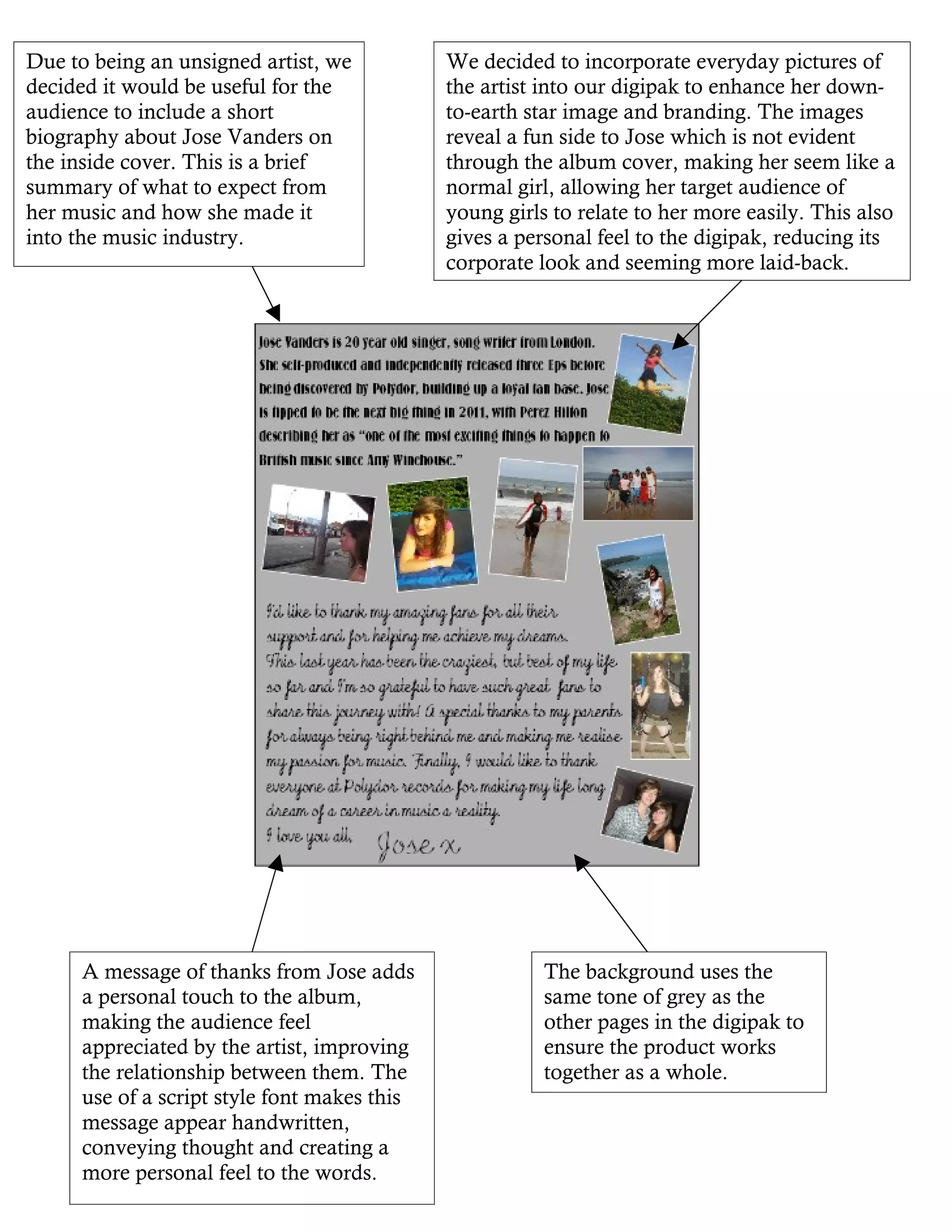
- 1. Due to beingan unsigned artist, we We decided to incorporate everyday pictures of decided it would be useful for the the artist into our digipak to enhance her down- audience to include a short to-earth star image and branding. The images biography about Jose Vanders on reveal a fun side to Jose which is not evident the inside cover. This is a brief through the album cover, making her seem like a summary of what to expect from normal girl, allowing her target audience of her music and how she made it young girls to relate to her more easily. This also into the music industry. gives a personal feel to the digipak, reducing its corporate look and seeming more laid-back. A message of thanks from Jose adds The background uses the a personal touch to the album, same tone of grey as the making the audience feel other pages in the digipak to appreciated by the artist, improving ensure the product works the relationship between them. The together as a whole. use of a script style font makes this message appear handwritten, conveying thought and creating a more personal feel to the words.