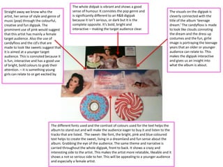
Straight away we know who the
artist, her sense of style and genre of
music (pop) through the colourful,
creative and fun digipak. The
prominent use of pink would suggest
that this artist has mainly a female
target audience. Also the use of
candyfloss and the cd’s that are
made to look like sweets suggest that
it is aimed at a younger target
audience. This is connoted because it
is fun, interactive and has a good use
of bright, bold colours to grab their
attention. – it is something young
girls can relate to or get excited by.

The whole didpak is vibrant and shows a good
sense of humour. It connotes the pop genre and
is significantly different to an R&B digipak
because it isn’t serious, or dark but it is the
complete opposite. It’s bold, bright and
interactive – making the target audience clear.

The visuals on the digipak is
cleverly connected with the
title of the album ‘teenage
dream.’ The candyfloss is made
to look like clouds connoting
the dream and the dress up
costumes and the fun, girlie
image is portraying the teenage
years that an older or younger
audience can relate to. This
makes the digipak interactive
and gives us an insight into
what the album is about.

The different fonts used and the contrast of colours used for the text helps the
album to stand out and will make the audience eager to buy it and listen to the
tracks that are listed. The sweet- like font, the bright, pink and blue coloured
text helps to create the sweet, living in a dreamland and fun sense about the
album. Grabbing the eye of the audience. The same theme and narrative is
carried throughout the whole digipak, front to back. It shows a crazy and
interesting side to the artist. This makes the artist more relatable, likeable and it
shows a not so serious side to her. This will be appealing to a younger audience
and especially a female artist.

Digipak Analysis

  • 1.
    Straight away weknow who the artist, her sense of style and genre of music (pop) through the colourful, creative and fun digipak. The prominent use of pink would suggest that this artist has mainly a female target audience. Also the use of candyfloss and the cd’s that are made to look like sweets suggest that it is aimed at a younger target audience. This is connoted because it is fun, interactive and has a good use of bright, bold colours to grab their attention. – it is something young girls can relate to or get excited by. The whole didpak is vibrant and shows a good sense of humour. It connotes the pop genre and is significantly different to an R&B digipak because it isn’t serious, or dark but it is the complete opposite. It’s bold, bright and interactive – making the target audience clear. The visuals on the digipak is cleverly connected with the title of the album ‘teenage dream.’ The candyfloss is made to look like clouds connoting the dream and the dress up costumes and the fun, girlie image is portraying the teenage years that an older or younger audience can relate to. This makes the digipak interactive and gives us an insight into what the album is about. The different fonts used and the contrast of colours used for the text helps the album to stand out and will make the audience eager to buy it and listen to the tracks that are listed. The sweet- like font, the bright, pink and blue coloured text helps to create the sweet, living in a dreamland and fun sense about the album. Grabbing the eye of the audience. The same theme and narrative is carried throughout the whole digipak, front to back. It shows a crazy and interesting side to the artist. This makes the artist more relatable, likeable and it shows a not so serious side to her. This will be appealing to a younger audience and especially a female artist.