From researching into the CD/ Album covers of The Script I must include: Rainbow  Urban environment A poignant object in the middle of the cover Dark colours  Simplistic font White font
Some of the points made on the developing ideas slide are impossible to translate onto a CD cover without a specialist Photoshop programme that would allow me to blend and place objects on the cover with ease....
After reviewing and experimenting with what is possible and what is not, my list of objects to include on my CD cover have changed. After realising what is possible I made a new list of factors to include. Rainbow Poignant object Dark colours Simplistic Font White Font
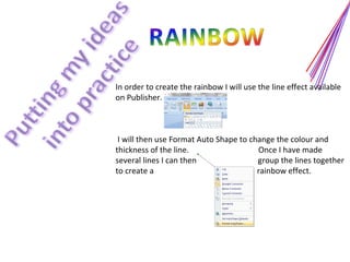
In order to create the rainbow I will use the line effect available on Publisher.  I will then use Format Auto Shape to change the colour and thickness of the line.  Once I have made  several lines I can then  group the lines together to create a  rainbow effect.
From looking at my research The Script have frequently used a symbol, such as a hand or heart as their poignant object, however at present I am not sure exactly what picture will be used in my CD. One idea was to have a still/ freeze frame of the main protagonist in my own video, however this is not completely decided yet. Another idea was to have the background as a beach with the rainbow effect coming out of the sun. More research is needed to completely decide the final project.
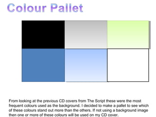
From looking at the previous CD covers from The Script these were the most frequent colours used as the background. I decided to make a pallet to see which of these colours stand out more than the others. If not using a background image then one or more of these colours will be used on my CD cover.
I have created a poll on my blog, missemilystevens.wordpress.com, to receive feedback from the audience as to what ‘theme’ they would prefer to see on the CD cover. As you can see the most popular answer is the rainbow which we will consider when putting together the  design of our cover. However, the poignant object seems to be also very popular which we will think about when creating this CD cover.
The main focus on this style of album cover is the rainbow effect... This was the most popular theme from our poll so has to be the main focus of our CD cover. This is a very basic idea, improvements would need to be made to make it look more effective such as, a filter could be placed over the rainbow effect to make it more translucent and maybe the rainbow effect of the spine could blend into the back cover. This will have to be decided as we gather more primary research. "We Cry" – 3:43 "Before the Worst" – 3:23 "Talk You Down" – 3:50 "The Man Who Can't Be Moved" – 4:01 "Breakeven" – 4:21 "Rusty Halo" – 3:34 "The End Where I Begin" – 3:34 "Fall For Anything" – 4:32 "If You See Kay" – 3:12 "I'm Yours" – 4:13
other ideas

Cd cover powerpoint

  • 1.
  • 2.
    From researching intothe CD/ Album covers of The Script I must include: Rainbow Urban environment A poignant object in the middle of the cover Dark colours Simplistic font White font
  • 3.
    Some of thepoints made on the developing ideas slide are impossible to translate onto a CD cover without a specialist Photoshop programme that would allow me to blend and place objects on the cover with ease....
  • 4.
    After reviewing andexperimenting with what is possible and what is not, my list of objects to include on my CD cover have changed. After realising what is possible I made a new list of factors to include. Rainbow Poignant object Dark colours Simplistic Font White Font
  • 5.
    In order tocreate the rainbow I will use the line effect available on Publisher. I will then use Format Auto Shape to change the colour and thickness of the line. Once I have made several lines I can then group the lines together to create a rainbow effect.
  • 6.
    From looking atmy research The Script have frequently used a symbol, such as a hand or heart as their poignant object, however at present I am not sure exactly what picture will be used in my CD. One idea was to have a still/ freeze frame of the main protagonist in my own video, however this is not completely decided yet. Another idea was to have the background as a beach with the rainbow effect coming out of the sun. More research is needed to completely decide the final project.
  • 7.
    From looking atthe previous CD covers from The Script these were the most frequent colours used as the background. I decided to make a pallet to see which of these colours stand out more than the others. If not using a background image then one or more of these colours will be used on my CD cover.
  • 8.
    I have createda poll on my blog, missemilystevens.wordpress.com, to receive feedback from the audience as to what ‘theme’ they would prefer to see on the CD cover. As you can see the most popular answer is the rainbow which we will consider when putting together the design of our cover. However, the poignant object seems to be also very popular which we will think about when creating this CD cover.
  • 9.
    The main focuson this style of album cover is the rainbow effect... This was the most popular theme from our poll so has to be the main focus of our CD cover. This is a very basic idea, improvements would need to be made to make it look more effective such as, a filter could be placed over the rainbow effect to make it more translucent and maybe the rainbow effect of the spine could blend into the back cover. This will have to be decided as we gather more primary research. "We Cry" – 3:43 "Before the Worst" – 3:23 "Talk You Down" – 3:50 "The Man Who Can't Be Moved" – 4:01 "Breakeven" – 4:21 "Rusty Halo" – 3:34 "The End Where I Begin" – 3:34 "Fall For Anything" – 4:32 "If You See Kay" – 3:12 "I'm Yours" – 4:13
  • 10.