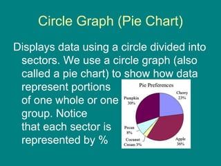
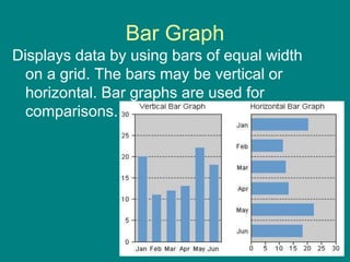
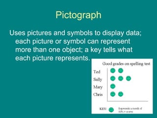
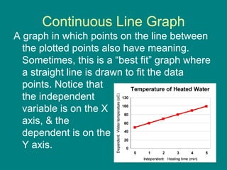
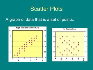
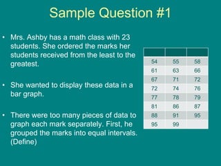
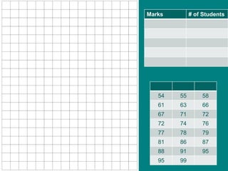
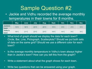
This document provides information about different types of graphs used to display data: circle graphs (pie charts) show portions of a whole, bar graphs allow for comparisons using vertical or horizontal bars of equal width, pictographs use pictures/symbols to represent data with a key, broken line graphs join data points over time, continuous line graphs have meaning between plotted points, and scatter plots show sets of plotted points. It includes sample questions about displaying student mark data in a bar graph and comparing average monthly temperatures in two towns using a line graph.
Circle Graph (PieChart)
Displays data using a circle divided into
sectors. We use a circle graph (also
called a pie chart) to show how data
represent portions
of one whole or one
group. Notice
that each sector is
represented by %
3.
Bar Graph
Displays databy using bars of equal width
on a grid. The bars may be vertical or
horizontal. Bar graphs are used for
comparisons.
4.
Pictograph
Uses pictures andsymbols to display data;
each picture or symbol can represent
more than one object; a key tells what
each picture represents.
5.
Broken Line Graph
Agraph showing data points joined by line
segments to show trends over time.
6.
Continuous Line Graph
Agraph in which points on the line between
the plotted points also have meaning.
Sometimes, this is a “best fit” graph where
a straight line is drawn to fit the data
points. Notice that
the independent
variable is on the X
axis, & the
dependent is on the
Y axis.
Sample Question #1
•Mrs. Ashby has a math class with 23
students. She ordered the marks her
students received from the least to the
greatest.
• She wanted to display these data in a
bar graph.
• There were too many pieces of data to
graph each mark separately. First, he
grouped the marks into equal intervals.
(Define)
54 55 58
61 63 66
67 71 72
72 74 76
77 78 79
81 86 87
88 91 95
95 99
Sample Question #2
•Jackie and Vidhu recorded the average monthly
temperatures in their towns for 8 months.
May June July Aug. Sept. Oct. Nov. Dec.
Jackie’s
town
13C 18C 23C 20C 15C 9C 2C 0C
Vidhu’s
town
18C 21C 23C 23C 18C 14C 9C 5C
• What kind of graph should we display the data for each town?
Circle, Bar, Line, Pictograph, Scatterplots? Should we put both sets
of data on the same grid? Should we use a different color for each
town?
• Is the average monthly temperature in Vidhu’s town always higher
than in Jackie’s town? How can you tell this from the graph?
• Write a statement about what the graph shows for each town.
• Write two questions that can be answered using your graph.