Downloaded 72 times
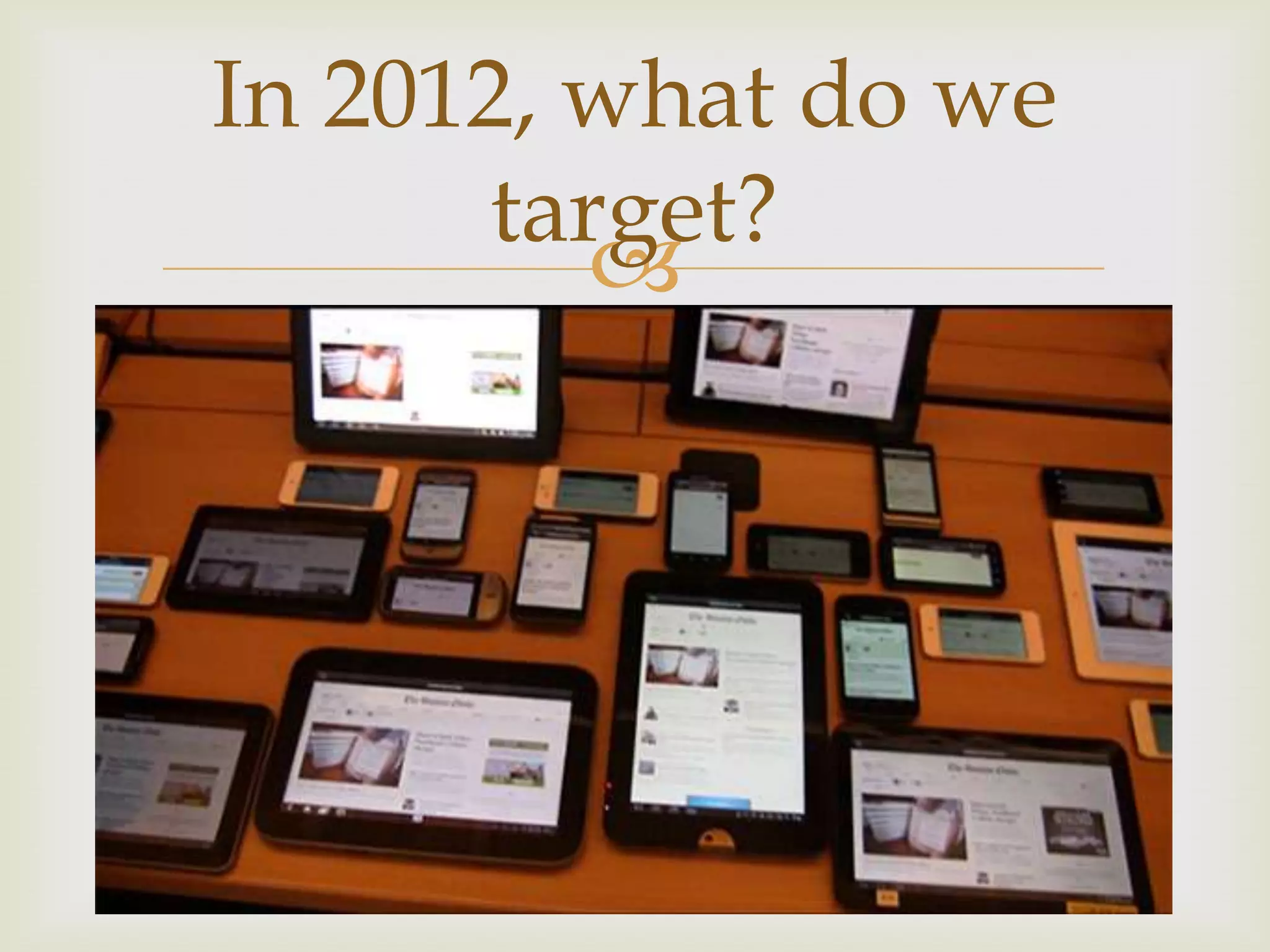
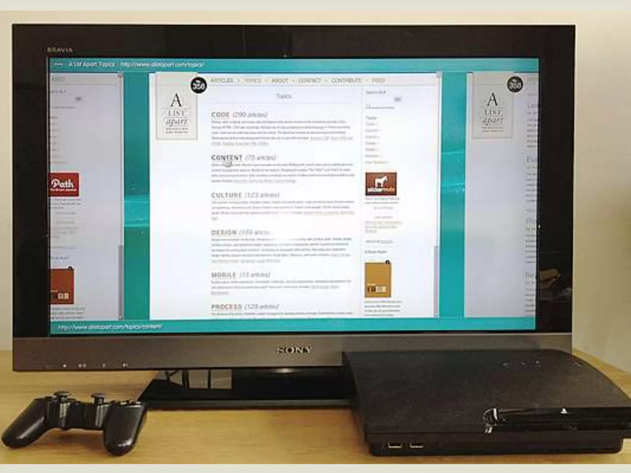
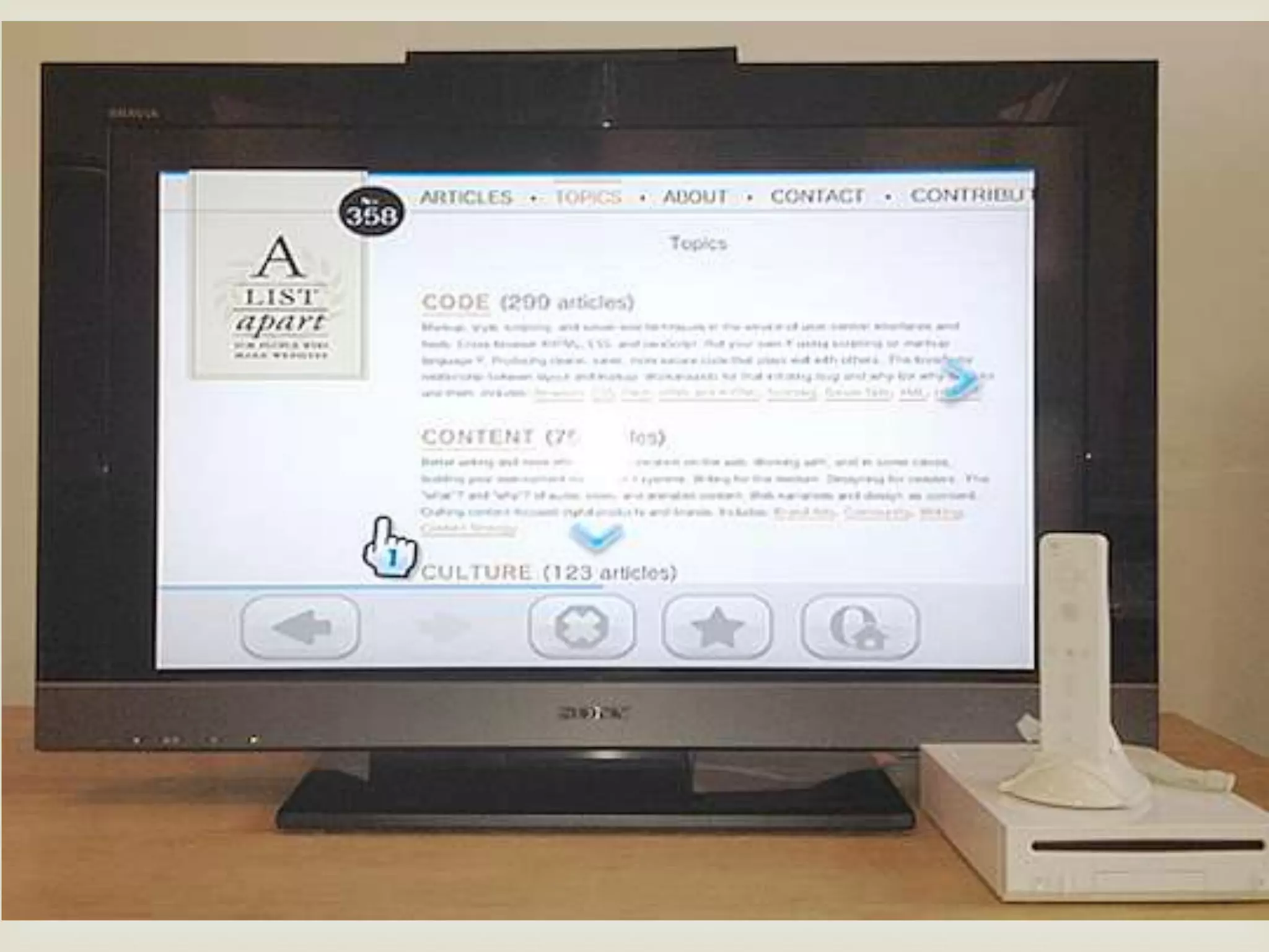
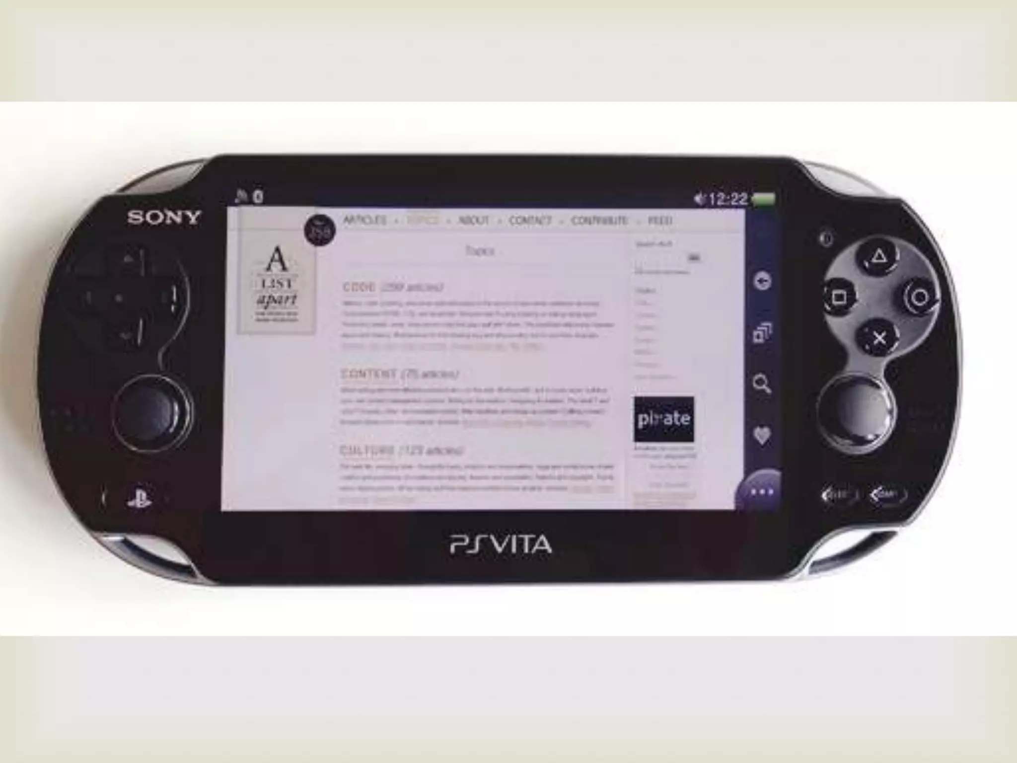


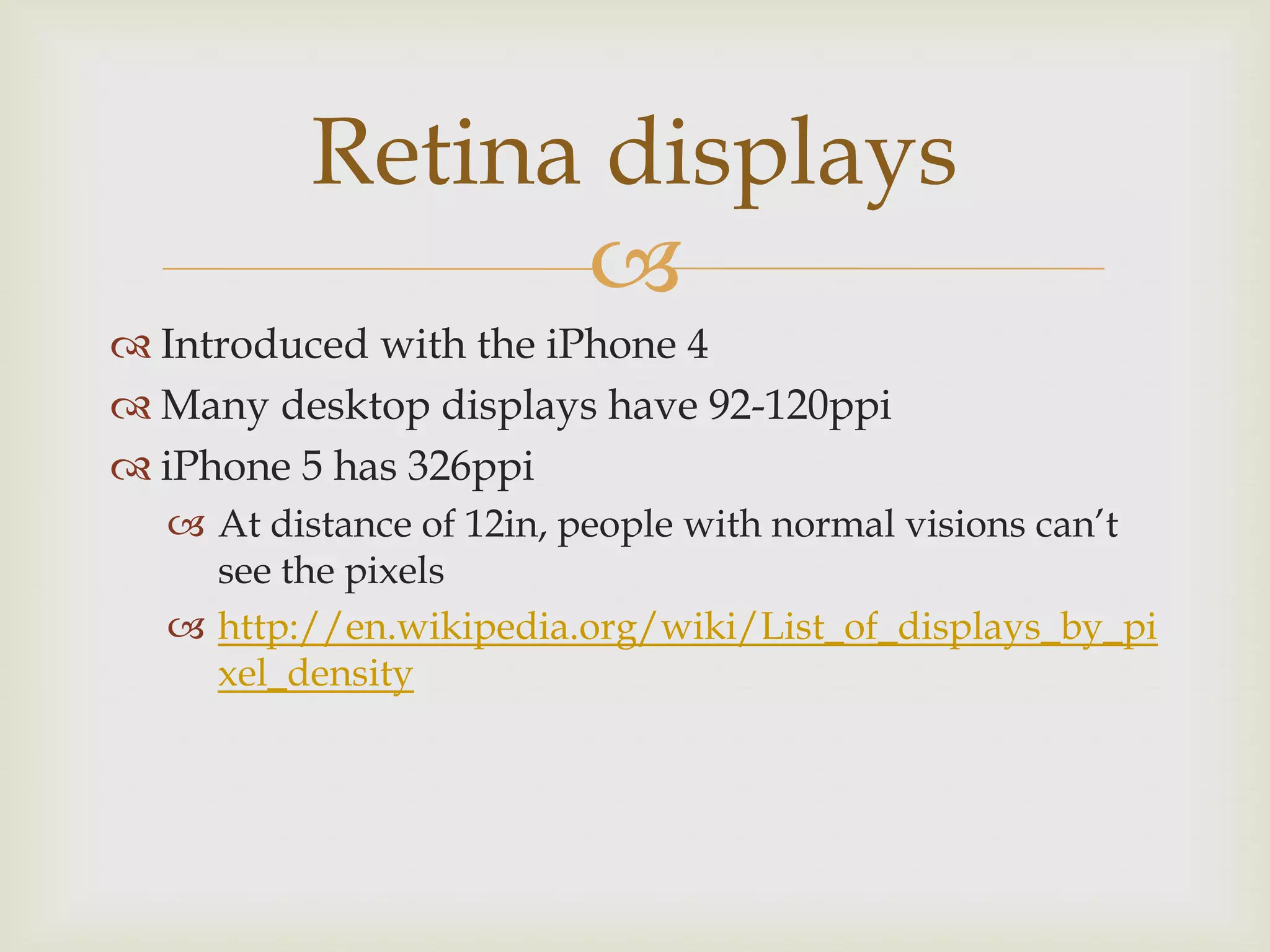
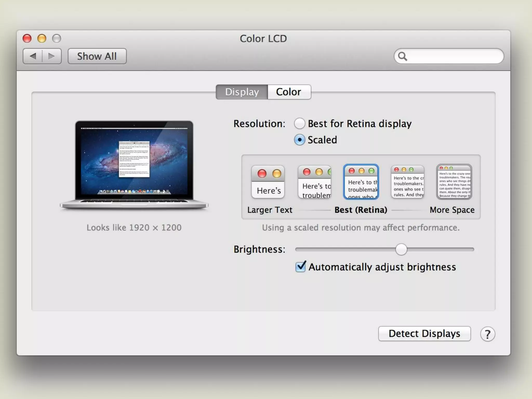
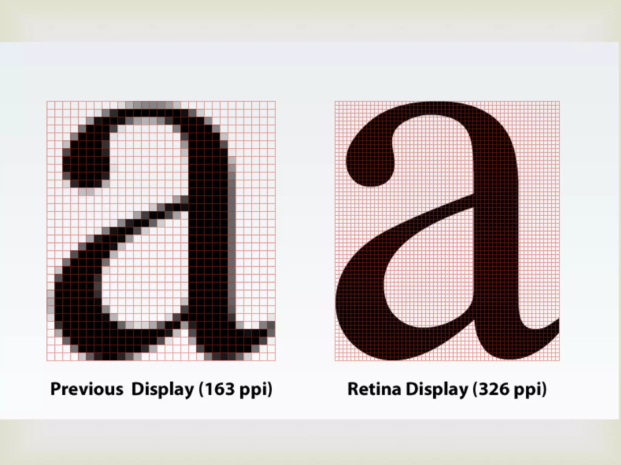
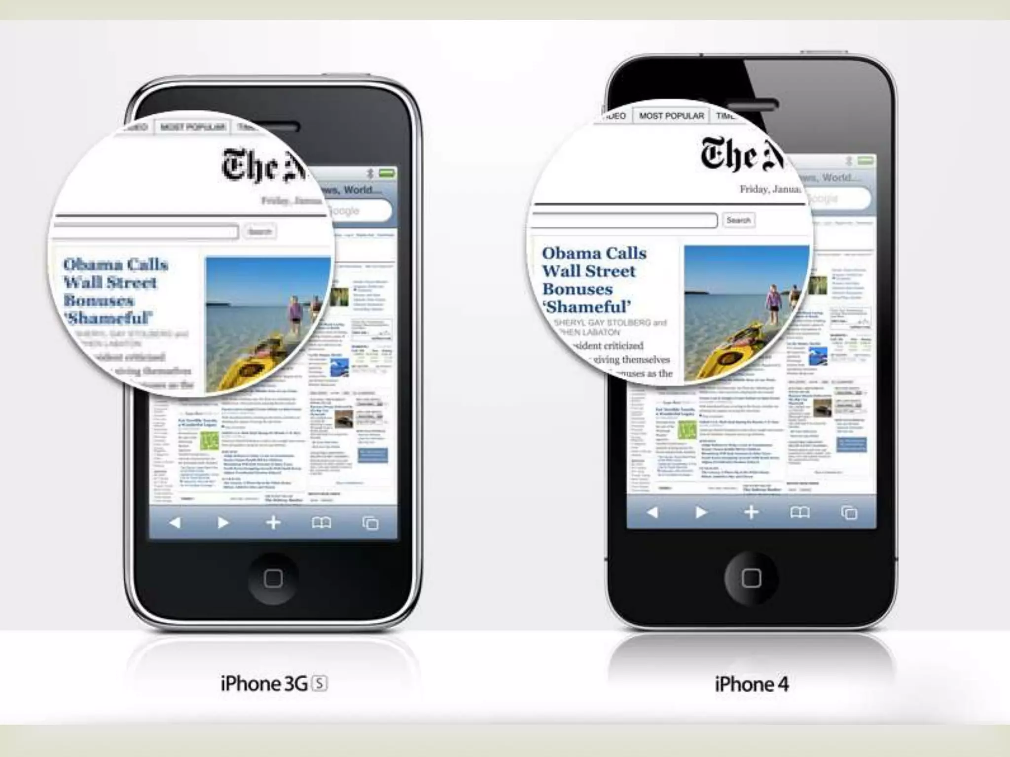

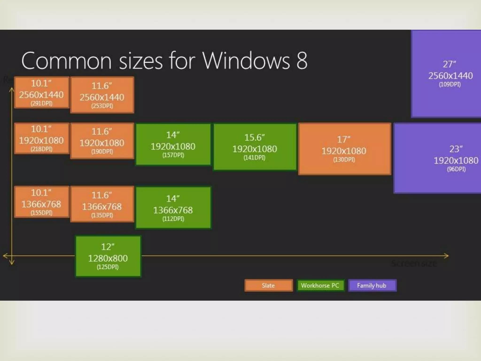
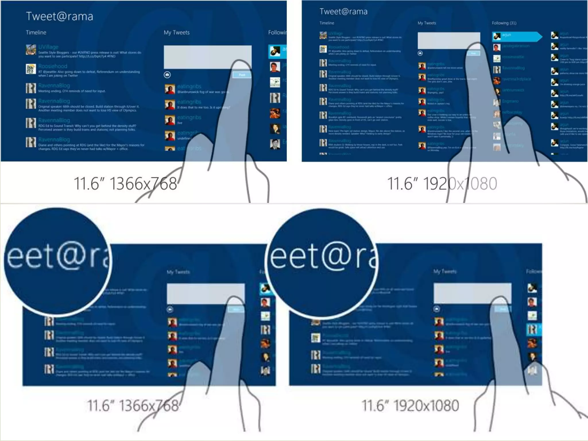
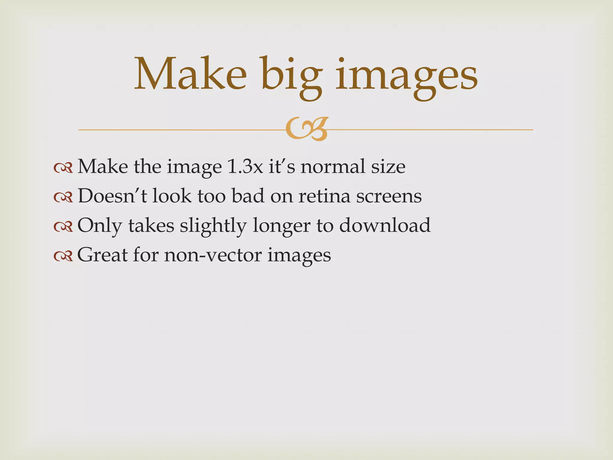
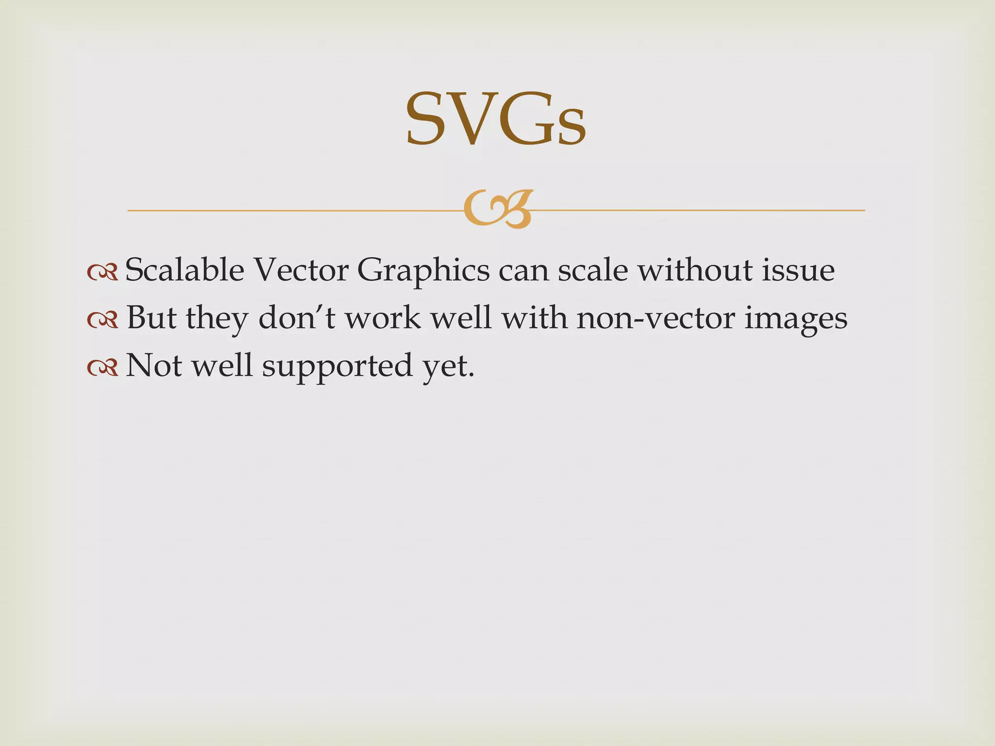


The document discusses responsive design, targeting designs based on device display and utilizing HTML5 and CSS3 with media queries and scalable images for optimal viewing. It emphasizes the importance of adapting to varying screen sizes and resolutions, especially with the advent of high-DPI displays like Retina. The content highlights resources and coding practices to tackle the challenges of responsive web design effectively.


![Vibe Coding vs. Spec-Driven Development [Free Meetup]](https://cdn.slidesharecdn.com/ss_thumbnails/vibecodingvsspecdrivendevelopment-251209105622-43f455e7-thumbnail.jpg?width=640&height=640&fit=bounds)


