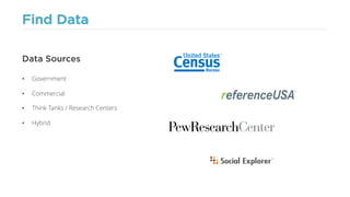
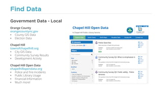
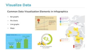
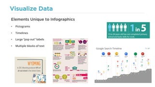
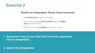
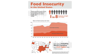
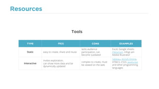
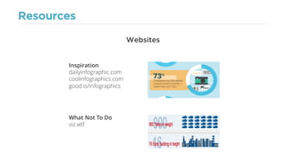
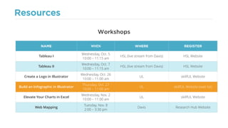
TURNING DATA INTO
INFOGRAPHICS
an Interactive Workshop for Problem Solvers
Lorin Bruckner Jennie Goforth
Step 1: Find Data
Find Data
• Government
• Commercial
• Think Tanks / Research Centers
• Hybrid
Data Sources
Find Data
Orange County
orangecountync.gov
• County GIS Data
• Election Data
Chapel Hill
townofchapelhill.org
• City GIS Data
• Community Survey Results
• Development Activity
Chapel Hill Open Data
chapelhillopendata.org
• Police and Fire Incidents
• Public Library Usage
• Financial Information
• Much more!
Government Data - Local
Find Data
Health and Human Services
schs.state.nc.us
• Health Statistics
Environmental Quality
deq.nc.gov
• State GIS Data
• Environmental Reports
State Budget and Management
www.osbm.nc.gov
• Demographics
• Census Data
ACCESSNC
accessnc.commerce.state.nc.us
• Economic Reports
Government Data - State
Find Data
Census
census.gov
• American Fact Finder
• Business & Employment Data
Department of Agriculture
usda.gov
• Food and Farm Info
• Trade Reports
Geological Survey
usgs.gov
• National GIS Data
• Environmental Data
(Including Real-Time/Streaming)
Government Data - Federal
Find Data
referenceUSA
referenceusa.com
• Directory of Business Contact Info
ArcGIS Online
arcgis.com
• Business GIS Data
Federal Communications Commission
fcc.gov
• Consumer Complaints
• Business License Info
Small Business Administration
sba.gov
• Consumer Statistics
• Production & Sales Statistics
Commercial Data
Find Data
Pew
pewresearch.org
• Political, Social & Economic Trends
Odum Institute Dataverse
arc.irss.unc.edu
• Social Science
The World Bank
worldbank.org
• International Data
• Development Indicators
Roper
ropercenter.cornell.edu
• Public Opinion Surveys & Polls
Think Tanks / Research Centers
Find Data
Social Explorer
socialexplorer.com
• Census & American Community Survey
• User Friendly Platform
PolicyMap
policymap.com
• 150 Data Sources
• Represented on Easy-to-Use Map
DATA.GOV
data.gov
• Government Data
• Search Over 186,467 Datasets at Once!
Hybrid Sources
Find Data
• Primary sources have first-hand evidence.
• Raw data files are a primary source.
• Articles, blogs, etc. are a secondary source.
• Secondary sources can be inaccurate and
contain misinformation.
Primary vs. Secondary Sources
Find Data
• Even if two different sources are collecting the
same type of data, they will use different
methods and techniques.
• Different sources will be sampling from
different populations.
• Mixing data from different sources can
provide an inaccurate representation.
Don’t Mix Sources
Step 2: Explore Data
Explore Data
• Are there patterns in the data?
• Look for built-in visualizations
• Look for summary statistics and reports
(if published by the same reliable source
that collected the original data)
What Story Does the Data Tell?
Explore Data
What do the patterns in the data tell you?
What arguments can you make using this data?
Data Driven Discovery
Find Patterns Form ArgumentsAcquire Data
Exercise 1
1. Using one or more of the sources listed in your hand-out, find data on
national food insecurity.
2. Examine visualizations, reports and/or statistics related to the data.
3. Form three arguments based on the information you find.
Find Data on Food Insecurity in the U.S.
Exercise 1
Arguments About Food Insecurity
1. 1 in 8 Americans struggle with hunger.
2. Some states, including North Carolina have even higher
rates of food insecurity.
3. Food insecurity has increased over the past 15 years.
Source: USDA Report - Household Food Security
in the United States in 2015
Step 3: Visualize Data
Visualize Data
• Data visualization helps us explore and
understand complex patterns in large
quantities of data.
What is Data Visualization?
• An infographic is a type of data
visualization with specific goals.
• Those goals are to illustrate,
narrate and often persuade.
What is an Infographic?
0
10
20
30
40
2002 2003 2004 2005 2006 2007 2008 2009 2010
BillionsofDollars
U.S. History of Taxation
on Cigarettes
Federal State
Source: blog.turbotax.intuit.com/tax-news/cigarette-taxes-in-photos-7219
Visualize Data
Infographics Illustrate
Source: miva.com/blog/ecommerce-and-tablet-users-on-the-riseSource: custommade.com/buy-local
Visualize Data
Infographics Narrate
Source: ncta.com/platform/broadband-internet/
behind-the-numbers-growth-in-the-internet-of-things-2
Source: worldbank.org/en/news/feature/2013/06/19/Infographic-
Climate-Change-in-Sub-Saharan-Africa-South-Asia-South-East-Asia
Visualize Data
Infographics Persuade
Source: fastcompany.com/1691581/how-ups-keeps-blue-skies-greenSource: ensia.com/infographics/catch-and-deceased
Visualize Data
• Bar graphs
• Pie charts
• Line graphs
• Maps
Common Data Visualization Elements in Infographics
Visualize Data
• Pictograms
• Timelines
• Large “pop out” labels
• Multiple blocks of text
Elements Unique to Infographics
Best Practices for Infographics
Best Practices
• Who are you trying to reach?
• What are their demographics?
• What is their reading level?
• How much do they already know about the subject?
• What is likely to surprise them?
• What appeals to them?
• What turns them away?
Think About (or Research!) Your Audience
?
Best Practices
• Your story should be based on the
patterns you found in the data.
• Beginning – introduce the
problem or argument
• Middle – use your data to back
up your assertions
• End – wrap it up with a
conclusion and/or call to action
Tell a Story
Best Practices
Beginning
Middle
End
Source: blog.worldvision.org/sponsorship/infographic-a-story-of-good-health
Best Practices
• Plan a blueprint or wireframe for your infographic.
• Use an asymmetrical grid.
• Have a focal point.
• Balance white space to avoid clutter.
Use Spatial Hierarchy
Best Practices
• Use titles, headlines and body text.
• Separate different levels of text using size, weight, color, position and contrast.
Use Typographic Hierarchy
Good Read: webdesign.tutsplus.com/articles/understanding-typographic-hierarchy--webdesign-11636
TITLE
HEADLINE
BODY
Best Practices
• Choose a palette of no more than 5 colors
(black, white and grey count as different colors)
• Different palettes evoke different emotions
(Read Eiseman, Leatrice. Color: Messages and
Meanings: A Pantone Color Resource. Gloucester,
MA: Hand Books Press, 2006.)
• Use online resources to browse color palettes.
• Colour Lovers (colourlovers.com)
• Adobe Kuler (color.adobe.com)
Use Color Wisely
Best Practices
• Make sure the portions in your
pie charts add up to 100%.
• Make sure the vertical axes in your
bar charts start at 0.
• Make sure your bar lengths
make sense when compared
to one another.
• Avoid manipulation and deception.
• Cite your source.
• Failure to do the above makes your
audience see you as untrustworthy.
Be Accurate and Honest
Source: viz.wtf
Best Practices
• Every visualization should have clear and justifiable
reason for being included.
• Visualizations should be easily understood and
interpreted by your audience.
Creativity is Good, but Clarity is Key.
Source: viz.wtf
Infographics Critique
Critique
1. What do you
like about this
infographic?
2. What are some
problems with this
infographic?
3. How could it be
improved?
Source: bpl.org/press/2013/09/16/boston-public-library-by-the-numbers
Critique
1. What do you
like about this
infographic?
2. What are some
problems with this
infographic?
3. How could it be
improved?
Source: www.good.is/infographics/african-electricity-and-renewable-energy
Critique
1. What do you
like about this
infographic?
2. What are some
problems with this
infographic?
3. How could it be
improved?
Source: about.beyond.com/Content/Resources/images/BabyBoomers_GenInfographic.jpg
Critique
1. What do you
like about this
infographic?
2. What are some
problems with this
infographic?
3. How could it be
improved?
Source: grasshoppermarketing.com/infographics-best-practices
Exercise 2
1. Brainstorm ways to turn the food insecurity arguments
into an infographic.
2. Sketch the infographic!
Sketch an Infographic About Food Insecurity
1. 1 in 8 Americans struggle with hunger.
2. Some states, including North Carolina have even higher
rates of food insecurity.
3. Food insecurity has increased over the past 15 years.
Resources
Resources
Tools
TYPE PROS CONS EXAMPLES
Static easy to create, share and reuse
lacks audience
participation, can
become outdated
Excel, Google sheets
Piktochart, infogr.am
Adobe Illustrator
Interactive
invites exploration,
can show more data and be
dynamically updated
complex to create, must
be viewed on the web
Tableau, ArcGIS Online,
HTML5, CSS3, JavaScript
and other programming
languages
Resources
Websites
Inspiration
dailyinfographic.com
coolinfographics.com
good.is/infographics
What Not To Do
viz.wtf
Resources
Workshops
NAME WHEN WHERE REGISTER
Tableau I
Wednesday, Oct. 5
10:00 – 11:15 am
HSL (live stream from Davis) HSL Website
Tableau II
Wednesday, Oct. 7
10:00 – 11:15 am
HSL (live stream from Davis) HSL Website
Create a Logo in Illustrator
Wednesday, Oct. 26
10:00 – 11:00 am
UL skillfUL Website
Build an Infographic in Illustrator
Thursday, Oct. 27
10:00 – 11:00 am
UL skillfUL Website (wait list)
Elevate Your Charts in Excel
Wednesday, Nov. 2
10:00 – 11:00 am
UL skillfUL Website
Web Mapping
Tuesday, Nov. 8
2:00 – 3:30 pm
Davis Research Hub Website
Questions?

Turning Data into Infographics: An Interactive Workshop for Problem Solvers

  • 1.
    TURNING DATA INTO INFOGRAPHICS anInteractive Workshop for Problem Solvers Lorin Bruckner Jennie Goforth
  • 2.
  • 3.
    Find Data • Government •Commercial • Think Tanks / Research Centers • Hybrid Data Sources
  • 4.
    Find Data Orange County orangecountync.gov •County GIS Data • Election Data Chapel Hill townofchapelhill.org • City GIS Data • Community Survey Results • Development Activity Chapel Hill Open Data chapelhillopendata.org • Police and Fire Incidents • Public Library Usage • Financial Information • Much more! Government Data - Local
  • 5.
    Find Data Health andHuman Services schs.state.nc.us • Health Statistics Environmental Quality deq.nc.gov • State GIS Data • Environmental Reports State Budget and Management www.osbm.nc.gov • Demographics • Census Data ACCESSNC accessnc.commerce.state.nc.us • Economic Reports Government Data - State
  • 6.
    Find Data Census census.gov • AmericanFact Finder • Business & Employment Data Department of Agriculture usda.gov • Food and Farm Info • Trade Reports Geological Survey usgs.gov • National GIS Data • Environmental Data (Including Real-Time/Streaming) Government Data - Federal
  • 7.
    Find Data referenceUSA referenceusa.com • Directoryof Business Contact Info ArcGIS Online arcgis.com • Business GIS Data Federal Communications Commission fcc.gov • Consumer Complaints • Business License Info Small Business Administration sba.gov • Consumer Statistics • Production & Sales Statistics Commercial Data
  • 8.
    Find Data Pew pewresearch.org • Political,Social & Economic Trends Odum Institute Dataverse arc.irss.unc.edu • Social Science The World Bank worldbank.org • International Data • Development Indicators Roper ropercenter.cornell.edu • Public Opinion Surveys & Polls Think Tanks / Research Centers
  • 9.
    Find Data Social Explorer socialexplorer.com •Census & American Community Survey • User Friendly Platform PolicyMap policymap.com • 150 Data Sources • Represented on Easy-to-Use Map DATA.GOV data.gov • Government Data • Search Over 186,467 Datasets at Once! Hybrid Sources
  • 10.
    Find Data • Primarysources have first-hand evidence. • Raw data files are a primary source. • Articles, blogs, etc. are a secondary source. • Secondary sources can be inaccurate and contain misinformation. Primary vs. Secondary Sources
  • 11.
    Find Data • Evenif two different sources are collecting the same type of data, they will use different methods and techniques. • Different sources will be sampling from different populations. • Mixing data from different sources can provide an inaccurate representation. Don’t Mix Sources
  • 12.
  • 13.
    Explore Data • Arethere patterns in the data? • Look for built-in visualizations • Look for summary statistics and reports (if published by the same reliable source that collected the original data) What Story Does the Data Tell?
  • 14.
    Explore Data What dothe patterns in the data tell you? What arguments can you make using this data? Data Driven Discovery Find Patterns Form ArgumentsAcquire Data
  • 15.
    Exercise 1 1. Usingone or more of the sources listed in your hand-out, find data on national food insecurity. 2. Examine visualizations, reports and/or statistics related to the data. 3. Form three arguments based on the information you find. Find Data on Food Insecurity in the U.S.
  • 16.
    Exercise 1 Arguments AboutFood Insecurity 1. 1 in 8 Americans struggle with hunger. 2. Some states, including North Carolina have even higher rates of food insecurity. 3. Food insecurity has increased over the past 15 years. Source: USDA Report - Household Food Security in the United States in 2015
  • 17.
  • 18.
    Visualize Data • Datavisualization helps us explore and understand complex patterns in large quantities of data. What is Data Visualization? • An infographic is a type of data visualization with specific goals. • Those goals are to illustrate, narrate and often persuade. What is an Infographic? 0 10 20 30 40 2002 2003 2004 2005 2006 2007 2008 2009 2010 BillionsofDollars U.S. History of Taxation on Cigarettes Federal State Source: blog.turbotax.intuit.com/tax-news/cigarette-taxes-in-photos-7219
  • 19.
    Visualize Data Infographics Illustrate Source:miva.com/blog/ecommerce-and-tablet-users-on-the-riseSource: custommade.com/buy-local
  • 20.
    Visualize Data Infographics Narrate Source:ncta.com/platform/broadband-internet/ behind-the-numbers-growth-in-the-internet-of-things-2 Source: worldbank.org/en/news/feature/2013/06/19/Infographic- Climate-Change-in-Sub-Saharan-Africa-South-Asia-South-East-Asia
  • 21.
    Visualize Data Infographics Persuade Source:fastcompany.com/1691581/how-ups-keeps-blue-skies-greenSource: ensia.com/infographics/catch-and-deceased
  • 22.
    Visualize Data • Bargraphs • Pie charts • Line graphs • Maps Common Data Visualization Elements in Infographics
  • 23.
    Visualize Data • Pictograms •Timelines • Large “pop out” labels • Multiple blocks of text Elements Unique to Infographics
  • 24.
    Best Practices forInfographics
  • 25.
    Best Practices • Whoare you trying to reach? • What are their demographics? • What is their reading level? • How much do they already know about the subject? • What is likely to surprise them? • What appeals to them? • What turns them away? Think About (or Research!) Your Audience ?
  • 26.
    Best Practices • Yourstory should be based on the patterns you found in the data. • Beginning – introduce the problem or argument • Middle – use your data to back up your assertions • End – wrap it up with a conclusion and/or call to action Tell a Story
  • 27.
  • 28.
    Best Practices • Plana blueprint or wireframe for your infographic. • Use an asymmetrical grid. • Have a focal point. • Balance white space to avoid clutter. Use Spatial Hierarchy
  • 29.
    Best Practices • Usetitles, headlines and body text. • Separate different levels of text using size, weight, color, position and contrast. Use Typographic Hierarchy Good Read: webdesign.tutsplus.com/articles/understanding-typographic-hierarchy--webdesign-11636 TITLE HEADLINE BODY
  • 30.
    Best Practices • Choosea palette of no more than 5 colors (black, white and grey count as different colors) • Different palettes evoke different emotions (Read Eiseman, Leatrice. Color: Messages and Meanings: A Pantone Color Resource. Gloucester, MA: Hand Books Press, 2006.) • Use online resources to browse color palettes. • Colour Lovers (colourlovers.com) • Adobe Kuler (color.adobe.com) Use Color Wisely
  • 31.
    Best Practices • Makesure the portions in your pie charts add up to 100%. • Make sure the vertical axes in your bar charts start at 0. • Make sure your bar lengths make sense when compared to one another. • Avoid manipulation and deception. • Cite your source. • Failure to do the above makes your audience see you as untrustworthy. Be Accurate and Honest Source: viz.wtf
  • 32.
    Best Practices • Everyvisualization should have clear and justifiable reason for being included. • Visualizations should be easily understood and interpreted by your audience. Creativity is Good, but Clarity is Key. Source: viz.wtf
  • 33.
  • 34.
    Critique 1. What doyou like about this infographic? 2. What are some problems with this infographic? 3. How could it be improved? Source: bpl.org/press/2013/09/16/boston-public-library-by-the-numbers
  • 35.
    Critique 1. What doyou like about this infographic? 2. What are some problems with this infographic? 3. How could it be improved? Source: www.good.is/infographics/african-electricity-and-renewable-energy
  • 36.
    Critique 1. What doyou like about this infographic? 2. What are some problems with this infographic? 3. How could it be improved? Source: about.beyond.com/Content/Resources/images/BabyBoomers_GenInfographic.jpg
  • 37.
    Critique 1. What doyou like about this infographic? 2. What are some problems with this infographic? 3. How could it be improved? Source: grasshoppermarketing.com/infographics-best-practices
  • 38.
    Exercise 2 1. Brainstormways to turn the food insecurity arguments into an infographic. 2. Sketch the infographic! Sketch an Infographic About Food Insecurity 1. 1 in 8 Americans struggle with hunger. 2. Some states, including North Carolina have even higher rates of food insecurity. 3. Food insecurity has increased over the past 15 years.
  • 40.
  • 41.
    Resources Tools TYPE PROS CONSEXAMPLES Static easy to create, share and reuse lacks audience participation, can become outdated Excel, Google sheets Piktochart, infogr.am Adobe Illustrator Interactive invites exploration, can show more data and be dynamically updated complex to create, must be viewed on the web Tableau, ArcGIS Online, HTML5, CSS3, JavaScript and other programming languages
  • 42.
  • 43.
    Resources Workshops NAME WHEN WHEREREGISTER Tableau I Wednesday, Oct. 5 10:00 – 11:15 am HSL (live stream from Davis) HSL Website Tableau II Wednesday, Oct. 7 10:00 – 11:15 am HSL (live stream from Davis) HSL Website Create a Logo in Illustrator Wednesday, Oct. 26 10:00 – 11:00 am UL skillfUL Website Build an Infographic in Illustrator Thursday, Oct. 27 10:00 – 11:00 am UL skillfUL Website (wait list) Elevate Your Charts in Excel Wednesday, Nov. 2 10:00 – 11:00 am UL skillfUL Website Web Mapping Tuesday, Nov. 8 2:00 – 3:30 pm Davis Research Hub Website
  • 44.