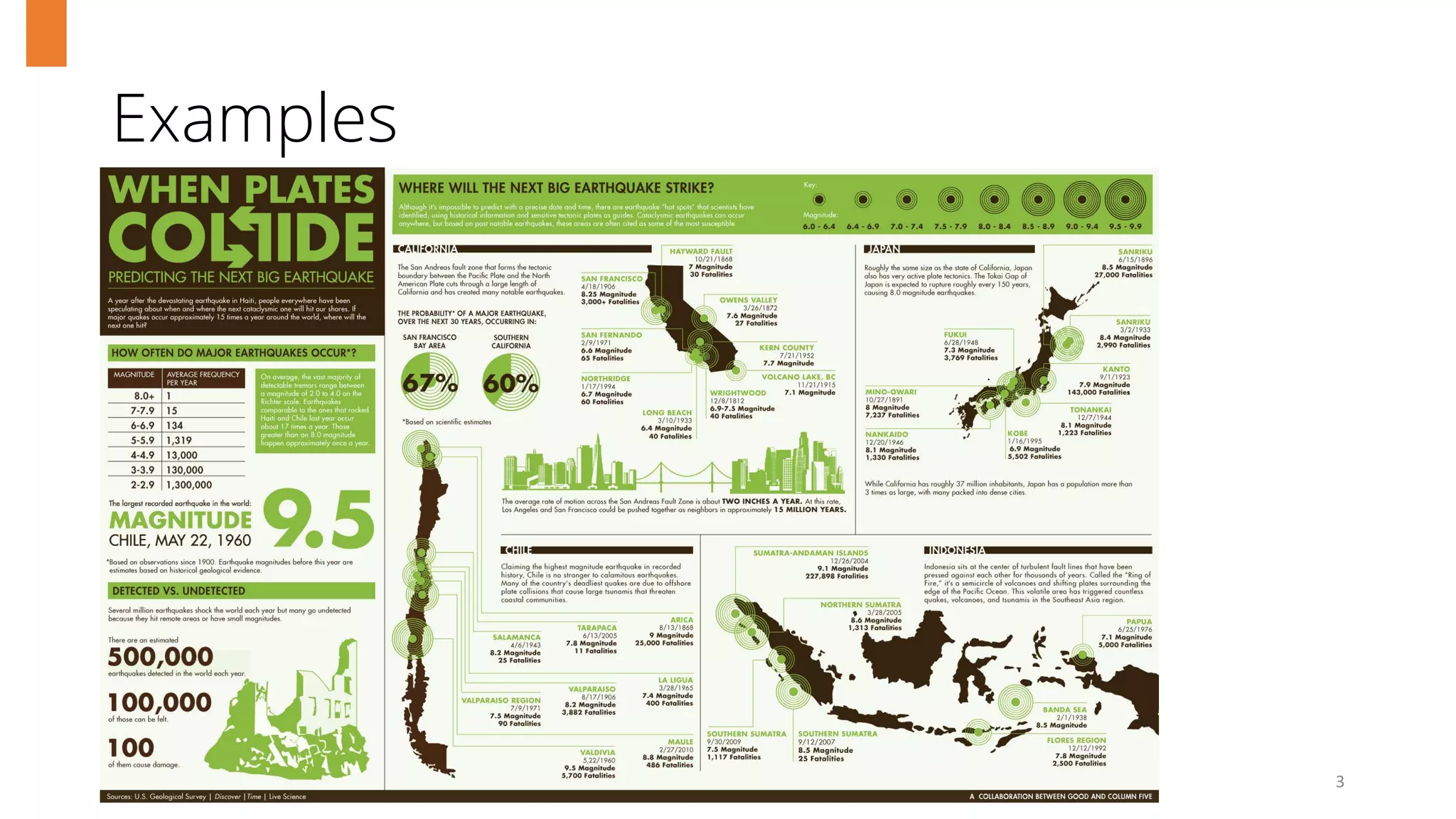
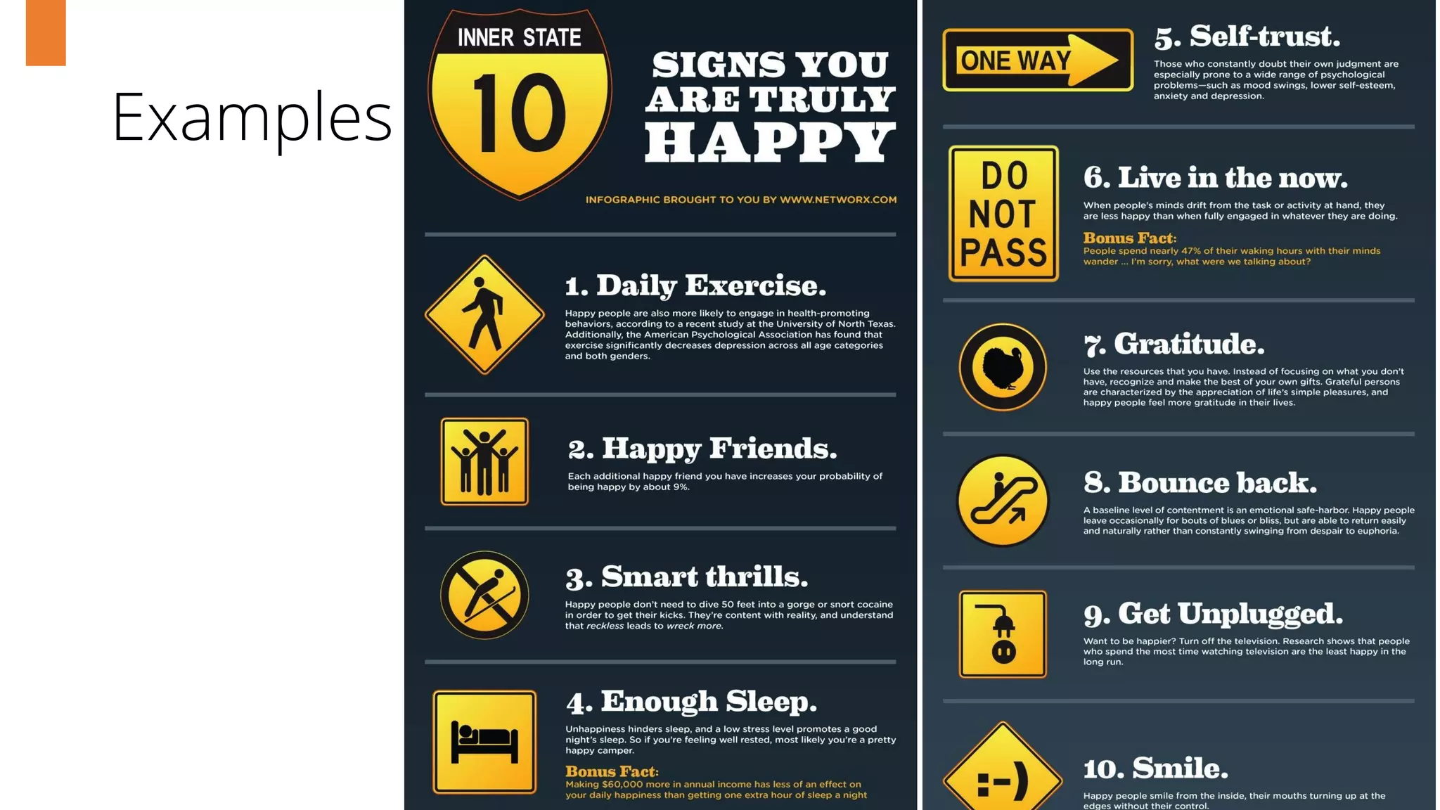
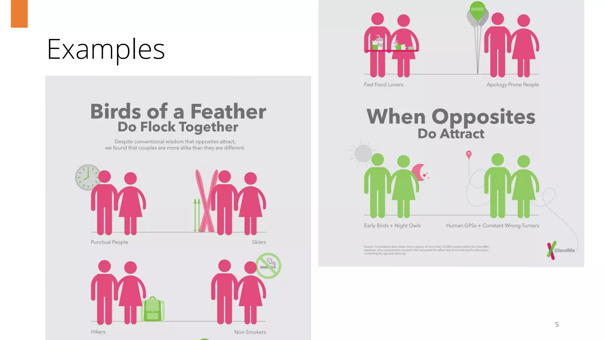
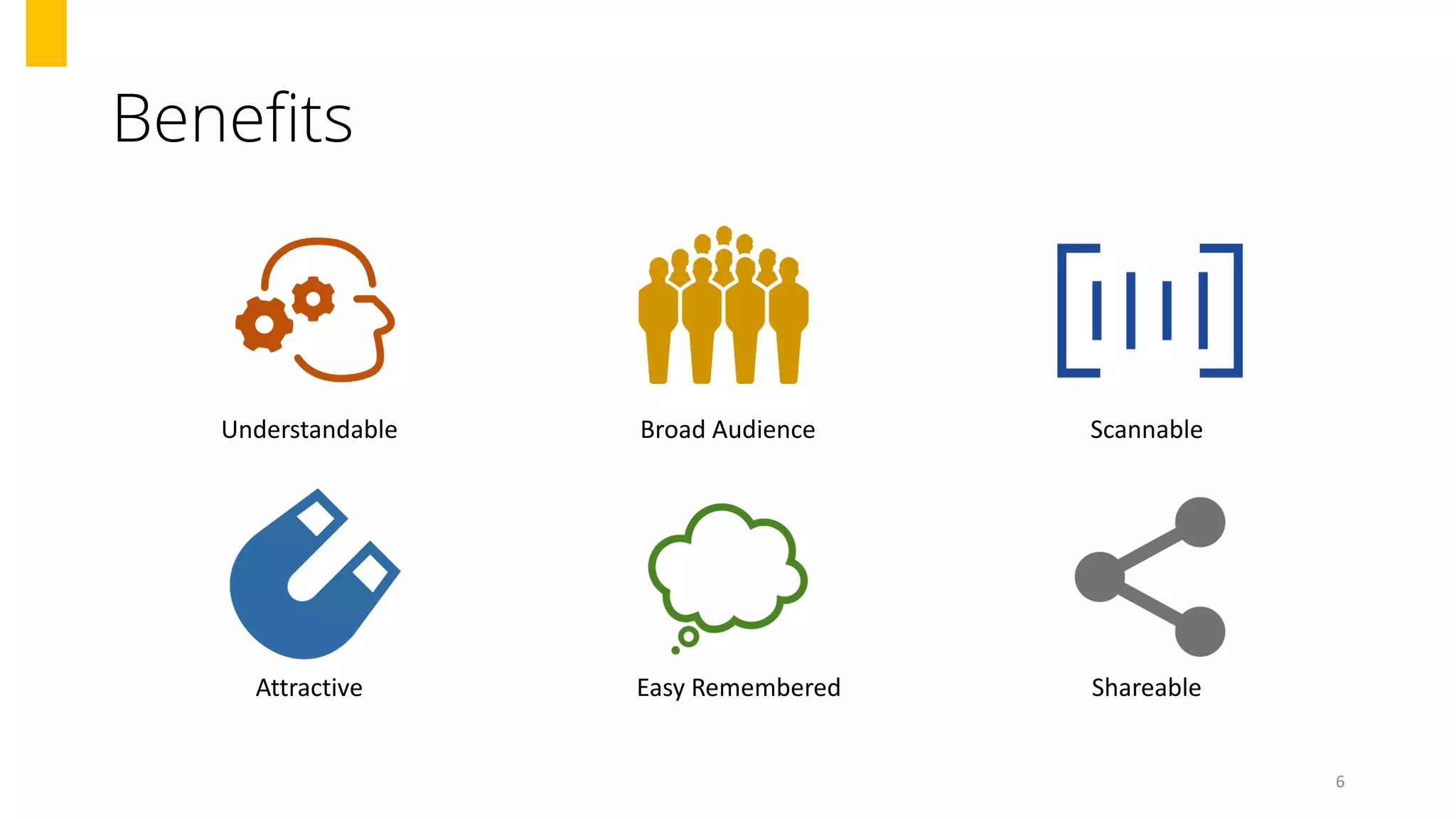
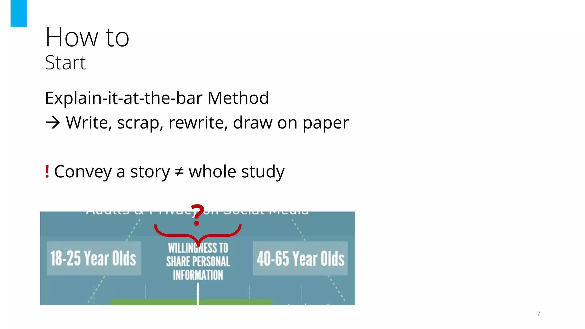
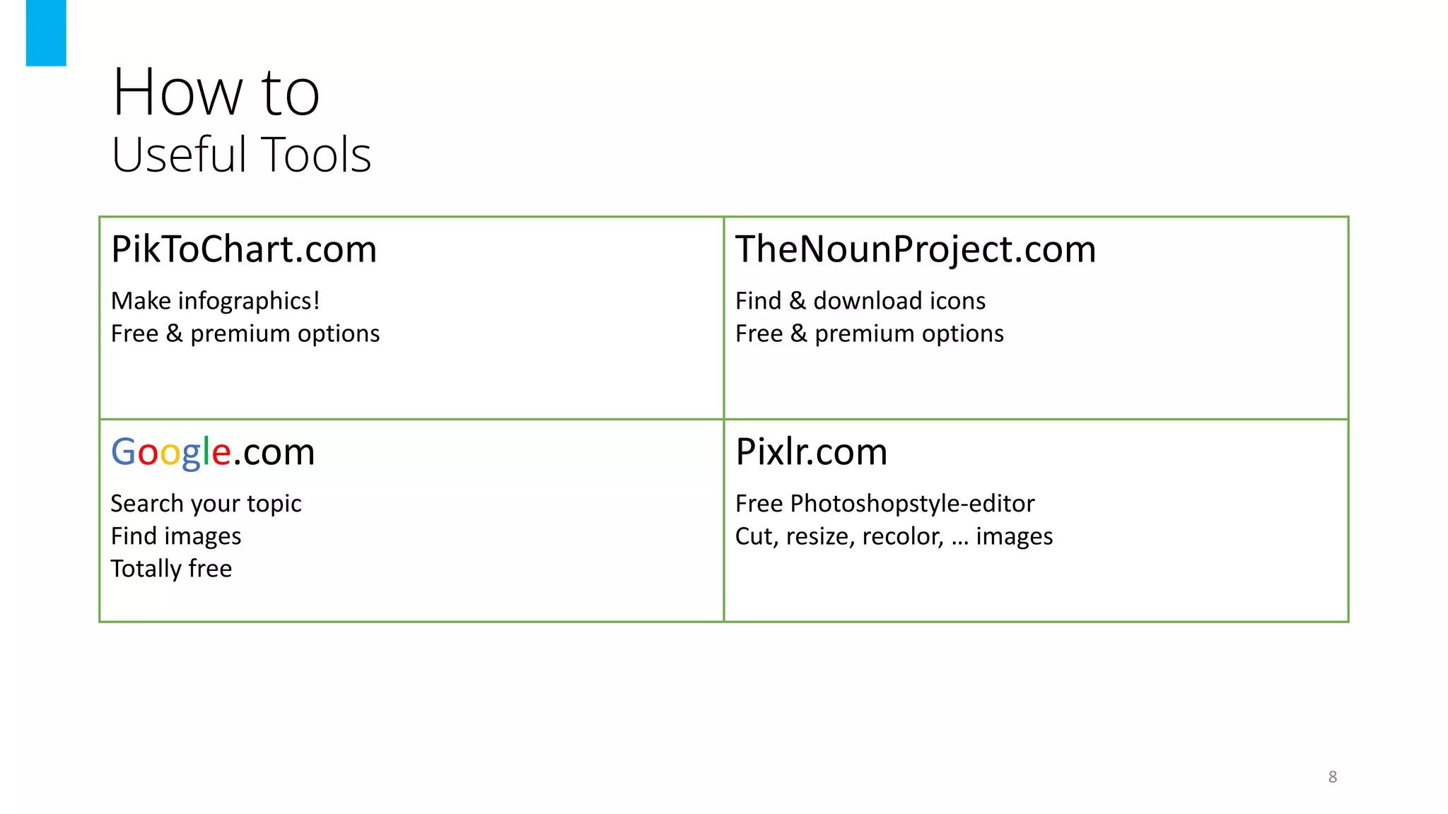
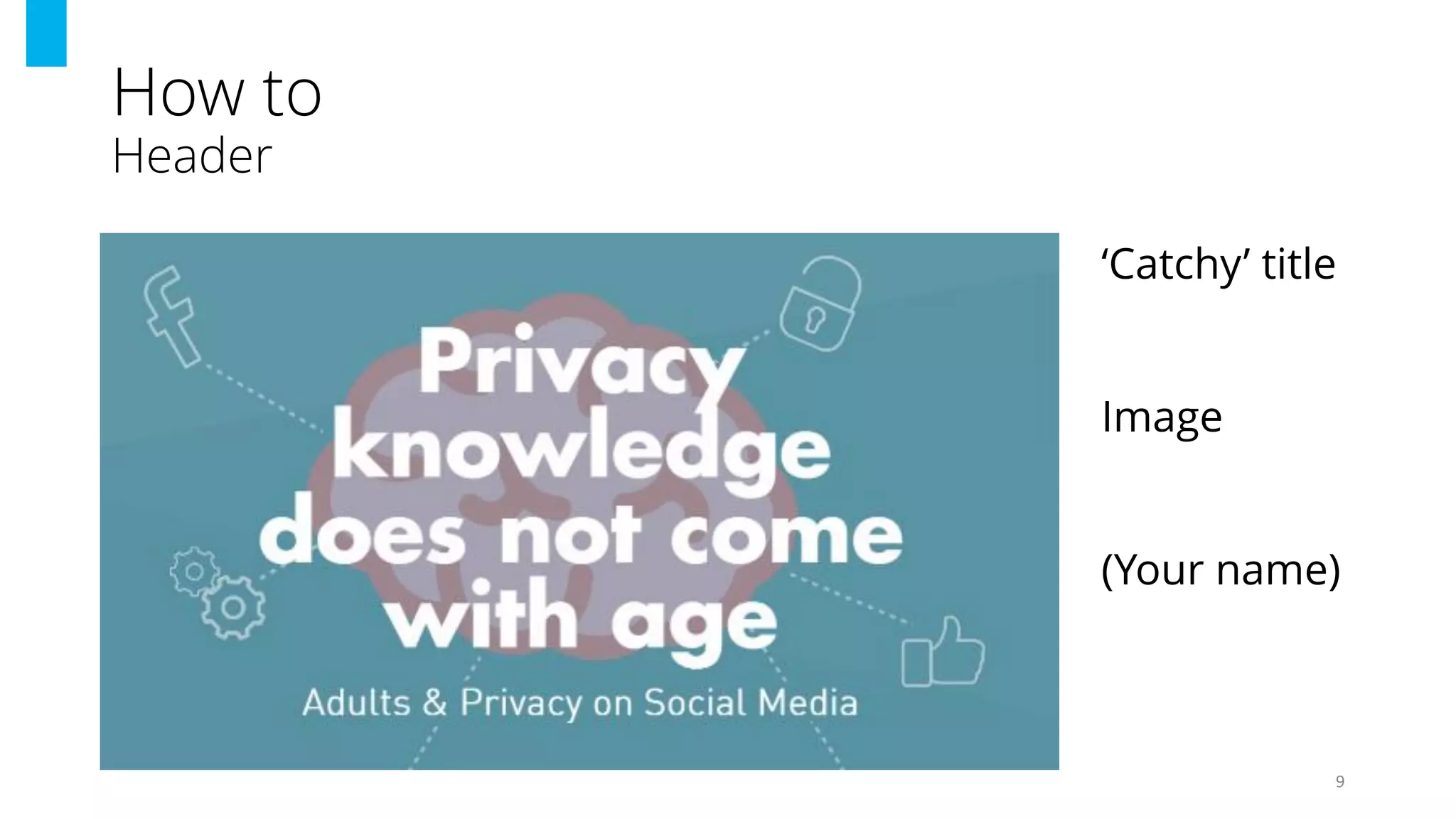
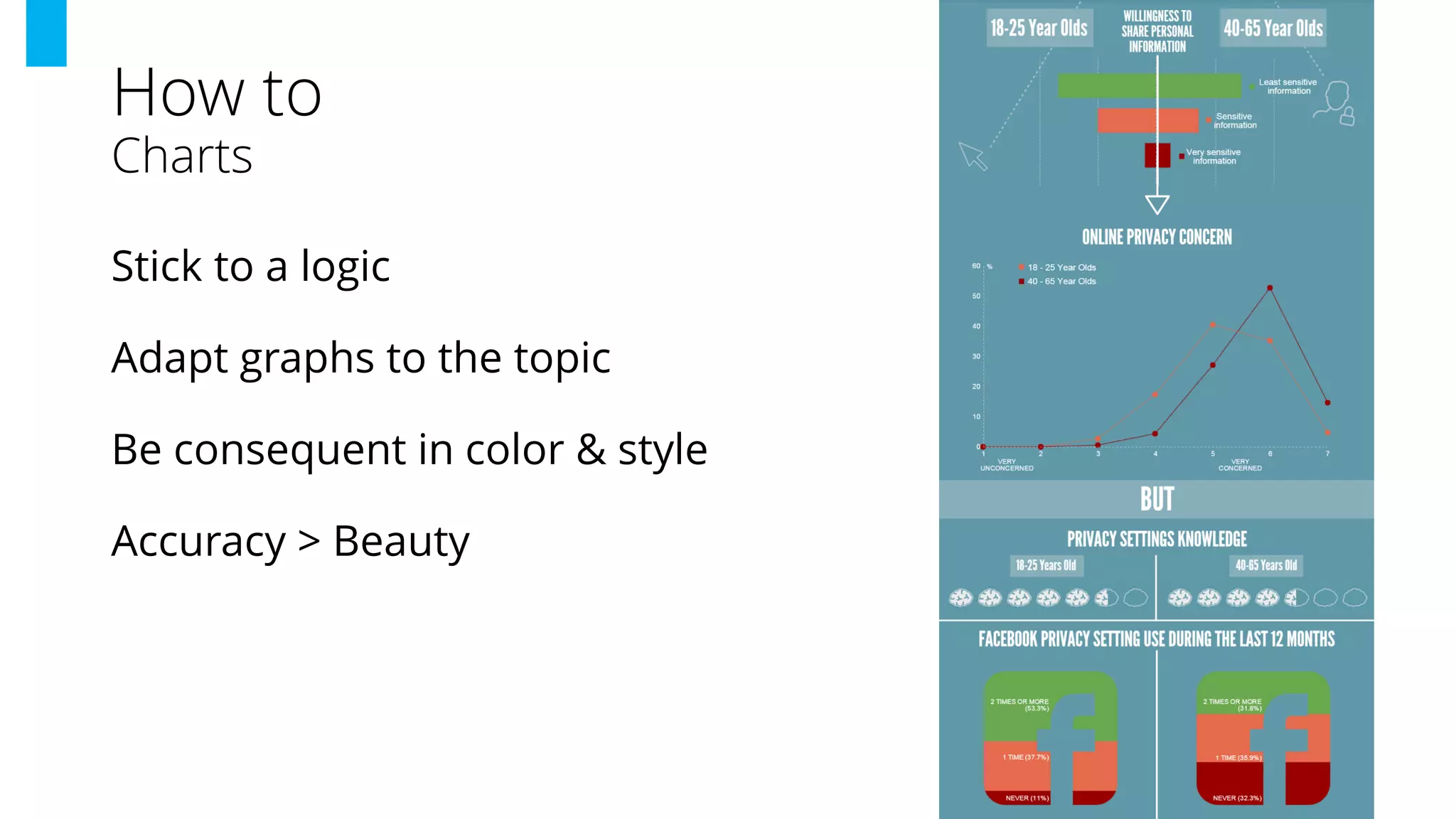
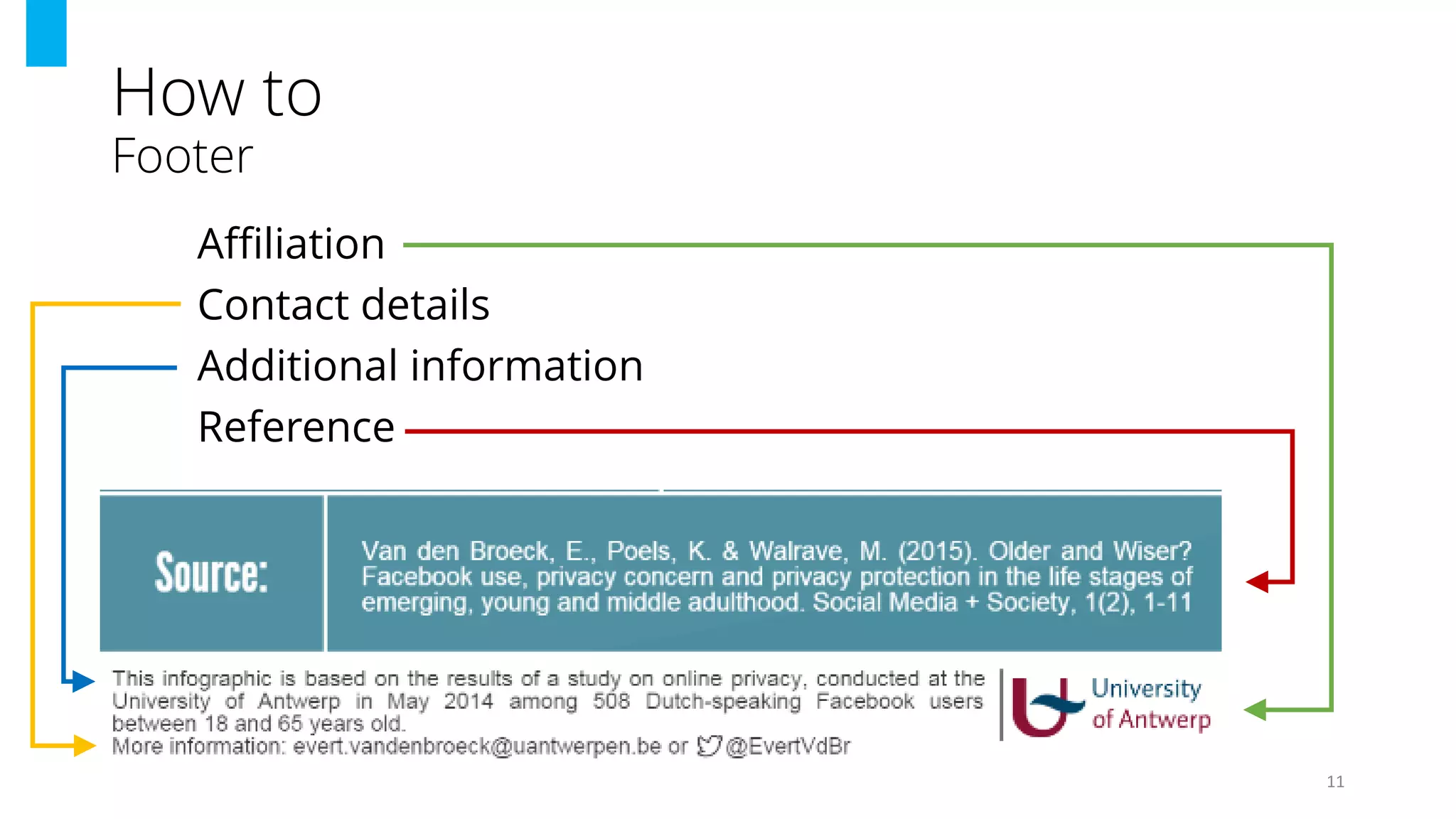
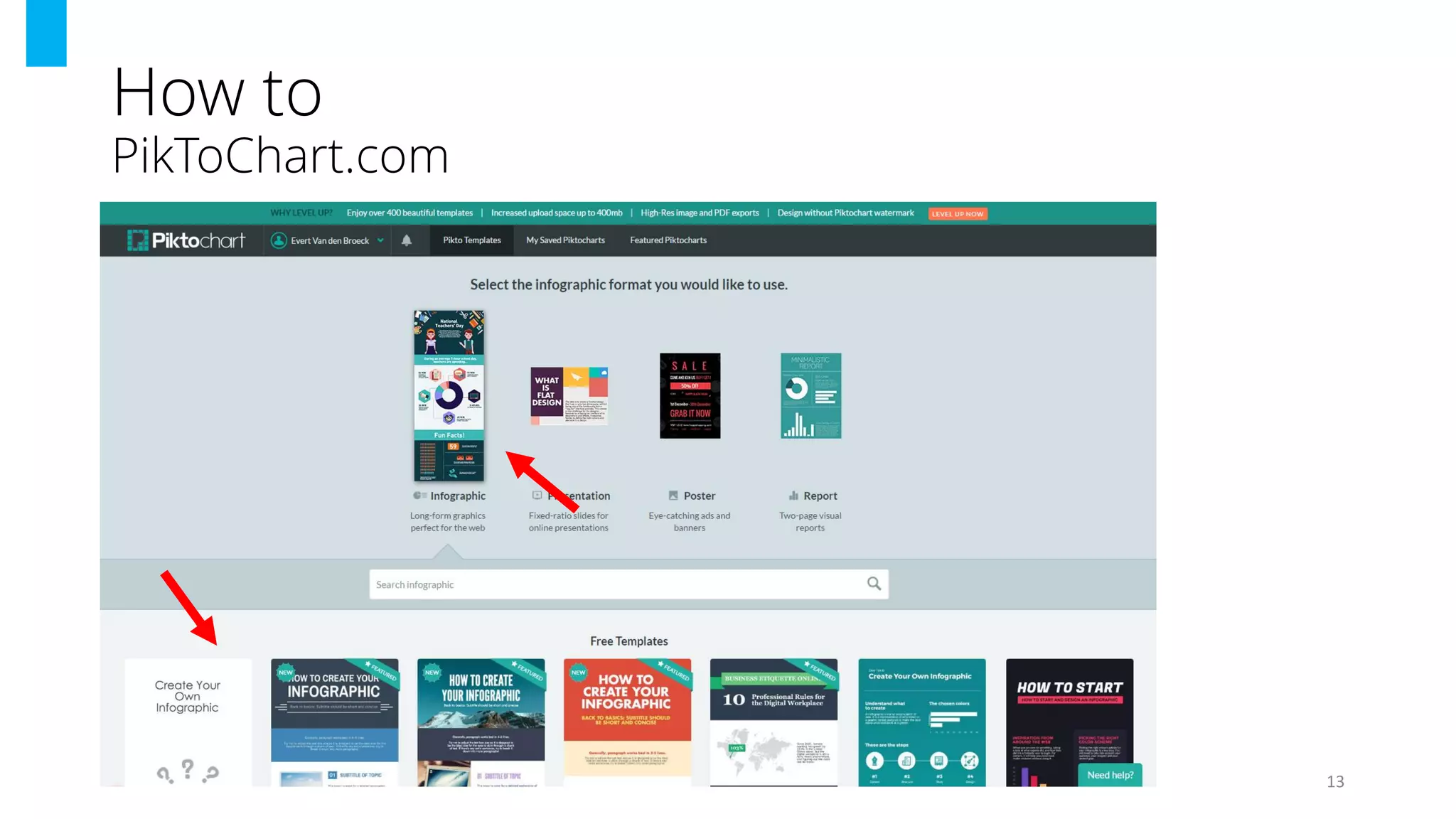
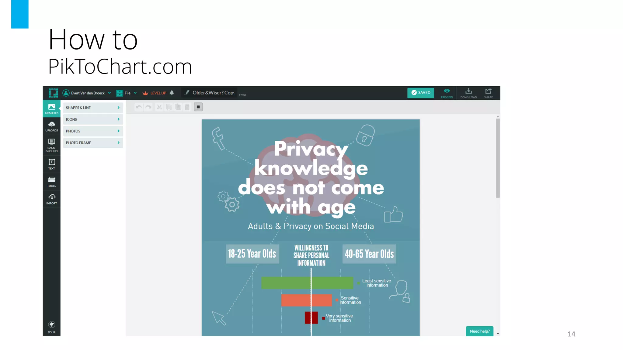
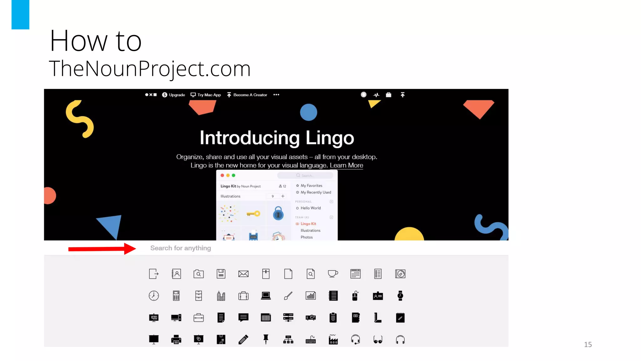
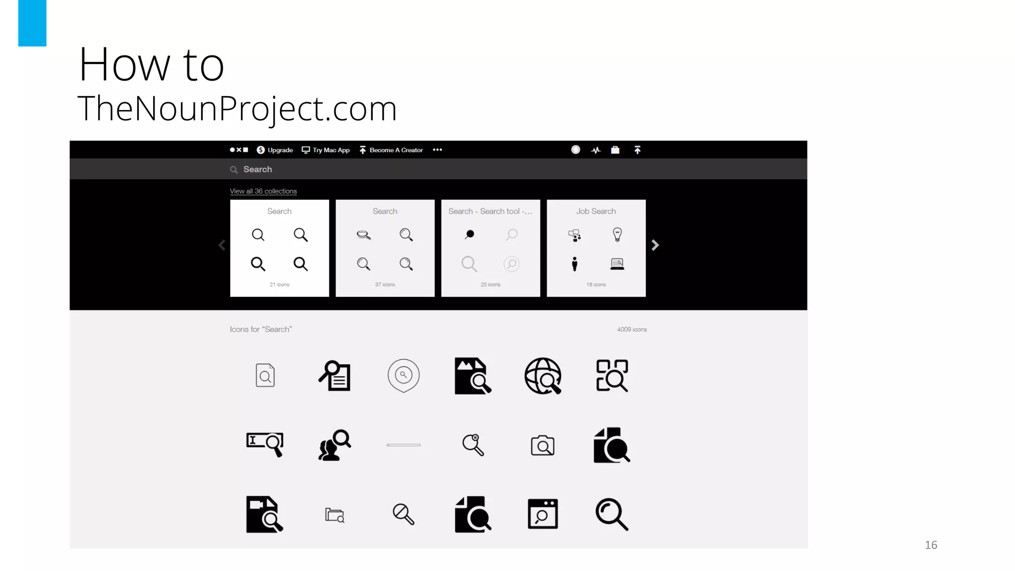
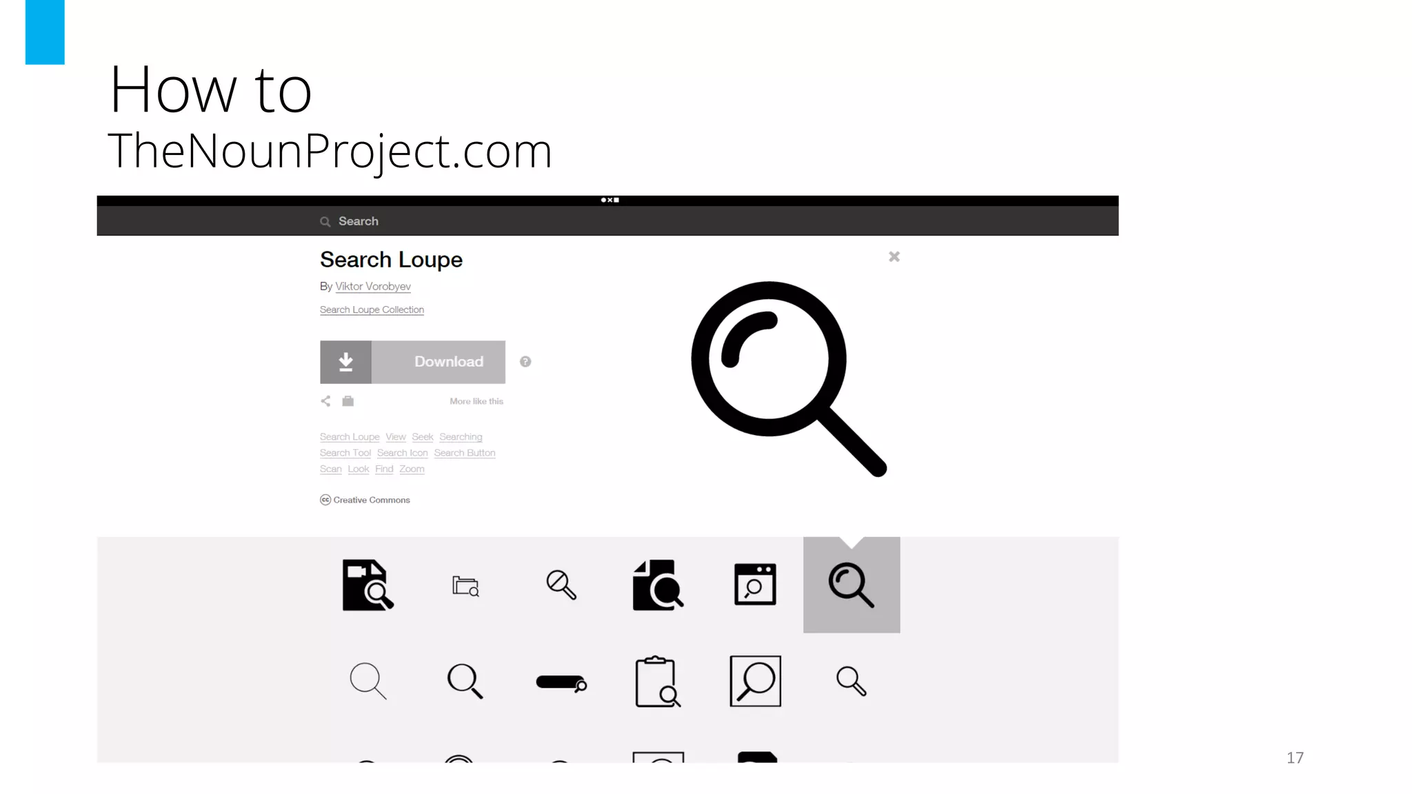
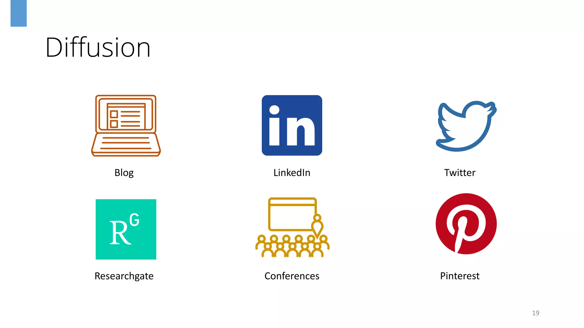
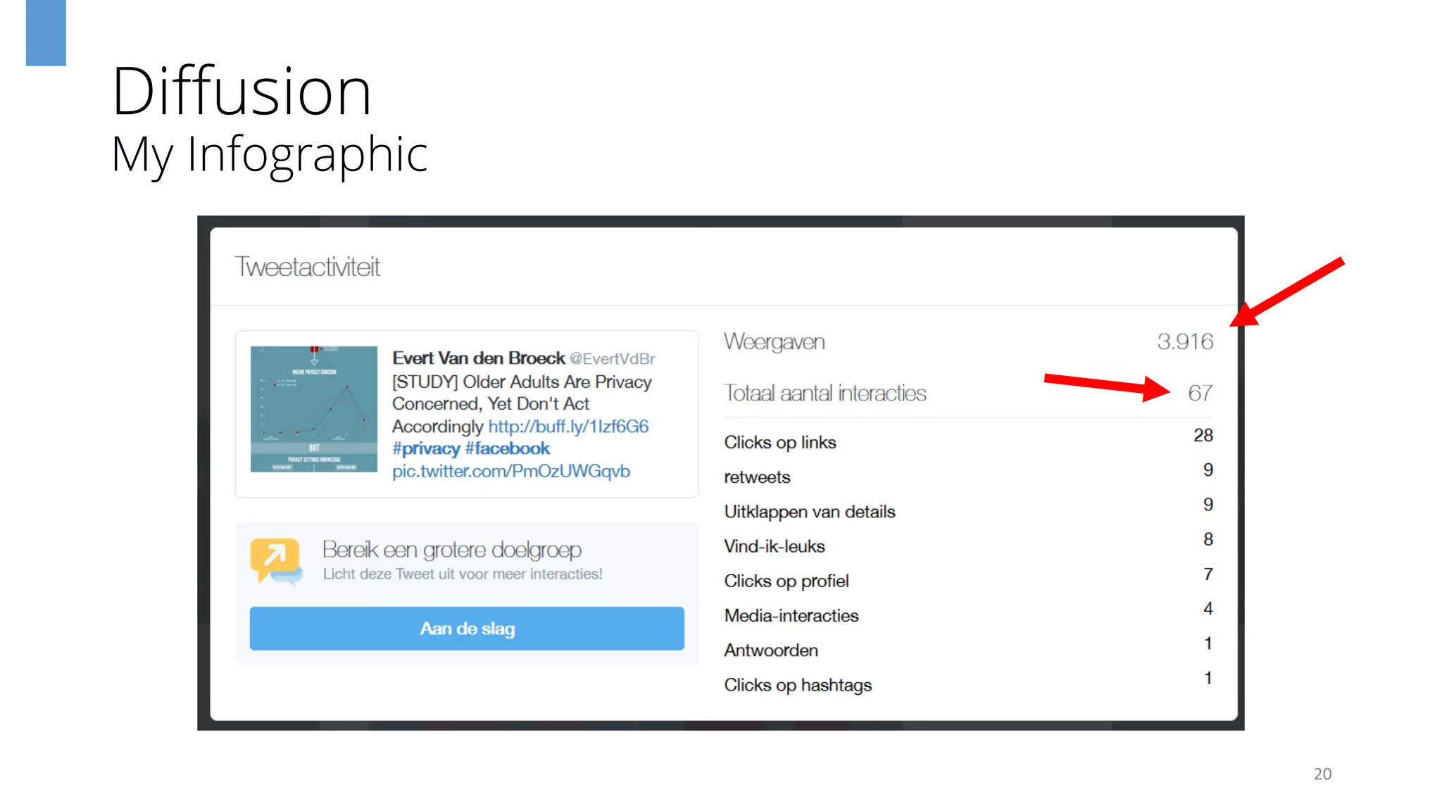
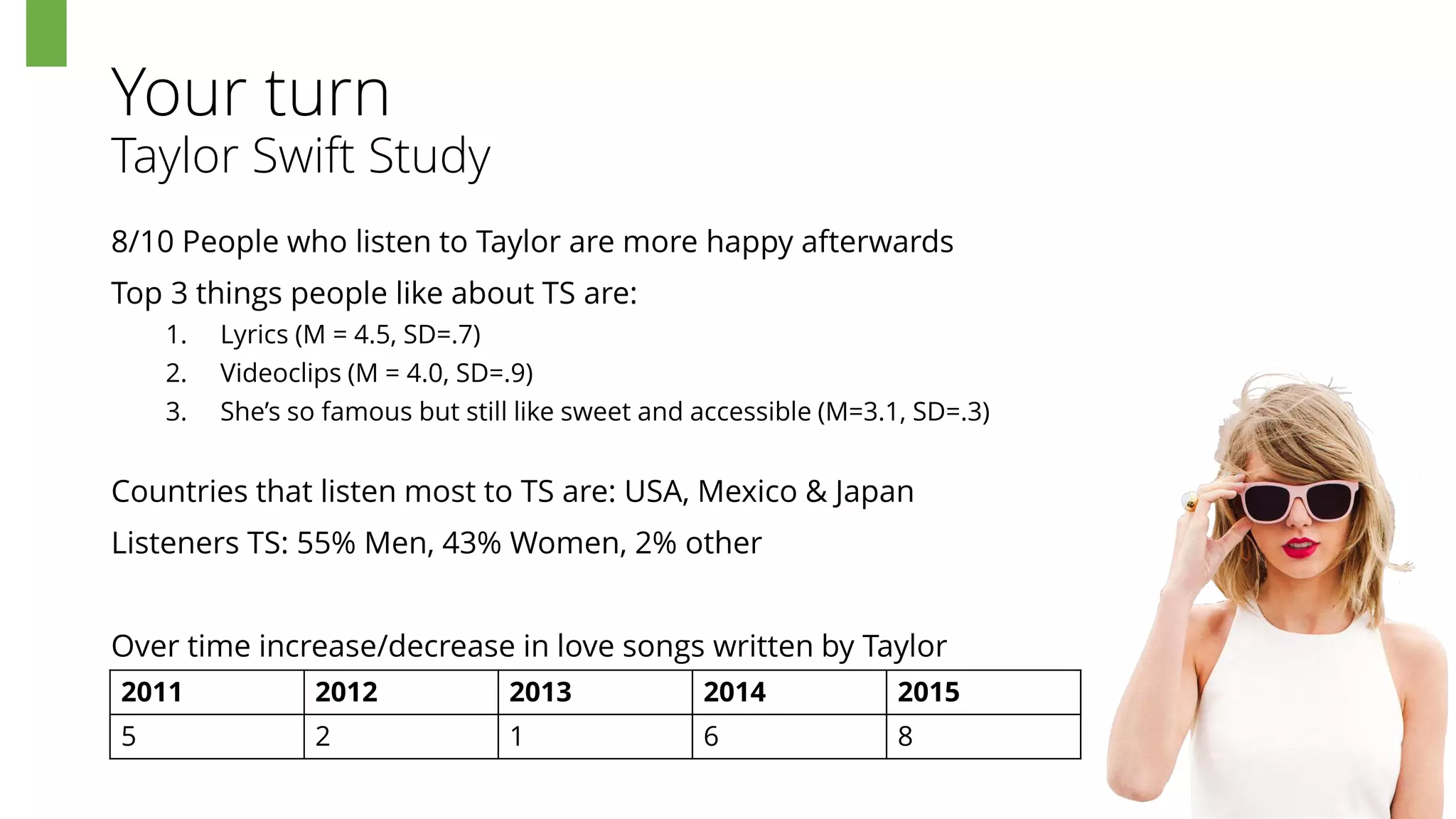
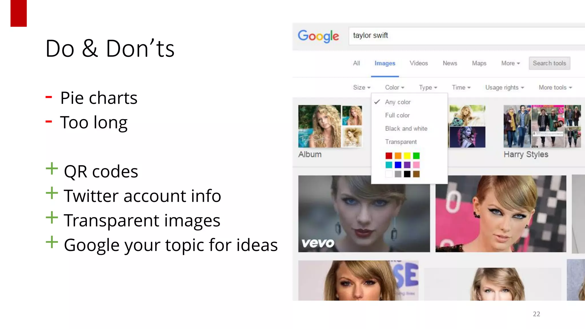
Research Infographics
I made an infographic once, this is how I did it
@EvertVdBr
The next 20 minutes
Examples Benefits How to
Diffusion Do &Don’tsYour turn
2
Examples
3
Examples
4
Examples
5
Benefits
6
Understandable Broad Audience Scannable
Attractive Easy Remembered Shareable
How to
Start
Explain-it-at-the-bar Method
 Write, scrap, rewrite, draw on paper
! Convey a story ≠ whole study
7
?
How to
Useful Tools
PikToChart.com TheNounProject.com
Make infographics!
Free & premium options
Find & download icons
Free & premium options
Google.com Pixlr.com
Search your topic
Find images
Totally free
Free Photoshopstyle-editor
Cut, resize, recolor, … images
8
How to
Header
9
‘Catchy’ title
Image
(Your name)
How to
Charts
10
Stick to a logic
Adapt graphs to the topic
Be consequent in color & style
Accuracy > Beauty
How to
Footer
Affiliation
Contact details
Additional information
Reference
11
How to
PikToChart.com
12
How to
PikToChart.com
13
How to
PikToChart.com
14
How to
TheNounProject.com
15
How to
TheNounProject.com
16
How to
TheNounProject.com
17
How to
TheNounProject.com
18
Diffusion
19
Blog LinkedIn Twitter
Researchgate Conferences Pinterest
Diffusion
My Infographic
20
Your turn
Taylor Swift Study
8/10 People who listen to Taylor are more happy afterwards
Top 3 things people like about TS are:
1. Lyrics (M = 4.5, SD=.7)
2. Videoclips (M = 4.0, SD=.9)
3. She’s so famous but still like sweet and accessible (M=3.1, SD=.3)
Countries that listen most to TS are: USA, Mexico & Japan
Listeners TS: 55% Men, 43% Women, 2% other
Over time increase/decrease in love songs written by Taylor
21
2011 2012 2013 2014 2015
5 2 1 6 8
Do & Don’ts
- Pie charts
- Too long
+ QR codes
+ Twitter account info
+ Transparent images
+ Google your topic for ideas
22
http://www.qr-code-generator.com/
Thanks!
@EvertVdBr
All icons by thenounproject.com
23

How to Make Infographics for Research