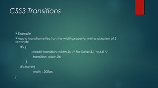
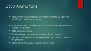
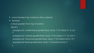
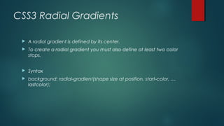
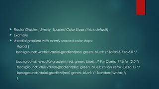
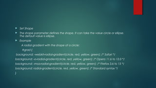
CSS 3
Difference between CSS and CSS 3
 The CSS3 version supports many more browsers than CSS2, but be sure
to test it on all operating systems and browsers.
 Other major changes/additions include:
 * New Combinator
 * New CSS Selectors
 * New Pseudoelements
 * New Style properties
 Now let us discuss these in detail.
 Combinator New addition of General Sibling Combinator is done to
match sibling elements of a given element through tilde (~)
Combinator.
 CSS Selectors
 While CSS2 had ‘simple selectors’, the new version calls them the
components as ‘a sequence of simple selectors’.
 PseudoElements
 Many Pseudo Elements have been added that allow indepth yet
easy styling and a new convention of double colons ‘::’ has been
introduced.
 Style Properties
 New Background Style Properties Multiple Background images can
be layered in the box using different elements like background
image, position and repeat.
CSS3 Transitions
With CSS3, we can add an effect when changing from one style to
another, without using Flash or JavaScript.
CSS3 transitions are effects that let an element gradually change
from one style to another.
To do this, you must specify two things:
the CSS property you want to add an effect to
the duration of the effect
CSS3 Transitions
Example
Add a transition effect on the width property, with a duration of 2
seconds:
div {
‐webkit transition: width 2s; /* For Safari 3.1 to 6.0 */‐
transition: width 2s;
}
div:hover{
width : 300px;
}
 Example
 Add transition effects on width, height, and transformation:
div {
‐webkit transition: width 2s, height 2s, webkit transform 2s;‐ ‐ ‐
/* For Safari 3.1 to 6.0 */
transition: width 2s, height 2s, transform 2s;
}
CSS3 Animations
 CSS3 animations can replace animations created by Flash and
JavaScript in existing web pages.
 Numbers followed by webkit, moz, or ospecify the first version that
worked with a prefix.
 CSS3 @keyframes Rule
 The @keyframes rule is where the animation is created.
 Specify a CSS style inside the @keyframes rule and the animation
will gradually
 change from the current style to the new style.
 When an animation is created in the @keyframe rule, you must bind
it to a selector, otherwise the animation will have no effect.
 Bind the animation to a selector (element) by specifying at least
these two properties:
 the name of the animation
 the duration of the animation
 Example :
 Bind the "myfirst" animation to the <div> element. Animation duration: 5 seconds:
div {
‐webkit animation: myfirst 5s; /* Chrome, Safari, Opera */‐
animation: myfirst 5s;
}
/* Chrome, Safari, Opera */
@ webkit keyframes myfirst {‐ ‐
from {background: red;}
to {background: yellow;}
}
/* Standard syntax */
@keyframes myfirst {
from {background: red;}
to {background: yellow;}
}
Gradients Background
 CSS3 gradients let you display smooth transitions between two or
more specified colors.
 Earlier, you had to use images for these effects. However, by using
CSS3 gradients you can reduce download time and bandwidth
usage. In addition, elements with gradients look better when
zoomed, because the gradient is generated by the browser.
 CSS3 defines two types of gradients:
 Linear Gradients (goes down/up/left/right/diagonally)
 Radial Gradients (defined by their center)
CSS3 Linear Gradients
 To create a linear gradient you must define at least two color stops.
Color stops are the colors you want to render smooth transitions
among. You can also set a starting point and a direction (or an
angle) along with the gradient effect.
 Syntax :
background: linear gradient(‐ direction, color stop1‐ , color stop2, ...‐ );
 Linear Gradient Top to Bottom (this is default)
 Example
A linear gradient from top to bottom:
#grad {
background: webkit linear gradient(red, blue); /* For Safari 5.1 to‐ ‐ ‐ 6.0
*/
background: o linear gradient(red, blue); /* For Opera 11.1 to 12.0‐ ‐ ‐ */
background: moz linear gradient(red, blue); /* For Firefox 3.6 to 15‐ ‐ ‐ */
background: linear gradient(red, blue); /* Standard syntax */‐
}
 Linear Gradient Diagonal
 You can make a gradient diagonally by specifying both the horizontal and vertical
starting positions.
Example :
A linear gradient that starts at top left (and goes to bottom right):
#grad {
background: webkit linear gradient(left top, red , blue); /* For‐ ‐ ‐ Safari 5.1 to 6.0 */
background: o linear gradient(bottom right, red, blue); /* For Opera‐ ‐ ‐ 11.1 to 12.0 */
background: moz linear gradient(bottom right, red, blue); /* For‐ ‐ ‐ Firefox 3.6 to 15 */
background: linear gradient(to bottom right, red , blue); /* Standard‐ syntax */
}
CSS3 Radial Gradients
 A radial gradient is defined by its center.
 To create a radial gradient you must also define at least two color
stops.
 Syntax
 background: radial gradient(‐ shape size at position, start color, ...,‐
lastcolor);
 Radial Gradient Evenly Spaced Color Stops (this is default)
 Example
 A radial gradient with evenly spaced color stops:
#grad {
background: webkit radial gradient(red, green, blue); /* Safari 5.1‐ ‐ ‐ to 6.0 */
background: o radial gradient(red, green, blue); /* For Opera 11.6 to‐ ‐ ‐ 12.0 */
background: moz radial gradient(red, green, blue); /* For Firefox 3.6‐ ‐ ‐ to 15 */
background: radial gradient(red, green, blue); /* Standard syntax */‐
}
 Set Shape
 The shape parameter defines the shape. It can take the value circle or ellipse.
The default value is ellipse.
 Example
A radial gradient with the shape of a circle:
#grad {
background: webkit radial gradient(circle, red, yellow, green); /*‐ ‐ ‐ Safari */
background: o radial gradient(circle, red, yellow, green); /* Opera‐ ‐ ‐ 11.6 to 12.0 */
background: moz radial gradient(circle, red, yellow, green); /*‐ ‐ ‐ Firefox 3.6 to 15 */
background: radial gradient(circle, red, yellow, green); /* Standard‐ syntax */
}
 Repeating a radialgradient
 The repeatingradialgradient() function is used to repeat radial gradients:
 Example
 A repeating radial gradient:
#grad {
/* For Safari 5.1 to 6.0 */
background: webkit repeating radial gradient(red, yellow 10%, green‐ ‐ ‐ ‐ 15%);
/* For Opera 11.6 to 12.0 */
background: o repeating radial gradient(red, yellow 10%, green 15%);‐ ‐ ‐ ‐
/* For Firefox 3.6 to 15 */
background: moz repeating radial gradient(red, yellow 10%, green‐ ‐ ‐ ‐ 15%);
/* Standard syntax */
background: repeating radial gradient(red, yellow 10%, green 15%);‐ ‐
}

CSS3 : Animation ,Transitions, Gradients

  • 1.
  • 2.
    Difference between CSSand CSS 3  The CSS3 version supports many more browsers than CSS2, but be sure to test it on all operating systems and browsers.  Other major changes/additions include:  * New Combinator  * New CSS Selectors  * New Pseudoelements  * New Style properties
  • 3.
     Now letus discuss these in detail.  Combinator New addition of General Sibling Combinator is done to match sibling elements of a given element through tilde (~) Combinator.  CSS Selectors  While CSS2 had ‘simple selectors’, the new version calls them the components as ‘a sequence of simple selectors’.
  • 4.
     PseudoElements  ManyPseudo Elements have been added that allow indepth yet easy styling and a new convention of double colons ‘::’ has been introduced.  Style Properties  New Background Style Properties Multiple Background images can be layered in the box using different elements like background image, position and repeat.
  • 5.
    CSS3 Transitions With CSS3,we can add an effect when changing from one style to another, without using Flash or JavaScript. CSS3 transitions are effects that let an element gradually change from one style to another. To do this, you must specify two things: the CSS property you want to add an effect to the duration of the effect
  • 6.
    CSS3 Transitions Example Add atransition effect on the width property, with a duration of 2 seconds: div { ‐webkit transition: width 2s; /* For Safari 3.1 to 6.0 */‐ transition: width 2s; } div:hover{ width : 300px; }
  • 7.
     Example  Addtransition effects on width, height, and transformation: div { ‐webkit transition: width 2s, height 2s, webkit transform 2s;‐ ‐ ‐ /* For Safari 3.1 to 6.0 */ transition: width 2s, height 2s, transform 2s; }
  • 8.
    CSS3 Animations  CSS3animations can replace animations created by Flash and JavaScript in existing web pages.  Numbers followed by webkit, moz, or ospecify the first version that worked with a prefix.  CSS3 @keyframes Rule  The @keyframes rule is where the animation is created.  Specify a CSS style inside the @keyframes rule and the animation will gradually  change from the current style to the new style.
  • 9.
     When ananimation is created in the @keyframe rule, you must bind it to a selector, otherwise the animation will have no effect.  Bind the animation to a selector (element) by specifying at least these two properties:  the name of the animation  the duration of the animation
  • 10.
     Example : Bind the "myfirst" animation to the <div> element. Animation duration: 5 seconds: div { ‐webkit animation: myfirst 5s; /* Chrome, Safari, Opera */‐ animation: myfirst 5s; } /* Chrome, Safari, Opera */ @ webkit keyframes myfirst {‐ ‐ from {background: red;} to {background: yellow;} } /* Standard syntax */ @keyframes myfirst { from {background: red;} to {background: yellow;} }
  • 11.
    Gradients Background  CSS3gradients let you display smooth transitions between two or more specified colors.  Earlier, you had to use images for these effects. However, by using CSS3 gradients you can reduce download time and bandwidth usage. In addition, elements with gradients look better when zoomed, because the gradient is generated by the browser.  CSS3 defines two types of gradients:  Linear Gradients (goes down/up/left/right/diagonally)  Radial Gradients (defined by their center)
  • 12.
    CSS3 Linear Gradients To create a linear gradient you must define at least two color stops. Color stops are the colors you want to render smooth transitions among. You can also set a starting point and a direction (or an angle) along with the gradient effect.  Syntax : background: linear gradient(‐ direction, color stop1‐ , color stop2, ...‐ );
  • 13.
     Linear GradientTop to Bottom (this is default)  Example A linear gradient from top to bottom: #grad { background: webkit linear gradient(red, blue); /* For Safari 5.1 to‐ ‐ ‐ 6.0 */ background: o linear gradient(red, blue); /* For Opera 11.1 to 12.0‐ ‐ ‐ */ background: moz linear gradient(red, blue); /* For Firefox 3.6 to 15‐ ‐ ‐ */ background: linear gradient(red, blue); /* Standard syntax */‐ }
  • 14.
     Linear GradientDiagonal  You can make a gradient diagonally by specifying both the horizontal and vertical starting positions. Example : A linear gradient that starts at top left (and goes to bottom right): #grad { background: webkit linear gradient(left top, red , blue); /* For‐ ‐ ‐ Safari 5.1 to 6.0 */ background: o linear gradient(bottom right, red, blue); /* For Opera‐ ‐ ‐ 11.1 to 12.0 */ background: moz linear gradient(bottom right, red, blue); /* For‐ ‐ ‐ Firefox 3.6 to 15 */ background: linear gradient(to bottom right, red , blue); /* Standard‐ syntax */ }
  • 15.
    CSS3 Radial Gradients A radial gradient is defined by its center.  To create a radial gradient you must also define at least two color stops.  Syntax  background: radial gradient(‐ shape size at position, start color, ...,‐ lastcolor);
  • 16.
     Radial GradientEvenly Spaced Color Stops (this is default)  Example  A radial gradient with evenly spaced color stops: #grad { background: webkit radial gradient(red, green, blue); /* Safari 5.1‐ ‐ ‐ to 6.0 */ background: o radial gradient(red, green, blue); /* For Opera 11.6 to‐ ‐ ‐ 12.0 */ background: moz radial gradient(red, green, blue); /* For Firefox 3.6‐ ‐ ‐ to 15 */ background: radial gradient(red, green, blue); /* Standard syntax */‐ }
  • 17.
     Set Shape The shape parameter defines the shape. It can take the value circle or ellipse. The default value is ellipse.  Example A radial gradient with the shape of a circle: #grad { background: webkit radial gradient(circle, red, yellow, green); /*‐ ‐ ‐ Safari */ background: o radial gradient(circle, red, yellow, green); /* Opera‐ ‐ ‐ 11.6 to 12.0 */ background: moz radial gradient(circle, red, yellow, green); /*‐ ‐ ‐ Firefox 3.6 to 15 */ background: radial gradient(circle, red, yellow, green); /* Standard‐ syntax */ }
  • 18.
     Repeating aradialgradient  The repeatingradialgradient() function is used to repeat radial gradients:  Example  A repeating radial gradient: #grad { /* For Safari 5.1 to 6.0 */ background: webkit repeating radial gradient(red, yellow 10%, green‐ ‐ ‐ ‐ 15%); /* For Opera 11.6 to 12.0 */ background: o repeating radial gradient(red, yellow 10%, green 15%);‐ ‐ ‐ ‐ /* For Firefox 3.6 to 15 */ background: moz repeating radial gradient(red, yellow 10%, green‐ ‐ ‐ ‐ 15%); /* Standard syntax */ background: repeating radial gradient(red, yellow 10%, green 15%);‐ ‐ }