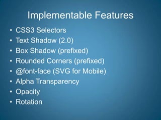
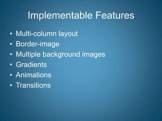
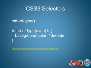
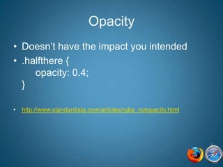
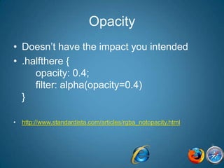
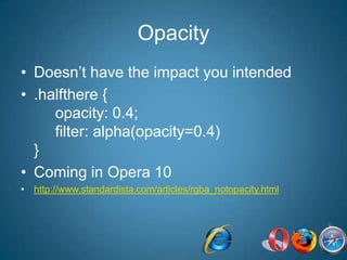
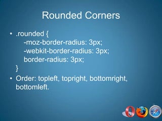
CSS3 for Webkit: Si se puede!Estelle Weylhttp://standardista.comhttp://evotech.net/blog
CSS2.1Since 1999, but only fully supported in IE8
Graceful DegradationorProgressive Enhancement
Don’t need to be identical
Implementable FeaturesCSS3 SelectorsText Shadow (2.0)Box Shadow (prefixed)Rounded Corners (prefixed)@font-face (SVG for Mobile)Alpha TransparencyOpacityRotation
Implementable FeaturesMulti-column layoutBorder-imageMultiple background imagesGradientsAnimationsTransitions
CSS3 Selectors:nth-of-type()tr:nth-of-type(even) td{   background-color: #dedede;}http://www.standardista.com/sandbox/nthoftype.html
CSS3 Selectors:nth-of-type()tr:nth-of-type(even) td, tr.even td{   background-color: #dedede;}$(‘tr:nth-of-type(even)’).addClass(‘evenrow’)
CSS3 Filter:nth-of-type(n).myClass {	background-color: #333333;}.myClass:nth-of-type(1n) {   background-color: rgba(0, 0, 0, 0.4);}
Alpha Tranparencyrbga( red, green, blue, opacity);.blackfilter{   background-color: rgba(0,0,0,0.4);}http://www.standardista.com/articles/rgba.html
Alpha Tranparency.blackfilter{background:transparent;filter:progid:DXImageTransform.Microsoft.gradient( startColorstr=#99000000,endColorstr=#99000000);   zoom: 1;   background-color: rgba(0,0,0,0.4);}
OpacityDoesn’t have the impact you intended.halfthere {     opacity: 0.4;}http://www.standardista.com/articles/rgba_notopacity.html
OpacityDoesn’t have the impact you intended.halfthere {     opacity: 0.4;     filter: alpha(opacity=0.4)}http://www.standardista.com/articles/rgba_notopacity.html
OpacityDoesn’t have the impact you intended.halfthere {     opacity: 0.4;     filter: alpha(opacity=0.4)}Coming in Opera 10http://www.standardista.com/articles/rgba_notopacity.html
Rounded Corners.rounded {    -moz-border-radius: 3px;    -webkit-border-radius: 3px;    border-radius: 3px;}Order: topleft, topright, bottomright, bottomleft.
Rounded Corners.rounded {    -moz-border-radius: 3px;    -webkit-border-radius: 3px;    border-radius: 3px;}$(‘.rounded’).append(‘<b class=“tr”></b> <b class=“tl”></b><b class=“br”></b> <b class=“bl”></b>’);
Rounded Corners.rounded {    -webkit-border-radius: 3px;}With shorthand, all 4 corners the same.    One Value:   rounded corners   Two Values: elliptical corners
Rounded CornersAdds prefix, otherwise syntactically correct-webkit-border-top-left-radius: 15px;-webkit-border-top-right-radius: 10px;-webkit-border-bottom-right-radius: 5px;-webkit-border-bottom-left-radius: 20px;one value: round, 2 values: elliptical
@font-faceSafari 3.2+: TTF/OTFChrome: SVG, TTF/OTF since 1/25/10iPhone: 3.1+ supports SVG
Text Shadow.shadowed {  text-shadow: 3px 3px 3px rgba(0,0,0,0.4);}leftOffsetrightOffset blur color
Text ShadowCut out text.shadowed {  color: #CCCCCC;  text-shadow: 3px 3px 3px rgba(0,0,0,0.4);  color: rgba(255,255,255,1)}http://www.standardista.com/articles/text_shadow.html
Text ShadowCut out text.shadowed {  text-shadow: 3px 3px 3px rgba(0,0,0,0.4); }filter: progid:DXImageTransform.Microsoft.Matrix(sizingMethod='auto expand', M11=6.123233995736766e-17, M12=-1, M21=1, M22=6.123233995736766e-17); /* for IE6 and IE7 */-ms-filter: "progid:DXImageTransform.Microsoft.Matrix(SizingMethod='auto expand', M11=6.123233995736766e-17, M12=-1, M21=1, M22=6.123233995736766e-17)"; /* for IE8 */
Text Shadowtext-shadow: 5px 4px 3px rgba(0,0,0,0.4);left-offset, top-offset, optional blur radius, color.text-shadow:       5px 5px 5px red,      -5px -5px  5px blue;http://www.standardista.com/sandbox/multiple_text_shadow.html
Rotation-webkit-transform: rotate(90deg); -moz-transform: rotate(90deg);filter: progid:DXImageTransform.Microsoft.BasicImage(rotation=1);				1=90, 2=180, 3=270http://standardista.com/sandbox/rotation.html
Rotation-webkit-transform: rotate(-5deg);-webkit-transform: rotate(7deg);rotates as a block, with children
Box Shadow-webkit-box-shadow: 3px 3px 3px rgba(0,0,0, 0.4);leftOffsettopOffsetblurRadius color-webkit-box-shadow:inset 3px 3px 3px rgba(0,0,0, 0.4); /* NOT SUPPORTED */http://www.standardista.com/css3/css3-border-properties#bshadow
Box Shadow – multiple(Fiery Glow)-webkit-box-shadow:         2px  -5px  4px 1px rgba(255, 255, 48, 0.5),                  5px -10px  6px 3px rgba(255, 224, 48, 0.5),                 7px -15px 11px 5px rgba(240, 128,  0, 0.4),                12px -25px 18px 7px rgba(200,   0,  0, 0.3),
columns-moz-column-count: 3;column-count, column-fill, column-gap,column-span, column-width, columnscolumn-rule: column-rule-color column-rule-style column-rule-widthhttp://www.standardista.com/css3/css3-columns-browser-supporthttp://www.evotech.net/sandbox/
Multiple Background Images.myDiv { background-image: url(img1.jpg), url(img2.jpg), url(img3.jpg);   background-position: 0 0, 100% 100%, 18px 27px;    background-repeat: no-repeat;}Supported since safari 1.3.
Border-imageBorder-image generatorShorthand is supported in Webkit, none of the longhand properties that make up the short hand property are.
Thanks.Estelle WeylTwitter: estellevwBlog: http://www.standardista.comhttp://evotech.net/blog
HTML5	Video (HTML5)Canvas / SVGWeb Forms: placeholder, input types=email, url, phone

CSS3 For WebKit: iPadDevCamp Presentation

Editor's Notes

  • #3 History of support of CSS, and why it’s ok to move forward
  • #4 Accessibilityv. ie6 looking ok
  • #5 Show twitter
  • #6 standardista