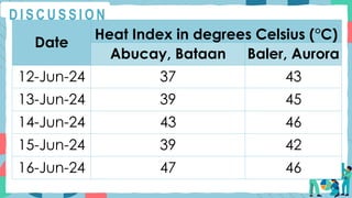
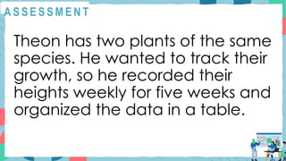
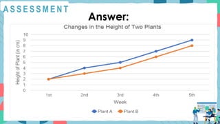
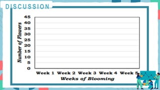
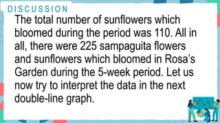
MATHEMATICS 5
QUARTER 3 WEEK 3
DAY 1
R E V I E W
Directions: Use this double-bar
graph to answer the
subsequent questions.
R E V I E W
R E V I E W
a. How many grade 5 pupils
participated in the survey?
b. How many boys participated
in the survey?
R E V I E W
e. What is the most popular
activity for girls?
f. Which activity/ies is/are
preferred by boys more than
girls?
R E V I E W
g. Which activity/ies is/are
preferred by girls more than
boys?
M O T I VAT I O N
What are line graphs? When are
they utilized?
Line graphs are visual
representations used to show
how data changes over a
period of time. They are utilized
to display trends over time or to
compare changes.
M O T I VAT I O N
In line graphs, the data points
are connected. These points
are joined in individual line
segments, creating a “broken”
line. An upward line indicates
increasing value, while a
downward line indicates
decreasing value.
M O T I VAT I O N
A double-line graph shows how
two data sets change over time.
It consists of two lines showing
continuous change between two
separate data sets. A double-line
graph is used to compare
changes in growth in two trends
over a period of time.
CONSTRUCTING
DOUBLE LINE GRAPHS
In recent months, we have
experienced extreme heat indices
that compelled local governments
to cancel face-to-face classes
and shift them online to protect
students and teachers from
discomforts and health risks posed
by these high temperatures.
D I S C U S S I O N
According to the US National
Weather Service, heat index, also
known as the apparent
temperature, is what the human
body feels like when relative
humidity is combined with the air
temperature.
D I S C U S S I O N
How can we protect ourselves
and avoid health risks when the
heat index shoots up?
D I S C U S S I O N
Example: Let us look at this table
which contains the recorded
heat indices in degrees Celsius
(°C) of two towns in Region 3
from June 12, 2024, to June 16,
2024, by the Philippine
Atmospheric Geophysical
Services Administration
D I S C U S S I O N
D I S C U S S I O N
Date
Heat Index in degrees Celsius (°C)
Abucay, Bataan Baler, Aurora
12-Jun-24 37 43
13-Jun-24 39 45
14-Jun-24 43 46
15-Jun-24 39 42
16-Jun-24 47 46
a. What was the highest
temperature recorded from June
12-16, 2024 in Abucay, Bataan?
b. What was the highest
temperature recorded in Baler,
Aurora, from June 12- 16, 2024?
D I S C U S S I O N
c. What was the lowest
temperature recorded from June
12-16, 2024 in Abucay, Bataan?
d. What was the lowest
temperature recorded in Baler,
Aurora, from June 12- 16, 2024?
D I S C U S S I O N
e. What temperatures were
recorded during the Philippine
Independence Day celebration
in Abucay, Bataan, and Baler,
Aurora?
D I S C U S S I O N
f. How higher was the temperature
in Baler, Aurora, than in Abucay,
Bataan, on June 13, 2024?
Since the given data are in tabular
form, we can present them visually
using graphs. Previously, we were
able to present data using
bar graphs.
D I S C U S S I O N
However, given that the data on
heat indices display trends or
changes in the temperature of
two towns over time, what type
of graph would be appropriate to
present these data?
D I S C U S S I O N
A C T I V I T Y 1
Here are the steps in constructing
double-line graphs:
1. Write the title of the graph.
Based on the given data, the title
of our graph is "Heat Indices
of Two Towns from June 12,
2024 to June 16, 2024".
A C T I V I T Y 1
2. Draw the horizontal and vertical
axes.
3. Label the horizontal axis. In our
example, the horizontal axis is
labeled "Date." Indicate the date
covered by the data. In our
example, the coverage is from
June 12, 2024, to June 16, 2024.
A C T I V I T Y 1
4. Label the vertical axis. In our
example, the vertical axis is
labeled " Heat Index in °C”.
A C T I V I T Y 1
5. Decide on a scale or the range of
numbers to be used. In our example,
the vertical axis represents the range
of numbers or scale. Since the data
points are closely spaced, with 47°C
as the highest temperature given,
we can set the range from 0 to 50
with an interval of 5.
A C T I V I T Y 1
6. Plot the points on the graph
representing the two data sets.
7. Connect the data points with
line segments separately for the
two data sets.
A C T I V I T Y 1
8. Indicate the legend used. We
need to use different colors of lines
to indicate two different data sets.
In our example, the blue line is
used for Abucay, Bataan, while
the orange line is used for Baler,
Aurora.
A C T I V I T Y 1
In addition, the legend can be
placed on the side or at the
bottom. In our example, it is at the
bottom.
A C T I V I T Y 1
A C T I V I T Y 1
What are the advantages of using
double-line graphs in presenting
data that show trends or changes
over a period of time?
A S S E S S M E N T
Directions: Let us construct the
double-line graph using the data
below.
A S S E S S M E N T
Theon has two plants of the same
species. He wanted to track their
growth, so he recorded their
heights weekly for five weeks and
organized the data in a table.
A S S E S S M E N T
Changes in the Height of Two Plants
Week
Height of Plant (in cm)
Plant A Plant B
1st 2 2
2nd 4 3
3rd 5 4
4th 7 6
5th 9 8
A S S E S S M E N T
Answer:
MATHEMATICS 5
QUARTER 3 WEEK 3
DAY 2
R E V I E W
Directions: Construct double-
line graphs using the data
presented in tabular form.
R E V I E W
Monthly Savings of Rapha and Kelvin
Month
Monthly Savings (in Peso)
Rapha Kelvin
August 250 200
September 200 250
October 200 150
November 250 300
December 450 500
CONSTRUCTING
DOUBLE LINE GRAPHS
A C T I V I T Y 2
Directions: Construct double-line
graphs using the data presented
in tabular form.
A C T I V I T Y 2
Number of Pupils Who Borrowed
Books from the Library
Day
Number of Pupils
Grade 5 Grade 6
Monday 50 45
Tuesday 45 55
Wednesday 60 55
Thursday 55 50
Friday 70 75
MATHEMATICS 5
QUARTER 3 WEEK 3
DAY 3
R E V I E W
Directions: Construct double-
line graphs using the data
presented in tabular form.
R E V I E W
Grades of Mia and Noah
in the First Quarter
Subject Mia Noah
Math 85 80
English 88 82
Science 90 85
History 87 83
PE 91 86
What if there are also sampaguita
plants in Rosa’s Garden? How would
you present the other set of data in
the same set of x and y axes or
coordinate system? Do you know that
your tabulated data can be
presented and interpreted using
different kinds of line graphs?
M O T I VAT I O N
INTERPRETING, DRAWING
CONCLUSIONS OR MAKING
INFERENCES, AND SOLVING
PROBLEMS USING DATA PRESENTED
IN A DOUBLE LINE GRAPH
In interpreting data presented in line
graphs, you have to know what the
variables are and understand what they
mean or represent.
D I S C U S S I O N
• The x-axis contains the values of the
first or independent variable. Its values
may refer to classes or categories,
periods of time, etc. In our previous
activity about the number of flowers which
bloomed in Rosa’s Garden, the variable
refers to the weeks in which the flowers
bloomed.
D I S C U S S I O N
• The y-axis contains the values of the
second or the dependent variable. As you
go up the y-axis, the values are
increasing.
The variable may refer to any type of
numerical data such as amounts of
money, scores, number of people,
temperature, grades etc.
D I S C U S S I O N
In our previous activity about the flowers
blooming in Rosa’s Garden, it represents
the number of flowers which bloomed in a
particular week. Let us go back to the
activity about the flowers in Rosa’s
Garden for us to better understand our
lesson on double line graphs.
D I S C U S S I O N
We will be constructing line graphs, one
for the sunflowers and one for sampaguita
flowers. In plotting the points and
connecting these with line segments, we
will use black for the sunflowers and blue
for the sampaguita flowers.
D I S C U S S I O N
Flowers in Rosa’s Garden
Weeks of
Blooming
Number of
Sunflowers which
bloomed
Number of
Sampaguita which
bloomed
1 15 10
2 5 20
3 40 25
4 20 25
5 30 35
To construct a line graph for the data on
the sunflowers, start by drawing the x and
y axes. Label the x-axis with “Week of
Blooming”, the independent variable, and
the y-axis with “Number of Flowers which
Bloomed”, the dependent variable.
D I S C U S S I O N
Next, lay out the numbers 1 to 5 along the
x-axis, the week in which the sunflowers
bloomed. Then, lay out the numbers 0 to
45 in intervals of 5 along the y-axis.
D I S C U S S I O N
Draw horizontal lines coinciding with the
laid-out values along the y-axis. These
lines will serve as guides when we plot
the points later on. The pair of axes,
properly labeled, with the values of the
independent and dependent variables laid
out is shown below.
D I S C U S S I O N
D I S C U S S I O N
Next, plot the points to represent the data
from the table. To do this, and using the
data from the table, pair one value of the
independent variable with the
corresponding value of the dependent
variable.
D I S C U S S I O N
You should then have these ordered pairs:
(1,15), (2,5), (3,40), (4,20), (5,30). Using
these pairs as coordinates, plot the points
and connect them consecutively from left
to right. The completed line graph is
shown below.
D I S C U S S I O N
D I S C U S S I O N
In the same set of axes and following the
same steps, make another line graph this
time using the data on the number of
sampaguita flowers which bloomed during
the same 5-week period. Add a legend to
inform readers which line graph is for
which set of data.
D I S C U S S I O N
Finally, write an appropriate title for the
double-line graph. This final double line
graph is shown below.
D I S C U S S I O N
D I S C U S S I O N
Looking at the graph for the sampaguita
flowers, it is easy to see that the number
of sampaguita flowers which bloomed was
consistently increasing during the 5-week
period. The total number of sampaguita
flowers which bloomed during the period
was 115.
D I S C U S S I O N
On the other hand, the line graph for the
sunflower shows that the number of
sunflowers that bloomed peaked or was
highest in week 3 From a high of 40 in
week 3, it fell to 20 the following week.
But it was up again the following week, to
30.
D I S C U S S I O N
The total number of sunflowers which
bloomed during the period was 110. All in
all, there were 225 sampaguita flowers
and sunflowers which bloomed in Rosa’s
Garden during the 5-week period. Let us
now try to interpret the data in the next
double-line graph.
D I S C U S S I O N
A C T I V I T Y 3
Directions: Given the data, let us
construct a double-line graph
and answer the following
questions.
A C T I V I T Y 3
Year
Total Number of Pupils
With Honors
With High
Honors
2021 34 28
2022 30 25
2023 32 24
2024 38 30
A C T I V I T Y 3
Answer: Double-line Graph
A C T I V I T Y 3
Answering the following
questions:
a. What year had the highest
number of pupils awarded with
honors? high honors?
A C T I V I T Y 3
b. What year had the lowest
number of pupils awarded
honors? high honors?
A C T I V I T Y 3
c. In 2022, how many more
pupils were awarded with
honors than with high honors?
A C T I V I T Y 3
d. What was the increase in the
number of pupils awarded with
honors from 2023 to 2024?
A C T I V I T Y 3
e. What year had the lowest
number of awardees?
A S S E S S M E N T
Directions: Given the data,
answer the following questions.
A S S E S S M E N T
Two of the most famous tourist
destinations in the Philippines are
Boracay and Baguio. The double-
line graph shows the number of
tourists visiting these two places
from August 2023 to December
2023.
A S S E S S M E N T
A S S E S S M E N T
a. What month did Baguio have
the highest number of tourists?
b. What month did Boracay have
the highest number of tourists?
A S S E S S M E N T
c. How many more tourists visited
Baguio than Boracay in
September 2023?
d. What was the total number of
tourists who visited Baguio and
Boracay from August 2023 to
December 2023?
A S S E S S M E N T
e. Why do you think fewer tourists
visited Baguio and Boracay in
August 2023?
A S S E S S M E N T
f. What factors may have
contributed to the increased
number of tourists in Baguio and
Boracay in December 2023?
MATHEMATICS 5
QUARTER 3 WEEK 3
DAY 4
R E V I E W
Directions: Analyze the double-
line graphs then answer the
questions that follow.
R E V I E W
R E V I E W
a. In what month was the
Gomez Family’s income lowest?
__________________
b. In what month was the
Gomez Family’s savings
highest?
__________________
c. How much was the income
increase of the Gomez family
from April to May?
____________________________
d. How much was the Gomez
Family’s total savings from
January to June?
____________________________
R E V I E W
e. How much was the highest
expenditure of the Gomez
Family? (Expenditure is the
amount of money spent on
something)
______________________________
R E V I E W
f. What do you think are the
possible factors that may have
contributed to the expenditures
in May?
______________________________
R E V I E W
Directions: Analyze the double-
line graphs then answer the
questions that follow.
M O T I VAT I O N
M O T I VAT I O N
a. What year did store X have
the lowest number of laptops
sold? _________________
b. What year did store Y have
the lowest number of laptops
sold? __________________
M O T I VAT I O N
c. How many more laptops
were sold in 2022 than in 2018
by store X? _______________
d. How many more laptops
were sold in 2022 than in 2018
by store Y? ______________
M O T I VAT I O N
e. How many laptops were sold
from 2018 – 2022 by store Y?
__________________
f. How many laptops were sold
from 2018 – 2022 by store X?
__________________
M O T I VAT I O N
g. Why do you think there was a
significant and steady increase
in the sales of laptops in both
stores from 2020 to 2022?
__________________
M O T I VAT I O N
INTERPRETING, DRAWING
CONCLUSIONS OR MAKING
INFERENCES, AND SOLVING
PROBLEMS USING DATA PRESENTED
IN A DOUBLE LINE GRAPH
In interpreting data presented in line
graphs, you have to know what the
variables are and understand what they
mean or represent.
D I S C U S S I O N
• The x-axis contains the values of the
first or independent variable. Its values
may refer to classes or categories,
periods of time, etc. In our previous
activity about the number of flowers which
bloomed in Rosa’s Garden, the variable
refers to the weeks in which the flowers
bloomed.
D I S C U S S I O N
• The y-axis contains the values of the
second or the dependent variable. As you
go up the y-axis, the values are
increasing.
The variable may refer to any type of
numerical data such as amounts of
money, scores, number of people,
temperature, grades etc.
D I S C U S S I O N
In our previous activity about the flowers
blooming in Rosa’s Garden, it represents
the number of flowers which bloomed in a
particular week. Let us go back to the
activity about the flowers in Rosa’s
Garden for us to better understand our
lesson on double line graphs.
D I S C U S S I O N
We will be constructing line graphs, one
for the sunflowers and one for sampaguita
flowers. In plotting the points and
connecting these with line segments, we
will use black for the sunflowers and blue
for the sampaguita flowers.
D I S C U S S I O N
Flowers in Rosa’s Garden
Weeks of
Blooming
Number of
Sunflowers which
bloomed
Number of
Sampaguita which
bloomed
1 15 10
2 5 20
3 40 25
4 20 25
5 30 35
To construct a line graph for the data on
the sunflowers, start by drawing the x and
y axes. Label the x-axis with “Week of
Blooming”, the independent variable, and
the y-axis with “Number of Flowers which
Bloomed”, the dependent variable.
D I S C U S S I O N
Next, lay out the numbers 1 to 5 along the
x-axis, the week in which the sunflowers
bloomed. Then, lay out the numbers 0 to
45 in intervals of 5 along the y-axis.
D I S C U S S I O N
Draw horizontal lines coinciding with the
laid-out values along the y-axis. These
lines will serve as guides when we plot
the points later on. The pair of axes,
properly labeled, with the values of the
independent and dependent variables laid
out is shown below.
D I S C U S S I O N
D I S C U S S I O N
Next, plot the points to represent the data
from the table. To do this, and using the
data from the table, pair one value of the
independent variable with the
corresponding value of the dependent
variable.
D I S C U S S I O N
You should then have these ordered pairs:
(1,15), (2,5), (3,40), (4,20), (5,30). Using
these pairs as coordinates, plot the points
and connect them consecutively from left
to right. The completed line graph is
shown below.
D I S C U S S I O N
D I S C U S S I O N
In the same set of axes and following the
same steps, make another line graph this
time using the data on the number of
sampaguita flowers which bloomed during
the same 5-week period. Add a legend to
inform readers which line graph is for
which set of data.
D I S C U S S I O N
Finally, write an appropriate title for the
double-line graph. This final double line
graph is shown below.
D I S C U S S I O N
D I S C U S S I O N
Looking at the graph for the sampaguita
flowers, it is easy to see that the number
of sampaguita flowers which bloomed was
consistently increasing during the 5-week
period. The total number of sampaguita
flowers which bloomed during the period
was 115.
D I S C U S S I O N
On the other hand, the line graph for the
sunflower shows that the number of
sunflowers that bloomed peaked or was
highest in week 3 From a high of 40 in
week 3, it fell to 20 the following week.
But it was up again the following week, to
30.
D I S C U S S I O N
The total number of sunflowers which
bloomed during the period was 110. All in
all, there were 225 sampaguita flowers
and sunflowers which bloomed in Rosa’s
Garden during the 5-week period. Let us
now try to interpret the data in the next
double-line graph.
D I S C U S S I O N
A C T I V I T Y 4
Directions: Given the data,
answer the following questions.
A C T I V I T Y 4
A C T I V I T Y 4
a. In which year was the total
number of pupils enrolled the
lowest? __________________
b. In which year were the
number of pupils in the private
school the lowest? __________
A C T I V I T Y 4
c. In which year was the number
of pupils in the private school the
highest? _________
d. From which year did the
significant decrease in private
school enrollees start to be
observed? __________________
A C T I V I T Y 4
e. From which year did the
significant increase in public
school enrollees start to be
observed? __________________
A C T I V I T Y 4
f. What factors may have
contributed to the significant
increase in enrollment in public
schools and the significant
decrease in the number of
enrollees in private schools?
__________________
A C T I V I T Y 4
g. What was the decrease in the
number of students in the private
school from 2019 to 2020?
__________________
A C T I V I T Y 4
h. What was the increase in the
number of students in public
schools from 2019 to 2020?
__________________
A S S E S S M E N T
Directions: Construct a double-
line graph for each of the
tables. Then, answer the
questions that follow.
A S S E S S M E N T
Patients Admitted in Jose Abad Santos
Hospital in 2023
Month
No. of Patients Admitted
Male Female
August 26 30
September 24 27
October 22 25
November 36 38
December 74 74
A S S E S S M E N T
a. How many more female
patients were admitted in
August 2023 than male patients?
______________________
A S S E S S M E N T
b. What month has the lowest
total number of patients
admitted?
______________________
A S S E S S M E N T
c. How many more female
patients were admitted than
male patients in 2023?
______________________
A S S E S S M E N T
d. What month has recorded a
significant increase in the
number of both male and
female patients?
______________________
A S S E S S M E N T
e. What do you think are the
factors that may have
contributed to the increase in
the number of patients
admitted?
______________________

Creating Double Bar Graph Presentation

  • 1.
  • 2.
    R E VI E W Directions: Use this double-bar graph to answer the subsequent questions.
  • 3.
    R E VI E W
  • 4.
    R E VI E W a. How many grade 5 pupils participated in the survey? b. How many boys participated in the survey?
  • 5.
    R E VI E W e. What is the most popular activity for girls? f. Which activity/ies is/are preferred by boys more than girls?
  • 6.
    R E VI E W g. Which activity/ies is/are preferred by girls more than boys?
  • 7.
    M O TI VAT I O N What are line graphs? When are they utilized? Line graphs are visual representations used to show how data changes over a period of time. They are utilized to display trends over time or to compare changes.
  • 8.
    M O TI VAT I O N In line graphs, the data points are connected. These points are joined in individual line segments, creating a “broken” line. An upward line indicates increasing value, while a downward line indicates decreasing value.
  • 9.
    M O TI VAT I O N A double-line graph shows how two data sets change over time. It consists of two lines showing continuous change between two separate data sets. A double-line graph is used to compare changes in growth in two trends over a period of time.
  • 10.
  • 11.
    In recent months,we have experienced extreme heat indices that compelled local governments to cancel face-to-face classes and shift them online to protect students and teachers from discomforts and health risks posed by these high temperatures. D I S C U S S I O N
  • 12.
    According to theUS National Weather Service, heat index, also known as the apparent temperature, is what the human body feels like when relative humidity is combined with the air temperature. D I S C U S S I O N
  • 13.
    How can weprotect ourselves and avoid health risks when the heat index shoots up? D I S C U S S I O N
  • 14.
    Example: Let uslook at this table which contains the recorded heat indices in degrees Celsius (°C) of two towns in Region 3 from June 12, 2024, to June 16, 2024, by the Philippine Atmospheric Geophysical Services Administration D I S C U S S I O N
  • 15.
    D I SC U S S I O N Date Heat Index in degrees Celsius (°C) Abucay, Bataan Baler, Aurora 12-Jun-24 37 43 13-Jun-24 39 45 14-Jun-24 43 46 15-Jun-24 39 42 16-Jun-24 47 46
  • 16.
    a. What wasthe highest temperature recorded from June 12-16, 2024 in Abucay, Bataan? b. What was the highest temperature recorded in Baler, Aurora, from June 12- 16, 2024? D I S C U S S I O N
  • 17.
    c. What wasthe lowest temperature recorded from June 12-16, 2024 in Abucay, Bataan? d. What was the lowest temperature recorded in Baler, Aurora, from June 12- 16, 2024? D I S C U S S I O N
  • 18.
    e. What temperatureswere recorded during the Philippine Independence Day celebration in Abucay, Bataan, and Baler, Aurora? D I S C U S S I O N
  • 19.
    f. How higherwas the temperature in Baler, Aurora, than in Abucay, Bataan, on June 13, 2024? Since the given data are in tabular form, we can present them visually using graphs. Previously, we were able to present data using bar graphs. D I S C U S S I O N
  • 20.
    However, given thatthe data on heat indices display trends or changes in the temperature of two towns over time, what type of graph would be appropriate to present these data? D I S C U S S I O N
  • 21.
    A C TI V I T Y 1 Here are the steps in constructing double-line graphs: 1. Write the title of the graph. Based on the given data, the title of our graph is "Heat Indices of Two Towns from June 12, 2024 to June 16, 2024".
  • 22.
    A C TI V I T Y 1 2. Draw the horizontal and vertical axes. 3. Label the horizontal axis. In our example, the horizontal axis is labeled "Date." Indicate the date covered by the data. In our example, the coverage is from June 12, 2024, to June 16, 2024.
  • 23.
    A C TI V I T Y 1 4. Label the vertical axis. In our example, the vertical axis is labeled " Heat Index in °C”.
  • 24.
    A C TI V I T Y 1 5. Decide on a scale or the range of numbers to be used. In our example, the vertical axis represents the range of numbers or scale. Since the data points are closely spaced, with 47°C as the highest temperature given, we can set the range from 0 to 50 with an interval of 5.
  • 25.
    A C TI V I T Y 1 6. Plot the points on the graph representing the two data sets. 7. Connect the data points with line segments separately for the two data sets.
  • 26.
    A C TI V I T Y 1 8. Indicate the legend used. We need to use different colors of lines to indicate two different data sets. In our example, the blue line is used for Abucay, Bataan, while the orange line is used for Baler, Aurora.
  • 27.
    A C TI V I T Y 1 In addition, the legend can be placed on the side or at the bottom. In our example, it is at the bottom.
  • 28.
    A C TI V I T Y 1
  • 29.
    A C TI V I T Y 1 What are the advantages of using double-line graphs in presenting data that show trends or changes over a period of time?
  • 30.
    A S SE S S M E N T Directions: Let us construct the double-line graph using the data below.
  • 31.
    A S SE S S M E N T Theon has two plants of the same species. He wanted to track their growth, so he recorded their heights weekly for five weeks and organized the data in a table.
  • 32.
    A S SE S S M E N T Changes in the Height of Two Plants Week Height of Plant (in cm) Plant A Plant B 1st 2 2 2nd 4 3 3rd 5 4 4th 7 6 5th 9 8
  • 33.
    A S SE S S M E N T Answer:
  • 34.
  • 35.
    R E VI E W Directions: Construct double- line graphs using the data presented in tabular form.
  • 36.
    R E VI E W Monthly Savings of Rapha and Kelvin Month Monthly Savings (in Peso) Rapha Kelvin August 250 200 September 200 250 October 200 150 November 250 300 December 450 500
  • 37.
  • 38.
    A C TI V I T Y 2 Directions: Construct double-line graphs using the data presented in tabular form.
  • 39.
    A C TI V I T Y 2 Number of Pupils Who Borrowed Books from the Library Day Number of Pupils Grade 5 Grade 6 Monday 50 45 Tuesday 45 55 Wednesday 60 55 Thursday 55 50 Friday 70 75
  • 40.
  • 41.
    R E VI E W Directions: Construct double- line graphs using the data presented in tabular form.
  • 42.
    R E VI E W Grades of Mia and Noah in the First Quarter Subject Mia Noah Math 85 80 English 88 82 Science 90 85 History 87 83 PE 91 86
  • 43.
    What if thereare also sampaguita plants in Rosa’s Garden? How would you present the other set of data in the same set of x and y axes or coordinate system? Do you know that your tabulated data can be presented and interpreted using different kinds of line graphs? M O T I VAT I O N
  • 44.
    INTERPRETING, DRAWING CONCLUSIONS ORMAKING INFERENCES, AND SOLVING PROBLEMS USING DATA PRESENTED IN A DOUBLE LINE GRAPH
  • 45.
    In interpreting datapresented in line graphs, you have to know what the variables are and understand what they mean or represent. D I S C U S S I O N
  • 46.
    • The x-axiscontains the values of the first or independent variable. Its values may refer to classes or categories, periods of time, etc. In our previous activity about the number of flowers which bloomed in Rosa’s Garden, the variable refers to the weeks in which the flowers bloomed. D I S C U S S I O N
  • 47.
    • The y-axiscontains the values of the second or the dependent variable. As you go up the y-axis, the values are increasing. The variable may refer to any type of numerical data such as amounts of money, scores, number of people, temperature, grades etc. D I S C U S S I O N
  • 48.
    In our previousactivity about the flowers blooming in Rosa’s Garden, it represents the number of flowers which bloomed in a particular week. Let us go back to the activity about the flowers in Rosa’s Garden for us to better understand our lesson on double line graphs. D I S C U S S I O N
  • 49.
    We will beconstructing line graphs, one for the sunflowers and one for sampaguita flowers. In plotting the points and connecting these with line segments, we will use black for the sunflowers and blue for the sampaguita flowers. D I S C U S S I O N
  • 50.
    Flowers in Rosa’sGarden Weeks of Blooming Number of Sunflowers which bloomed Number of Sampaguita which bloomed 1 15 10 2 5 20 3 40 25 4 20 25 5 30 35
  • 51.
    To construct aline graph for the data on the sunflowers, start by drawing the x and y axes. Label the x-axis with “Week of Blooming”, the independent variable, and the y-axis with “Number of Flowers which Bloomed”, the dependent variable. D I S C U S S I O N
  • 52.
    Next, lay outthe numbers 1 to 5 along the x-axis, the week in which the sunflowers bloomed. Then, lay out the numbers 0 to 45 in intervals of 5 along the y-axis. D I S C U S S I O N
  • 53.
    Draw horizontal linescoinciding with the laid-out values along the y-axis. These lines will serve as guides when we plot the points later on. The pair of axes, properly labeled, with the values of the independent and dependent variables laid out is shown below. D I S C U S S I O N
  • 54.
    D I SC U S S I O N
  • 55.
    Next, plot thepoints to represent the data from the table. To do this, and using the data from the table, pair one value of the independent variable with the corresponding value of the dependent variable. D I S C U S S I O N
  • 56.
    You should thenhave these ordered pairs: (1,15), (2,5), (3,40), (4,20), (5,30). Using these pairs as coordinates, plot the points and connect them consecutively from left to right. The completed line graph is shown below. D I S C U S S I O N
  • 57.
    D I SC U S S I O N
  • 58.
    In the sameset of axes and following the same steps, make another line graph this time using the data on the number of sampaguita flowers which bloomed during the same 5-week period. Add a legend to inform readers which line graph is for which set of data. D I S C U S S I O N
  • 59.
    Finally, write anappropriate title for the double-line graph. This final double line graph is shown below. D I S C U S S I O N
  • 60.
    D I SC U S S I O N
  • 61.
    Looking at thegraph for the sampaguita flowers, it is easy to see that the number of sampaguita flowers which bloomed was consistently increasing during the 5-week period. The total number of sampaguita flowers which bloomed during the period was 115. D I S C U S S I O N
  • 62.
    On the otherhand, the line graph for the sunflower shows that the number of sunflowers that bloomed peaked or was highest in week 3 From a high of 40 in week 3, it fell to 20 the following week. But it was up again the following week, to 30. D I S C U S S I O N
  • 63.
    The total numberof sunflowers which bloomed during the period was 110. All in all, there were 225 sampaguita flowers and sunflowers which bloomed in Rosa’s Garden during the 5-week period. Let us now try to interpret the data in the next double-line graph. D I S C U S S I O N
  • 64.
    A C TI V I T Y 3 Directions: Given the data, let us construct a double-line graph and answer the following questions.
  • 65.
    A C TI V I T Y 3 Year Total Number of Pupils With Honors With High Honors 2021 34 28 2022 30 25 2023 32 24 2024 38 30
  • 66.
    A C TI V I T Y 3 Answer: Double-line Graph
  • 67.
    A C TI V I T Y 3 Answering the following questions: a. What year had the highest number of pupils awarded with honors? high honors?
  • 68.
    A C TI V I T Y 3 b. What year had the lowest number of pupils awarded honors? high honors?
  • 69.
    A C TI V I T Y 3 c. In 2022, how many more pupils were awarded with honors than with high honors?
  • 70.
    A C TI V I T Y 3 d. What was the increase in the number of pupils awarded with honors from 2023 to 2024?
  • 71.
    A C TI V I T Y 3 e. What year had the lowest number of awardees?
  • 72.
    A S SE S S M E N T Directions: Given the data, answer the following questions.
  • 73.
    A S SE S S M E N T Two of the most famous tourist destinations in the Philippines are Boracay and Baguio. The double- line graph shows the number of tourists visiting these two places from August 2023 to December 2023.
  • 74.
    A S SE S S M E N T
  • 75.
    A S SE S S M E N T a. What month did Baguio have the highest number of tourists? b. What month did Boracay have the highest number of tourists?
  • 76.
    A S SE S S M E N T c. How many more tourists visited Baguio than Boracay in September 2023? d. What was the total number of tourists who visited Baguio and Boracay from August 2023 to December 2023?
  • 77.
    A S SE S S M E N T e. Why do you think fewer tourists visited Baguio and Boracay in August 2023?
  • 78.
    A S SE S S M E N T f. What factors may have contributed to the increased number of tourists in Baguio and Boracay in December 2023?
  • 79.
  • 80.
    R E VI E W Directions: Analyze the double- line graphs then answer the questions that follow.
  • 81.
    R E VI E W
  • 82.
    R E VI E W a. In what month was the Gomez Family’s income lowest? __________________ b. In what month was the Gomez Family’s savings highest? __________________
  • 83.
    c. How muchwas the income increase of the Gomez family from April to May? ____________________________ d. How much was the Gomez Family’s total savings from January to June? ____________________________ R E V I E W
  • 84.
    e. How muchwas the highest expenditure of the Gomez Family? (Expenditure is the amount of money spent on something) ______________________________ R E V I E W
  • 85.
    f. What doyou think are the possible factors that may have contributed to the expenditures in May? ______________________________ R E V I E W
  • 86.
    Directions: Analyze thedouble- line graphs then answer the questions that follow. M O T I VAT I O N
  • 87.
    M O TI VAT I O N
  • 88.
    a. What yeardid store X have the lowest number of laptops sold? _________________ b. What year did store Y have the lowest number of laptops sold? __________________ M O T I VAT I O N
  • 89.
    c. How manymore laptops were sold in 2022 than in 2018 by store X? _______________ d. How many more laptops were sold in 2022 than in 2018 by store Y? ______________ M O T I VAT I O N
  • 90.
    e. How manylaptops were sold from 2018 – 2022 by store Y? __________________ f. How many laptops were sold from 2018 – 2022 by store X? __________________ M O T I VAT I O N
  • 91.
    g. Why doyou think there was a significant and steady increase in the sales of laptops in both stores from 2020 to 2022? __________________ M O T I VAT I O N
  • 92.
    INTERPRETING, DRAWING CONCLUSIONS ORMAKING INFERENCES, AND SOLVING PROBLEMS USING DATA PRESENTED IN A DOUBLE LINE GRAPH
  • 93.
    In interpreting datapresented in line graphs, you have to know what the variables are and understand what they mean or represent. D I S C U S S I O N
  • 94.
    • The x-axiscontains the values of the first or independent variable. Its values may refer to classes or categories, periods of time, etc. In our previous activity about the number of flowers which bloomed in Rosa’s Garden, the variable refers to the weeks in which the flowers bloomed. D I S C U S S I O N
  • 95.
    • The y-axiscontains the values of the second or the dependent variable. As you go up the y-axis, the values are increasing. The variable may refer to any type of numerical data such as amounts of money, scores, number of people, temperature, grades etc. D I S C U S S I O N
  • 96.
    In our previousactivity about the flowers blooming in Rosa’s Garden, it represents the number of flowers which bloomed in a particular week. Let us go back to the activity about the flowers in Rosa’s Garden for us to better understand our lesson on double line graphs. D I S C U S S I O N
  • 97.
    We will beconstructing line graphs, one for the sunflowers and one for sampaguita flowers. In plotting the points and connecting these with line segments, we will use black for the sunflowers and blue for the sampaguita flowers. D I S C U S S I O N
  • 98.
    Flowers in Rosa’sGarden Weeks of Blooming Number of Sunflowers which bloomed Number of Sampaguita which bloomed 1 15 10 2 5 20 3 40 25 4 20 25 5 30 35
  • 99.
    To construct aline graph for the data on the sunflowers, start by drawing the x and y axes. Label the x-axis with “Week of Blooming”, the independent variable, and the y-axis with “Number of Flowers which Bloomed”, the dependent variable. D I S C U S S I O N
  • 100.
    Next, lay outthe numbers 1 to 5 along the x-axis, the week in which the sunflowers bloomed. Then, lay out the numbers 0 to 45 in intervals of 5 along the y-axis. D I S C U S S I O N
  • 101.
    Draw horizontal linescoinciding with the laid-out values along the y-axis. These lines will serve as guides when we plot the points later on. The pair of axes, properly labeled, with the values of the independent and dependent variables laid out is shown below. D I S C U S S I O N
  • 102.
    D I SC U S S I O N
  • 103.
    Next, plot thepoints to represent the data from the table. To do this, and using the data from the table, pair one value of the independent variable with the corresponding value of the dependent variable. D I S C U S S I O N
  • 104.
    You should thenhave these ordered pairs: (1,15), (2,5), (3,40), (4,20), (5,30). Using these pairs as coordinates, plot the points and connect them consecutively from left to right. The completed line graph is shown below. D I S C U S S I O N
  • 105.
    D I SC U S S I O N
  • 106.
    In the sameset of axes and following the same steps, make another line graph this time using the data on the number of sampaguita flowers which bloomed during the same 5-week period. Add a legend to inform readers which line graph is for which set of data. D I S C U S S I O N
  • 107.
    Finally, write anappropriate title for the double-line graph. This final double line graph is shown below. D I S C U S S I O N
  • 108.
    D I SC U S S I O N
  • 109.
    Looking at thegraph for the sampaguita flowers, it is easy to see that the number of sampaguita flowers which bloomed was consistently increasing during the 5-week period. The total number of sampaguita flowers which bloomed during the period was 115. D I S C U S S I O N
  • 110.
    On the otherhand, the line graph for the sunflower shows that the number of sunflowers that bloomed peaked or was highest in week 3 From a high of 40 in week 3, it fell to 20 the following week. But it was up again the following week, to 30. D I S C U S S I O N
  • 111.
    The total numberof sunflowers which bloomed during the period was 110. All in all, there were 225 sampaguita flowers and sunflowers which bloomed in Rosa’s Garden during the 5-week period. Let us now try to interpret the data in the next double-line graph. D I S C U S S I O N
  • 112.
    A C TI V I T Y 4 Directions: Given the data, answer the following questions.
  • 113.
    A C TI V I T Y 4
  • 114.
    A C TI V I T Y 4 a. In which year was the total number of pupils enrolled the lowest? __________________ b. In which year were the number of pupils in the private school the lowest? __________
  • 115.
    A C TI V I T Y 4 c. In which year was the number of pupils in the private school the highest? _________ d. From which year did the significant decrease in private school enrollees start to be observed? __________________
  • 116.
    A C TI V I T Y 4 e. From which year did the significant increase in public school enrollees start to be observed? __________________
  • 117.
    A C TI V I T Y 4 f. What factors may have contributed to the significant increase in enrollment in public schools and the significant decrease in the number of enrollees in private schools? __________________
  • 118.
    A C TI V I T Y 4 g. What was the decrease in the number of students in the private school from 2019 to 2020? __________________
  • 119.
    A C TI V I T Y 4 h. What was the increase in the number of students in public schools from 2019 to 2020? __________________
  • 120.
    A S SE S S M E N T Directions: Construct a double- line graph for each of the tables. Then, answer the questions that follow.
  • 121.
    A S SE S S M E N T Patients Admitted in Jose Abad Santos Hospital in 2023 Month No. of Patients Admitted Male Female August 26 30 September 24 27 October 22 25 November 36 38 December 74 74
  • 122.
    A S SE S S M E N T a. How many more female patients were admitted in August 2023 than male patients? ______________________
  • 123.
    A S SE S S M E N T b. What month has the lowest total number of patients admitted? ______________________
  • 124.
    A S SE S S M E N T c. How many more female patients were admitted than male patients in 2023? ______________________
  • 125.
    A S SE S S M E N T d. What month has recorded a significant increase in the number of both male and female patients? ______________________
  • 126.
    A S SE S S M E N T e. What do you think are the factors that may have contributed to the increase in the number of patients admitted? ______________________

Editor's Notes

  • #67 Looking at the graph, we can see that 2024 was the year with the highest number of pupils awarded honors and high honors.
  • #68 Conversely, the graph shows that the year with the lowest number of honors was 2022, while the year with the lowest number of high honors was 2023.
  • #69 There were 30 pupils awarded with honors and 25 with high honors. To determine how many more pupils were awarded with honors than with high honors, we subtract 25 from 30; hence, 30 – 25 = 5. There were five more pupils awarded with honors than with high honors.
  • #70 32 pupils were awarded with honors in 2023 and 38 pupils in 2024. To determine the increase in the number of pupils awarded in these years, we subtract 32 from 38; hence, 38 – 32 = 6. The increase in the number of pupils awarded with honors from 2023 to 2024 was 6.
  • #71 If we get the combined number of awardees per year, we have 2021 – 62 pupils, 2022 – 55 pupils, 2023 – 56 pupils, and 2024 – 68 pupils. The year with the lowest number of awardees was in 2022.
  • #75 a. December b. December
  • #76 c. 8,000 tourists d. 1,341,000 tourists
  • #77 e. It can be inferred that fewer tourists visited Baguio and Boracay in August 2023 because of: ● Weather conditions ● Typhoon signals ● Cheaper airfare due to airline promos ● Hotel promos
  • #78 f. The increase in the number of tourists who visited Baguio and Boracay may be due to: ● Christmas Vacation ● Receipt of 13th-month pay and other bonuses ● Cheaper airfare due to airline promos ● Hotel promos