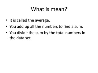
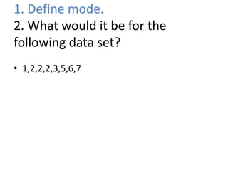
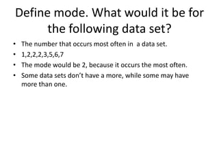
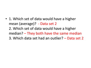
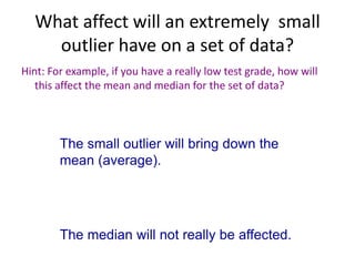
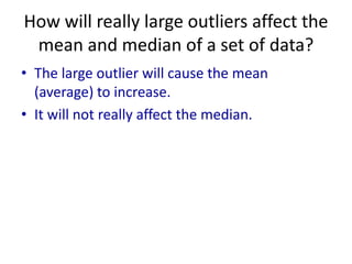
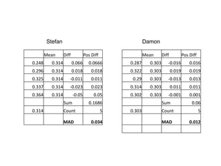
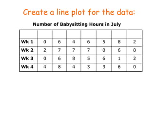
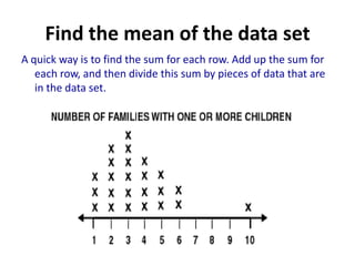
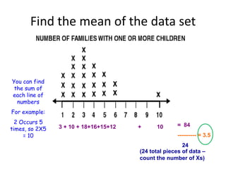
Unit 4 Midterm
    Review
What is central tendency?
• It refers to the middle or center of the data.
What is the mean of a data set?
What is mean?
• It is called the average.
• You add up all the numbers to find a sum.
• You divide the sum by the total numbers in
  the data set.
What is the median? How do you
             find it?
What is the median? How do you find
                it?
• It is the middle of the data.
• You put the numbers in order and eliminate
  one on each side of the data until you find the
  middle.
How do you find the median of a data set if
  there are more than one number in the
          middle of the data set?

            2 5 6 12 15 18
How do you find the median of a data
set if there are more than one number
      in the middle of the data set?
                     2 5 6 12 15 18

     Find the mean of those two numbers by adding them up
     and dividing by two.


  6 + 12 = 18
  18/2 = 9
  The median would be 9
1. Define mode.
2. What would it be for the
following data set?
• 1,2,2,2,3,5,6,7
Define mode. What would it be for
      the following data set?
•   The number that occurs most often in a data set.
•   1,2,2,2,3,5,6,7
•   The mode would be 2, because it occurs the most often.
•   Some data sets don’t have a more, while some may have
    more than one.
Which measure of center is
       affected by outliers?
• Hint: If you made a really low grade, what is
  going to affected the most? (Mean or Median)
Which measure of central tendency is
       affected by outliers?
Hint: If you made a really low grade, what is
  going to affected the most? (Mean or Median)

The mean is affected by outliers. The mean of
  the test scores will go down.

The median is not affected by outliers?
1. Which set of data would have a higher
mean (average)?
2. Which set of data would have a higher
median?
3. Which data set had an outlier?

Data set 1: 5 5 15 20 25

Data set 2: 5 5 15 20 60
• 1. Which set of data would have a higher
  mean (average)? - Data set 2
  2. Which set of data would have a higher
  median? – They both have the same median
  3. Which data set had an outlier? – Data set 2
What affect will an extremely small
    outlier have on a set of data?
Hint: For example, if you have a really low test grade, how will
   this affect the mean and median for the set of data?
What affect will an extremely small
    outlier have on a set of data?
Hint: For example, if you have a really low test grade, how will
   this affect the mean and median for the set of data?


        The small outlier will bring down the
        mean (average).


        The median will not really be affected.
How will really large outliers affect the
 mean and median of a set of data?
How will really large outliers affect the
 mean and median of a set of data?
• The large outlier will cause the mean
  (average) to increase.
• It will not really affect the median.
Before
• We measured the
  heights of the
  cans and created
  data sets.
• What happens to
  the measures of
  center after we     After
  replace the
  tallest can with
  the Pringles can?
Before
• We measured the
  heights of the
  cans and created
  data sets.
• What happens to
  the measures of
  center after we         After
  replace the
  tallest can with
  the Pringles can?
• The mean increased.
• The median stayed the
  same.
Can you name a real example of how
  mode is used in the real world?
Can you name a real example of how
   mode is used in the real world?
• Voting - the candidate with the most
  votes, wins.
Find the Mean Absolute Deviation
(MAD) for both people. Find who is
       more consistent hitter.
Batting Averages:
Stefan: .248, .296, .325, .337, .364
Damon: .287. .322, .290, .314, .302

Be sure to make a table for each baseball player.
Stefan                                          Damon

        Mean      Diff           Pos Diff               Mean      Diff           Pos Diff
0.248     0.314          0.066     0.0666       0.287     0.303      -0.016          0.016
0.296     0.314          0.018       0.018      0.322     0.303          0.019       0.019
0.325     0.314      -0.011          0.011       0.29     0.303      -0.013          0.013
0.337     0.314      -0.023          0.023      0.314     0.303          0.011       0.011
0.364     0.314          -0.05        0.05      0.302     0.303      -0.001          0.001
                  Sum              0.1686                         Sum                 0.06
0.314             Count                     5   0.303             Count                     5

                  MAD                0.034                        MAD                0.012
Complete the Frequency column in this cumulative
                frequency table

The list shows the average high temperatures for 20 cities
on one February day.
69, 66, 65, 51, 50, 50, 44, 41, 38, 32, 32, 28, 20, 18, 12, 8,
8, 4, 2, 2

                          February Temperatures in 20 Cities
Hint: Count the           Average    Frequency Cumulative
                           Highs                 Frequency
numbers that fall
into each interval          0–19
category, and              20–39
place that total           40–59
under frequency.
                           60–79
Complete the Cumulative Frequency
              column
The list shows the average high temperatures for 20 cities
on one February day. Make a cumulative frequency table of
the data.

                           February Temperatures in 20 Cities
                           Average    Frequency Cumulative
Step 3: Find the            Highs                 Frequency
cumulative frequency        0–19          7            7
for each row by adding
all the frequency values   20–39          5           12
that are above or in       40–59          5           17
that row.
                           60–79          3           20
A stem-and-leaf plot can be used to show how often data
values occur and how they are distributed.
Each leaf on the plot represents the right-hand digit in a
data value.
Stems represents left-hand digits.


               Stems     Leaves
                   2     4 7 9
                    3    0 6


               Key: 2|7 means 27
Create a stem and leaf plot

 The data shows the number of years coached by the top
 15 coaches in the all-time NFL coaching victories. Make
 a stem-and-leaf plot of the data.
  33, 40, 29, 33, 23, 22, 20, 21, 18, 23, 17, 15, 15, 12, 17


 Step 2: List the stems from least to greatest on the plot.
The stems
are the tens
                Stems      Leaves
digits.
                    1
                    2
                    3
                    4
Creating Stem and Leaf Plot

The data shows the number of years coached by the top 15 coaches in the all-
time NFL coaching victories. Make a stem-and-leaf plot of the data. Then find
the number of coaches who coached fewer than 25 years.


33, 40, 29, 33, 23, 22, 20, 21, 18, 23, 17, 15, 15, 12, 17

 Step 3: List the leaves for each stem from least to greatest.
The stems                                                       The leaves
are the tens                                                    are the
                      Stems          Leaves
digits.                                                         ones digits.
                          1          2 5 5 7 7 8
                          2          0 1 23 3 9
                          3          3 3
                          4          0
Would it be appropriate to make a
stem and leaf plot for the number of
  text message you send Monday
          through Friday?
Would it be appropriate to make a
  stem and leaf plot for the number of
    text message you send Monday
            through Friday?
• No because you would be examining two
  variables ( number of messages, and days of
  the week).
• Stem and leaf plots are only appropriate when
  you are examining one variable, such as the
  number of text message, or test grades in
  math.
Create a line plot for the data:
   Number of Babysitting Hours in July

       M    T     W    Th     F     S    Su
Wk 1   0     6    4     6     5     8    2
Wk 2   2     7    7     7     0     6    8
Wk 3   0     6    8     5     6     1    2
Wk 4   4     8    4     3     3     6    0
Your line plot should look like this:


Step 2: Put an X above the number on the number
line that corresponds to the number of babysitting
hours in July.                          X
                                       X
X                                      X             X
X           X            X             X     X       X
X           X      X     X      X      X     X       X
X    X      X      X     X      X      X     X       X


0     1     2     3      4       5     6      7    8
 The greatest number of X’s appear above the number 6.
 This means that Morgan babysat most often for 6 hours.
Find the median of the line plot
     that you just created.
What is noticeable about this line plot?
This line plot has an outlier. Which measure of
  central tendency best describes the data?
This line plot has an outlier. Which measure of
  central tendency best describes the data?
  The median because there is an outlier in the
  data set.
Which measure of central tendency should be
      used to describe this data set?
Which measure of central tendency should be
      used to describe this data set?


   The mean because it data set does
         not have an outlier.
Which measure of central tendency should be
      used to describe this data set?
Which measure of central tendency should be
      used to describe this data set?


     The median should be used because
        the data set has an outlier.
Find the mean of the data set
A quick way is to find the sum for each row. Add up the sum for
   each row, and then divide this sum by pieces of data that are
   in the data set.
Find the mean of the data set


You can find
 the sum of
each line of
  numbers
For example:
  2 Occurs 5                                         = 84
times, so 2X5   3 + 10 + 18+16+15+12   +     10
     = 10                                            ---------- = 3.5
                                                        24
                                       (24 total pieces of data –
                                       count the number of Xs)
Use the information given to
complete the cumulative frequency
              table
             Nurses’ Ages
     Ages    Frequency   Cumulative
                         Frequency
     20–29     5             5
     30–39     7            12
     40–49     4            16
     50–59     2            18
     60–69     2            20
What is a population?
Population
 = the entire group

• Researchers often study
  a part of the population,
  called a sample.
What is a sample?
Sample is a small group
 of the total population
What is a random sample?
•For a random sample,
 members of the population are
 chosen at random. This gives
 every member of the
 population an equal chance of
 being chosen.
What is a convenience sample?
CONVENIENCE SAMPLE
• A convenience sample is based
  on members of the population
  that are conveniently available,
  such as 30 elk in a wildlife
  preservation area.
•A biased sample does not
 fairly represent the
 population.

• A study of 50 elk belonging to a breeder
  could be biased because the breeder’s elk
  might be less likely to have Mad Elk
  Disease than elk in the wild.
Which would be better to have, a
random sample or a convenience
           sample?
Which would be better to have, a
random sample or a convenience
           sample?

A random sample is more likely
    to be representative of a
 population than a convenience
            sample is.
Min - 22
LQ - 24
Med - 31
UQ - 38
Max - 42
Box-and-Whisker Plots
      Data from the previous question
                    (min, LQ, med, UQ, max)


           42 22 31 27 24 38 35

  Step 1: Order the data from least to greatest. Then find the
          least and greatest values, the median, and the lower
          and upper quartiles.
                                             The least value.
           22 24 27 31 35 38 42
                                             The greatest value.


           22 24 27 31 35 38 42              The median.

                                             The upper and lower
           22 24 27 31 35 38 42
                                             quartiles.

Course 2
Create a box and whiskers from
the 5 number summary you just
            found.
7-5 Box-and-Whisker Plots


           Above the number line, plot a point for each
           value in Step 1.


  Step 3: Draw a box from the lower to the upper quartile.
          Inside the box, draw a vertical line through the median.
          Then draw the “whiskers” from the box to the least
          and greatest values.


    20     22   24   26   28   30   32   34   36   38   40   42


Course 2
7-5 Box-and-Whisker Plots
     Additional Example 2A: Comparing Box-and-
                    Whisker Plot
  Use the box-and-whisker plots below to answer each
  question.

                                                            Basketball Players

                                                            Baseball Players


   64      66   68   70    72  74    76   78    80   82    84    86
   t         Heights of Basketball and Baseball Players (in.)

        Which set of heights of players has a greater
        median?
        The median height of basketball players, about
        74 inches, is greater than the median height of
        baseball players, about 70 inches.
Course 2
7-5 Box-and-Whisker Plots
                      Check It Out: Example 2A

  Use the box-and-whisker plots below to answer each
  question.
                                                     Maroon’s Shoe Store

                                                     Sage’s Shoe Store


   20      24  26   28   30   32    34   36  38    40   42     44
   t         Number of Shoes Sold in One Week at Each Store

        Which shoe store has a greater median?
        The median number of shoes sold in one week
        at Sage’s Shoe Store, about 32, is greater than
        the median number of shoes sold in one week
        at Maroon’s Shoe Store, about 28.

Course 2
Find the Range of the Box and
       Whiskers Plot
Find the Range of the Box and
       Whiskers Plot


 Max – min = range
 100 – 20 = 80
Find the Inter quartile Range of
         the B&W Plot
Find the Inter quartile Range of
         the B&W Plot


 UQ – LQ = IQR
 87 – 50 = 37
What is the range of the box known
                as?
What is the range of the box known
                as?
• Interquartile range
7-5 Box-and-Whisker Plots
                      Check It Out: Example 2B

  Use the box-and-whisker plots below to answer each
  question.
                                                     Maroon’s Shoe Store

                                                     Sage’s Shoe Store


   20      24  26   28   30   32    34   36  38    40   42     44
   t         Number of Shoes Sold in One Week at Each Store

        Which shoe store has a greater interquartile
        range?


Course 2
7-5 Box-and-Whisker Plots
                      Check It Out: Example 2B

  Use the box-and-whisker plots below to answer each
  question.
                                                     Maroon’s Shoe Store

                                                     Sage’s Shoe Store


   20      24  26   28   30   32    34   36  38    40   42     44
   t         Number of Shoes Sold in One Week at Each Store

        Which shoe store has a greater interquartile
        range?
        Maroon’s shoe store has a longer box, so it has
        a greater interquartile range.


Course 2
I would like to create a graph to show
  the number of cancer cases world
wide from 1950 to 2011. What kind of
        graph would be best?
I would like to create a graph to show
  the number of cancer cases world
wide from 1950 to 2011. What kind of
        graph would be best?
• Line graph because it shows change over time
What kind of graphs should I use if
percents or populations are involved?
What kind of graphs should I use if
percents or populations are involved?
• Circle graph
If I want to create a display to show the
number of cell phone messages sent from
Monday – Friday, what kind of graph would
                be best?
If I want to create a display to show the
number of cell phone messages sent from
Monday – Friday, what kind of graph would
                be best?

• Line Graph – it shows change over time
If I wanted to create a display to show test
scores in math, SS, science, and LA, what kind
           of graph would be best?
If I wanted to create a display to show test
 scores in math, SS, science, and LA, what kind
            of graph would be best?


• Bar Graph – each set of data (subject) is not
  related to the other
I want to create a display to show the
classes grade on the final exam. What
  kind of graphs would be the best?
I want to create a display to show the
classes grade on the final exam. What
  kind of graphs would be the best?
• Stem and Leaf
• Line Plot
• or histogram

2012 2013 3rd 9 weeks midterm review

  • 1.
  • 2.
    What is centraltendency?
  • 3.
    What is centraltendency? • It refers to the middle or center of the data.
  • 4.
    What is themean of a data set?
  • 5.
    What is mean? •It is called the average. • You add up all the numbers to find a sum. • You divide the sum by the total numbers in the data set.
  • 6.
    What is themedian? How do you find it?
  • 7.
    What is themedian? How do you find it? • It is the middle of the data. • You put the numbers in order and eliminate one on each side of the data until you find the middle.
  • 8.
    How do youfind the median of a data set if there are more than one number in the middle of the data set? 2 5 6 12 15 18
  • 9.
    How do youfind the median of a data set if there are more than one number in the middle of the data set? 2 5 6 12 15 18 Find the mean of those two numbers by adding them up and dividing by two. 6 + 12 = 18 18/2 = 9 The median would be 9
  • 10.
    1. Define mode. 2.What would it be for the following data set? • 1,2,2,2,3,5,6,7
  • 11.
    Define mode. Whatwould it be for the following data set? • The number that occurs most often in a data set. • 1,2,2,2,3,5,6,7 • The mode would be 2, because it occurs the most often. • Some data sets don’t have a more, while some may have more than one.
  • 12.
    Which measure ofcenter is affected by outliers? • Hint: If you made a really low grade, what is going to affected the most? (Mean or Median)
  • 13.
    Which measure ofcentral tendency is affected by outliers? Hint: If you made a really low grade, what is going to affected the most? (Mean or Median) The mean is affected by outliers. The mean of the test scores will go down. The median is not affected by outliers?
  • 14.
    1. Which setof data would have a higher mean (average)? 2. Which set of data would have a higher median? 3. Which data set had an outlier? Data set 1: 5 5 15 20 25 Data set 2: 5 5 15 20 60
  • 15.
    • 1. Whichset of data would have a higher mean (average)? - Data set 2 2. Which set of data would have a higher median? – They both have the same median 3. Which data set had an outlier? – Data set 2
  • 16.
    What affect willan extremely small outlier have on a set of data? Hint: For example, if you have a really low test grade, how will this affect the mean and median for the set of data?
  • 17.
    What affect willan extremely small outlier have on a set of data? Hint: For example, if you have a really low test grade, how will this affect the mean and median for the set of data? The small outlier will bring down the mean (average). The median will not really be affected.
  • 18.
    How will reallylarge outliers affect the mean and median of a set of data?
  • 19.
    How will reallylarge outliers affect the mean and median of a set of data? • The large outlier will cause the mean (average) to increase. • It will not really affect the median.
  • 20.
    Before • We measuredthe heights of the cans and created data sets. • What happens to the measures of center after we After replace the tallest can with the Pringles can?
  • 21.
    Before • We measuredthe heights of the cans and created data sets. • What happens to the measures of center after we After replace the tallest can with the Pringles can? • The mean increased. • The median stayed the same.
  • 22.
    Can you namea real example of how mode is used in the real world?
  • 23.
    Can you namea real example of how mode is used in the real world? • Voting - the candidate with the most votes, wins.
  • 24.
    Find the MeanAbsolute Deviation (MAD) for both people. Find who is more consistent hitter. Batting Averages: Stefan: .248, .296, .325, .337, .364 Damon: .287. .322, .290, .314, .302 Be sure to make a table for each baseball player.
  • 25.
    Stefan Damon Mean Diff Pos Diff Mean Diff Pos Diff 0.248 0.314 0.066 0.0666 0.287 0.303 -0.016 0.016 0.296 0.314 0.018 0.018 0.322 0.303 0.019 0.019 0.325 0.314 -0.011 0.011 0.29 0.303 -0.013 0.013 0.337 0.314 -0.023 0.023 0.314 0.303 0.011 0.011 0.364 0.314 -0.05 0.05 0.302 0.303 -0.001 0.001 Sum 0.1686 Sum 0.06 0.314 Count 5 0.303 Count 5 MAD 0.034 MAD 0.012
  • 26.
    Complete the Frequencycolumn in this cumulative frequency table The list shows the average high temperatures for 20 cities on one February day. 69, 66, 65, 51, 50, 50, 44, 41, 38, 32, 32, 28, 20, 18, 12, 8, 8, 4, 2, 2 February Temperatures in 20 Cities Hint: Count the Average Frequency Cumulative Highs Frequency numbers that fall into each interval 0–19 category, and 20–39 place that total 40–59 under frequency. 60–79
  • 27.
    Complete the CumulativeFrequency column The list shows the average high temperatures for 20 cities on one February day. Make a cumulative frequency table of the data. February Temperatures in 20 Cities Average Frequency Cumulative Step 3: Find the Highs Frequency cumulative frequency 0–19 7 7 for each row by adding all the frequency values 20–39 5 12 that are above or in 40–59 5 17 that row. 60–79 3 20
  • 28.
    A stem-and-leaf plotcan be used to show how often data values occur and how they are distributed. Each leaf on the plot represents the right-hand digit in a data value. Stems represents left-hand digits. Stems Leaves 2 4 7 9 3 0 6 Key: 2|7 means 27
  • 29.
    Create a stemand leaf plot The data shows the number of years coached by the top 15 coaches in the all-time NFL coaching victories. Make a stem-and-leaf plot of the data. 33, 40, 29, 33, 23, 22, 20, 21, 18, 23, 17, 15, 15, 12, 17 Step 2: List the stems from least to greatest on the plot. The stems are the tens Stems Leaves digits. 1 2 3 4
  • 30.
    Creating Stem andLeaf Plot The data shows the number of years coached by the top 15 coaches in the all- time NFL coaching victories. Make a stem-and-leaf plot of the data. Then find the number of coaches who coached fewer than 25 years. 33, 40, 29, 33, 23, 22, 20, 21, 18, 23, 17, 15, 15, 12, 17 Step 3: List the leaves for each stem from least to greatest. The stems The leaves are the tens are the Stems Leaves digits. ones digits. 1 2 5 5 7 7 8 2 0 1 23 3 9 3 3 3 4 0
  • 31.
    Would it beappropriate to make a stem and leaf plot for the number of text message you send Monday through Friday?
  • 32.
    Would it beappropriate to make a stem and leaf plot for the number of text message you send Monday through Friday? • No because you would be examining two variables ( number of messages, and days of the week). • Stem and leaf plots are only appropriate when you are examining one variable, such as the number of text message, or test grades in math.
  • 33.
    Create a lineplot for the data: Number of Babysitting Hours in July M T W Th F S Su Wk 1 0 6 4 6 5 8 2 Wk 2 2 7 7 7 0 6 8 Wk 3 0 6 8 5 6 1 2 Wk 4 4 8 4 3 3 6 0
  • 34.
    Your line plotshould look like this: Step 2: Put an X above the number on the number line that corresponds to the number of babysitting hours in July. X X X X X X X X X X X X X X X X X X X X X X X X X X X X 0 1 2 3 4 5 6 7 8 The greatest number of X’s appear above the number 6. This means that Morgan babysat most often for 6 hours.
  • 35.
    Find the medianof the line plot that you just created.
  • 37.
    What is noticeableabout this line plot?
  • 38.
    What is noticeableabout this line plot?
  • 39.
    This line plothas an outlier. Which measure of central tendency best describes the data?
  • 40.
    This line plothas an outlier. Which measure of central tendency best describes the data? The median because there is an outlier in the data set.
  • 41.
    Which measure ofcentral tendency should be used to describe this data set?
  • 42.
    Which measure ofcentral tendency should be used to describe this data set? The mean because it data set does not have an outlier.
  • 43.
    Which measure ofcentral tendency should be used to describe this data set?
  • 44.
    Which measure ofcentral tendency should be used to describe this data set? The median should be used because the data set has an outlier.
  • 45.
    Find the meanof the data set A quick way is to find the sum for each row. Add up the sum for each row, and then divide this sum by pieces of data that are in the data set.
  • 46.
    Find the meanof the data set You can find the sum of each line of numbers For example: 2 Occurs 5 = 84 times, so 2X5 3 + 10 + 18+16+15+12 + 10 = 10 ---------- = 3.5 24 (24 total pieces of data – count the number of Xs)
  • 48.
    Use the informationgiven to complete the cumulative frequency table Nurses’ Ages Ages Frequency Cumulative Frequency 20–29 5 5 30–39 7 12 40–49 4 16 50–59 2 18 60–69 2 20
  • 49.
    What is apopulation?
  • 50.
    Population = theentire group • Researchers often study a part of the population, called a sample.
  • 51.
    What is asample?
  • 52.
    Sample is asmall group of the total population
  • 53.
    What is arandom sample?
  • 54.
    •For a randomsample, members of the population are chosen at random. This gives every member of the population an equal chance of being chosen.
  • 55.
    What is aconvenience sample?
  • 56.
    CONVENIENCE SAMPLE • Aconvenience sample is based on members of the population that are conveniently available, such as 30 elk in a wildlife preservation area.
  • 57.
    •A biased sampledoes not fairly represent the population. • A study of 50 elk belonging to a breeder could be biased because the breeder’s elk might be less likely to have Mad Elk Disease than elk in the wild.
  • 58.
    Which would bebetter to have, a random sample or a convenience sample?
  • 59.
    Which would bebetter to have, a random sample or a convenience sample? A random sample is more likely to be representative of a population than a convenience sample is.
  • 61.
    Min - 22 LQ- 24 Med - 31 UQ - 38 Max - 42
  • 62.
    Box-and-Whisker Plots Data from the previous question (min, LQ, med, UQ, max) 42 22 31 27 24 38 35 Step 1: Order the data from least to greatest. Then find the least and greatest values, the median, and the lower and upper quartiles. The least value. 22 24 27 31 35 38 42 The greatest value. 22 24 27 31 35 38 42 The median. The upper and lower 22 24 27 31 35 38 42 quartiles. Course 2
  • 63.
    Create a boxand whiskers from the 5 number summary you just found.
  • 64.
    7-5 Box-and-Whisker Plots Above the number line, plot a point for each value in Step 1. Step 3: Draw a box from the lower to the upper quartile. Inside the box, draw a vertical line through the median. Then draw the “whiskers” from the box to the least and greatest values. 20 22 24 26 28 30 32 34 36 38 40 42 Course 2
  • 65.
    7-5 Box-and-Whisker Plots Additional Example 2A: Comparing Box-and- Whisker Plot Use the box-and-whisker plots below to answer each question. Basketball Players Baseball Players 64 66 68 70 72 74 76 78 80 82 84 86 t Heights of Basketball and Baseball Players (in.) Which set of heights of players has a greater median? Course 2
  • 66.
    7-5 Box-and-Whisker Plots Additional Example 2A: Comparing Box-and- Whisker Plot Use the box-and-whisker plots below to answer each question. Basketball Players Baseball Players 64 66 68 70 72 74 76 78 80 82 84 86 t Heights of Basketball and Baseball Players (in.) Which set of heights of players has a greater median? The median height of basketball players, about 74 inches, is greater than the median height of baseball players, about 70 inches. Course 2
  • 67.
    7-5 Box-and-Whisker Plots Check It Out: Example 2A Use the box-and-whisker plots below to answer each question. Maroon’s Shoe Store Sage’s Shoe Store 20 24 26 28 30 32 34 36 38 40 42 44 t Number of Shoes Sold in One Week at Each Store Which shoe store has a greater median? Course 2
  • 68.
    7-5 Box-and-Whisker Plots Check It Out: Example 2A Use the box-and-whisker plots below to answer each question. Maroon’s Shoe Store Sage’s Shoe Store 20 24 26 28 30 32 34 36 38 40 42 44 t Number of Shoes Sold in One Week at Each Store Which shoe store has a greater median? The median number of shoes sold in one week at Sage’s Shoe Store, about 32, is greater than the median number of shoes sold in one week at Maroon’s Shoe Store, about 28. Course 2
  • 69.
    Find the Rangeof the Box and Whiskers Plot
  • 70.
    Find the Rangeof the Box and Whiskers Plot Max – min = range 100 – 20 = 80
  • 71.
    Find the Interquartile Range of the B&W Plot
  • 72.
    Find the Interquartile Range of the B&W Plot UQ – LQ = IQR 87 – 50 = 37
  • 73.
    What is therange of the box known as?
  • 74.
    What is therange of the box known as? • Interquartile range
  • 75.
    7-5 Box-and-Whisker Plots Check It Out: Example 2B Use the box-and-whisker plots below to answer each question. Maroon’s Shoe Store Sage’s Shoe Store 20 24 26 28 30 32 34 36 38 40 42 44 t Number of Shoes Sold in One Week at Each Store Which shoe store has a greater interquartile range? Course 2
  • 76.
    7-5 Box-and-Whisker Plots Check It Out: Example 2B Use the box-and-whisker plots below to answer each question. Maroon’s Shoe Store Sage’s Shoe Store 20 24 26 28 30 32 34 36 38 40 42 44 t Number of Shoes Sold in One Week at Each Store Which shoe store has a greater interquartile range? Maroon’s shoe store has a longer box, so it has a greater interquartile range. Course 2
  • 77.
    I would liketo create a graph to show the number of cancer cases world wide from 1950 to 2011. What kind of graph would be best?
  • 78.
    I would liketo create a graph to show the number of cancer cases world wide from 1950 to 2011. What kind of graph would be best? • Line graph because it shows change over time
  • 79.
    What kind ofgraphs should I use if percents or populations are involved?
  • 80.
    What kind ofgraphs should I use if percents or populations are involved? • Circle graph
  • 81.
    If I wantto create a display to show the number of cell phone messages sent from Monday – Friday, what kind of graph would be best?
  • 82.
    If I wantto create a display to show the number of cell phone messages sent from Monday – Friday, what kind of graph would be best? • Line Graph – it shows change over time
  • 83.
    If I wantedto create a display to show test scores in math, SS, science, and LA, what kind of graph would be best?
  • 84.
    If I wantedto create a display to show test scores in math, SS, science, and LA, what kind of graph would be best? • Bar Graph – each set of data (subject) is not related to the other
  • 85.
    I want tocreate a display to show the classes grade on the final exam. What kind of graphs would be the best?
  • 86.
    I want tocreate a display to show the classes grade on the final exam. What kind of graphs would be the best? • Stem and Leaf • Line Plot • or histogram