1. The logo is placed in the top left of
the cover as we look at it. The The pug is located to the top right of
colour of the logo is usually a bright The target audience for the the page. The text fits in with the
red and white but on this magazine magazine is for people that colour scheme as it is white. This is
the red is slightly faded. The listen to rap and hip hop placed there to tell the reader that
masthead is quite big and attracts music. there is more than just the headline
the attention of the reader and in the that is in the magazine that is
shows the importance of the exciting.
magazine.
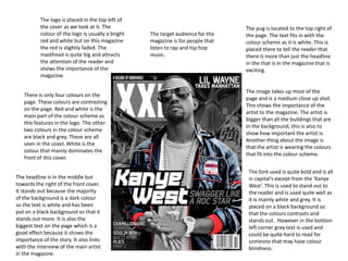
The image takes up most of the
There is only four colours on the
page and is a medium close up shot.
page. These colours are contrasting
This shows the importance of the
on the page. Red and white is the
artist to the magazine. The artist is
main part of the colour scheme as
bigger than all the buildings that are
this features in the logo. The other
in the background, this is also to
two colours in the colour scheme
show how important the artist is.
are black and grey. These are all
Another thing about the image is
seen in the cover. White is the
that the artist is wearing the colours
colour that mainly dominates the
that fit into the colour scheme.
front of this cover.
The font used is quite bold and is all
The headline is in the middle but in capital’s except from the ‘Kanye
towards the right of the front cover. West’. This is used to stand out to
It stands out because the majority the reader and is used quite well as
of the background is a dark colour it is mainly white and grey. It is
so the text is white and has been placed on a black background so
put on a black background so that it that the colours contrasts and
stands out more. It is also the stands out. However in the bottom
biggest text on the page which is a left corner grey text is used and
good effect because it shows the could be quite hard to read for
importance of the story. It also links someone that may have colour
with the interview of the main artist blindness.
in the magazine.
2. The logo is placed in the top left of
There is four colours in the colour the cover as we look at it. The
scheme of the cover. These colours colour of the logo is bright red and
The pug is located to the top right of
are contrasting on the page. White white. The masthead is quite big
the page. The text fits in with the
is the main part of the colour and attracts the attention of the
colour scheme as it is white and is
scheme and dominates the front reader and shows the importance of
placed on a red bubble. This is
cover. The other three colours in the the magazine as the Q is placed on a
placed there to tell the reader that
colour scheme are red, black and red background.
there is more than just the headline
bronze. These are all seen in the in the that is in the magazine that is
cover. exciting.
The headline is in the middle but
towards the left of the front cover. It
stands out because the majority of The image takes up most of the
the background is a white so the page and is a close up shot. This
text is red so that it stands out shows the importance of the artist
more. It is also the biggest text on to the magazine. The artist is placed
the page which is a good effect on a white background making it
because it shows the importance of contrasting colours.
the story. It also links with the
interview of the main artist in the
magazine. It is just under the main
logo and it links with the interview The texts is bold and is all in capital
of the main artist in the magazine. letters. This is good as it attracts the
readers attention. The text also
There is a circle that is placed on the contrasts to the background to
image and is next to the text. This is make it stand out a lot more.
place there to drag the users However, the text that is on the
attention to the text that is placed white shirt of the artist is quite hard
on the image so then the reader will to read because the text is also
notice it and might be persuaded to white so it blends in with the colour
buy the magazine because their of the shirt. Also the red blends in
favourite artist is in the magazine. with the dark of the blazer and the
artists skin.
3. The pug is located to the top right of
There is four colours in the colour the page. The text fits in with the
scheme of the cover. These colours colour scheme as it is white. This is
are contrasting on the page. White placed there to tell the reader that
is the main part of the colour there is more than just the headline
scheme and dominates the front in the that is in the magazine that is
cover. The other two colours in the exciting. However, the text could be
colour scheme are red and black. hard to reader for people that have
These are all seen in the cover. colour blindness because the
background is light and so is the
The logo is placed in the top left of
text.
the cover as we look at it. The
colour of the logo is bright red and
white. The masthead is quite big The image takes up most of the
and attracts the attention of the page and is a medium close up shot.
reader and shows the importance of This shows the importance of the
the magazine as the Q is placed on a artist to the magazine. The artist is
red background. placed on a white background and is
dressed in colours that will stand
The headline is in the middle but out. The artist is given messy hair
towards the left of the front cover. It and has a cigarette hanging out of
stands out because the majority of her mouth. This fits in with the
the background is white so the text headline because she is swearing so
is red and black. It has been put on a she is made to seem like a rebel and
white background so that it stands not caring about what people say
out more. It is also the biggest text about her
on the page which is a good effect
because it shows the importance of The texts is bold and is all in capital
the story. It also links with the letters. This is good as it attracts the
interview of the main artist in the readers attention. The text is placed
magazine. The colour of the text on the dark side of the image so is
saying ‘MIA’ is in the colour of the easy top read. However, the text
logo is just under the main logo. that is on the background is quite
The other text is in black and is also hard to read because the text is
in capitals. This text also links into also white so it blends in.
the headline