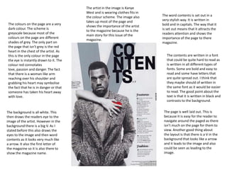
1. The artist in the image is Kanye
West and is wearing clothes fits in
the colour scheme. The image also The word contents is set out in a
takes up most of the page and very stylish way. It is written in
The colours on the page are a very bold and in capitals. The way that it
shows the importance of the artist
dark colour. The scheme is is set out means that it attracts the
to the magazine because he is the
greyscale because most of the readers attention and shows the
main story for this issue of the
colours on the page are different importance of the page to there
magazine.
shades of grey. The only part on magazine.
the page that isn’t grey is the red
heart in the chest of the artist. As
this is the only colour in the page The contents are written in a font
the eye is instantly drawn to it. The that could be quite hard to read as
colour red connotates is written in all different types of
love, passion and danger. The fact fonts. Some are bold and easy to
that there is a woman like arm read and some have letters that
reaching over his shoulder and are quite spread out. I think that
grabbing his heart may symbolise they maybe should of written in
the fact that he is in danger or that the same font as it would be easier
someone has taken his heart away to read. The good point about the
with love. text is that it is written in black and
contrasts to the background.
The background is all white. This The page is well laid out. This is
then draws the readers eye to the because it is easy for the reader to
image of the artist. However in the navigate around the paged as there
background there is a big V. As I isn’t much on the page for them to
stated before this also draws the view. Another good thing about
eyes to the image and then word the layout is that there is a V in the
contents as it looks very much like background that looks like a arrow
a arrow. It also the first letter of and it leads to the image and also
the magazine so it is also there to could be seen as leading to the
show the magazine name. image.
2. The text on the page is quite good
The word contents is written in because it is contrasting to the
bold. This stands out to the reader colour that it is laid on. It is all a
as it is in capitals. Another good reasonable size and easy to read.
thing about it being big is that Also, the headline of each story is
shows the importance of this page written in capitals so that it stands
to the magazine as it informs out.
people what it is about.
The colours on the page are a very
dark colour. The only colour on the The artist in the image is Richard
page that isn’t a dark colour is at Ashcroft and is wearing clothes fits
the top and the bottom where in the colour scheme. The image
there is a peachy coloured banner. also takes up most of the page and
The contents is written in a black shows the importance of the artist
font that is located in a red to the magazine because he is the
rectangle. There is also text written main story for this issue of the
in white and then at the top of the magazine. The subject of the image
page there is some text written in also has his arms out. This could
grey. The black, red and white all make the artist is a big and scary
fits into the colour scheme well as person who isn’t scared of
the logo also consists of these anything. His arms also lead to the
colours. contents rectangle.
The background is all a dark grey. The page is well laid out. This is
This could be bad because the because it is easy for the reader to
artist is also wearing dark navigate around the paged as there
blazer/jacket so he blends in to the isn’t much on the page for them to
background. The image is also in view. Another good thing about
the background of the page. This is the layout is that the arms of the
because he is located behind the artist lead the viewers eye back to
rectangle with all the contents in. the contents of the page so the
This is good because then the eyes person is reminded about what is
are drawn to the box as it the top in the magazine.
layer.
3. The text on the page is quite good
The title of the contents is written because it is contrasting to the
in bold. This stands out to the colour that it is laid on. It is all a
reader as it is in capitals. Another reasonable size and easy to read.
The colours on the page are a very good thing about it being big is Also, all the text is written in
light. The only colour on the page that shows the importance of this capital letters which makes it easy
that isn’t a light colour is at the top page to the magazine as it informs for the reader to read and stands
and the bottom where there is a people what it is about. out, with them being in capitals it
black coloured banner. The contents shows the importance of the
is written in a black font that is stories to the magazine.
located on a white rectangle. There
is also text written in white at the
top of the page and it is placed on a The image is off a building that is
black background. The black, red pointing up and leads the eyes to
and white all fits into the colour the top of the page. The image is
scheme well as the logo also consists also a dark colour so fits in well
of these colours. with the colour scheme. The image
is important to the contents page
as it tells the reader quite a lot
about the main story ion the
magazine.
The background is all white. This is The page isn’t well set out. This is
good because everything placed on because there is to much on the
the top of it is a dark colour. The page and will put the reader of
only thing that isn’t a dark colour is instantly because of all the text.
the arrow at the bottom corner. The image is facing up so may lead
This may be because that is an to the top of the page meaning
important bit and they want the that the reader will be reminded of
people to read it. the title as they keep looking at it.